Inside Zendesk’s New San Francisco Headquarters
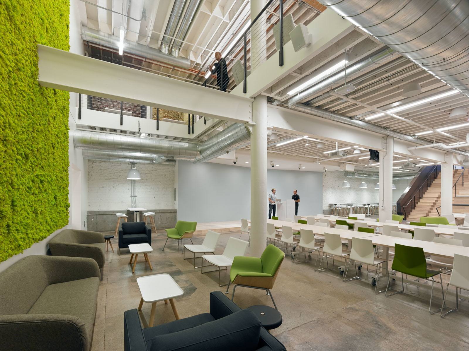
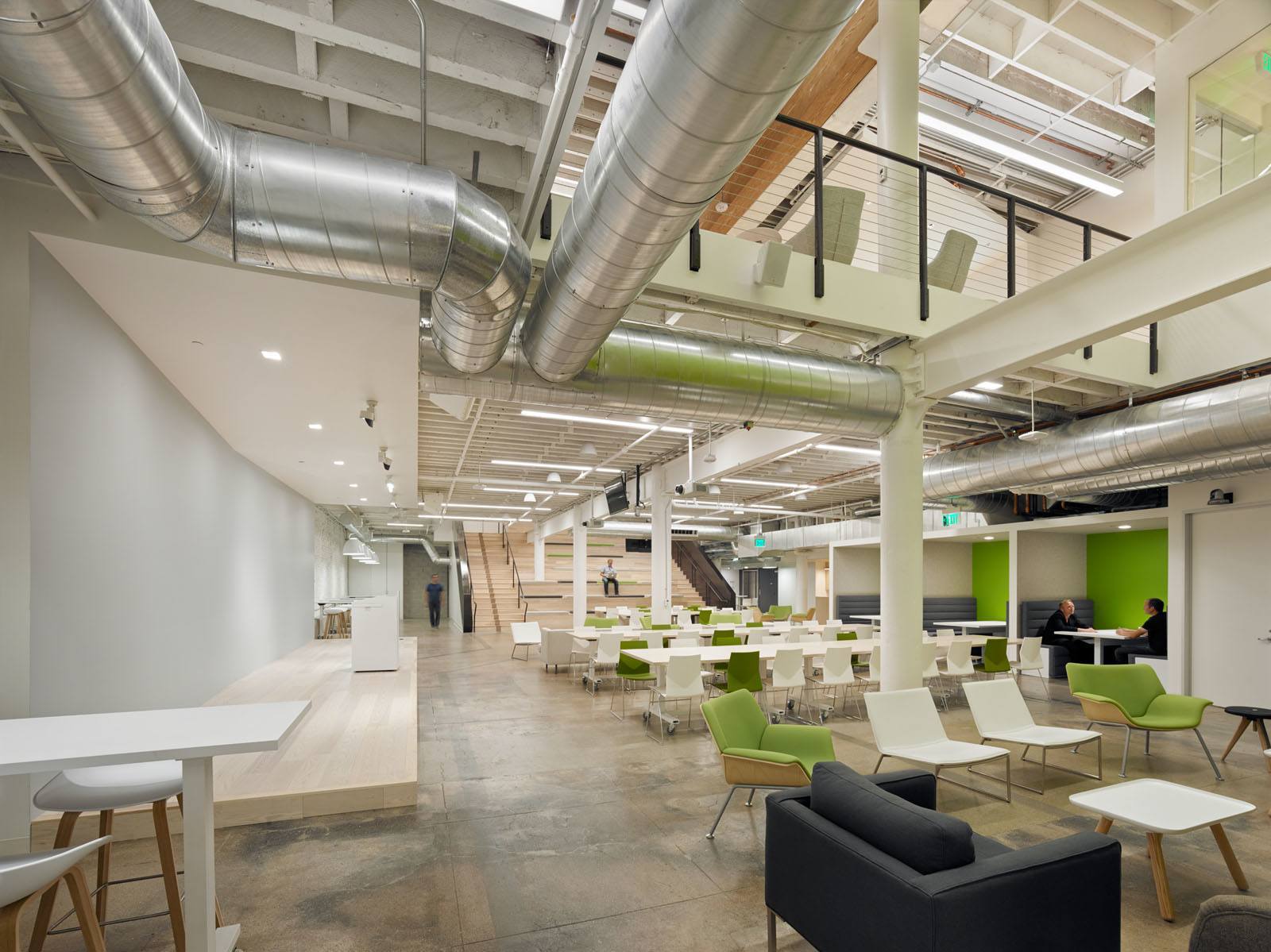
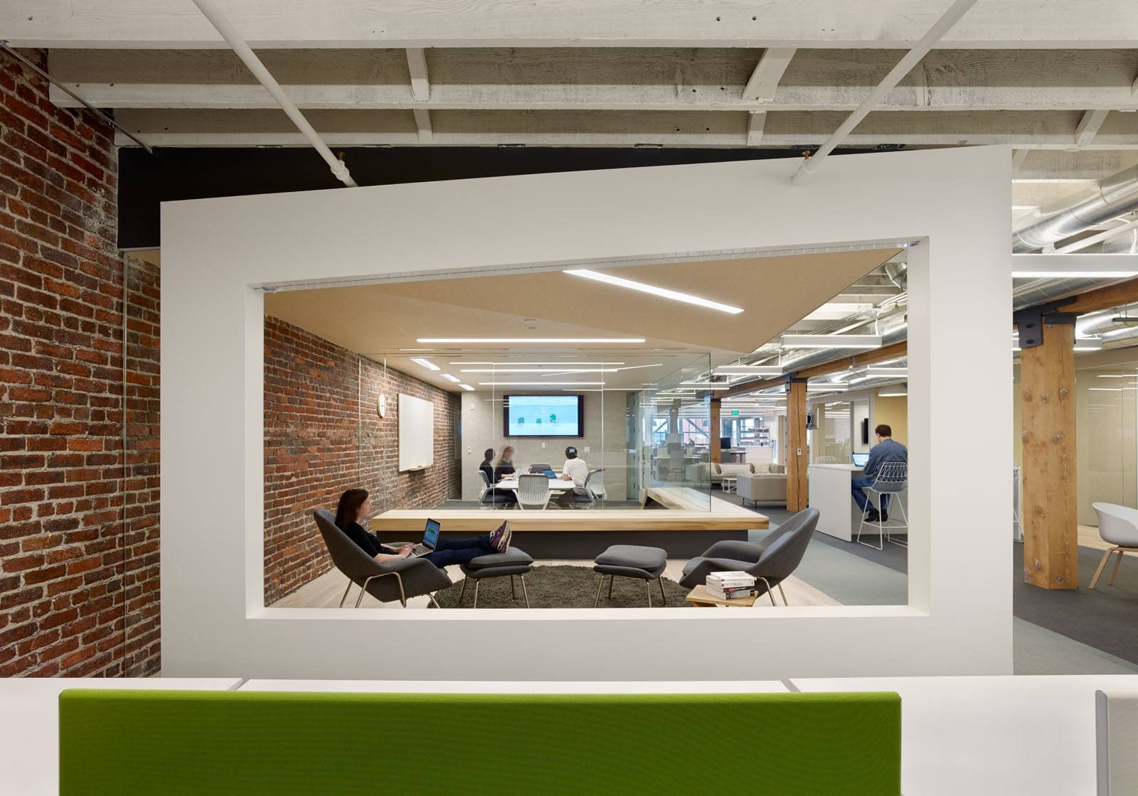
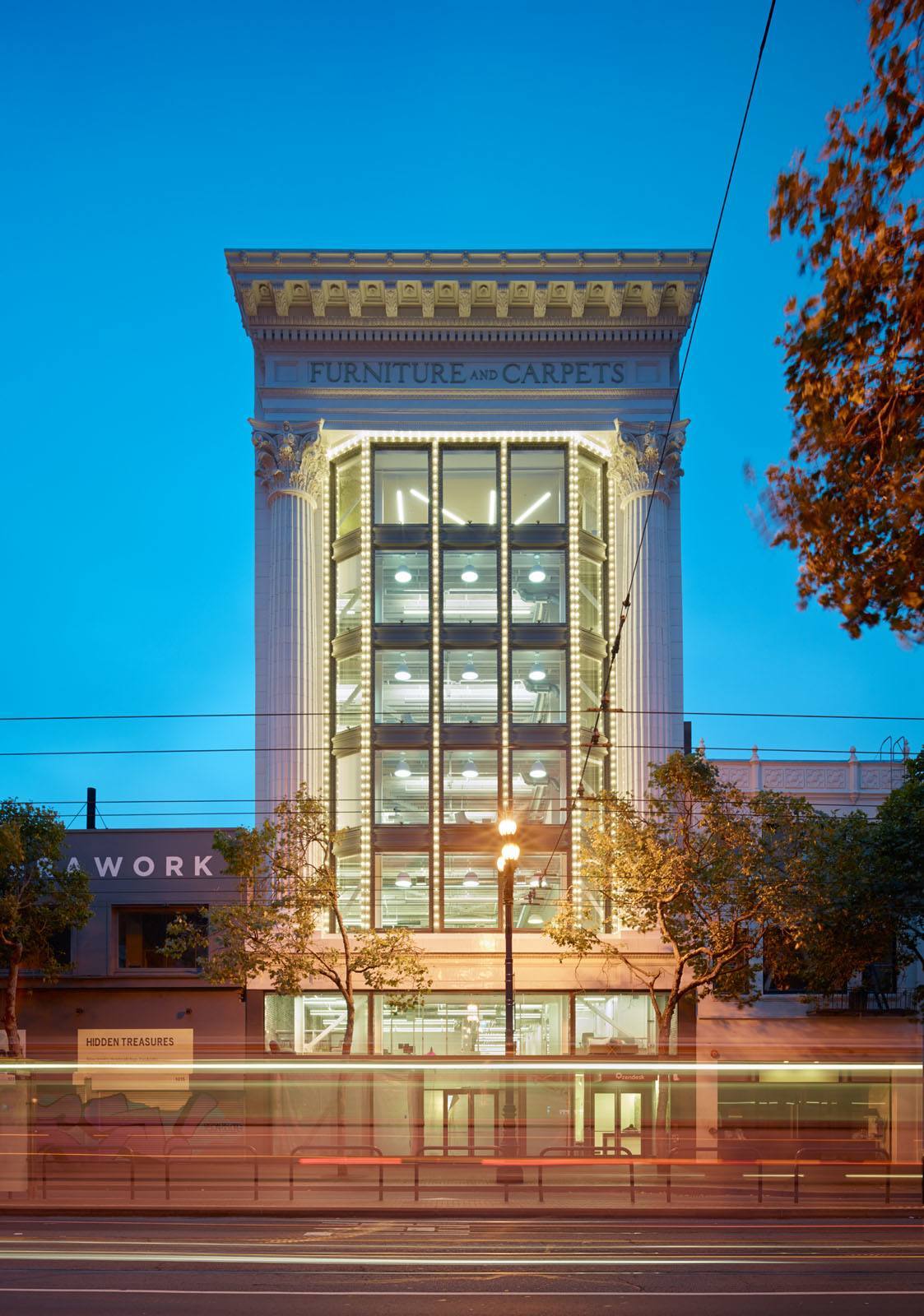
Interior design firm Design Blitz has recently designed a new headquarters for Zendesk in San Francisco, California.
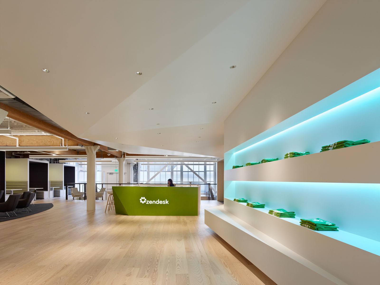
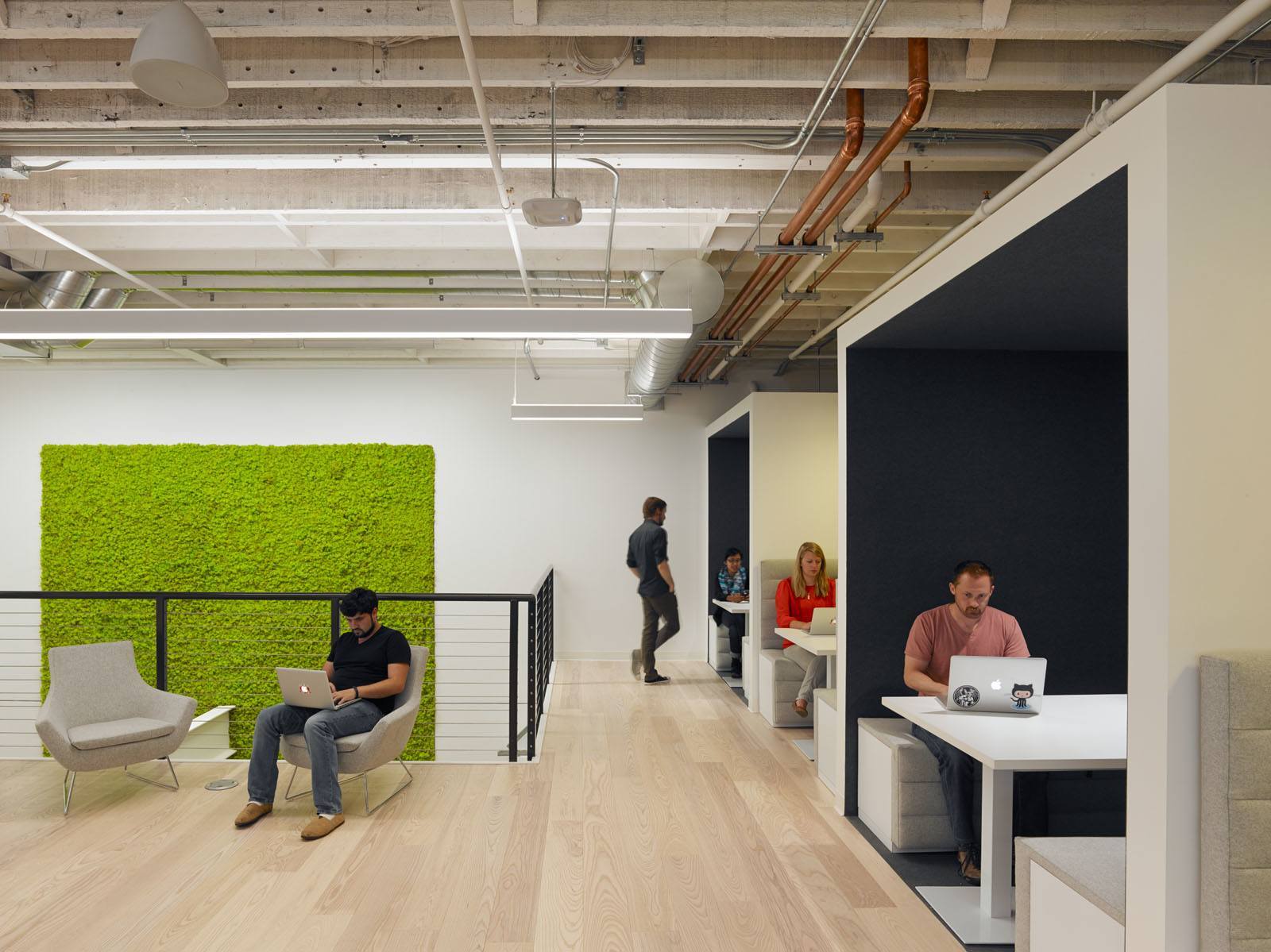
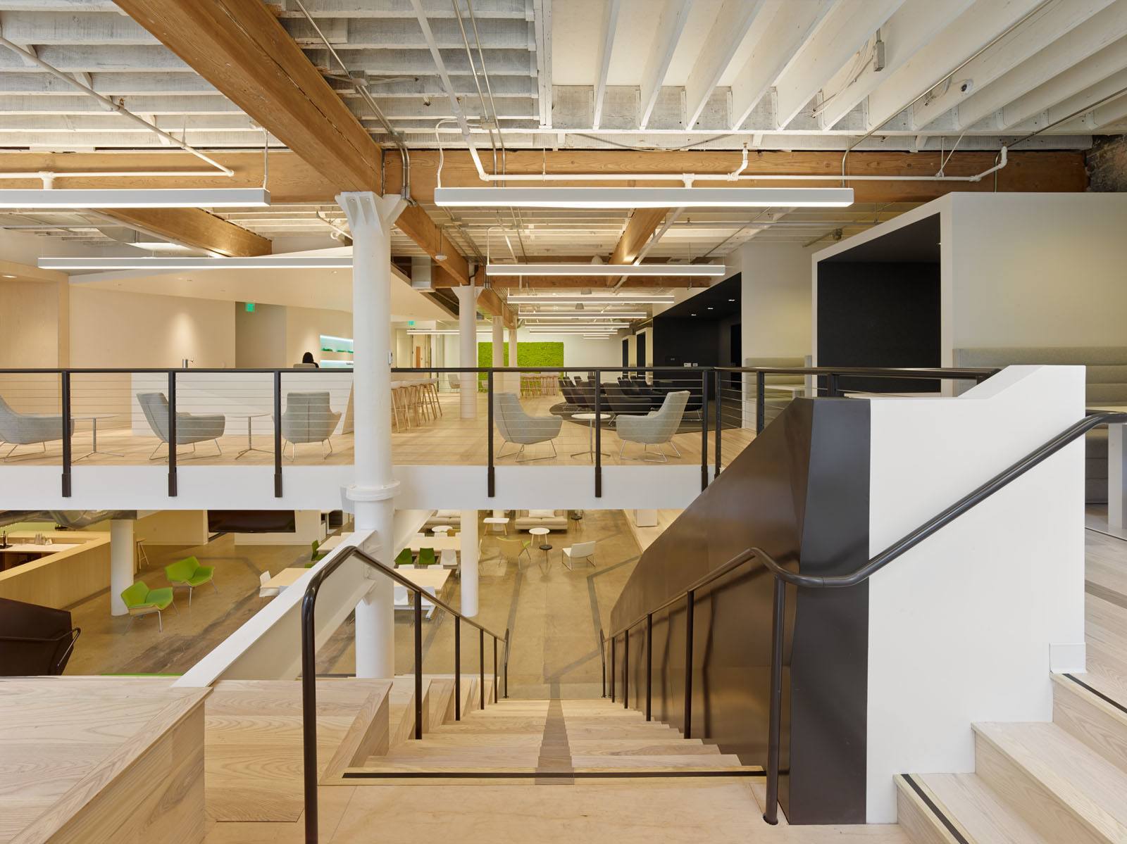
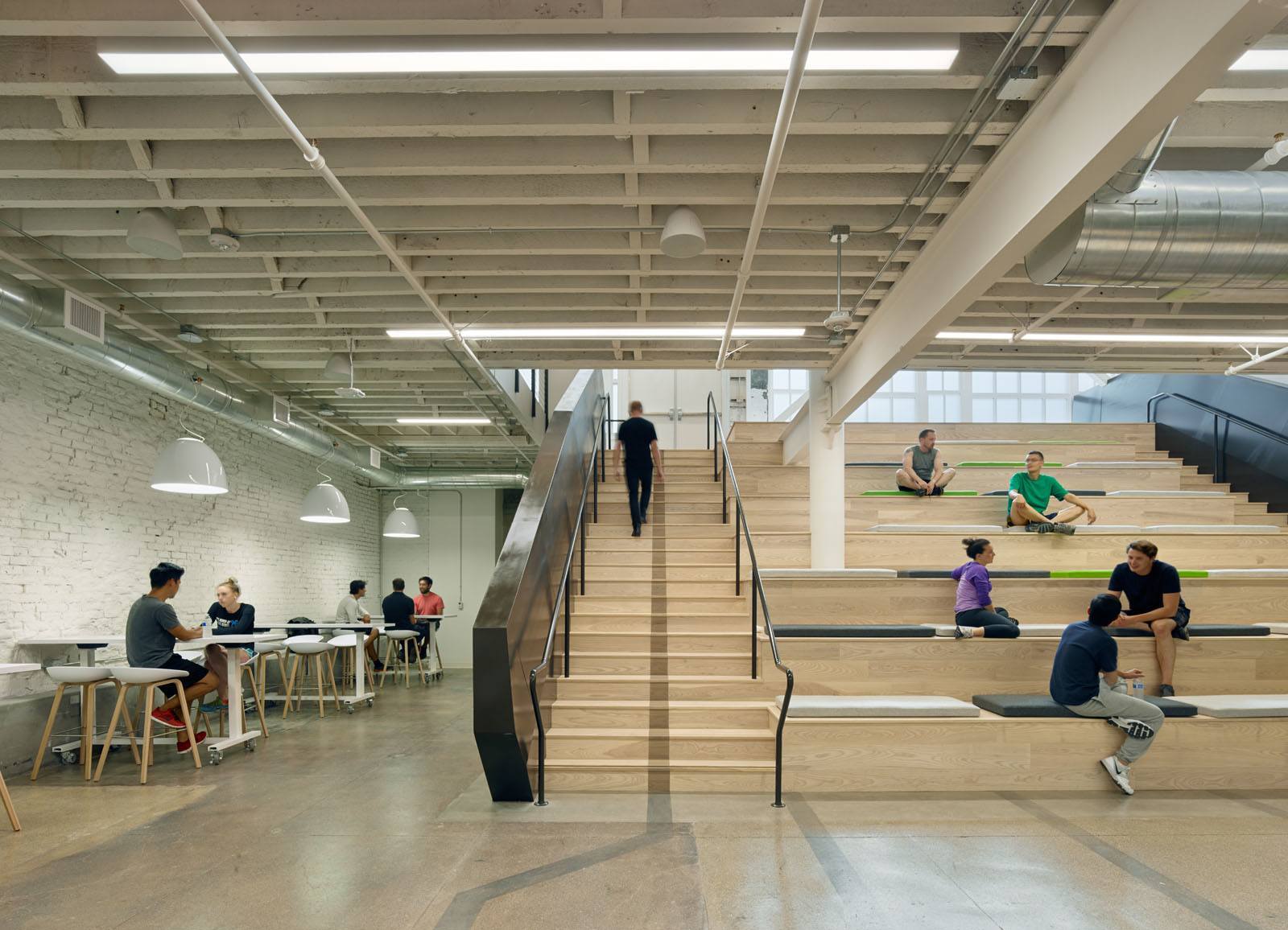
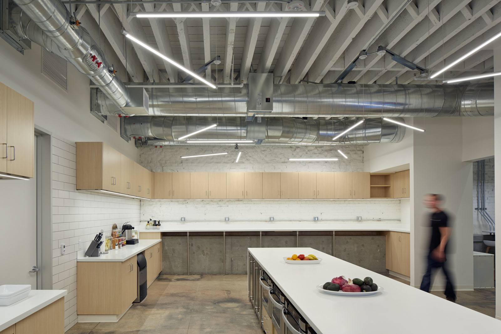
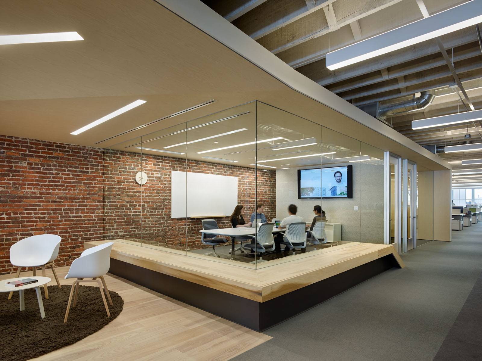
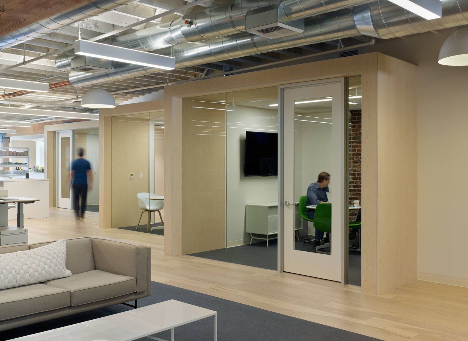
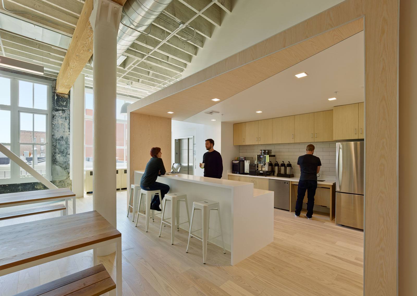
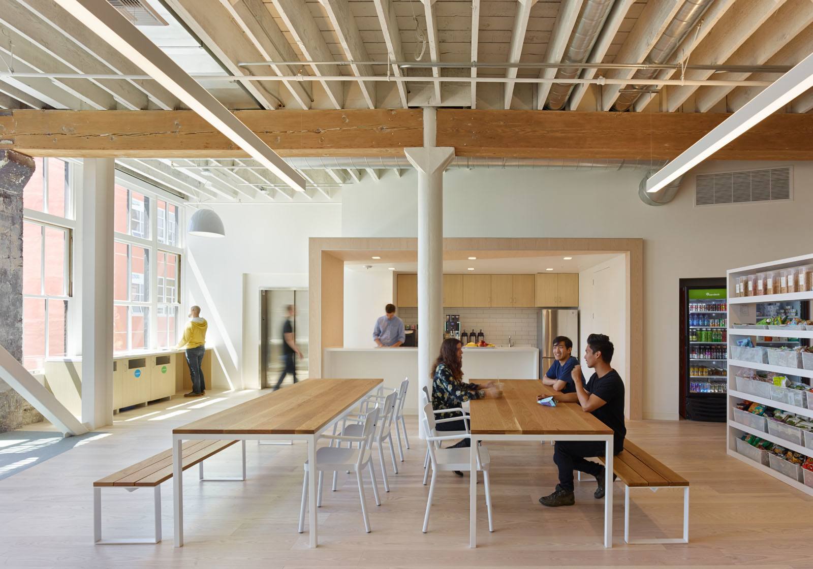
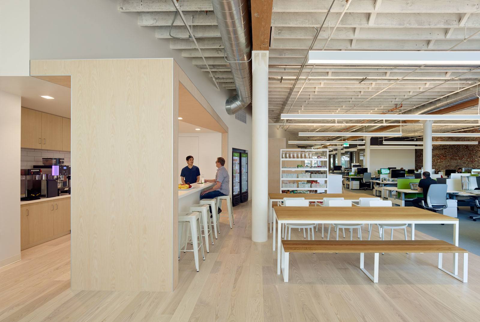
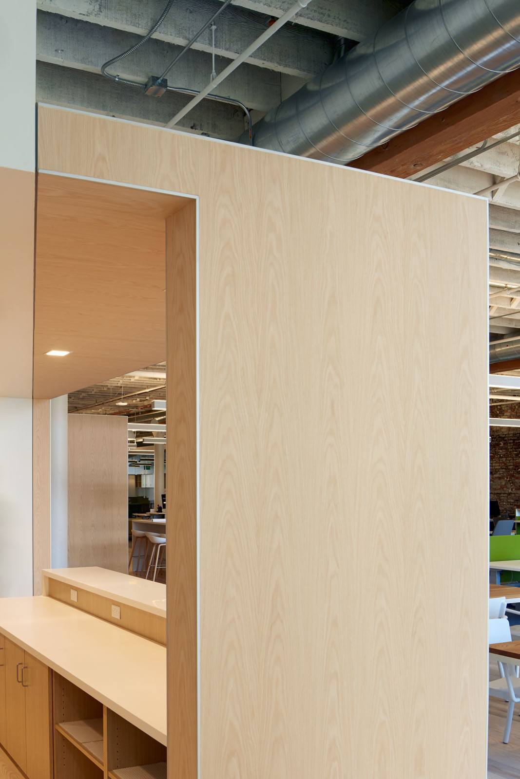
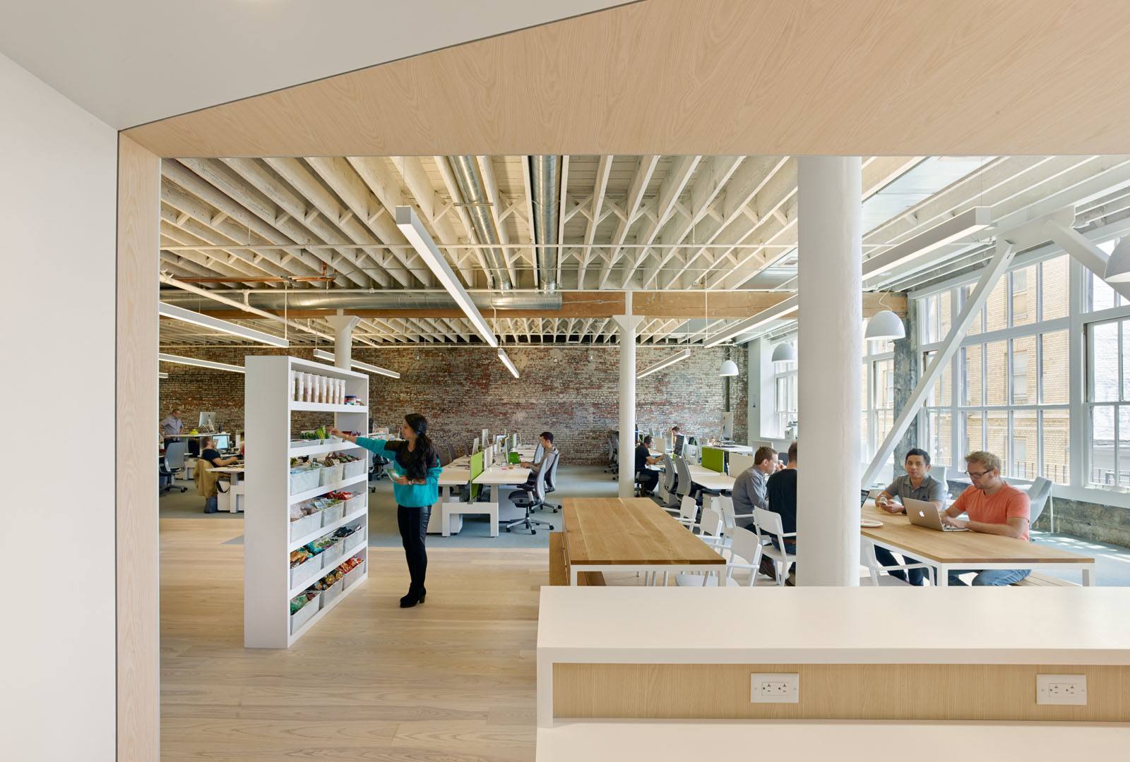
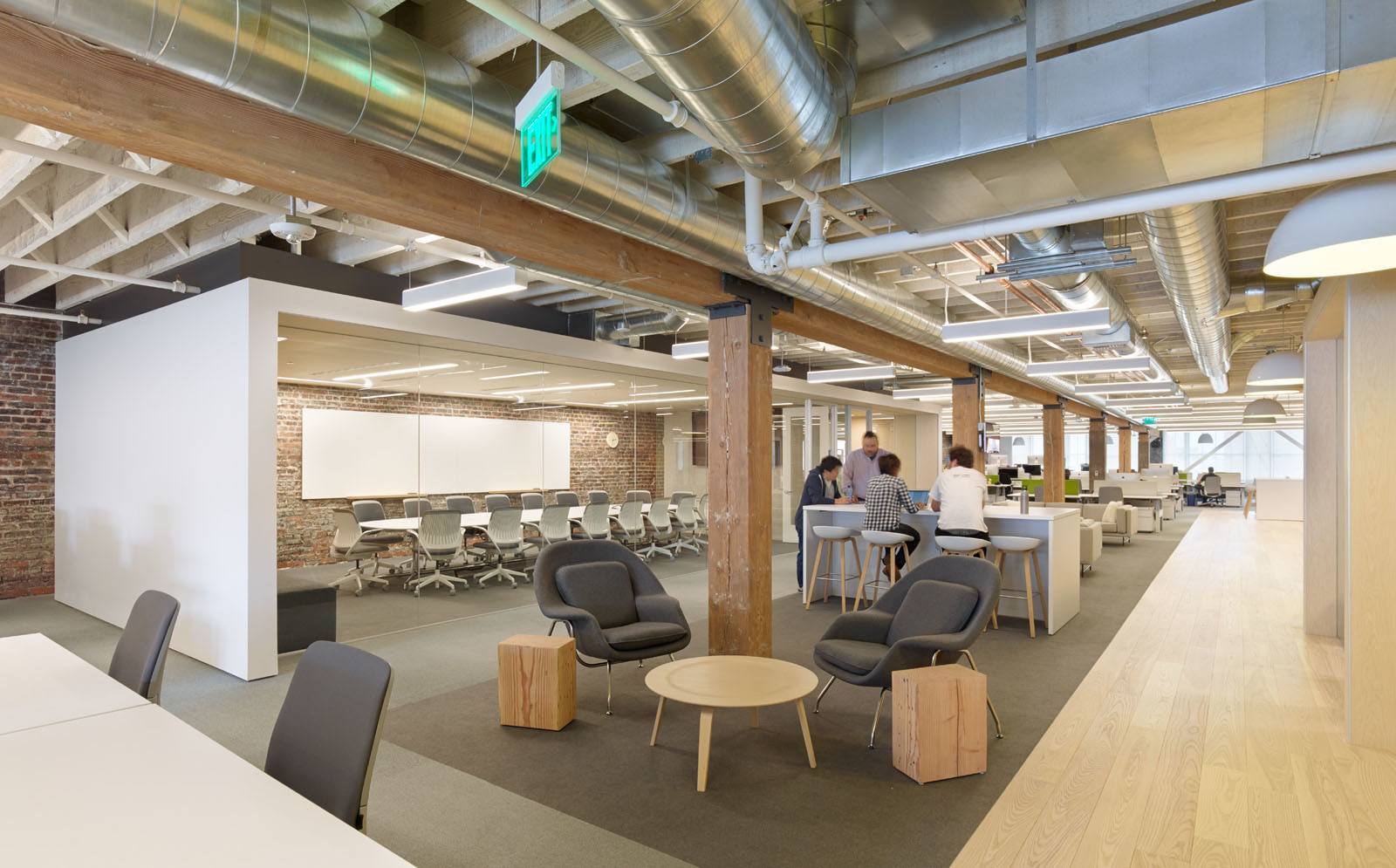
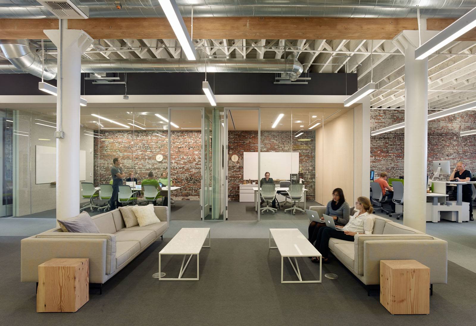
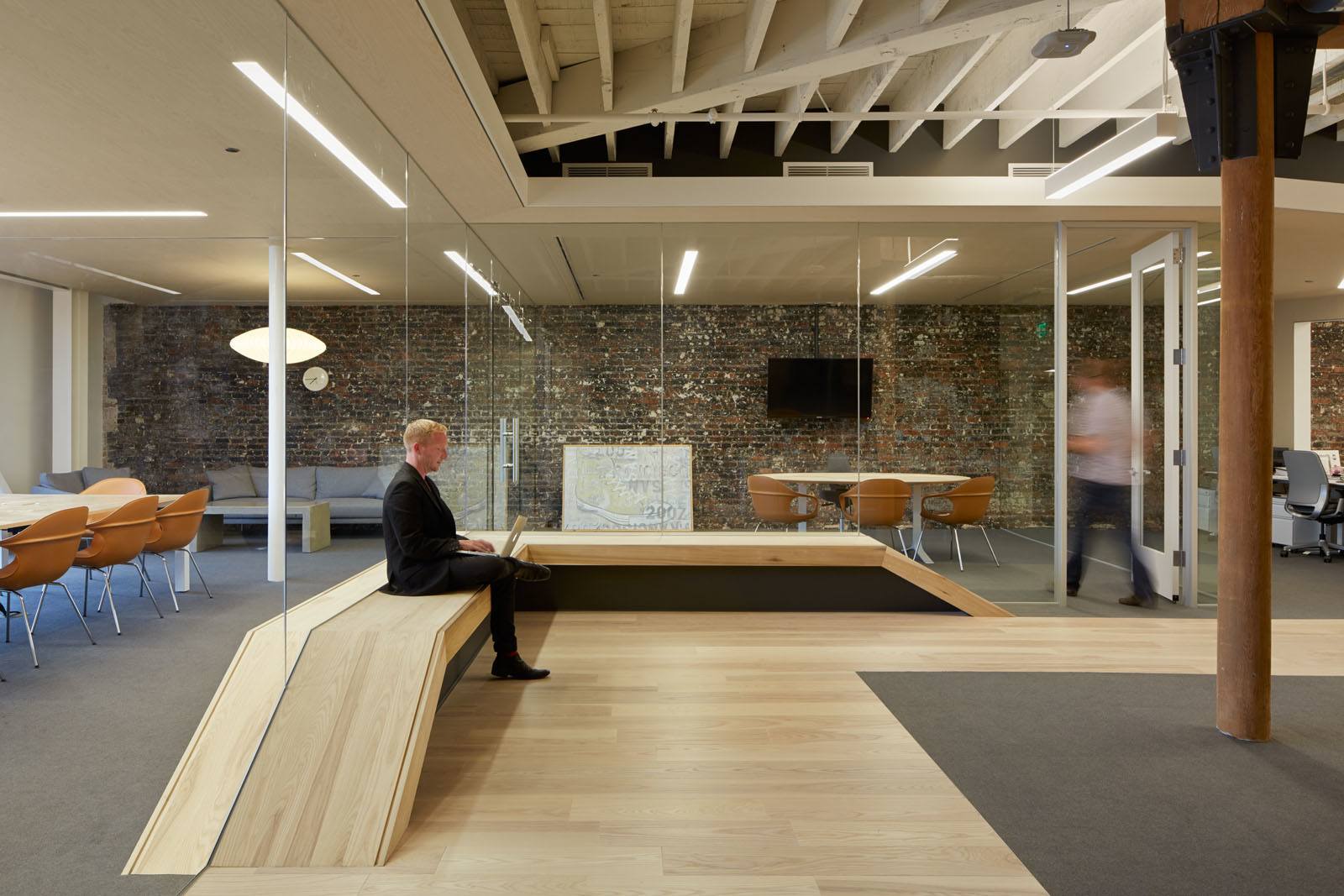
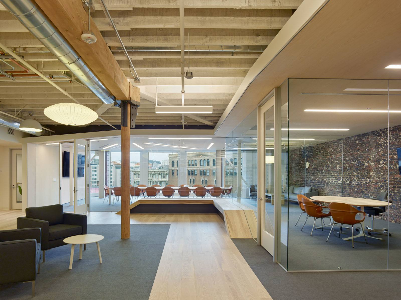
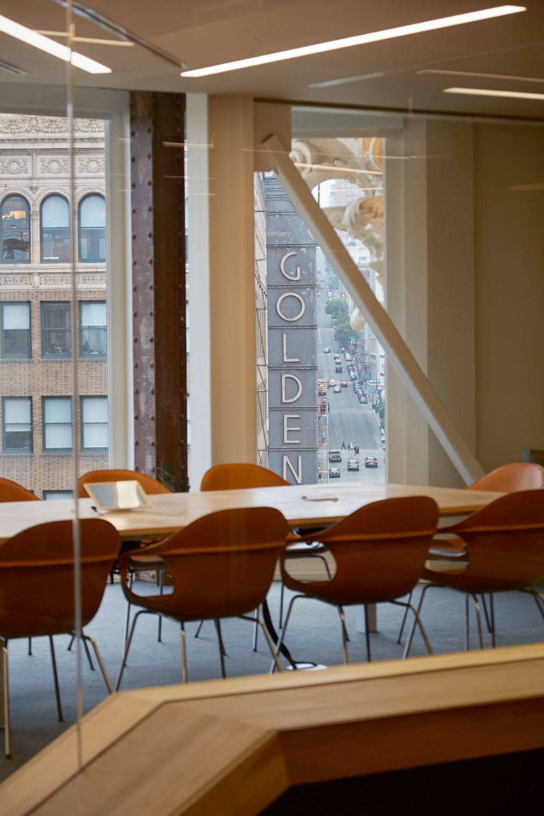
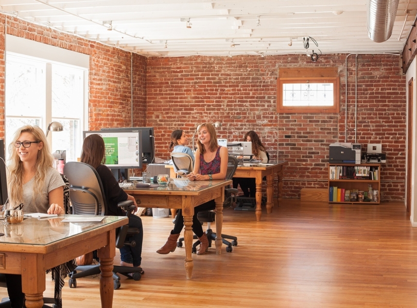
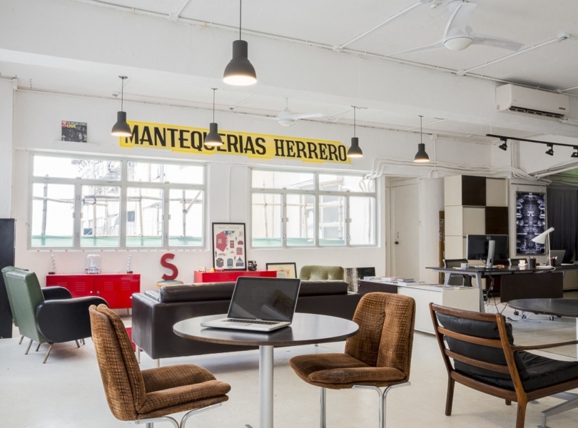
Zendesk wanted the space to feel light and open, but also varied and textured. By including secluded and darker spaces, Blitz created a contrasting atmosphere that emphasizes the airiness of the open office. Organic materials were selected throughout to harmonize with the building’s existing finishes and emphasize Zendesk’s humble qualities. The company’s charming attributes are also evident throughout, from the ground floor devoted entirely to reception, to pops of green cheekily inserted into the calm and neutral palette. Finally, Blitz took a reductionist approach, looking for opportunities to reduce rather than add. The result is an uncomplicated yet thoughtful space that combines minimalism with warmth. Another key design influence was the Danish concept of “hygge,” which roughly translates to “coziness.” Blitz created spaces with lowered ceilings and muted lighting, finished with soft, acoustic wall coverings and natural materials to create an inviting contrast to the bright and large open office area. Custom-designed booths create cozy refuges for meetings and focused work. Wood canopies extend from the kitchens, providing additional nooks and shelters,” says Design Blitz
- Location: Mid Market – San Francisco, California
- Date completed: 2014
- Size: 75,000 sq ft
- Design: Design Blitz
- Photos: Bruce Damonte
