Inside Halaman Printing’s Sleek New Istanbul Office
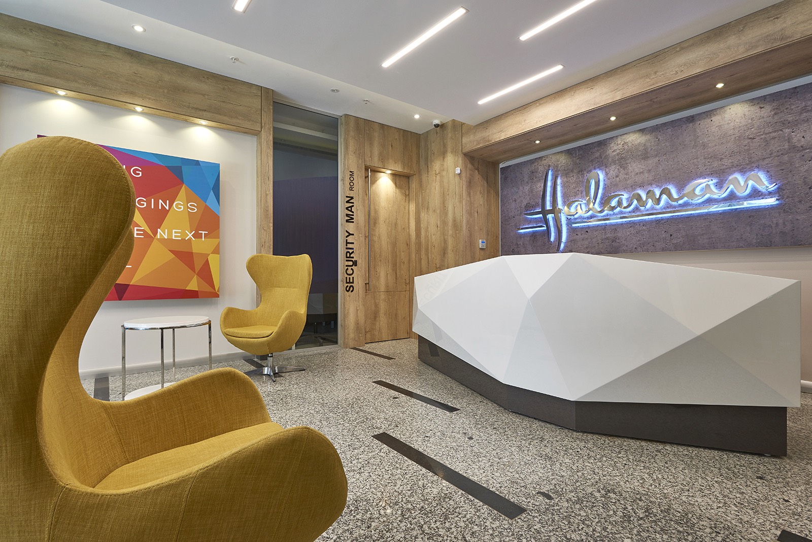
Halaman Printing and Packaging Corp, an Istanbul-based company that specialized particularly in manufacturing textile, cosmetic, food and specialty packagings for many international brands, recently hired interior design firm EDDA Architecture, to design their new offices located in Istanbul’s Esenyurt district.
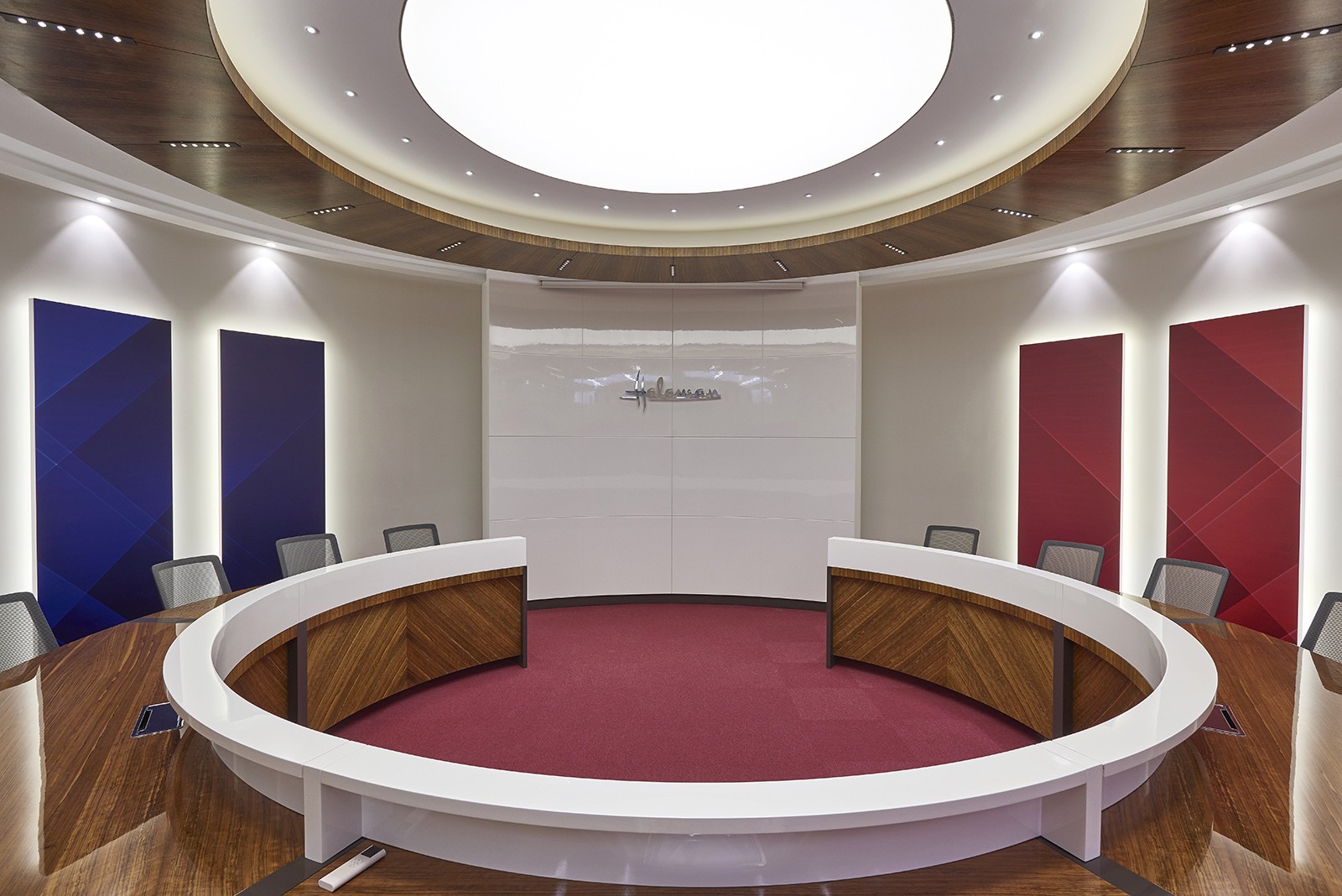
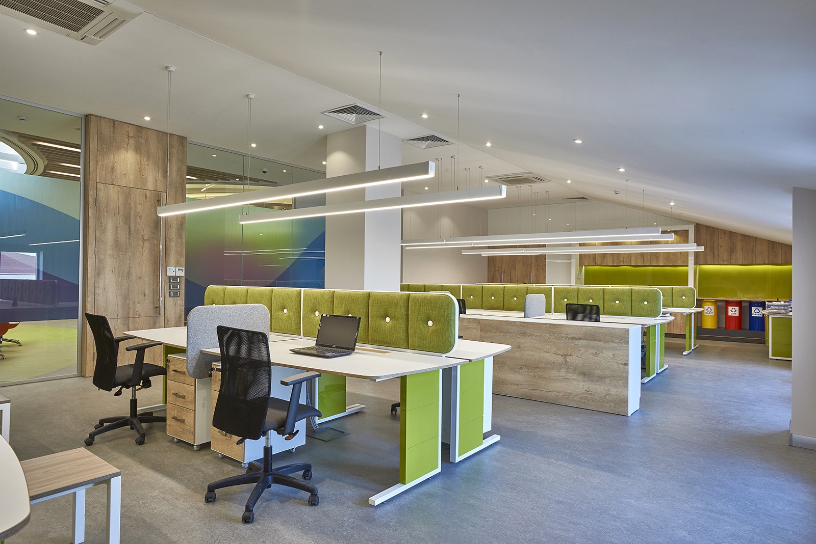
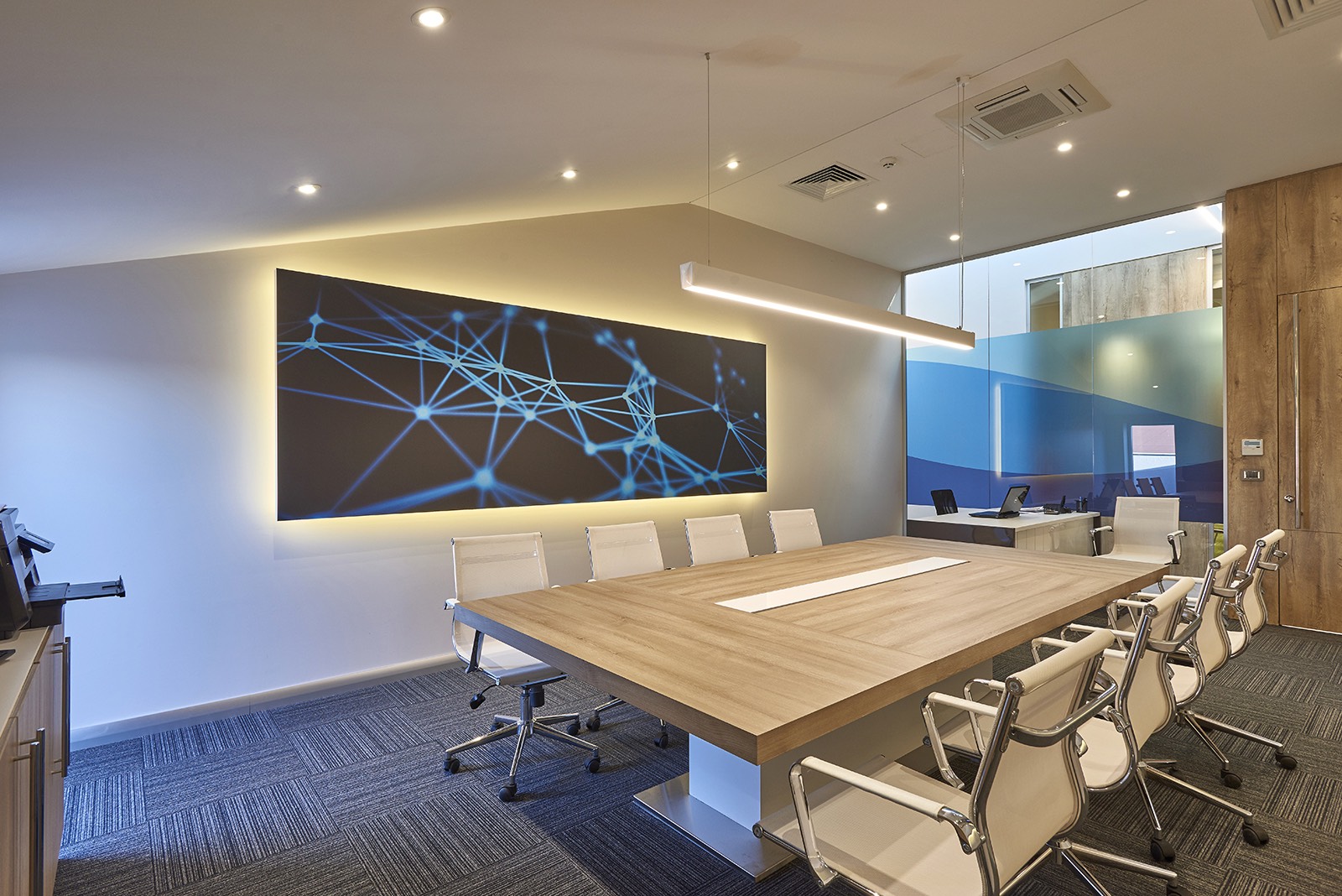
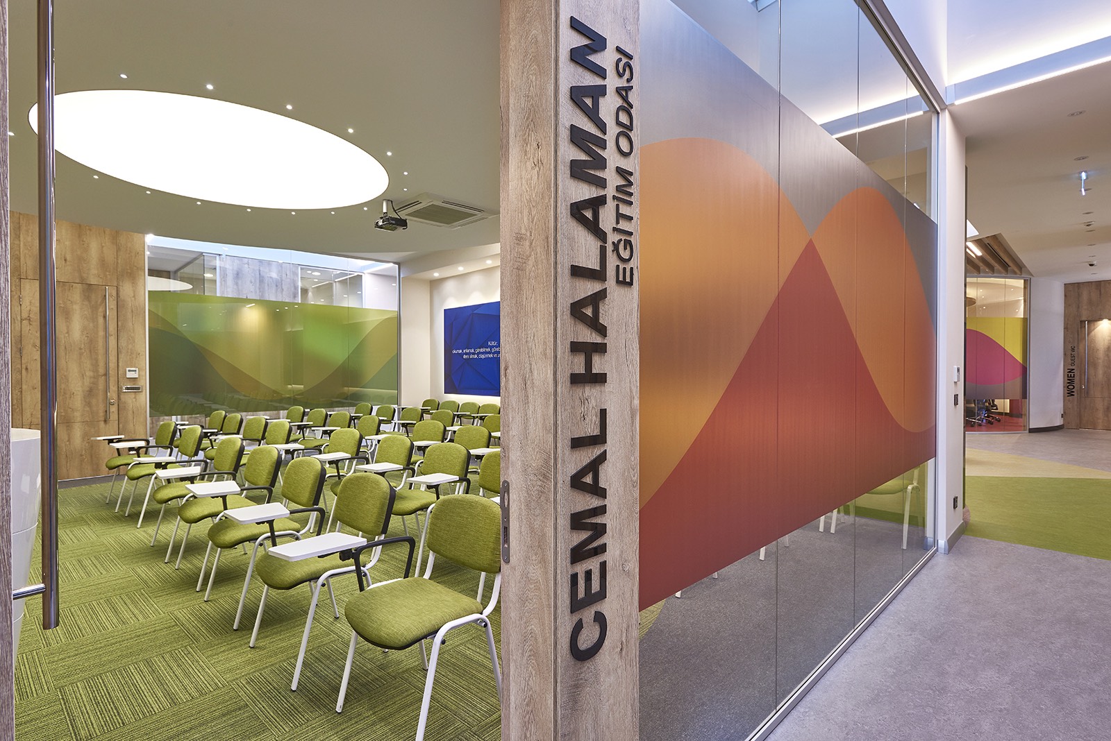
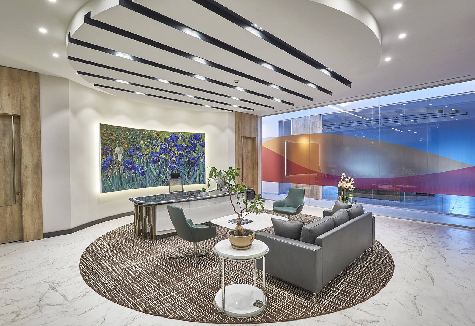
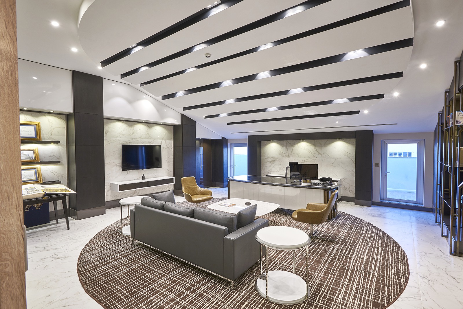
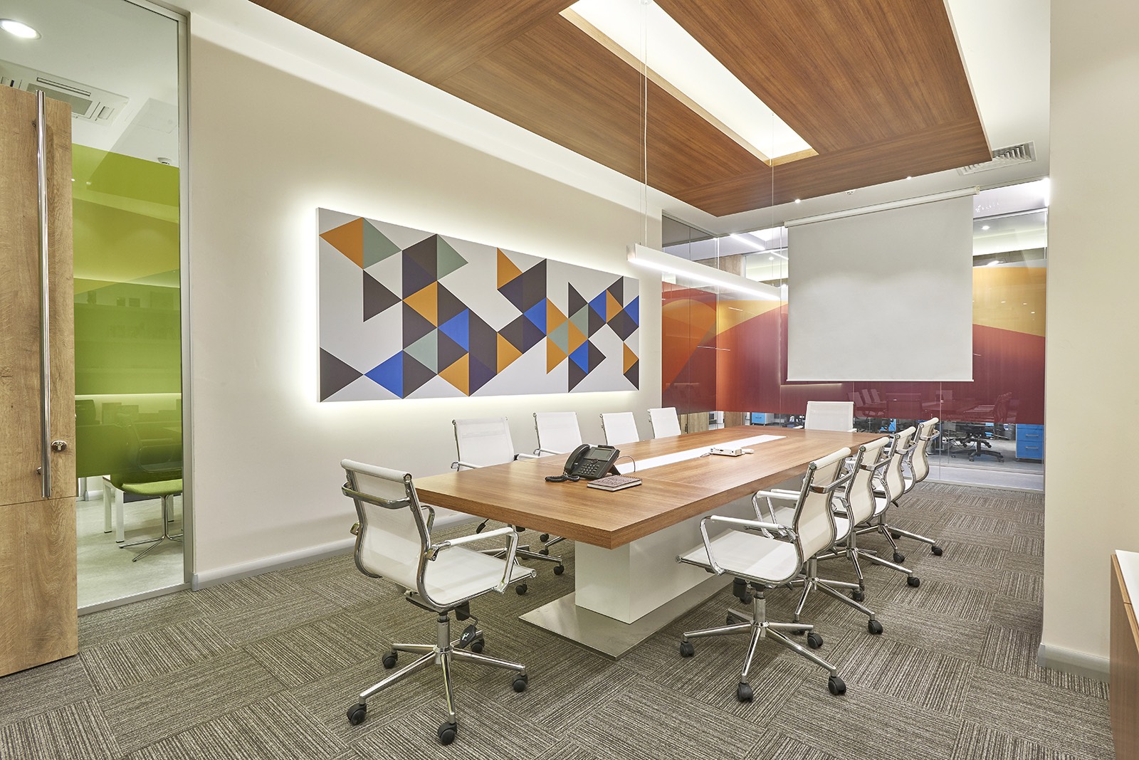
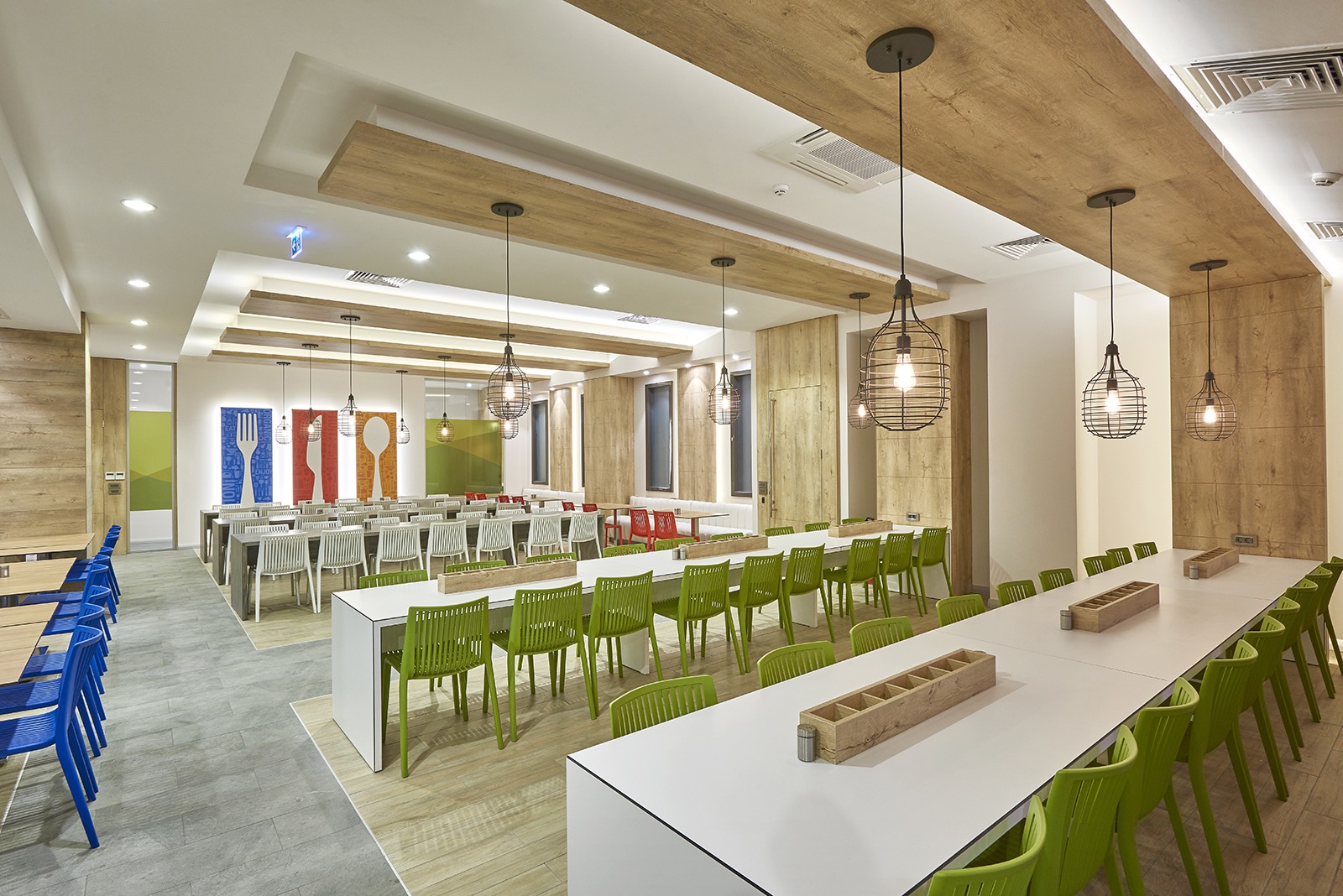
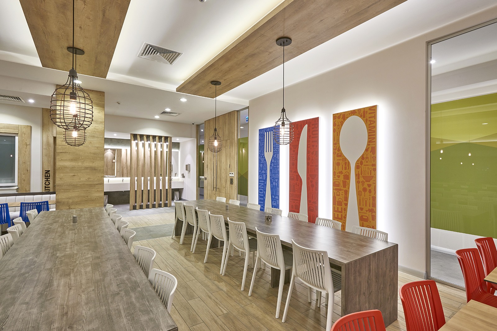
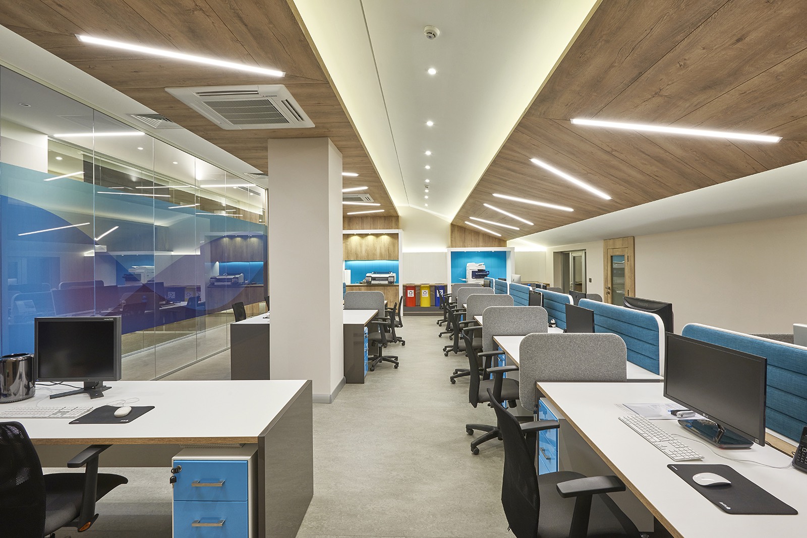
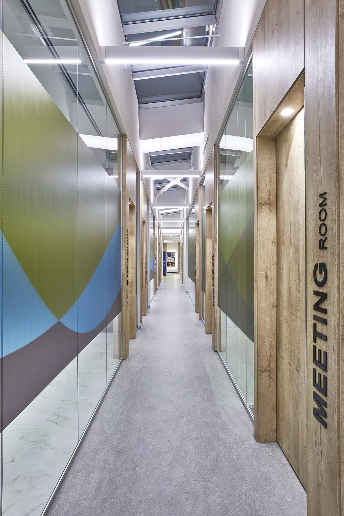
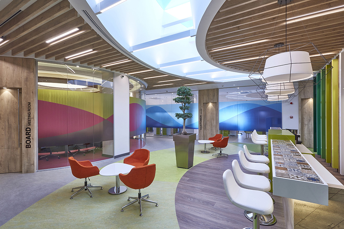
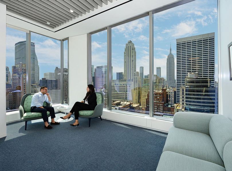
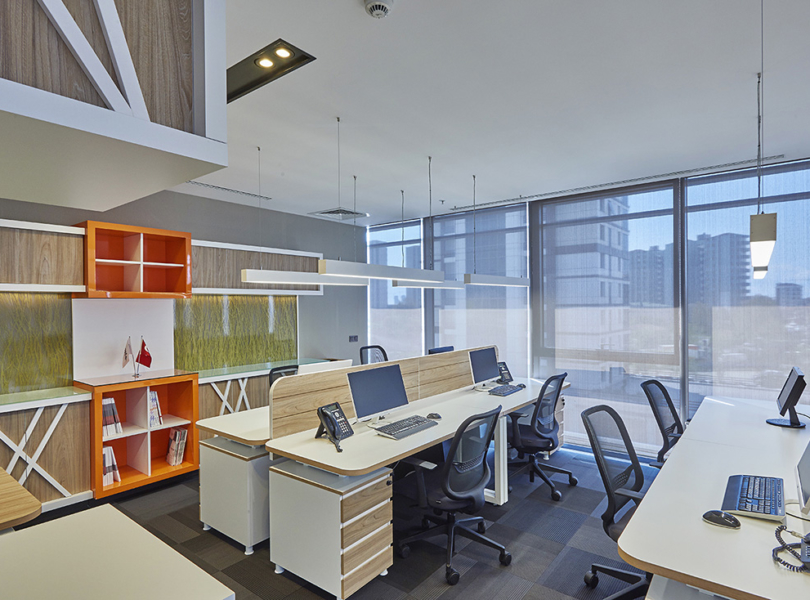
“EDDA Architecture, which designs an office environment, brings forth the institutionalized corporate identity, being integrated with the technology, and carrying out the user communication to the highest levels, created its design concept for the utilization of the natural light in maximum levels, in a way to obtain a spacious view by adding the daylight more into the space. While all the departments, designed with a transparent and fluid style that reflects the modern operation culture of the brand within themselves, the needs of the office and user demands have been taken into consideration. While in every department different working units have been oriented accordingly to functioning, personal locker systems have been added for all the personnel. The working, meeting, instruction and seminar areas of the departments have been integrated with social areas for the personnel to be able to getting away from the intensity and stress of the working life. EDDA Architecture, which turned the positioning of the management office in highest floor into the advantage of having the daylight in the space at a maximum level, have managed to take clean air into the office by using ‘skylight’ windows in cafe and circulation areas. In the Halaman Printing Office, the management office has been taken up as a circular form while the departments have been designed as integrated within each other in various forms. In this context, the 3D effect inside the space itself have been implied even more by reflecting these various forms to the ceilings and the furniture. Also, by placing a meeting room, the instruction-seminar room, the café and the recreational area in between the departments that are placed parallel to the two circulation axes, a direct relationship with the office areas and those areas have been built. While a variety was being created by the contrasts of colour that reflect the operating culture of the brand that are being used in the common areas, lively colours, warm products and interior landscapes, which would keep the operating team dynamic in the intense work pressure, the contemporary brand identity of the corporation have been brought together both with the space and the user with a simple design. EDDA Architecture, which has caught a simpler style with materials such as marble, natural wood and metal in the manager rooms, have planned every manager’s room together with their recreational rooms, as well. For to use on the panels and the seperating glasses, designed for all the office walls, a colorful interior space experience whose energy is high, has been targeted by fictionalizing graphic works flowing within each other. For increasing the motivation of the operation team, an innovatory approach has been displayed on the lightings, the lounge suits and floor coverings in the dining hall and various social areas have been created”.
- Location: Istanbul, Turkey
- Date completed: 2017
- Design: EDDA Architecture
