A Tour of Korbicom’s Sleek New Cape Town Office
Korbicom, a software company focusing on software development and subsequent commercialisation of technology-based products, hired interior design firm Conduit Interior Design to redesign their offices in Cape Town, South Africa.
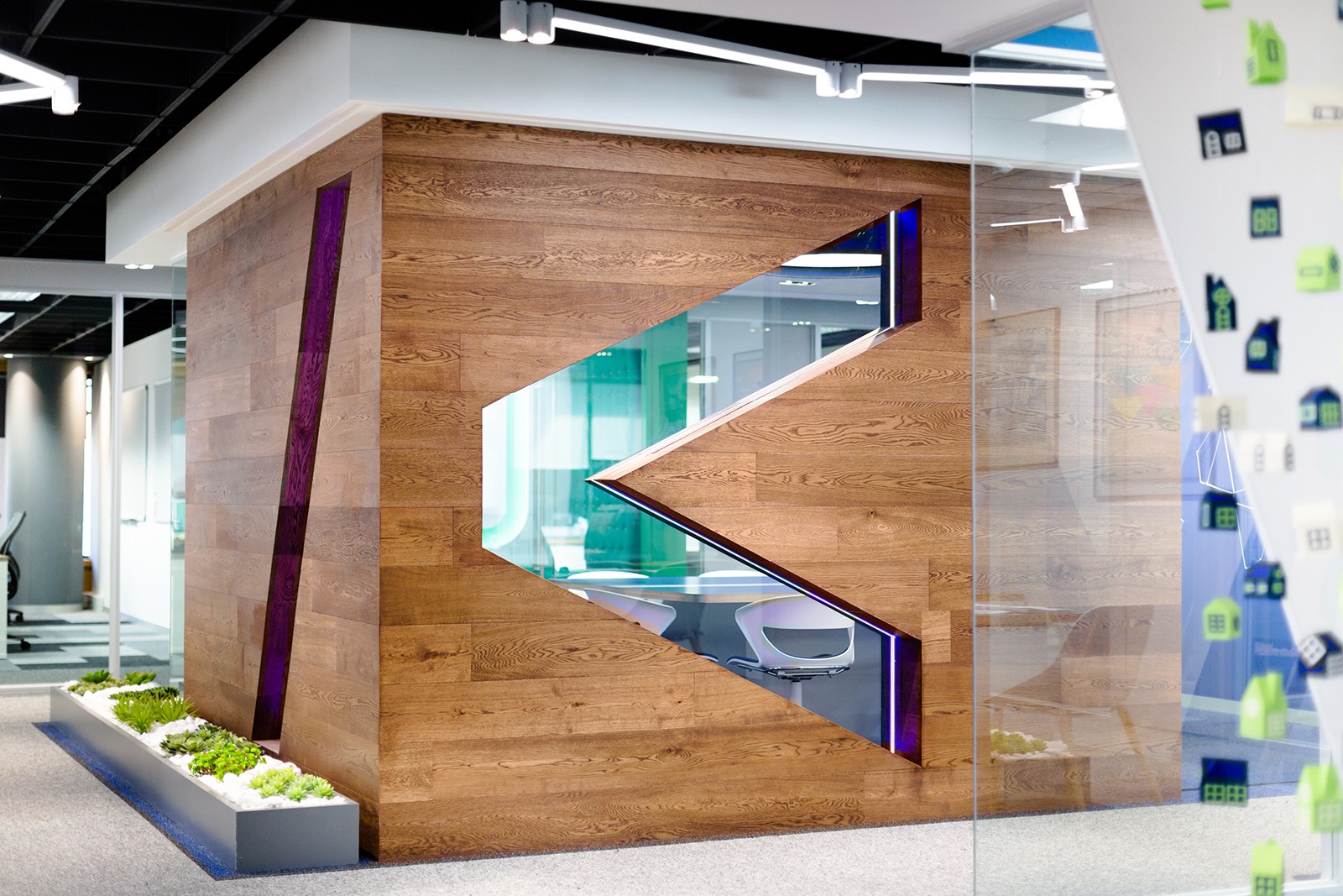
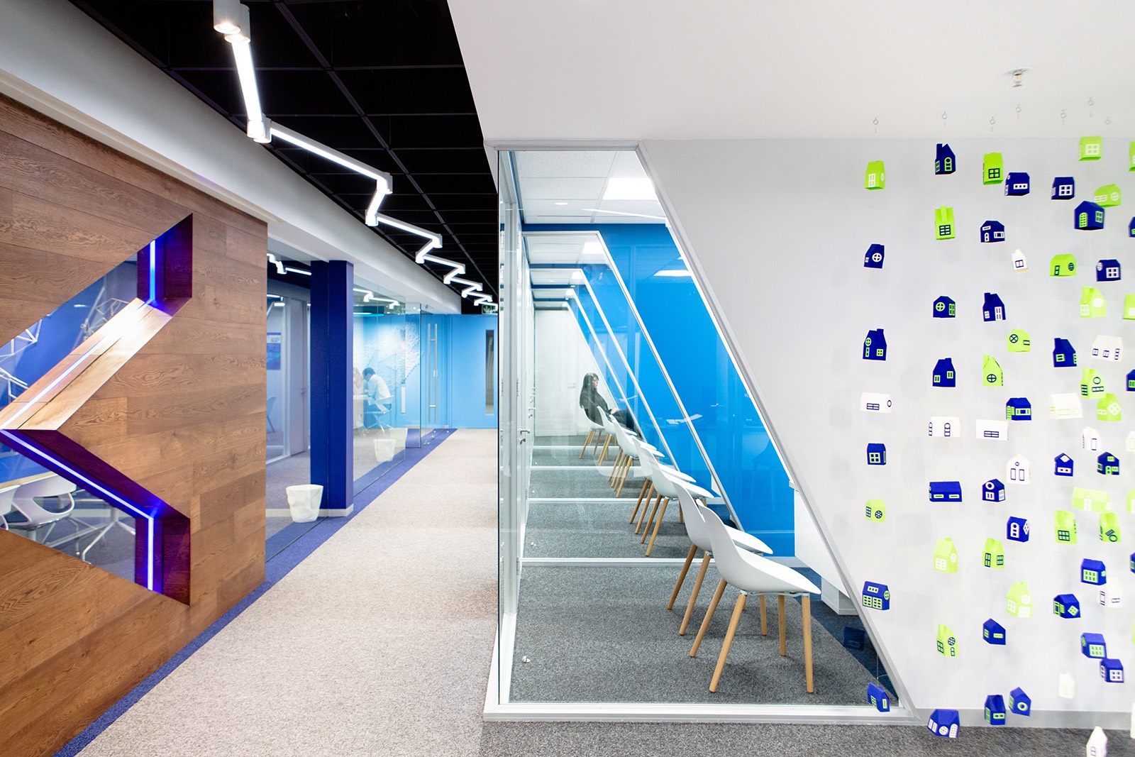
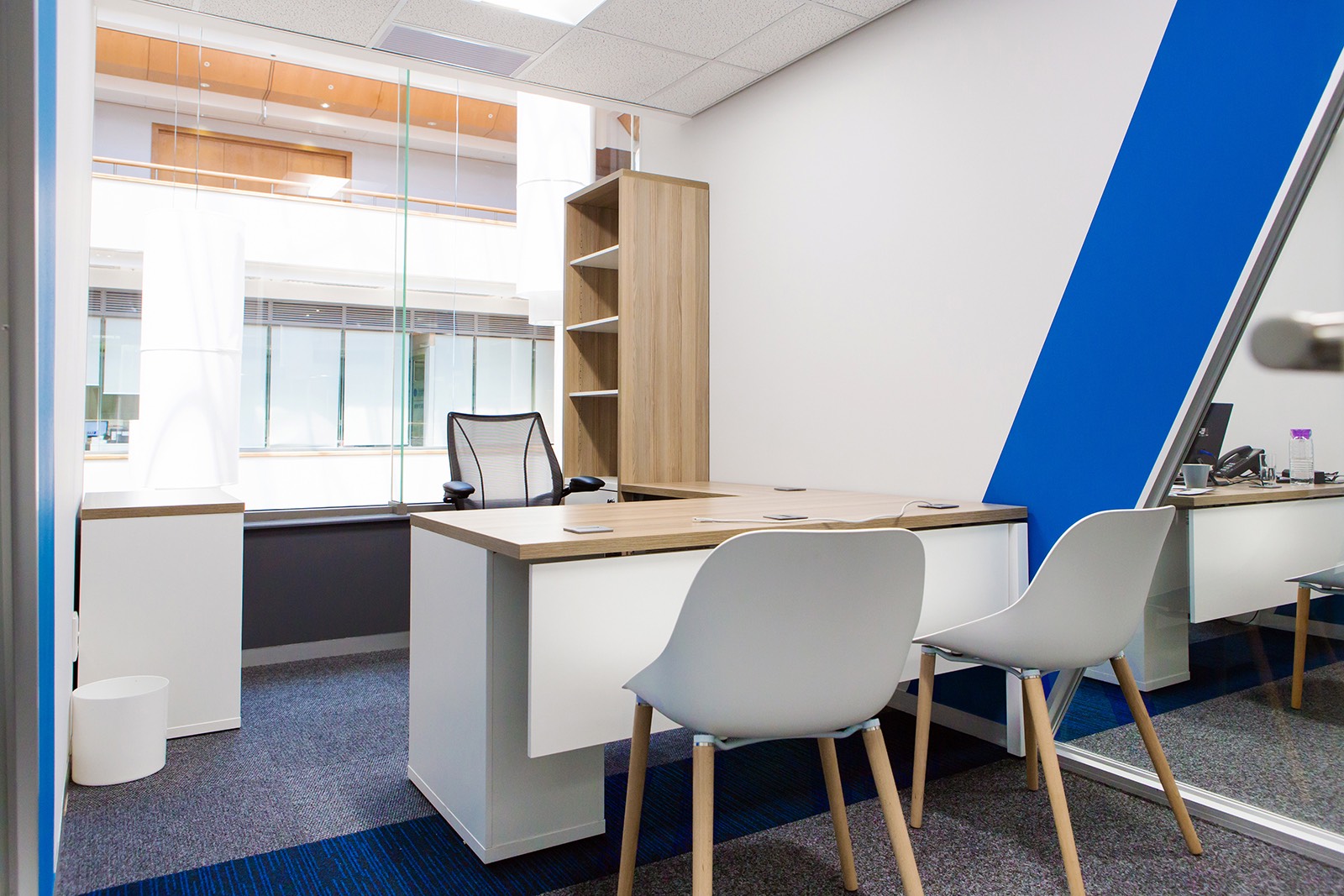
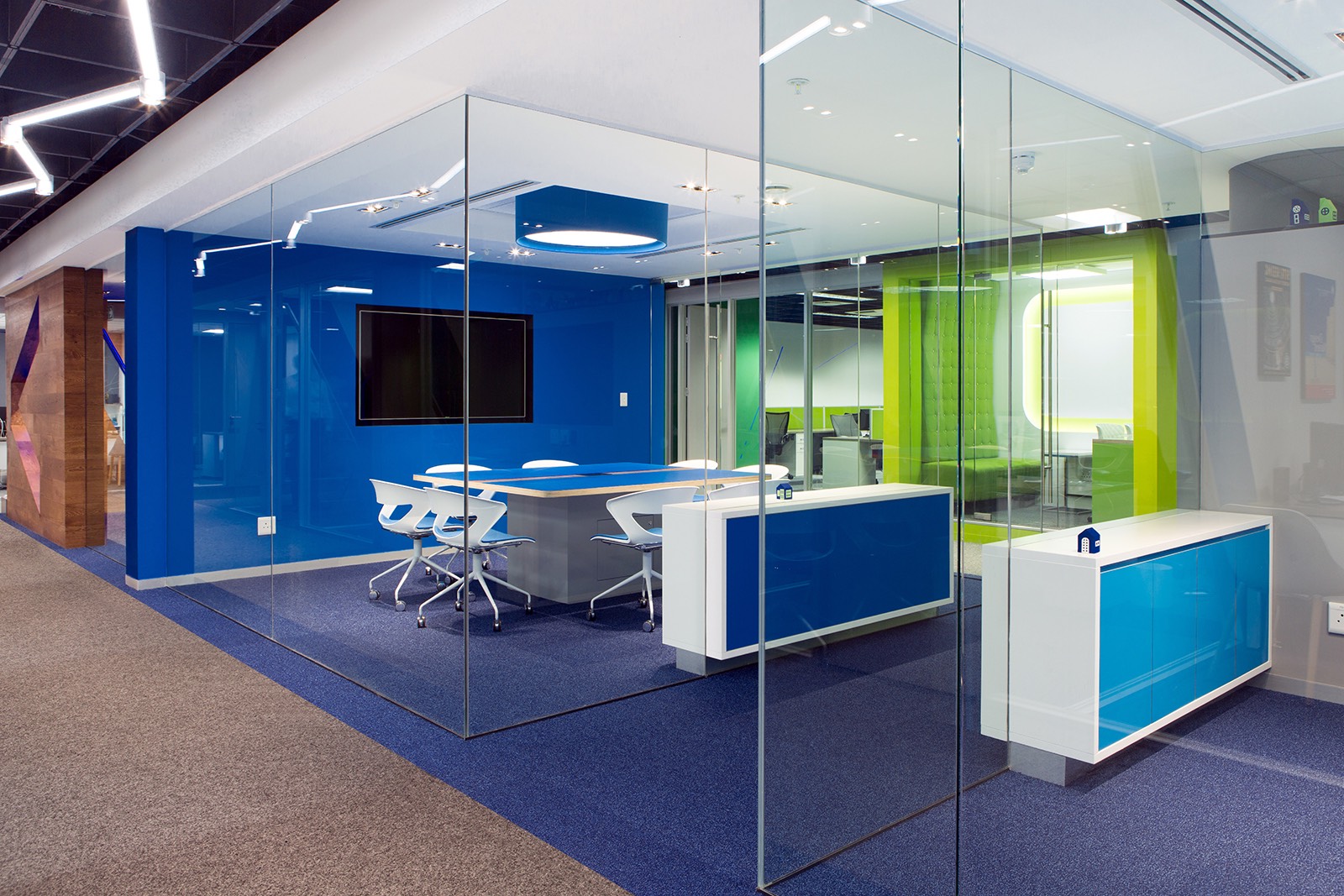
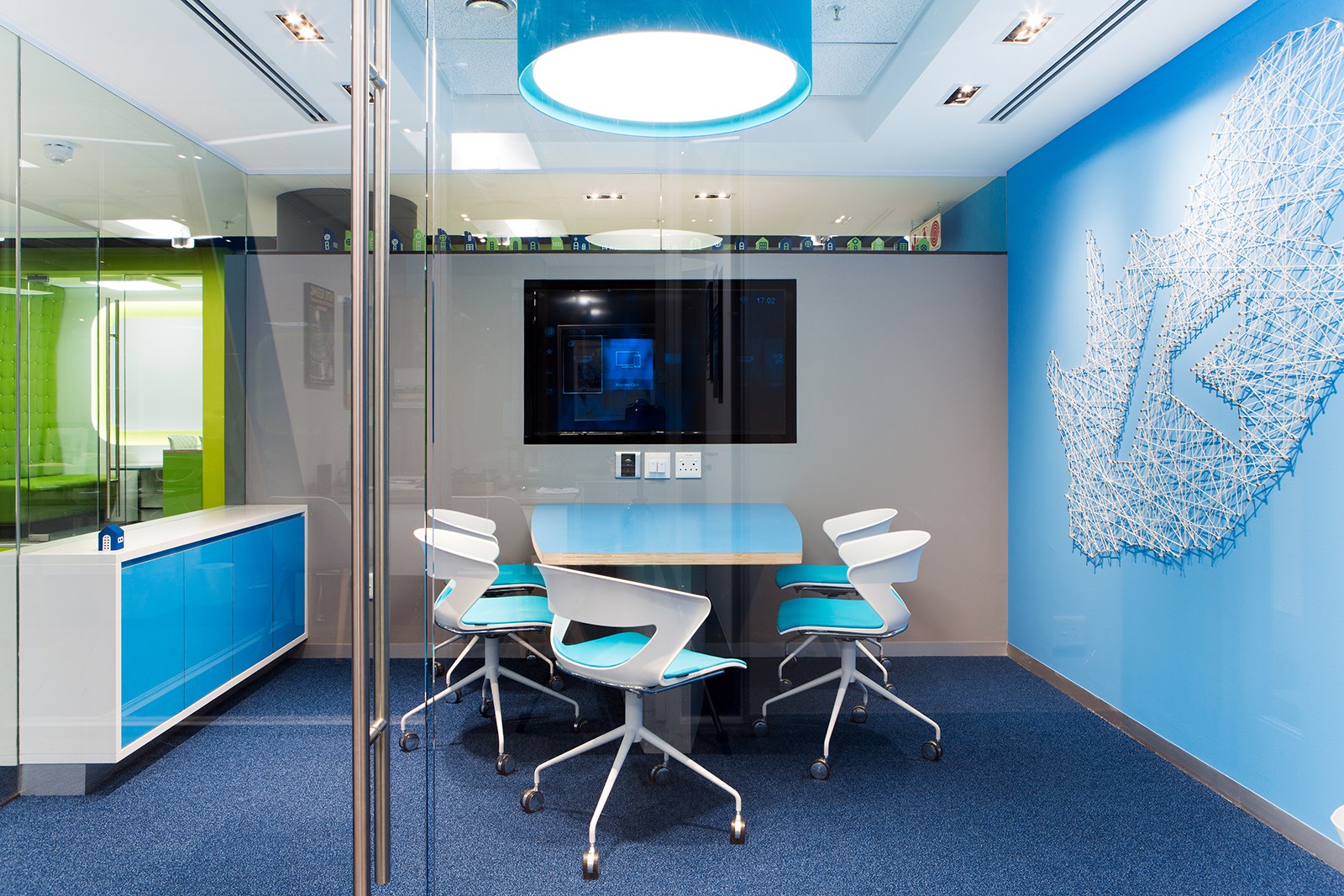
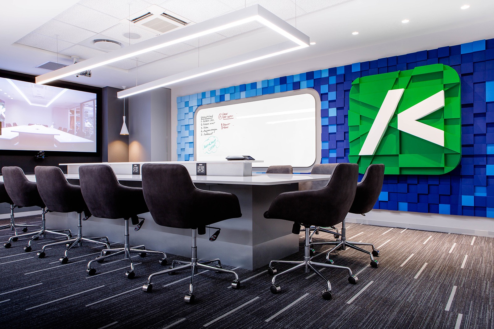
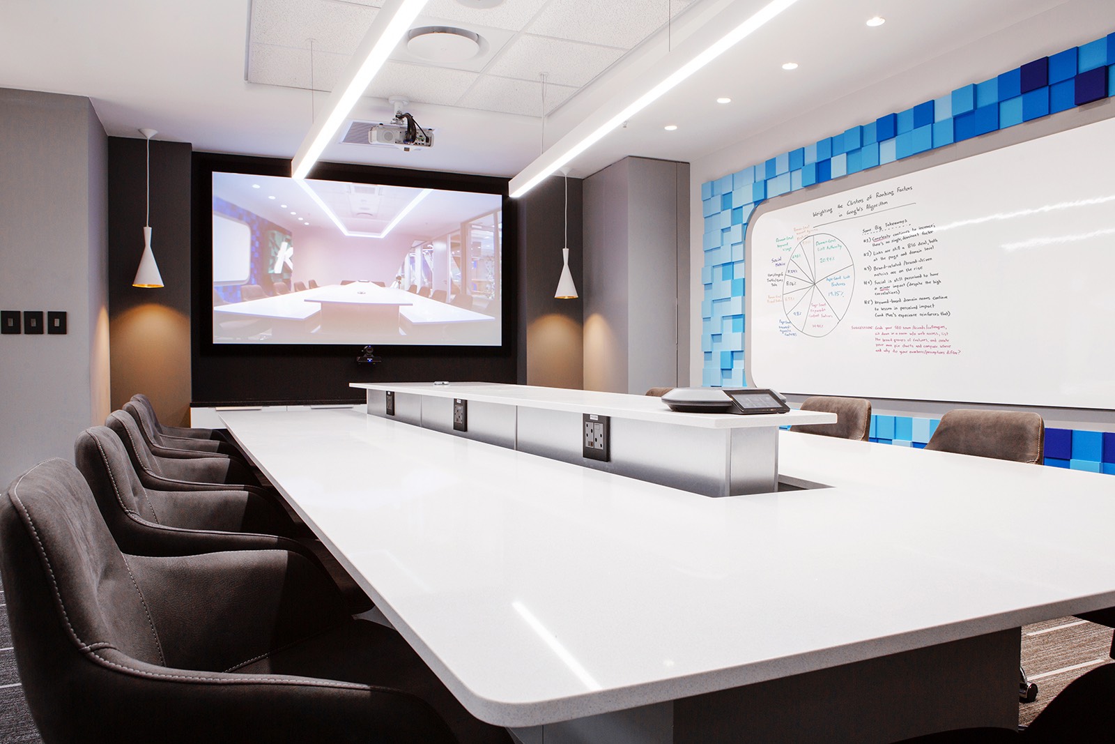
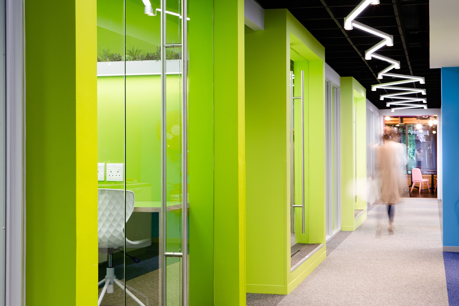
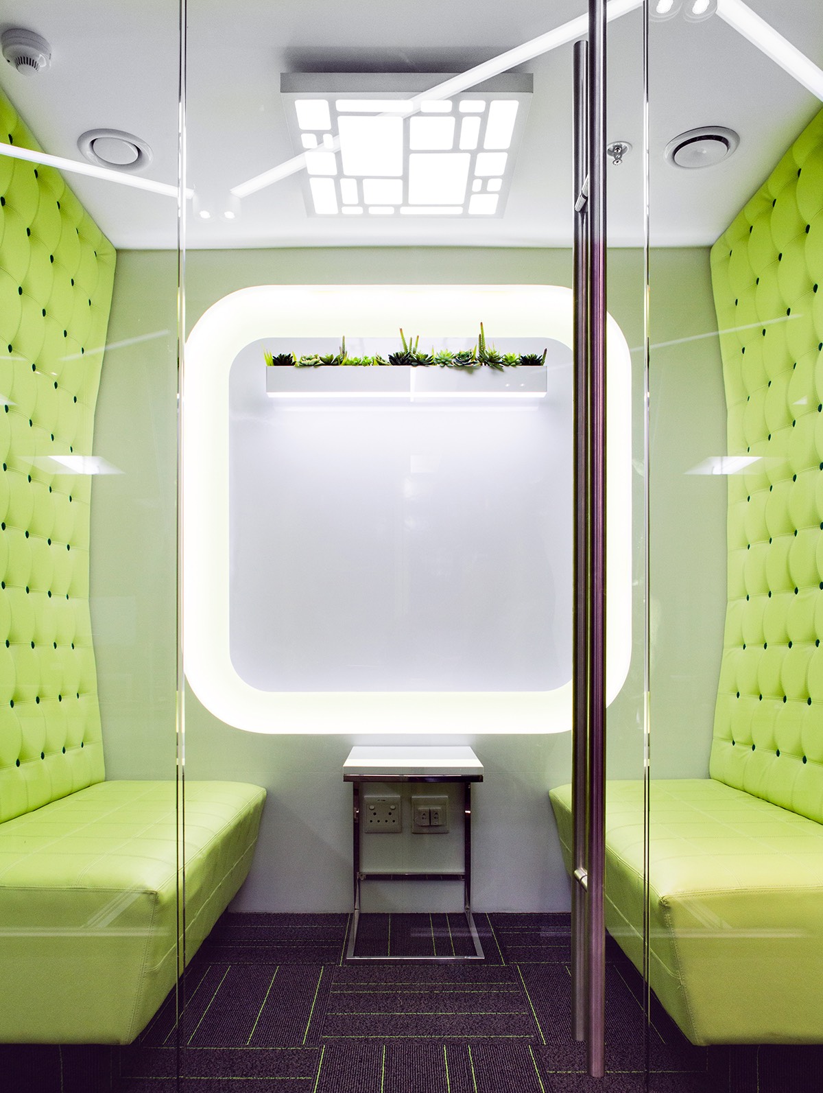
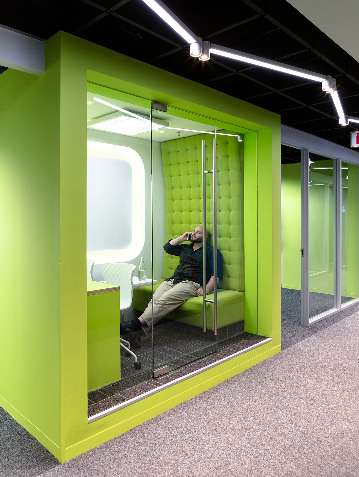
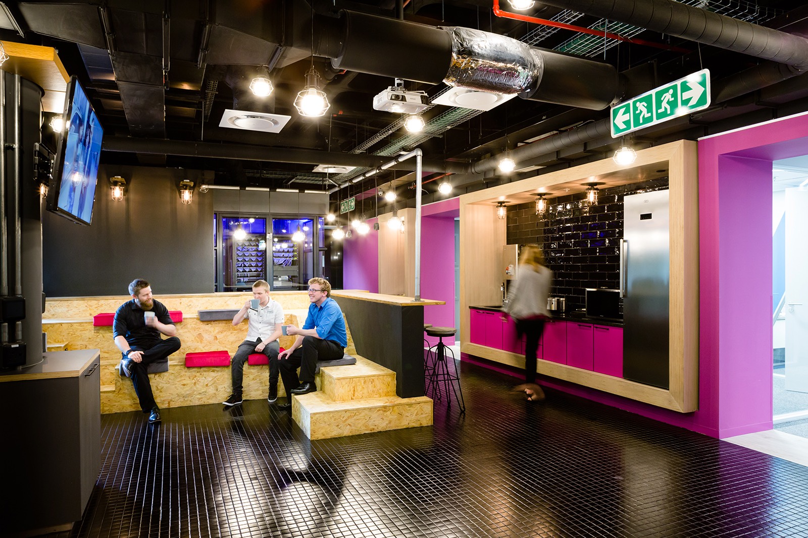
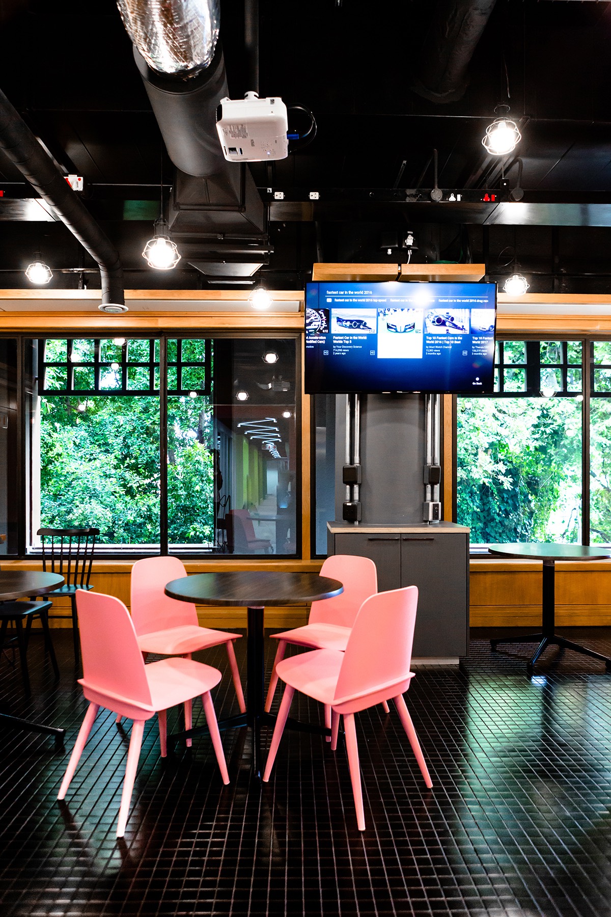
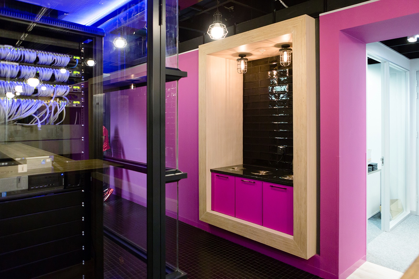
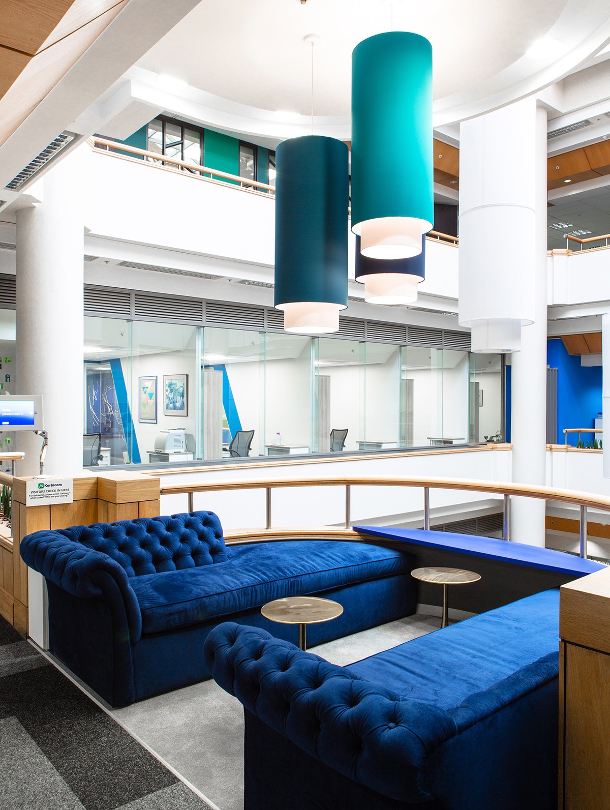
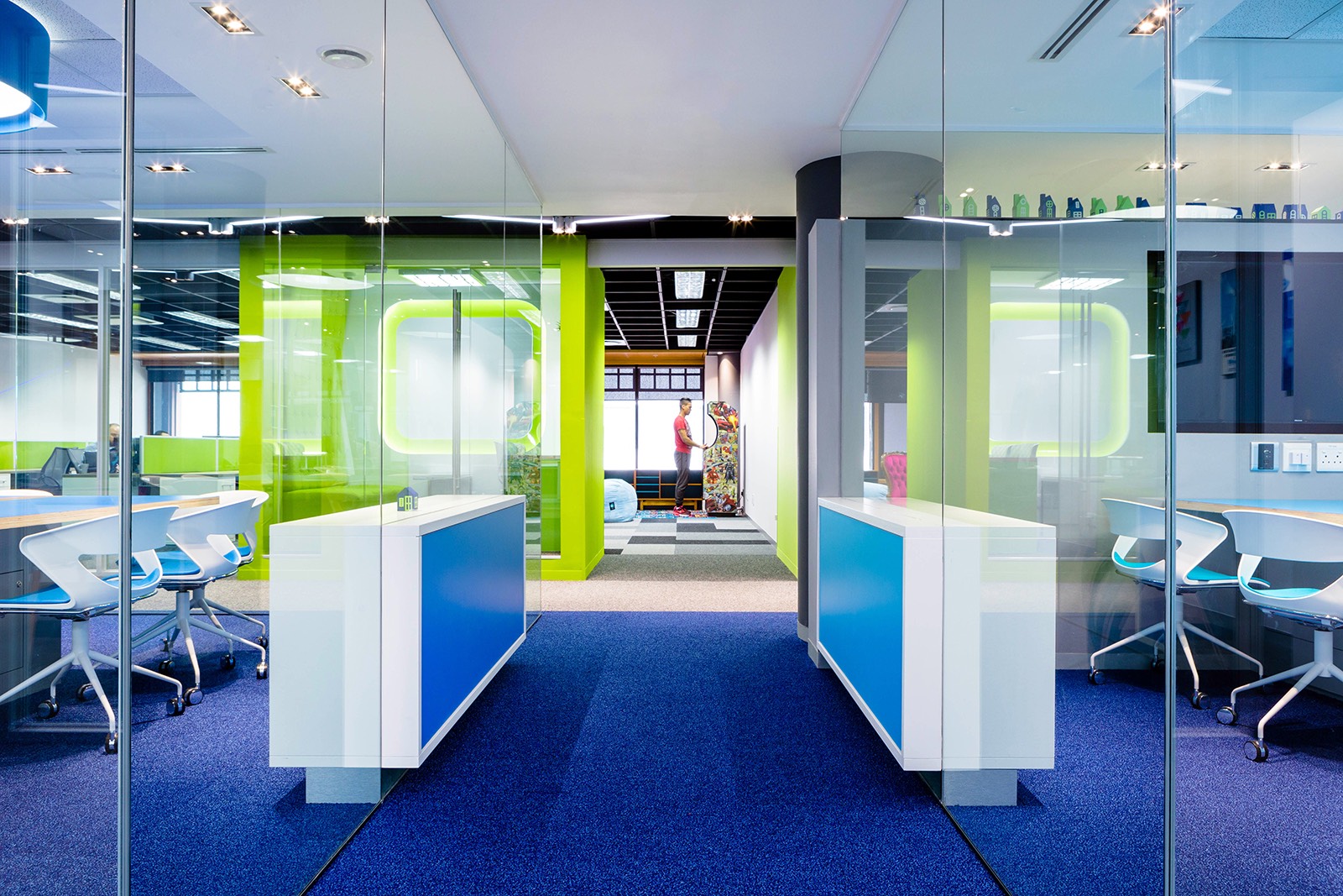
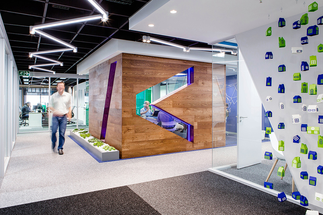
“Korbicom’s corporate brand identity was the starting point for the design in terms of colours, textures, and shapes. This was interpreted literally in the front client-facing areas, but it evolves to become more playful in the employee facing areas. The reception area offers a slick, digital screen, where guests can check themselves in, replacing the need for a receptionist, and setting the tone for the high-tech, forward-thinking world they’re about to enter. There are two plush blue velvet sofas where guests can wait, offering a slightly more formal feel, but as they walk through the rest of the office, the more playful design elements become apparent, such as colourful padded focus rooms, angular lighting and the quirky use of plants. The main meeting room is the centre-piece of the office. This room is where the magic happens, and it was designed as a showpiece, reflecting the company culture. Engineered flooring has been used to clad the walls, adding warmth and texture, while the use of stones and plants creates a sense of calm. A subtle use of neon lighting gives the room a modern edge, and helps the logo to pop. It was fitted with high-end acoustic design and the latest video conferencing technology, which comes to life at the touch of a button. “Our discussions with employees revealed that teams didn’t want to be cut off from each other in small offices, but they didn’t want a large open-plan layout, either,” says Grant. To work around this, Conduit designed four main team rooms, each with floor-to-ceiling glass panels. Positioned next to the windows, these rooms have incredible mountain views and receive amazing natural light, which filters through to the rest of the office too. To satisfy the staff’s need for privacy, soundproof booths in shades of green were created. The space is ideal for individuals or small groups to meet away from the team while remaining connected. It also serves as a private place to take a personal phone call and a quiet space to be alone to focus on a specific task. The work café is another unique space where employees can go to interact over a cup of coffee, or to just get away from their desk. It also provides a space for bringing the teams together and encourages cross-pollination. Here, the corporate colours were ditched in favour of bright pink and black. Korbicom are big believers in having fun and being social, so this space was especially designed to emphasise the balance and cross over between personal and work life, thus further promoting the company culture and lifestyle. Colour was used in carefully selected proportions to add energy and excitement to key collaboration areas without overwhelming the space. This extends to the client facing boardroom where one wall has been covered in tessellated blocks in shades of the corporate blue, arranged to resemble the pixels of a front-end software environment. All the artwork used was custom-made for the space. Conduit created a hanging mobile of tiny blue, white and green houses, representing part of Korbicom’s legacy. Grant also created a world map made of nylon cord (strung by hand himself), representing the company’s connectivity with the rest of the world,” says Conduit Interior Design
- Location: Cape Town, South Africa
- Date completed: 2017
- Design: Conduit Interior Design
