Inside Philip Morris Sabanci Marketing and Sales’ Istanbul Office
Philip Morris Sabanci Marketing and Sales (PMSA), a manufacturing joint venture between Philip Morris and Sabancı Holding, hired architecture & interior design firm Mimaristudio to design their offices in Istanbul, Turkey.
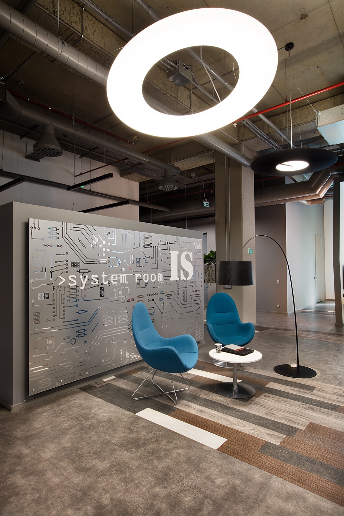
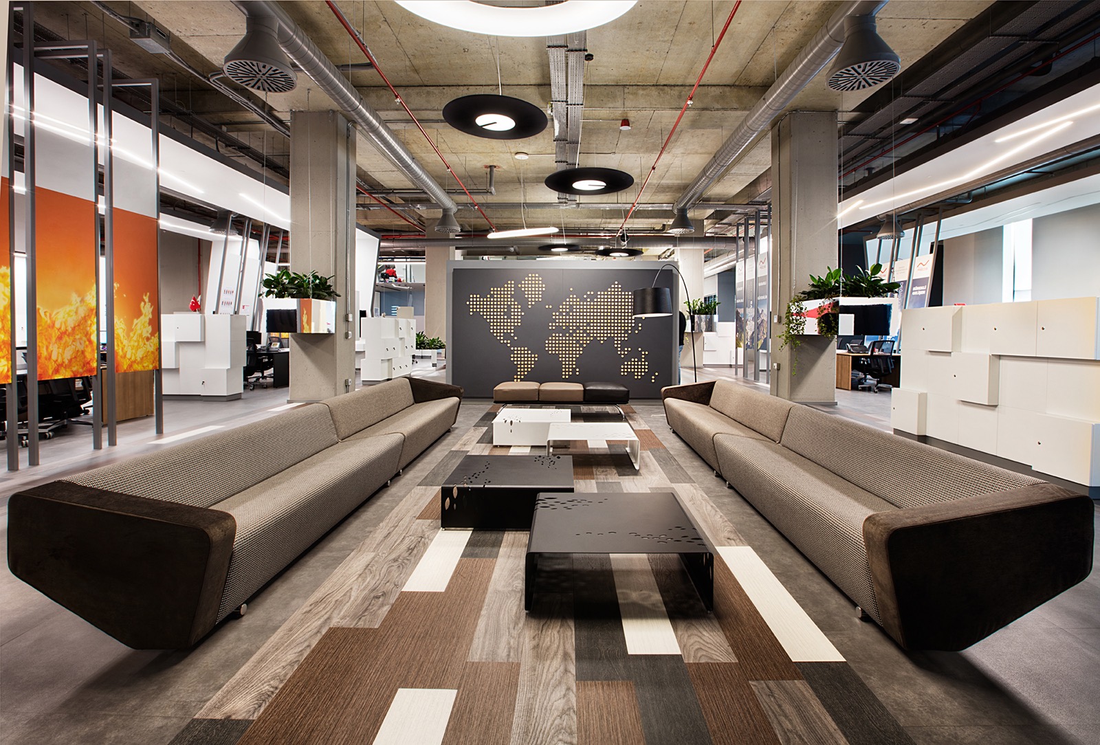
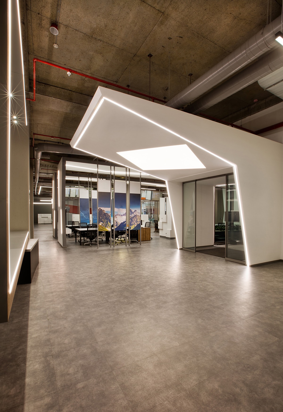
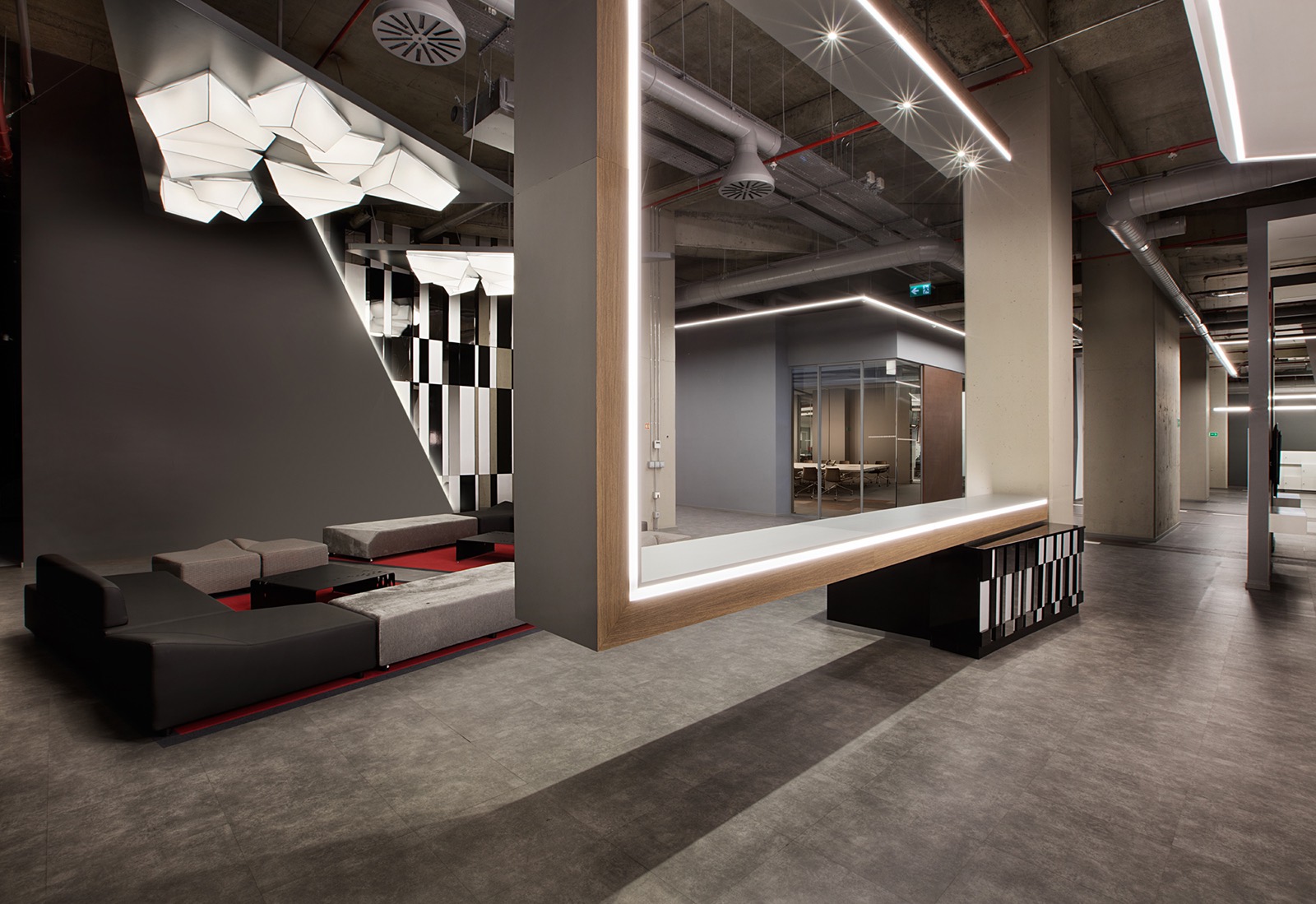
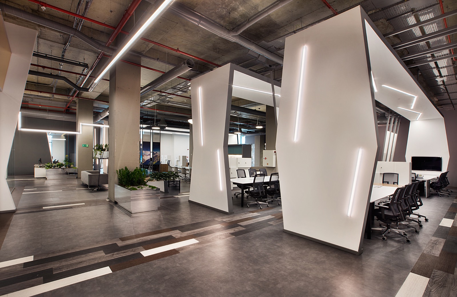
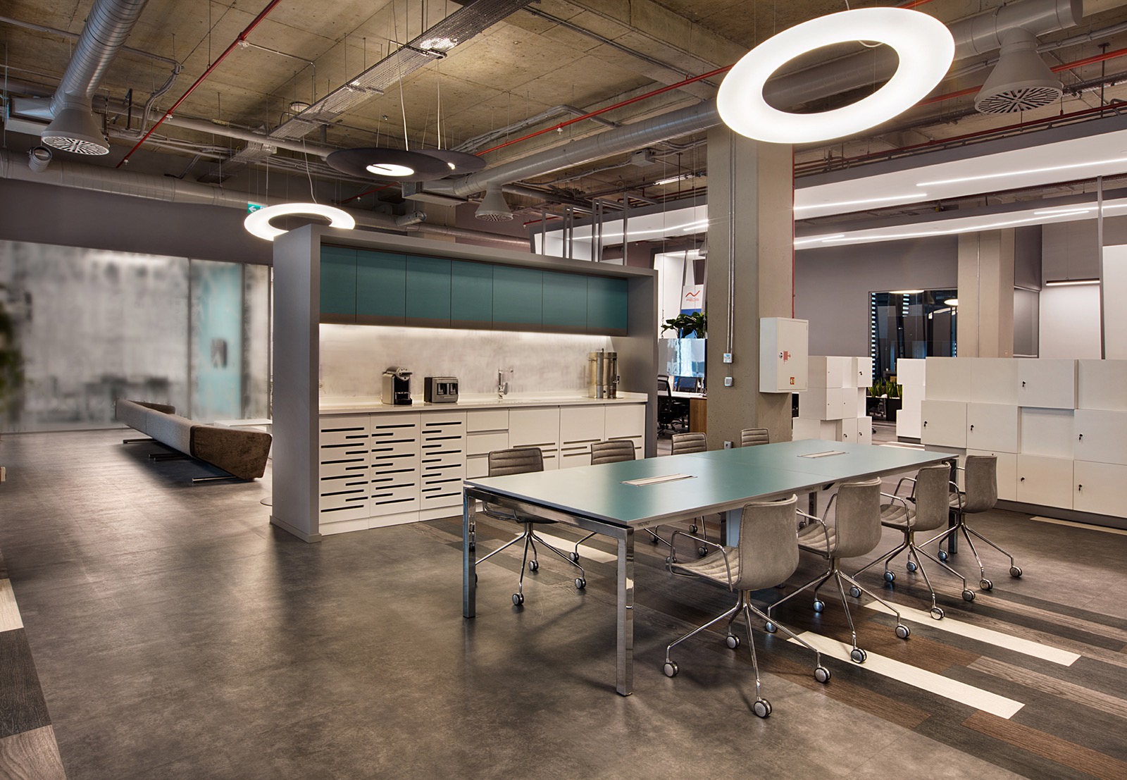
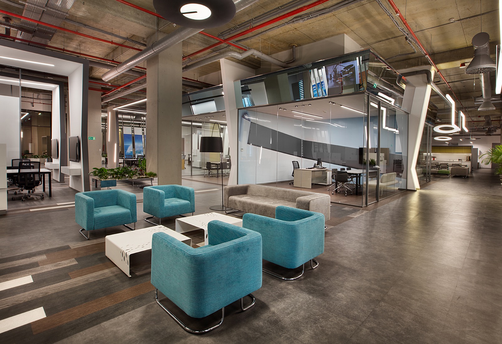
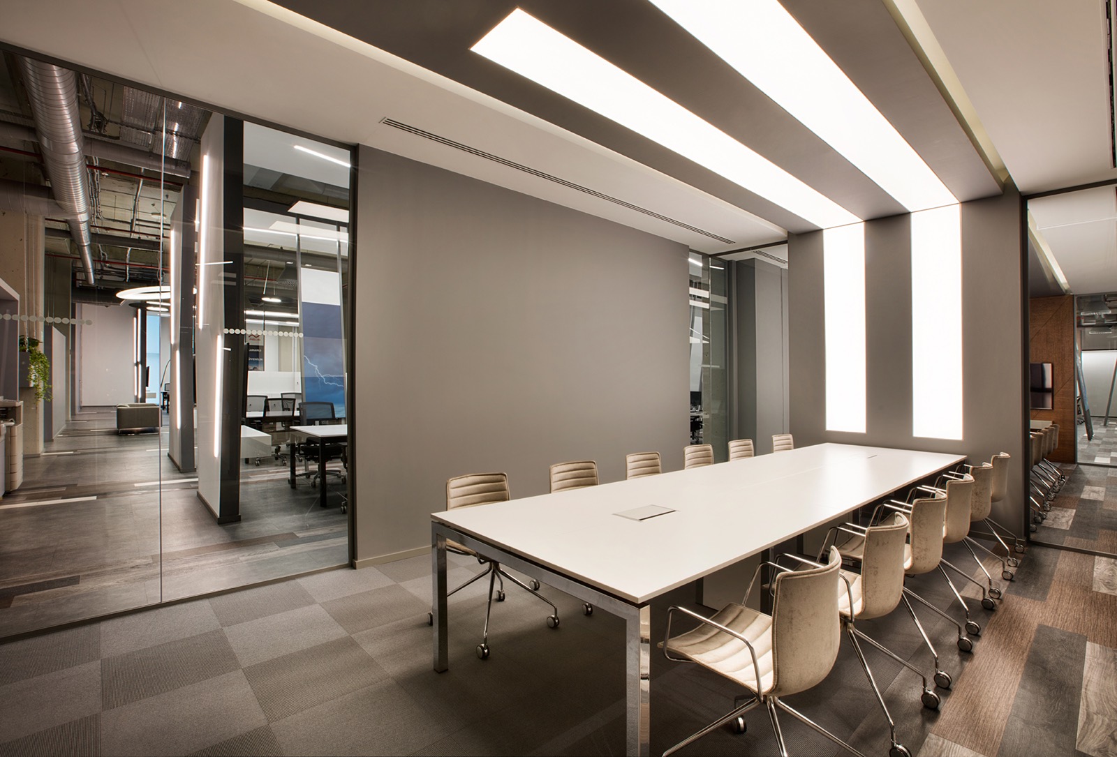
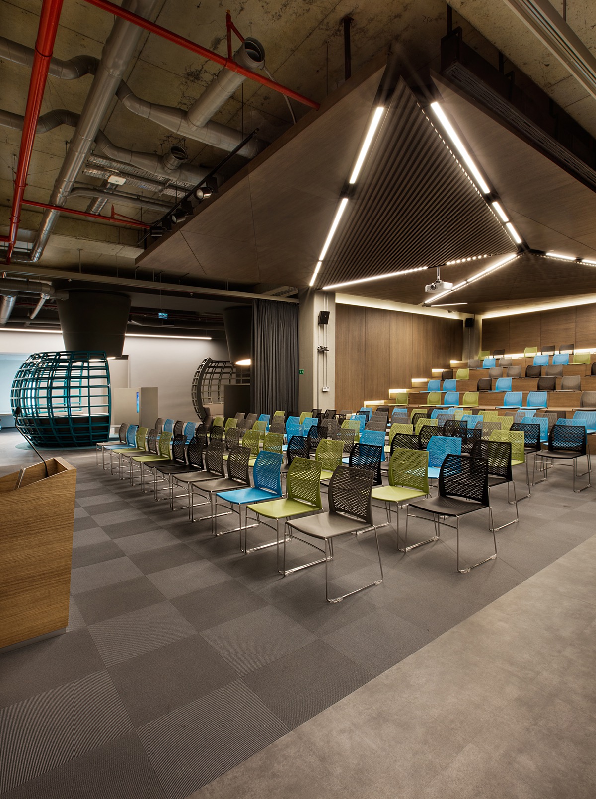
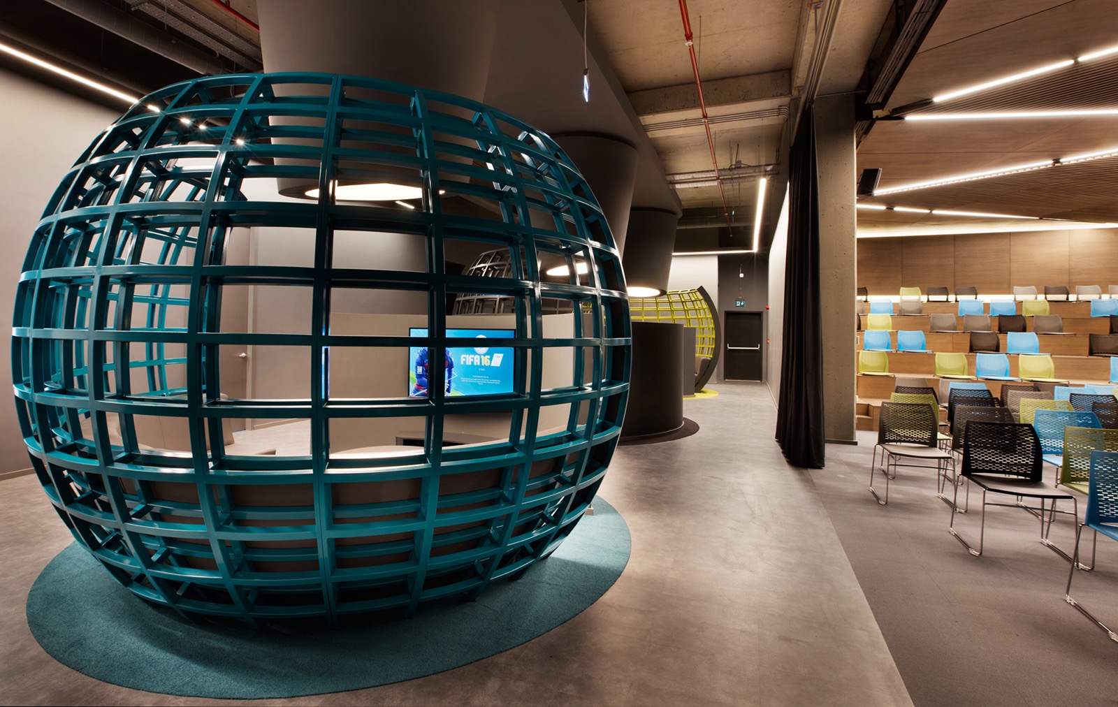
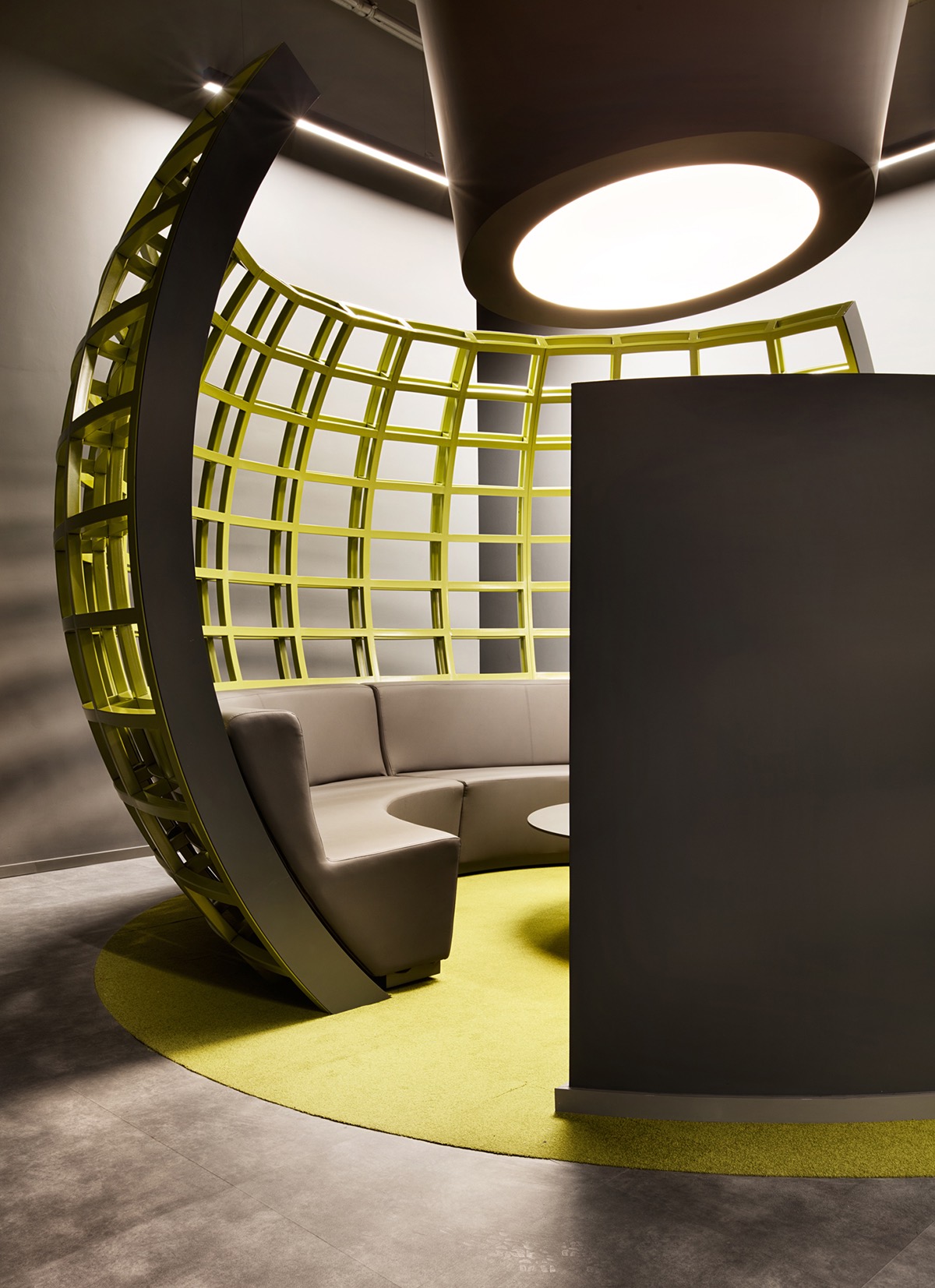
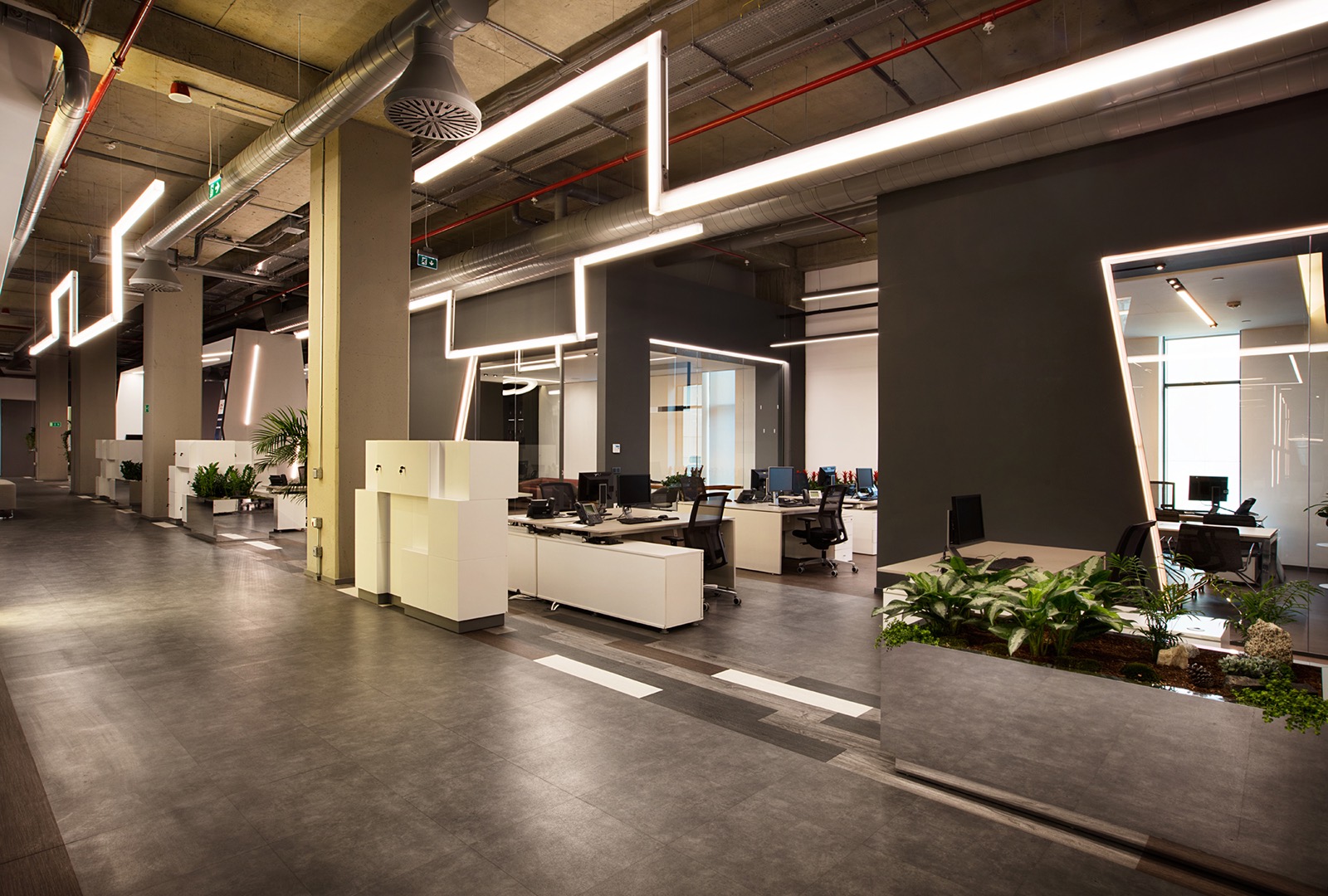
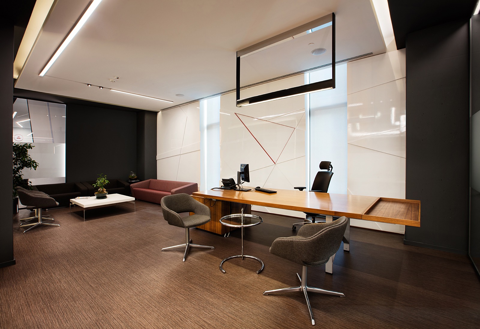
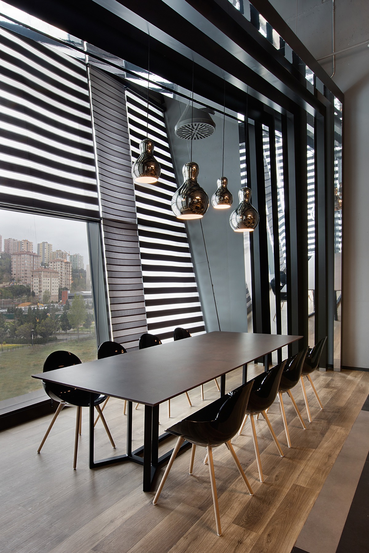
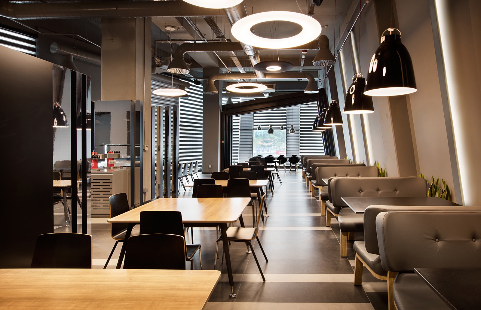
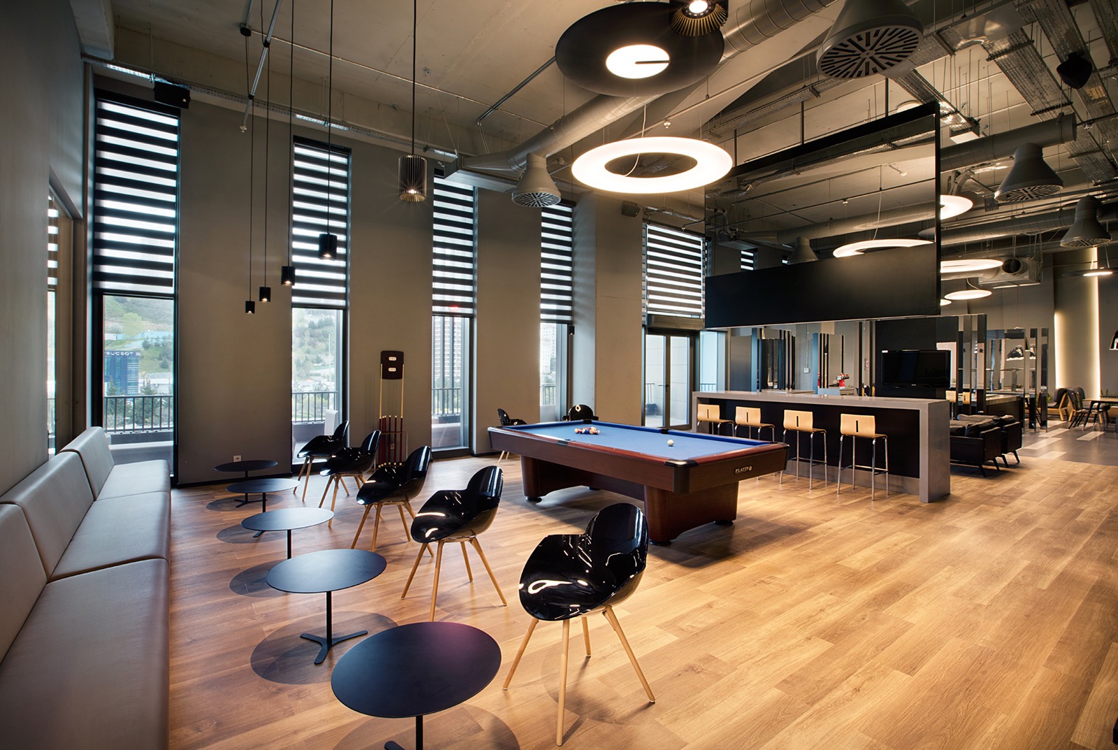
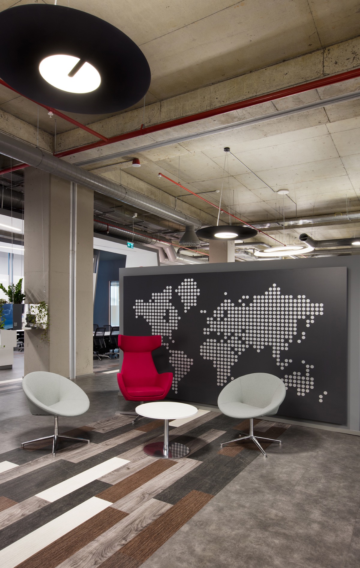
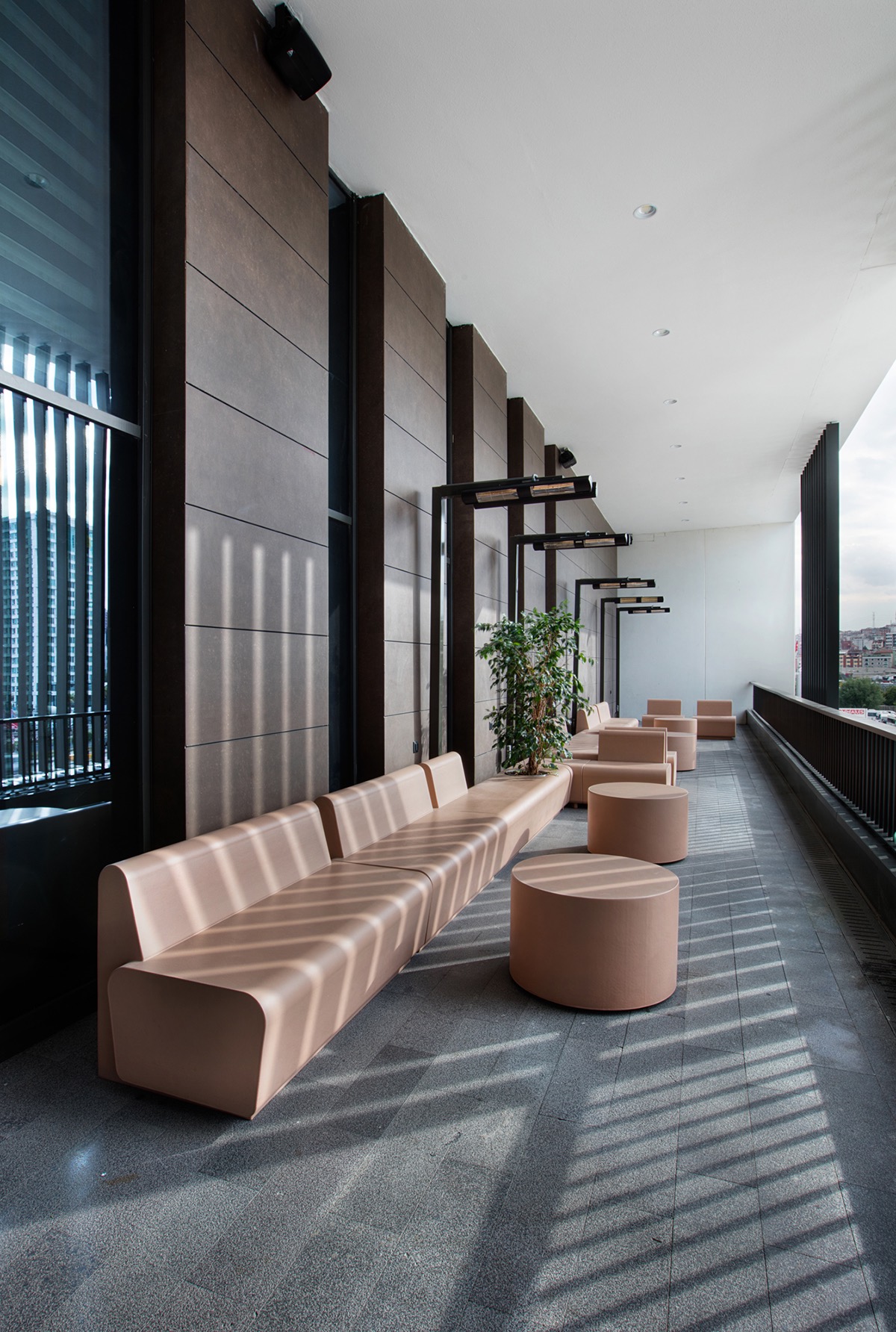
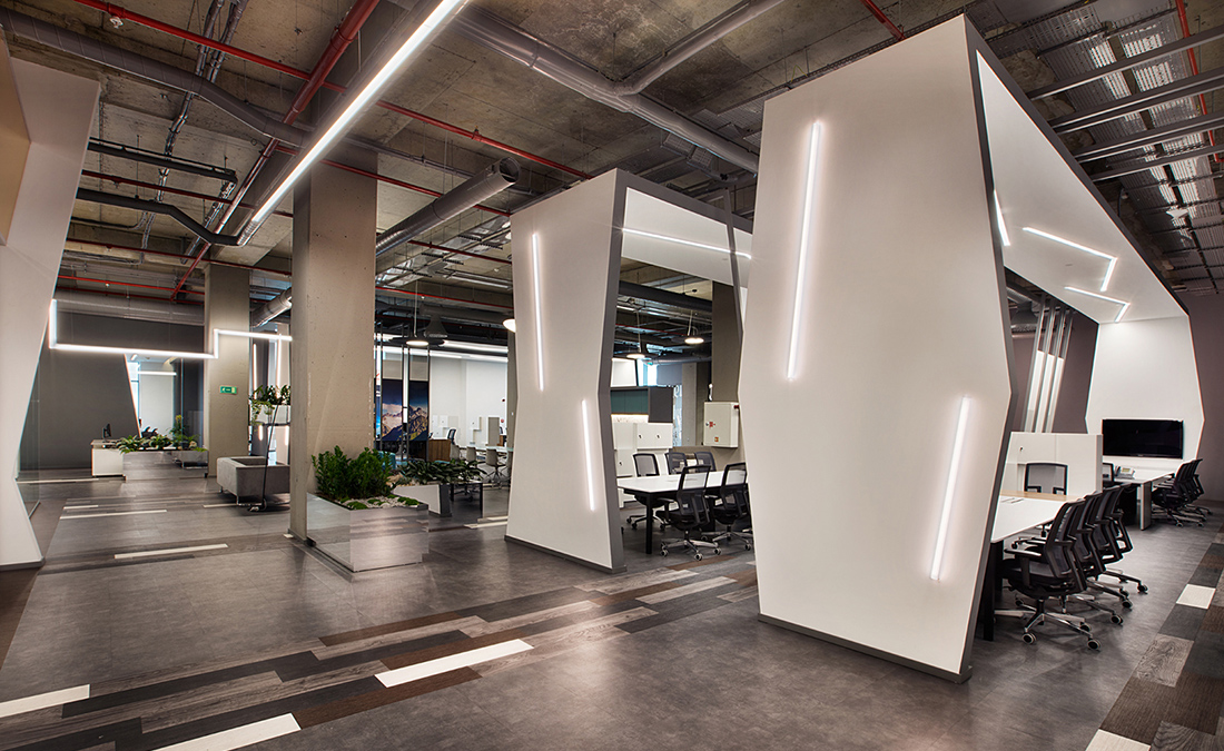
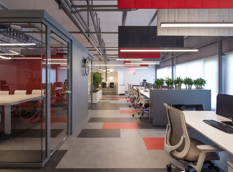
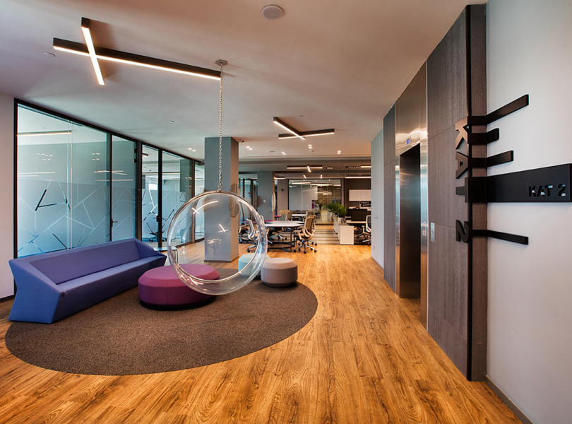
“The project started with planning sketches after interviews with the client about their current usage requirements. The offices main entrance and security points are placed in the ground floor while the first floor which is reached through stairs and escalators, embodies work spaces. After taking escalators visitors will be welcomed by an entrance arch which is designed by mimaristudio to emphasize PMSA’s corporate identity and a long counter next to it. This space provides direct access to working, meeting and social areas. During the planning phase, the sales teams are grouped in the center of the office floor. Teams who work on different areas are placed to be in close contact with their regional sales directors. Also the directors are placed in the center of workgroup clusters based on this idea. Considering the largeness of the space both in area and the volume, team shells to combine two work groups are designed so that each work group can have their own identity. These shells which respond to physical, technical and technological requirements of all the staff of the group, both during their personal or team work, are designed with a space inside a space approach creating open sub-spaces inside the main work area. With this approach showroom- like effect is avoided and a different identify for each team is provided. Other units in the office are placed around this core. Considering daily working requirements and routines, open and closed meeting spaces of different scales are designed. In addition to this, in substitution to the enclosed multipurpose hall which was in the Güneşli headquarters, an open multipurpose hall is proposed for the new place. This hall, which is considered for varying types of usages, is linked to social spaces. The ‘game shells’ which were specifically designed by mimaristudio are placed on the area that is next to this space. These two places which complete each other in form and spatial manner are considered to be one of the most salient places of the office. Drinking and copying service spots which are linked to open space meeting areas that are placed between the working spaces of the office promote the places quality to be vibrant on every hour of the day. These spaces are also made easily accessible for the employees. Next to these spaces the office floor leads up to the open terrace which is also linked to the dining and resting areas. These places form another radiant space of the office level with their design and with the materials and colors that are selected for them. The green lines function as natural separators that organize the units inside the office area. Plants that can sustain in closed environment and are able to use the natural light that space can provide are selected in the landscape design phase. Colors that are darker than general hue of the office are preferred here, and the effect is balanced trough graphic design, landscape and lighting decisions. The whole project took form with the application of contemporary forms without diverging from modern architectural principles and also with careful selection of finishing materials. Staying within the total budget, the existing office furniture, which could be considered quite new, were reused with some additions and alterations while new suitable products are selected. Besides purchased products, the objects that were designed for information desk, meeting rooms, drinking and copying spots are all custom made. The space between the shells that cover working clusters are composed like streets, the material selection for these spaces are arranged to create a sense of continuity between other meeting and social spaces. 5 mm modular PVC tiles are chosen for the all floor finishing, expect meeting and interview rooms, for its sanitary and acoustic advantages. Their color and texture vary to go along with the interior design concept of each space. In wet areas porcelain and ceramic products are used along with wallpapers. Natural wooden panels with different forms and textures are designed for the sizeable areas like the larger meeting room and the open multipurpose hall. Lighting design criteria are set by mimaristudio team as it was in the previous mimaristudio projects. LED products are used for all of the spaces in the project, linear or spot projections products are chosen for the working spaces, while in open spaces more specialized products with varying sizes and forms some of them having acoustic qualities are preferred. Inside the working group shells, luminosity suitable for work is applied while the spaces between shells are illuminated for the general usage. Specialized spaces like meeting and interview rooms, game shells and dining-resting areas are illuminated with products specially selected for their users or with products that are custom designed for them. As a result of this work, spaces with different functions and different openness qualities are all aimed to be parts of a common lighting design concept. With the completion of the project a space that is coherent with both PMSA’s corporate identity and the work that takes place there has come to being. Besides that, a comfortable working space for the staff that operates well and meets the actual and future expectations of the client is created.”
- Location: Istanbul, Turkey
- Date completed: 2016
- Size: 129,000 square feet
- Design: Mimaristudio
- Photos: Gurkan Akay
