A Peek Inside Publicis One’s Minimalist Prague Office
Publicis One, one of the world’s largest digital networks that provides digital and traditional advertising, and media and marketing services, asked architecture Studio Reaktor to create a new meeting space for their industrial-style offices in Prague, Czech Republic.
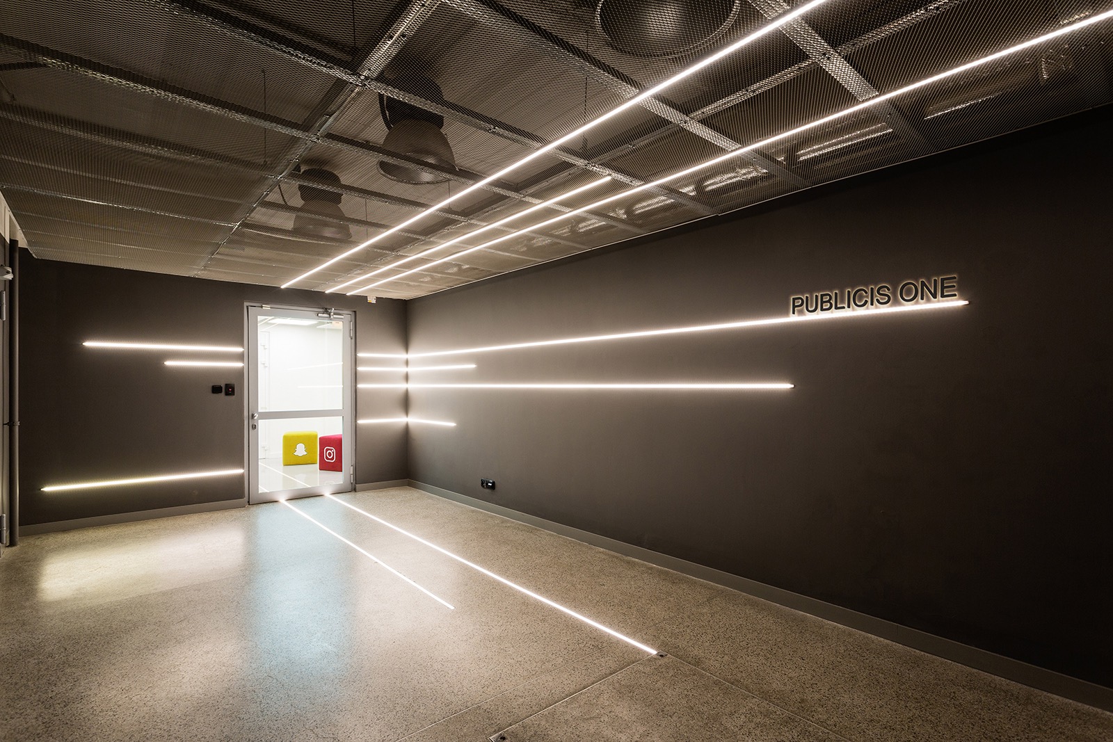
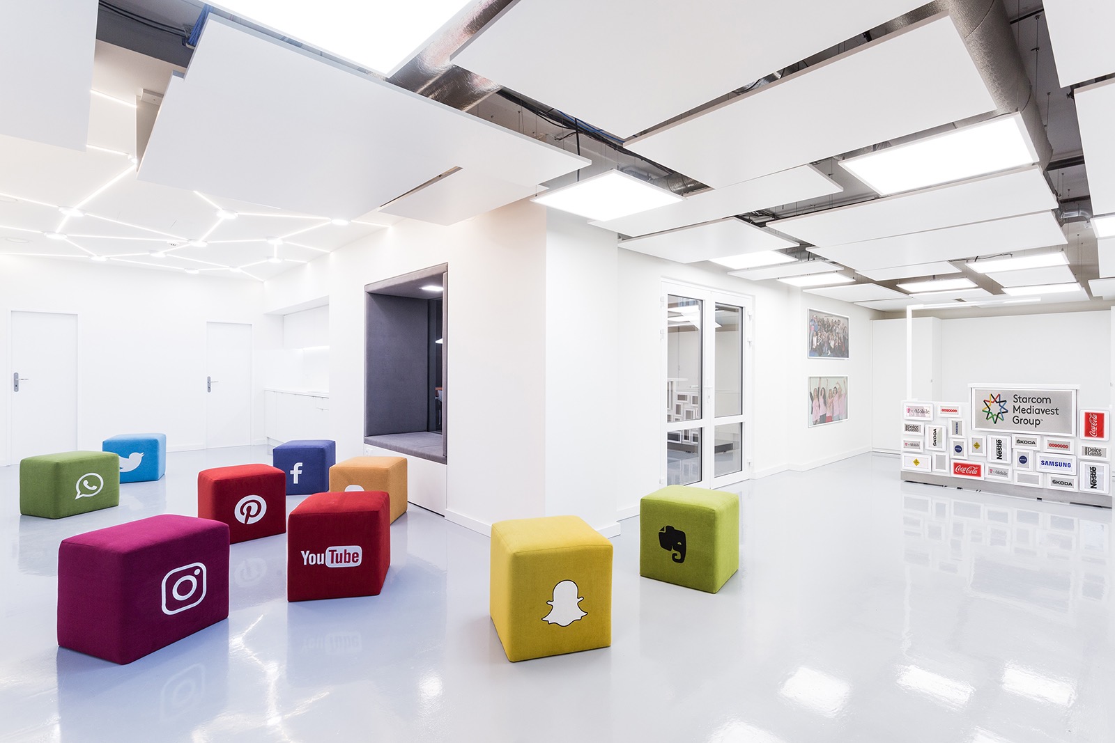
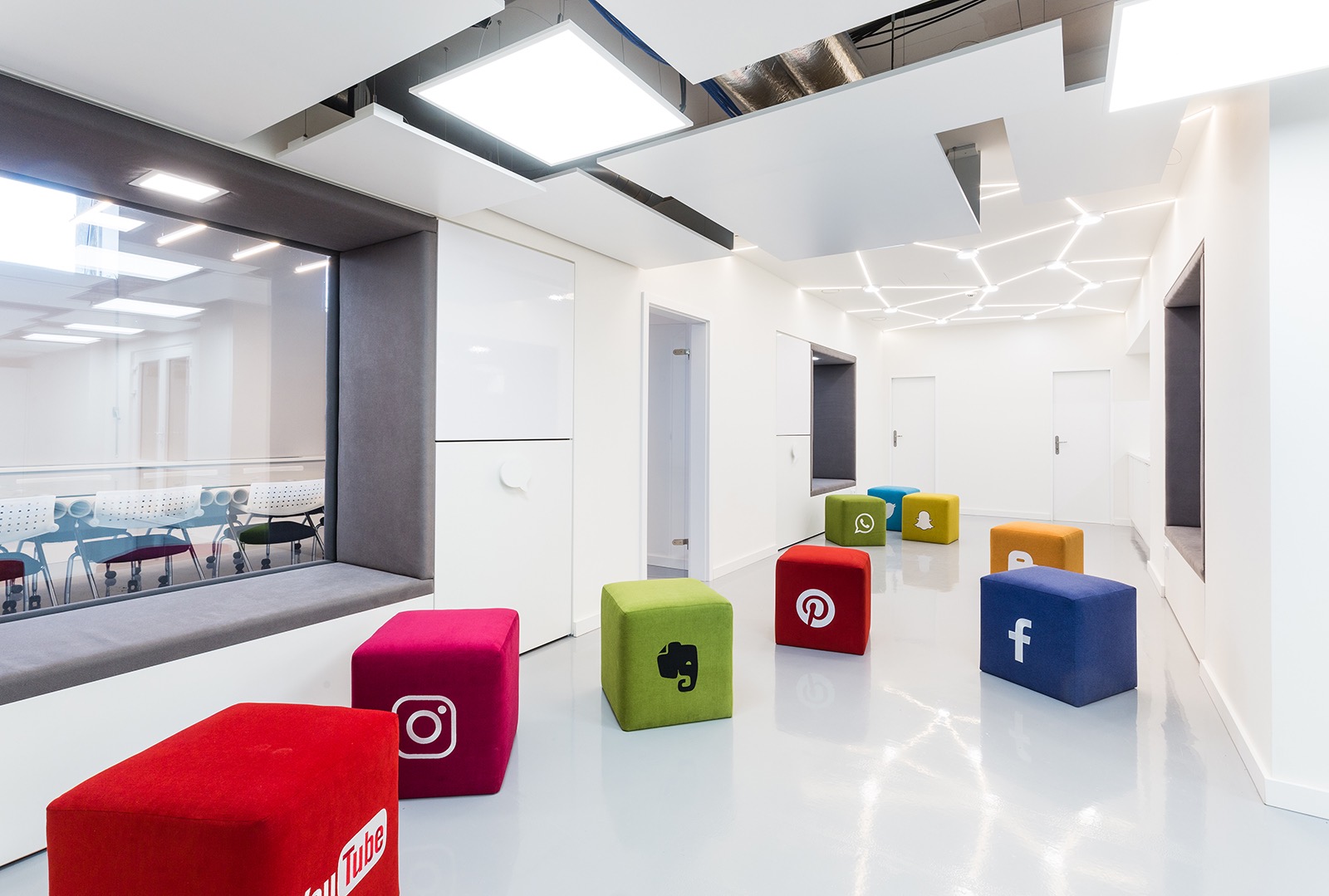
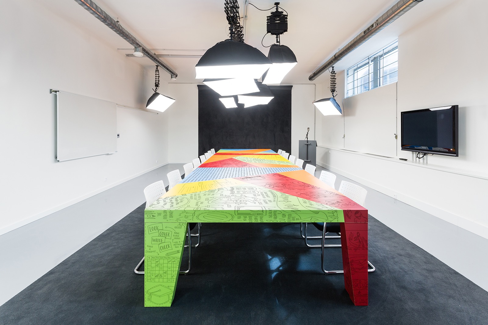
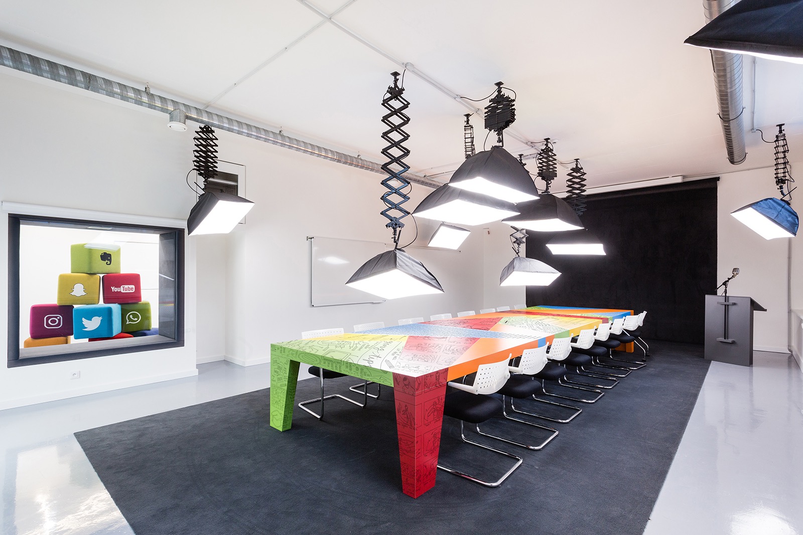
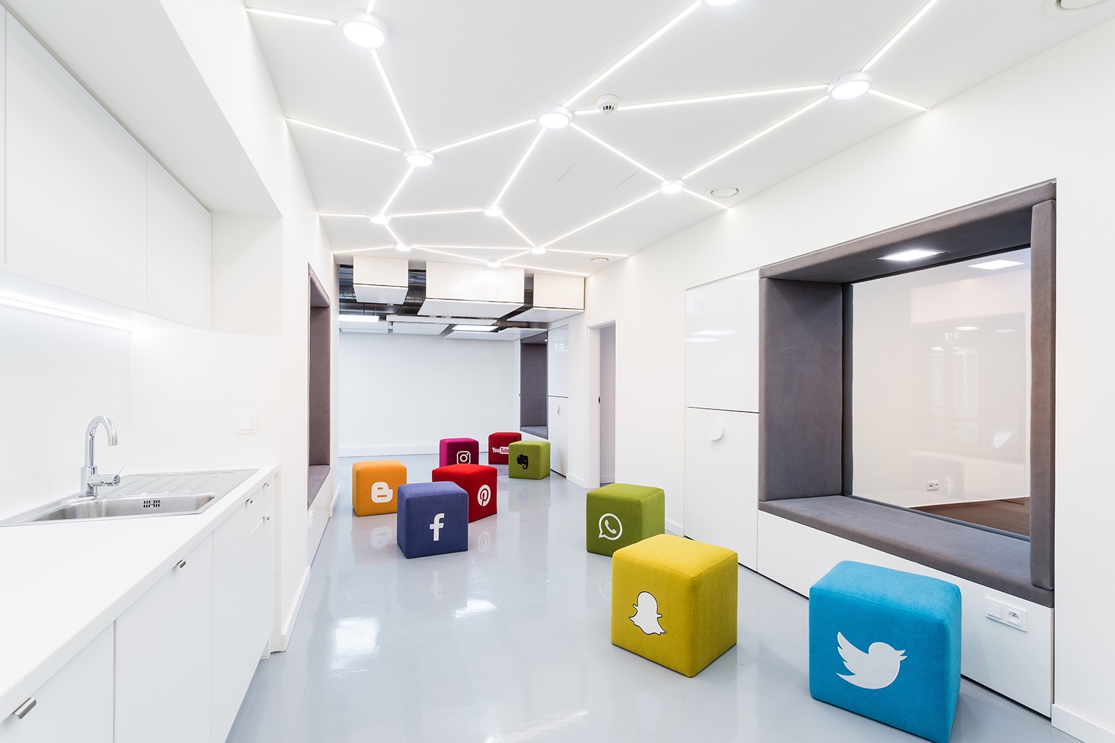
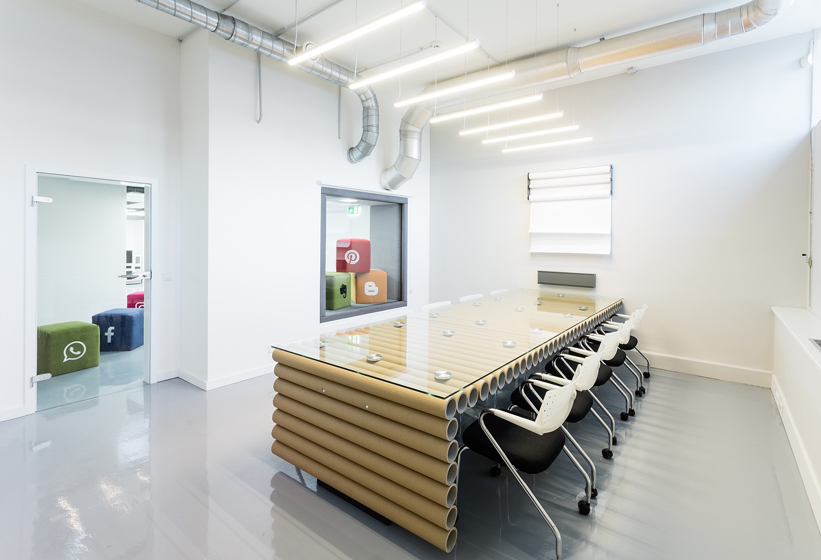
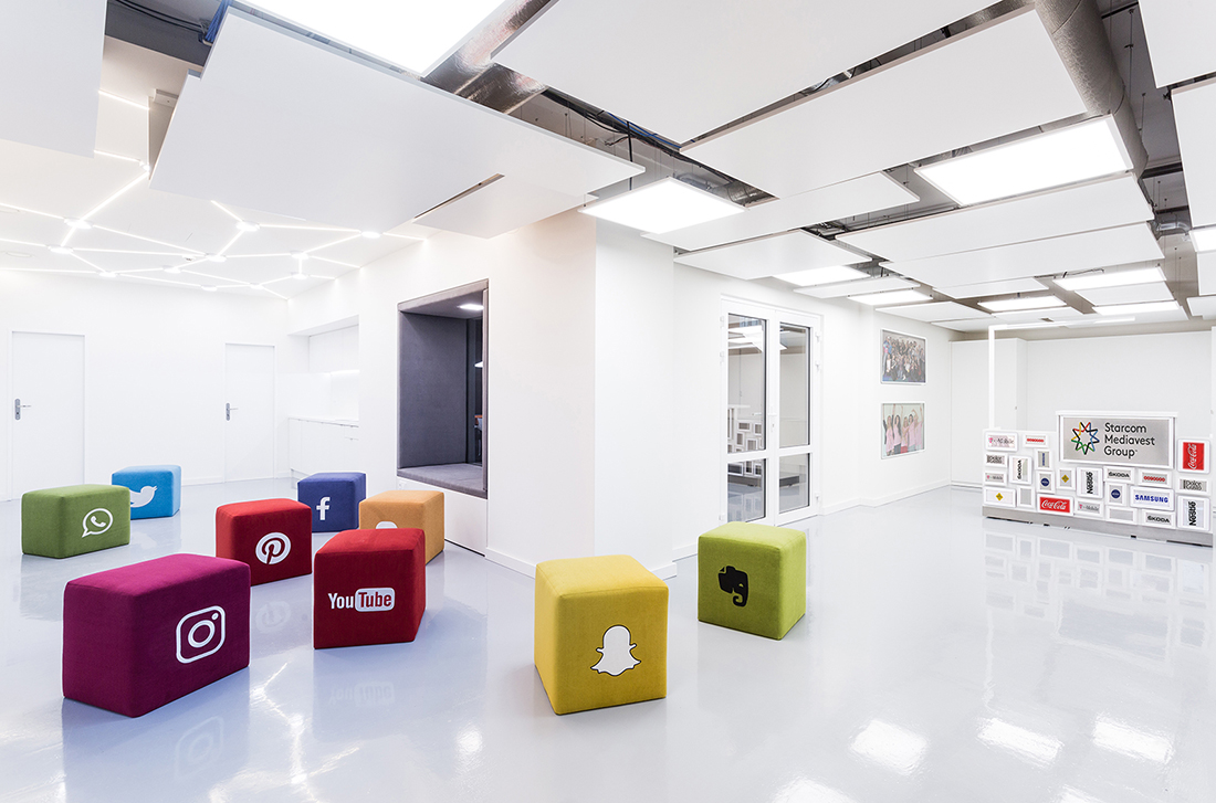
“The architect’s meeting with the client was traditional. Coffee, water, written assignment and 20 minutes of explanation time. The task was clear – to create a new meeting space in the dark cellar floor of the industrial building. We could design simple, classic “meeting rooms”. But there is already plenty of them on the market. The paper absorbs everything so we presented firsts sketches. And they liked it! Once the elevator door is opened, the light lines of the dark walls will guide you in the right direction, to the meeting with Publicis One. You enter the contrasting white space dazzled by the clientele reference who were already satisfied by SMG company. Through the glassed wall you can look into other parts of the interior. There is a colorful hero in the main hall. He is made of storyboards that the media company uses to promote creative campaigns. He is lit up like a model to show his importance. He has to take quite a wide stance, the huge loins will bear the weight of big decisions and contract signatures. The smaller meeting room is designed for brisk brainstorming. A long roll of paper and a bunch of empty cardboard tubes make up the design of a table reminding the shape of a printing machine, the origin of printed media. Take a yellow pencil and paint … a schedule of investments. The free space connecting all rooms is filled with color puffs printed with social network symbols, blogs, discussion platforms. You can sit, roll in cushioned niches, draw mindmaps and thoughts on clever walls. Here is the place to meet and relax, space for creative ideas. We tried to project the main work and ideas of the media company into the interior. During a visit, it will be clear at first glance where you are, who lives in the given space, how it is presented. We have proposed the appearance of meeting rooms in neutral colors, white and gray. Space does not disturb and is ready for new assignment, client perception, needs and communication. Small accessories and furniture pieces are then contrasting, distinctly colorful. Each room has its theme, which corresponds to the main media sector – print media, social media, TV media,” says Studio Reaktor
- Location: Holesovice – Prague, Czech Republic
- Date completed: 2017
- Design: Studio Reaktor
