A Tour of CROYO’s Modern Nanning HQ
CROYO, a Chinese design company that provides its customers with customized design solutions, recently moved into a new headquarters in Nanning, China, designed by interior design firm Shenzhen Super Normal Design.
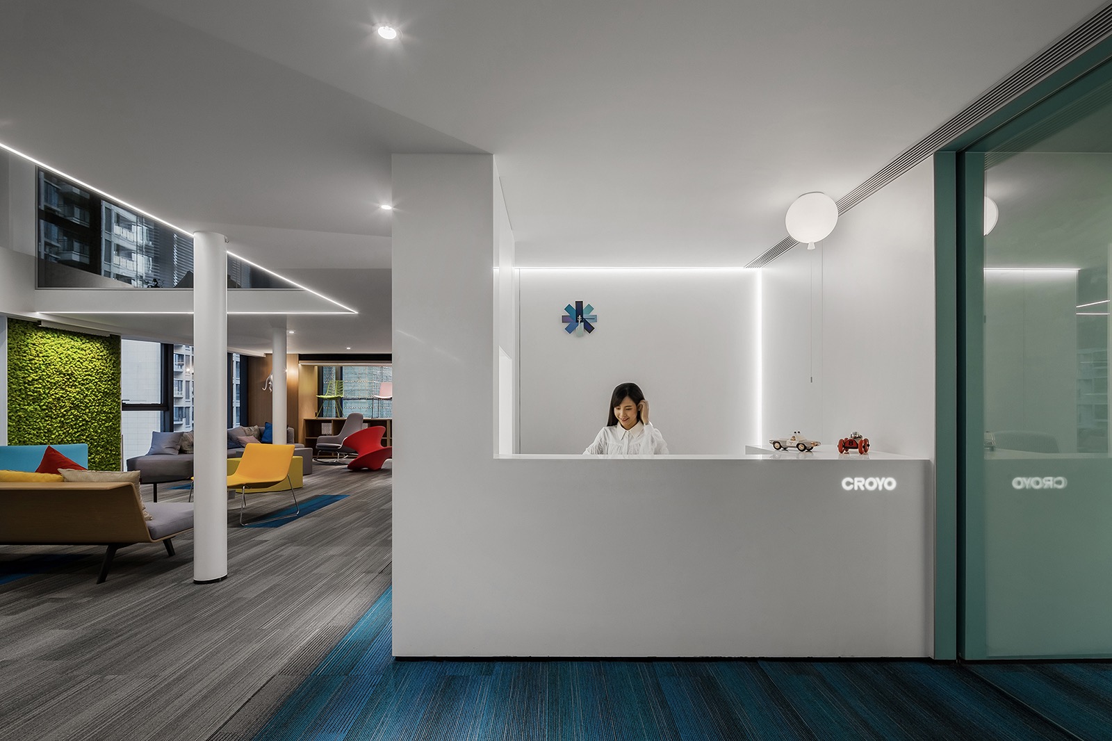
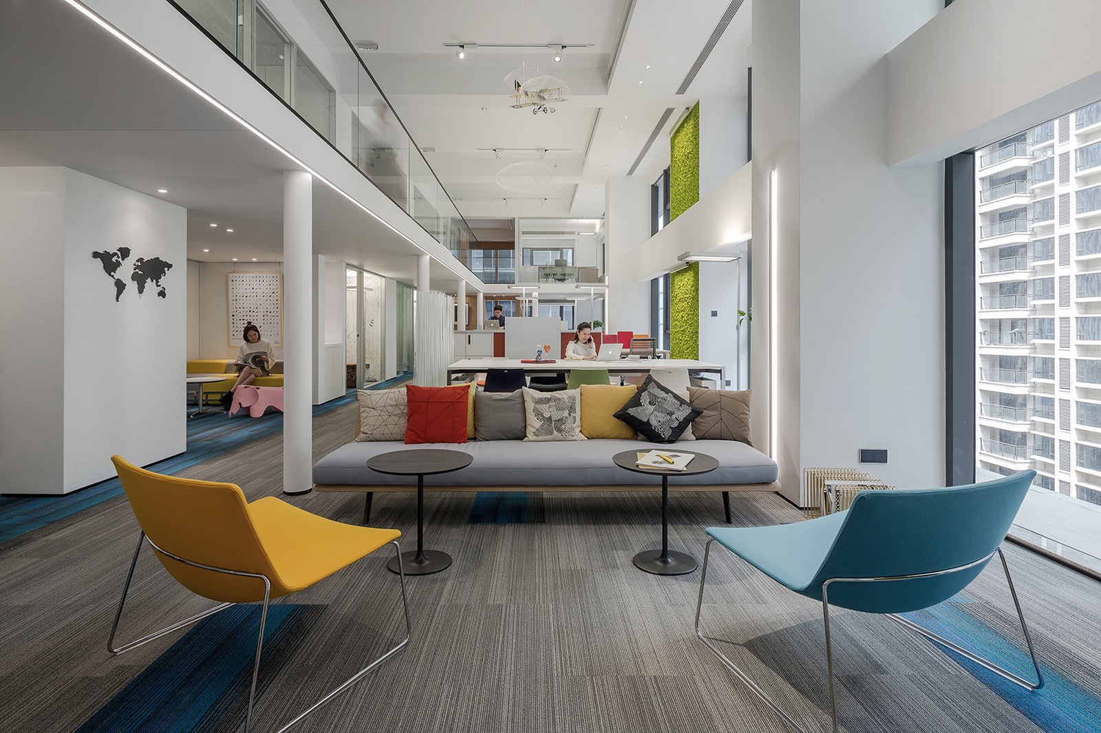
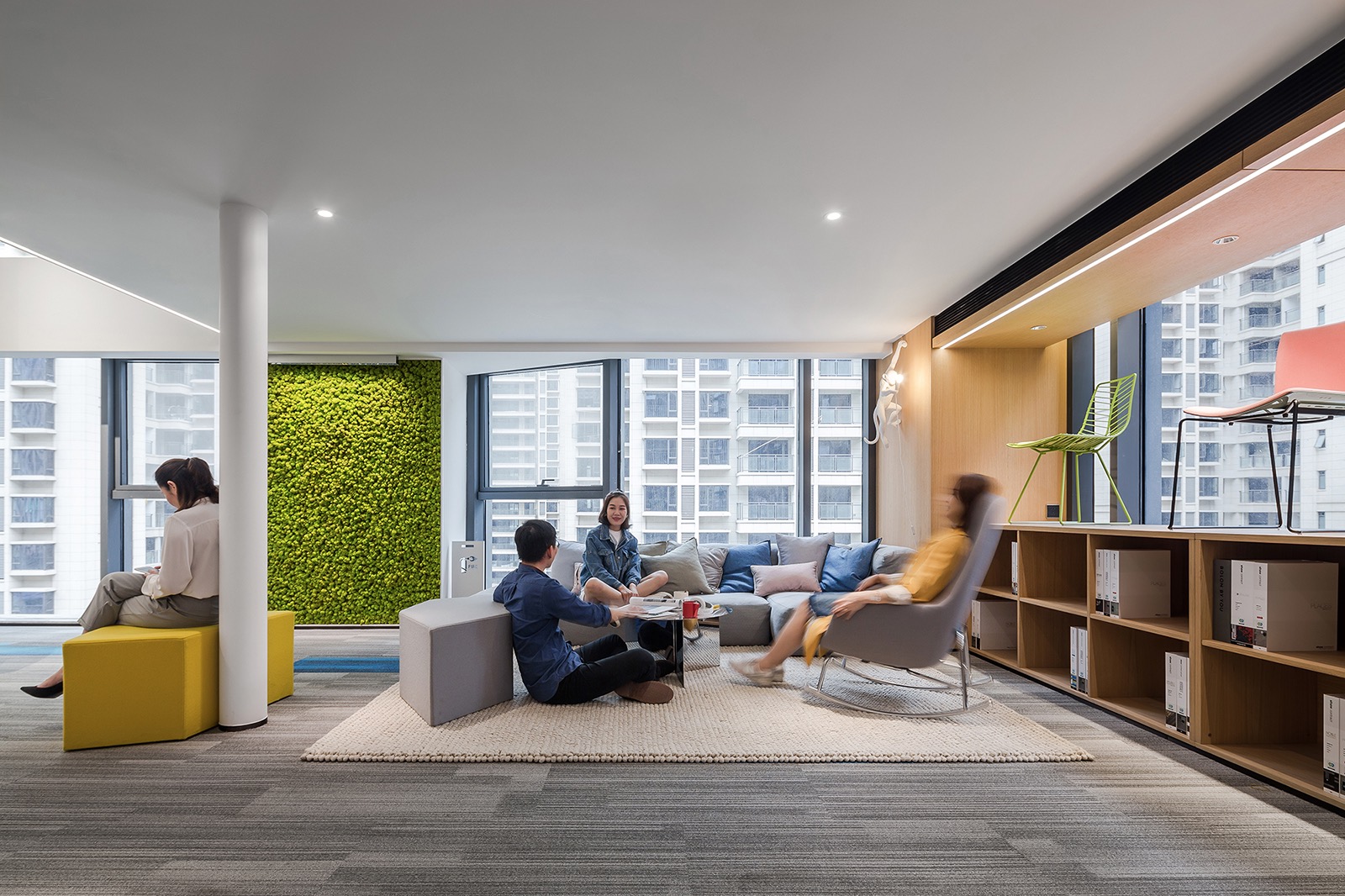
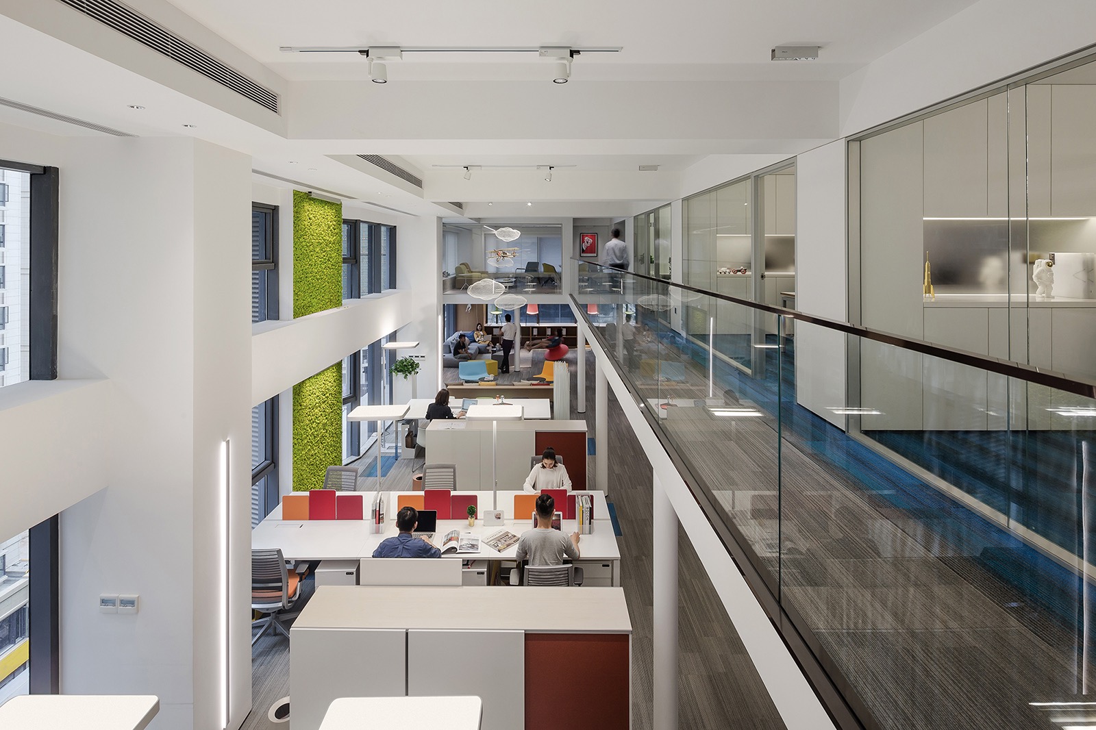
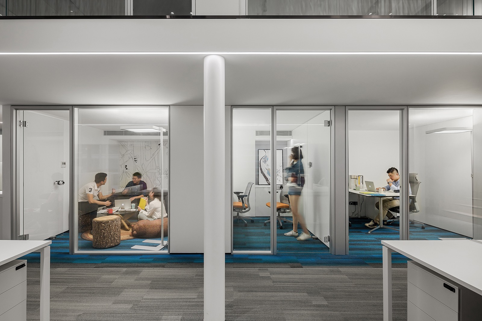
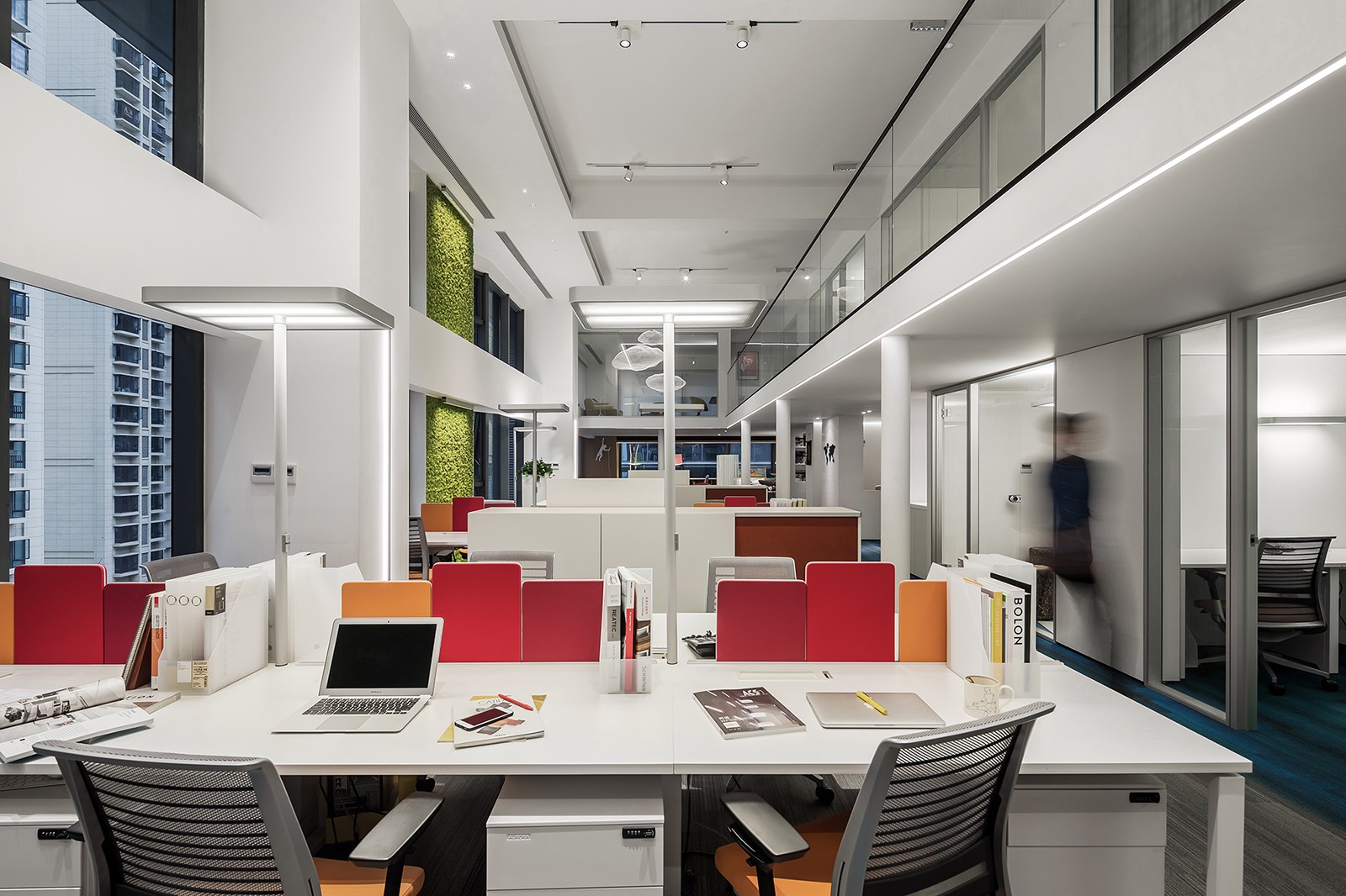
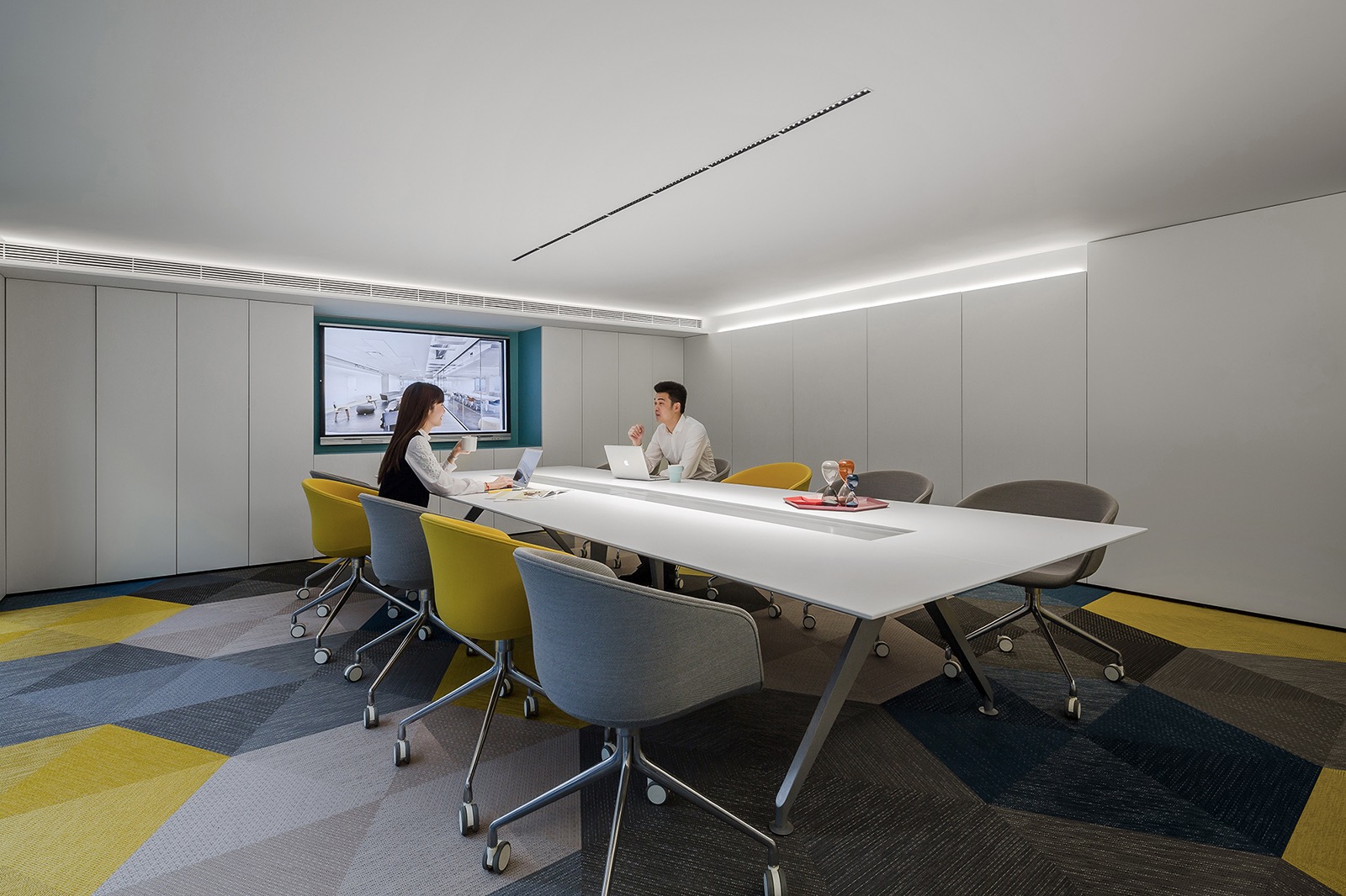
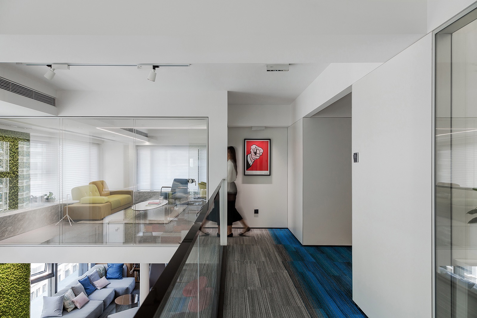
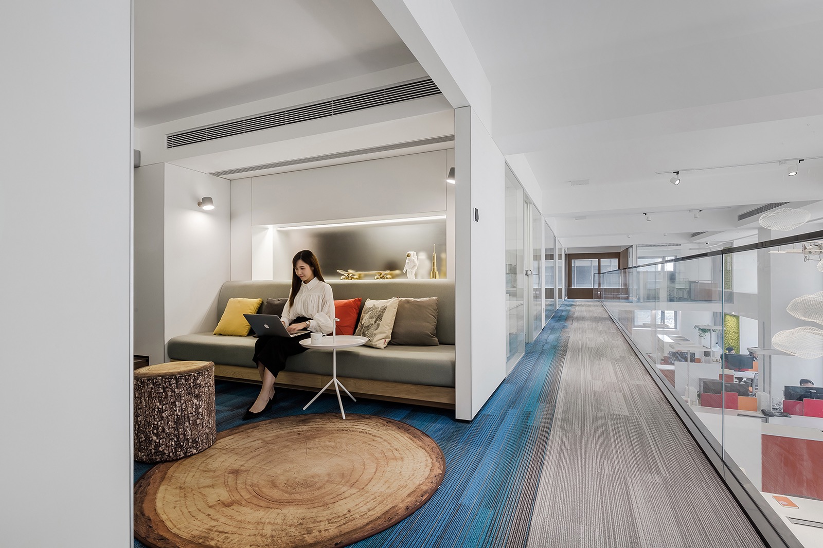
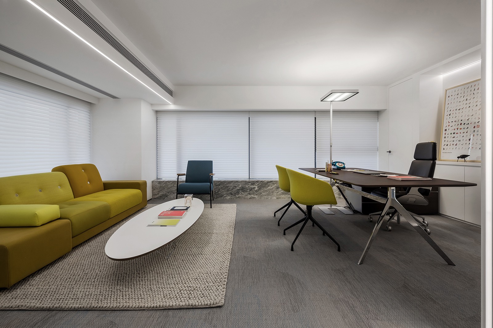
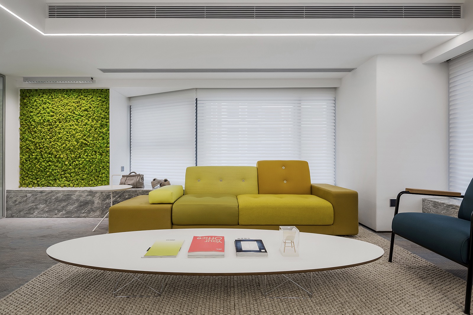
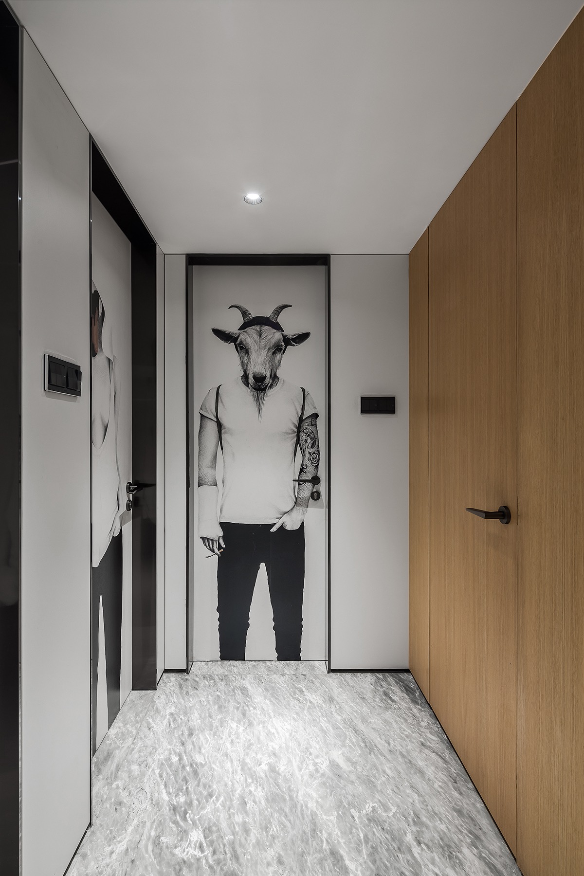
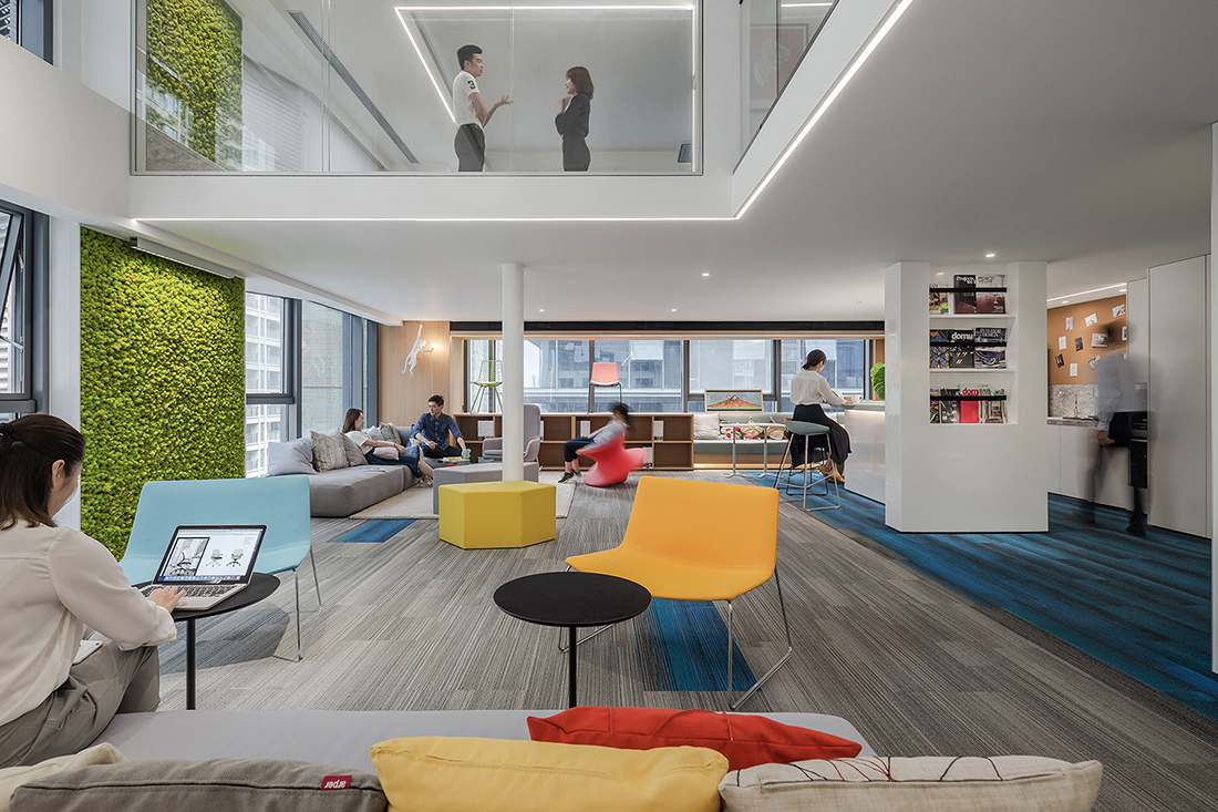
“The original space of the project merely occupied a floor area of 280 m2, with a story height of 5.09 meters. Therefore, the designers took setting up a floor slab as the first step, so as to expand the usable area. Considering that the thickness of the floor slab would affect user’s experience, the designers invited friends from Arup Group to be the structure consultants, with a view to creating a thin yet solid floor slab. They tried the best to integrate some structures with the walls, arrange the structure pillars in reasonably and deliberate on the position of each lighting fixture. Eventually, a 150mm-thick floor slab was designed and installed, separating part of the original space into two floors, with each designed in an appropriate height. Through the restructuring of the space via the floor slab, the usable area was expanded to 543 m2. The front counter area is bright and refreshing, embodying the beauty of minimalism. With a view to keeping balance, the designers added some exquisite decorations in the area, thereby creating a lively and relaxing atmosphere. The spatial aesthetics is also demonstrated in the utilization of colors. The blue-gradient carpet keeps people calm, the red office partition makes people passionate, while the green preserved plants add a natural feeling into the space. With the theme of “forest”, the design of the brainstorm area is unique and distinctive. In order to bring the forest into the space and recall childlike innocence, designers put a stump-shaped chair, a rug with pattern of tree rings, a sofa resembling sleeping bear and a wall lamp in the shape of monkey in the area. Such bold and ingenuous combination of these elements is conductive to encouraging the staff to “think out of the box” and spark inspiration and creativity during team discussions. As for lighting design, designers chose to utilize floor lamps instead of point light sources, which generate soft and undazzling light, making people feel comfortable and cozy. The designers attached great importance to designing a leisure area in the office. Lounge chairs and the distinctive modular sofa, combined with the bar counter, enable the staff to take a short break from work and have more contacts. In such relaxing environment, different teams can communicate freely and even generate collision of ideas in deep level. The leisure area features bold utilization of prevailing and vibrant colors, which creates a relaxing and cheerful atmosphere and embodies CROYO’s concept of “reject to be boring”. With a view to creating an open-plan office area, the design team set both independent work spaces and shared work spaces, so that the staff can choose the way of working in accordance with their preferences. Such design helps to facilitate face-to-face communication and professional knowledge exchanges among the staff, improve their capability of adapting to changing environment and strengthen their impetus for work, hence enhancing work efficiency. As for seating, the designers chose Steelcase ergonomic office chairs which make the employees feel comfortable and energetic. For lighting design in each independent offices, the interior and lighting designers made a new attempt. As opposed to installing lighting fixtures on the ceiling, they determined to use Waldmann free-standing luminaires. Such solution not only gives the ceiling a simple and clean look but also ensures the light to be soft and pleasant. The average color temperature of light is 4000k, creating a bright and pleasant working environment. However, in the shared working area, which was not partitioned by the floor slab, the designers adopted a different lighting solution. Considering that it was a full-height space, desk lamps were utilized so as to guarantee sufficient light. Besides, on the ceiling of this area, wide-angle track projectors were installed. In order to protect the staff at each seat from dazzling light, the designers made some multilayer cellular reticulations to cover these projectors. Furthermore, TVF wall washers were also used in the shared working area, making the preserved moss with exquisite texture on the wall more striking and refreshing,” said Shenzhen Super Normal Design
- Location: Nanning, China
- Date completed: April 2018
- Size: 5,840 square feet
- Design: Shenzhen Super Normal Design
