A Look Inside Holland America Group’s New Seattle HQ
Holland America Group, a crusing company that operates 41 cruise ships with over 36,000 employees worldwide, recently moved into a new headquarters in Seattle, Washington designed by architecture and interior design firm SkB Architects.
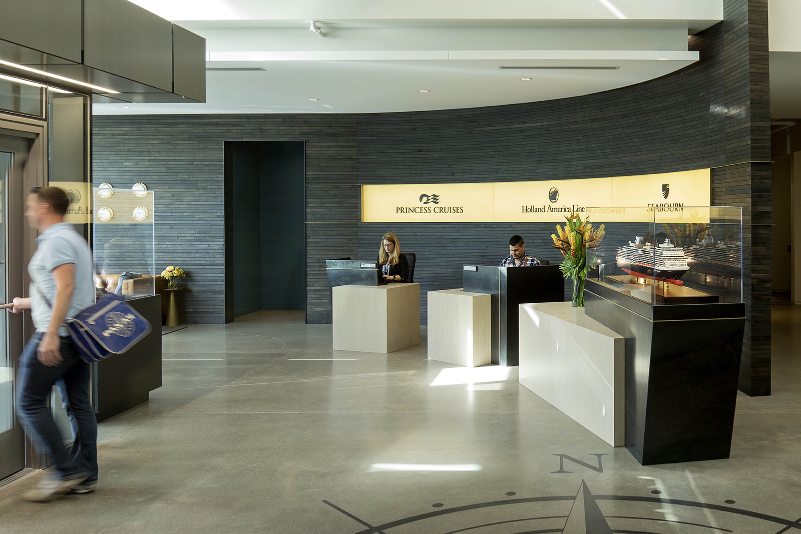
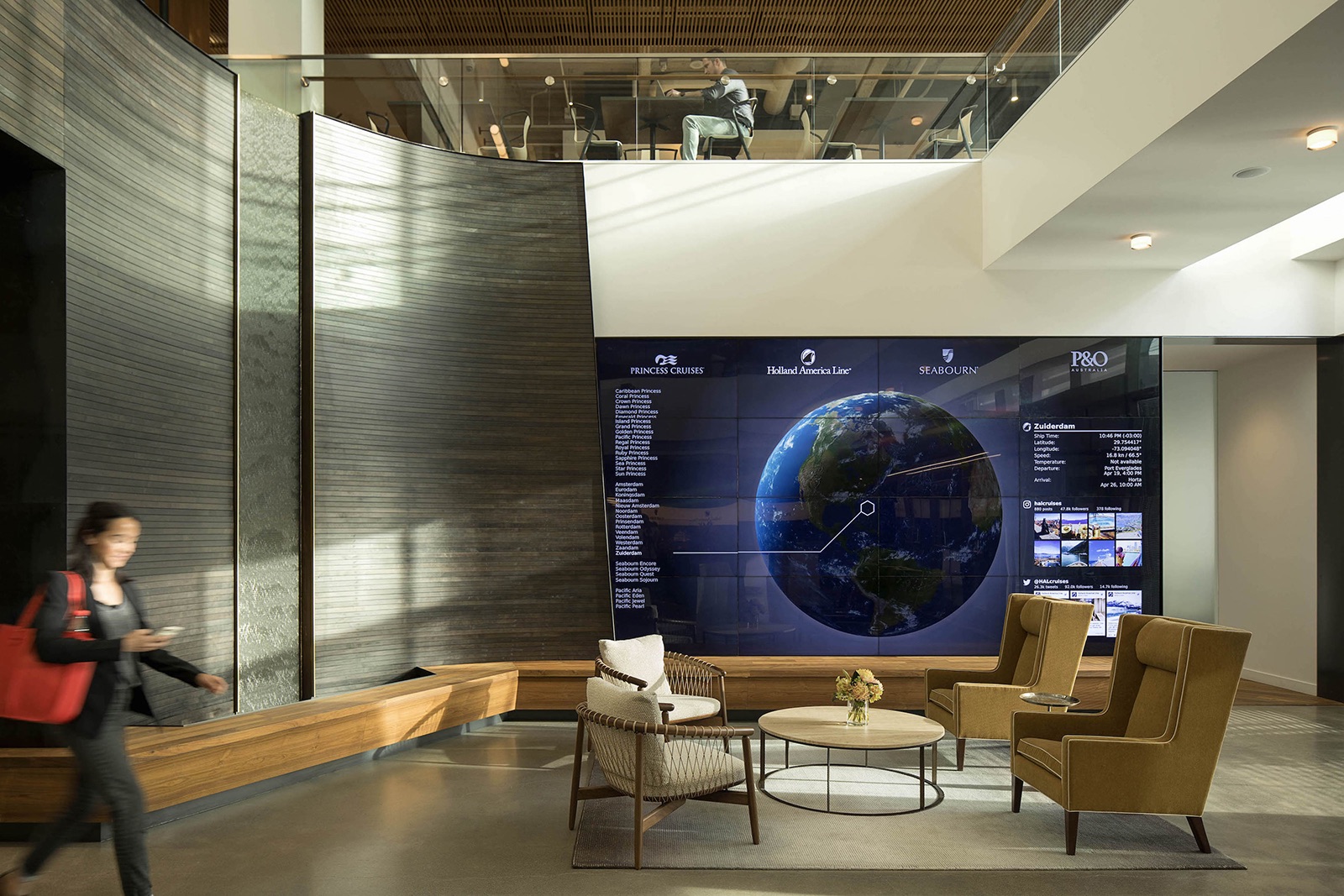
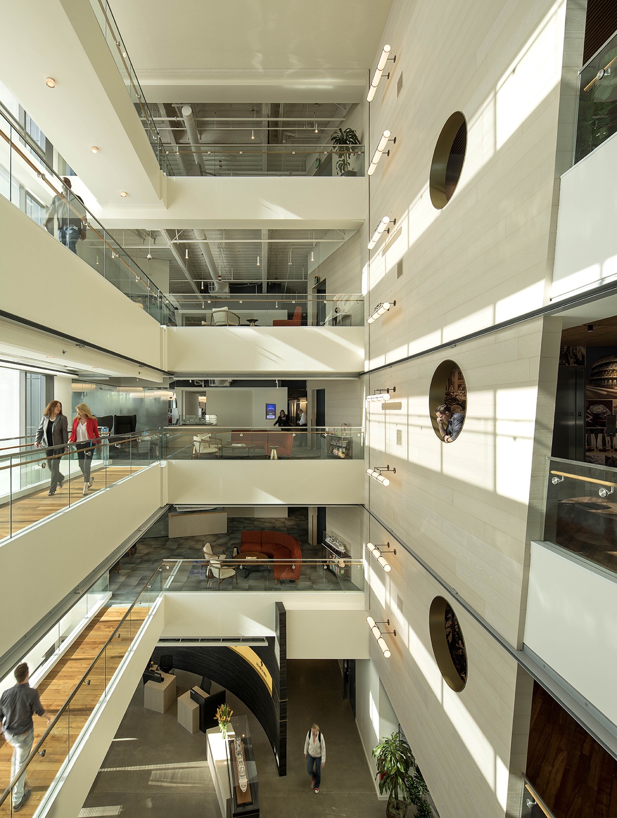
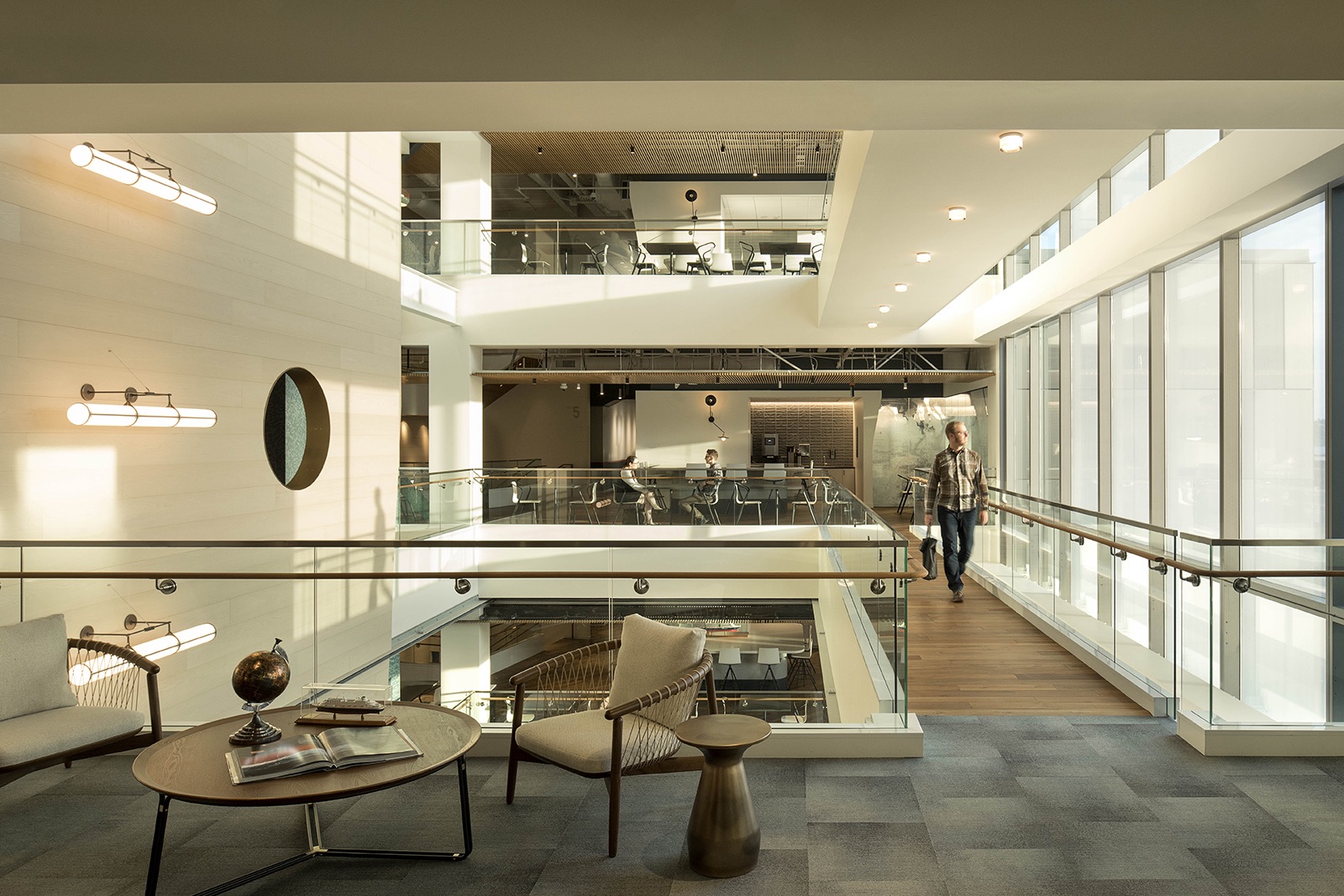
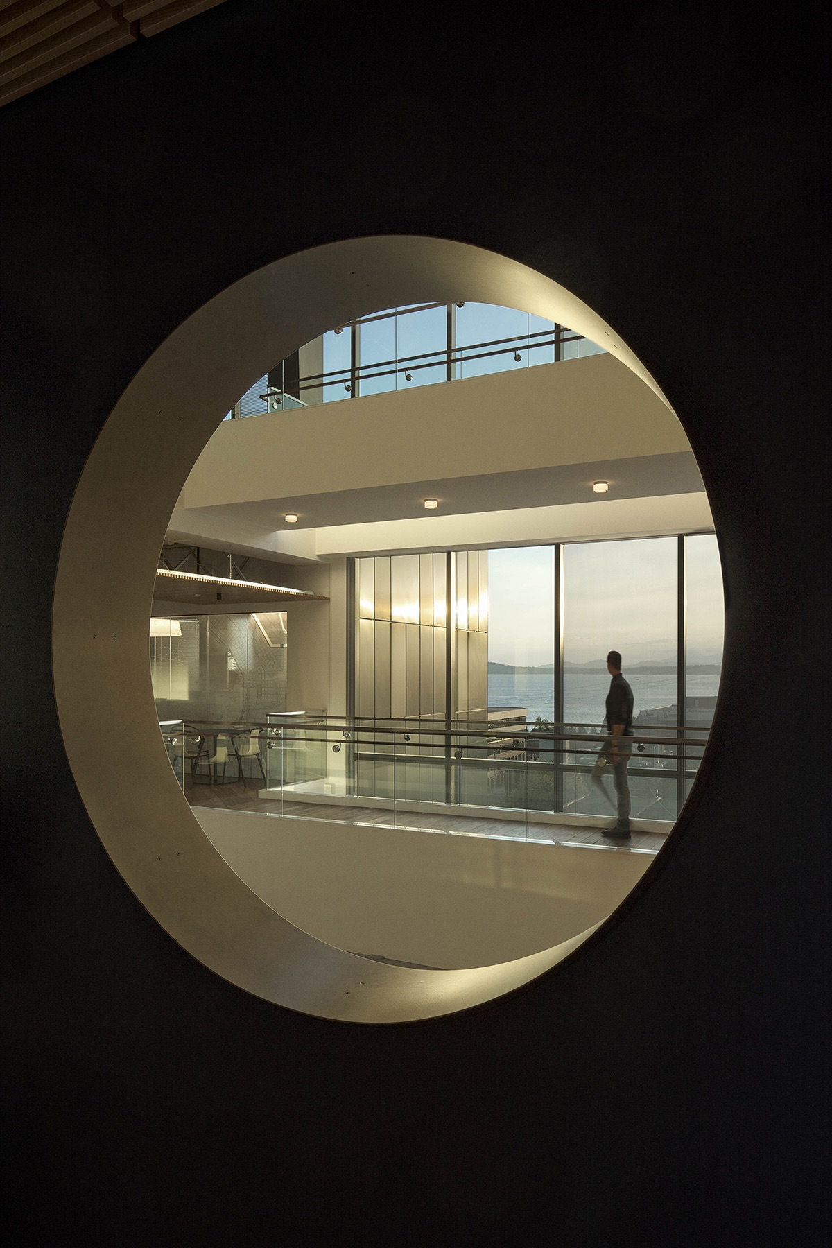
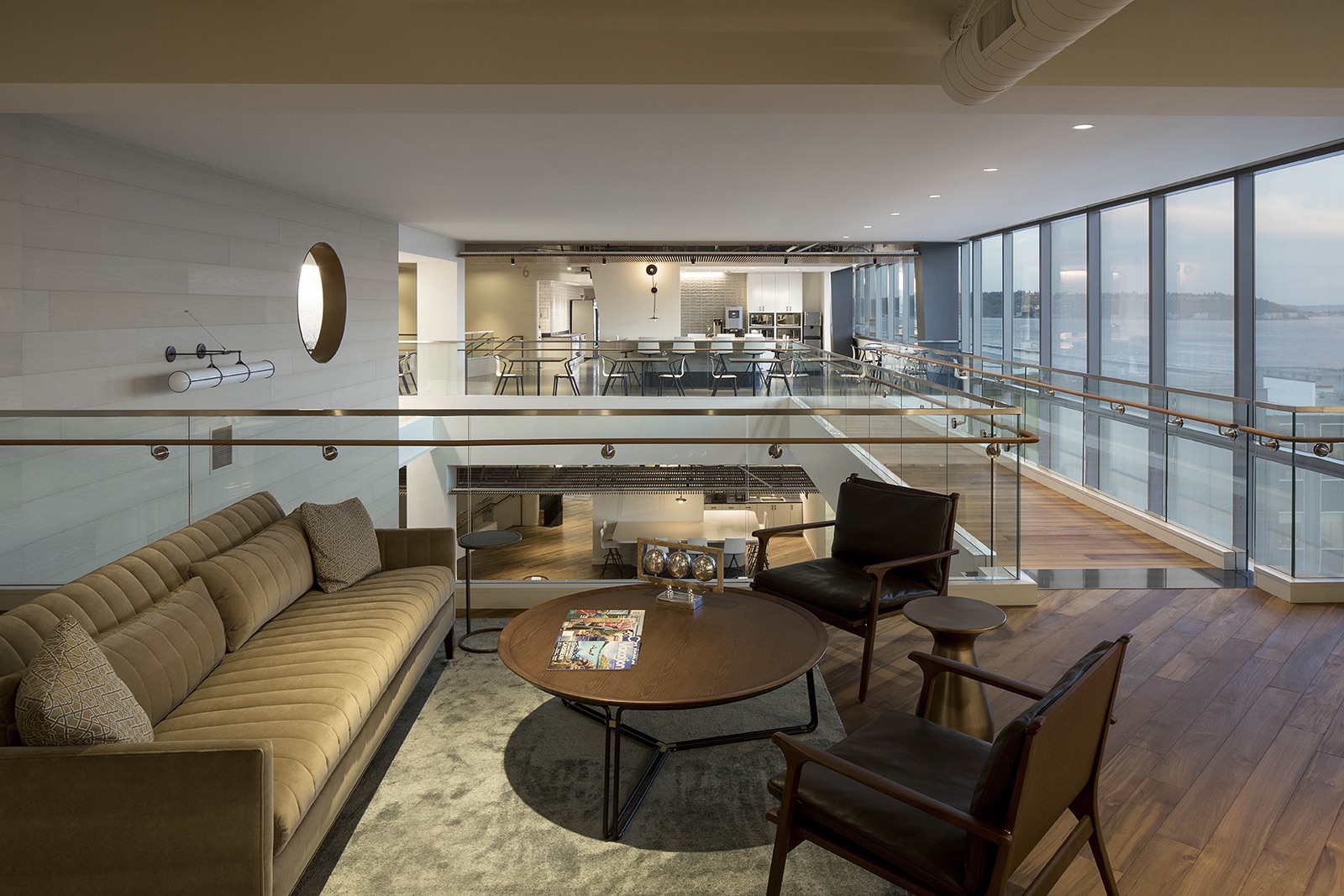
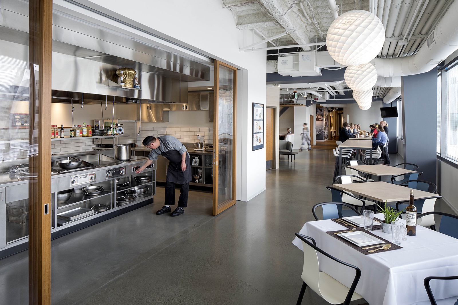
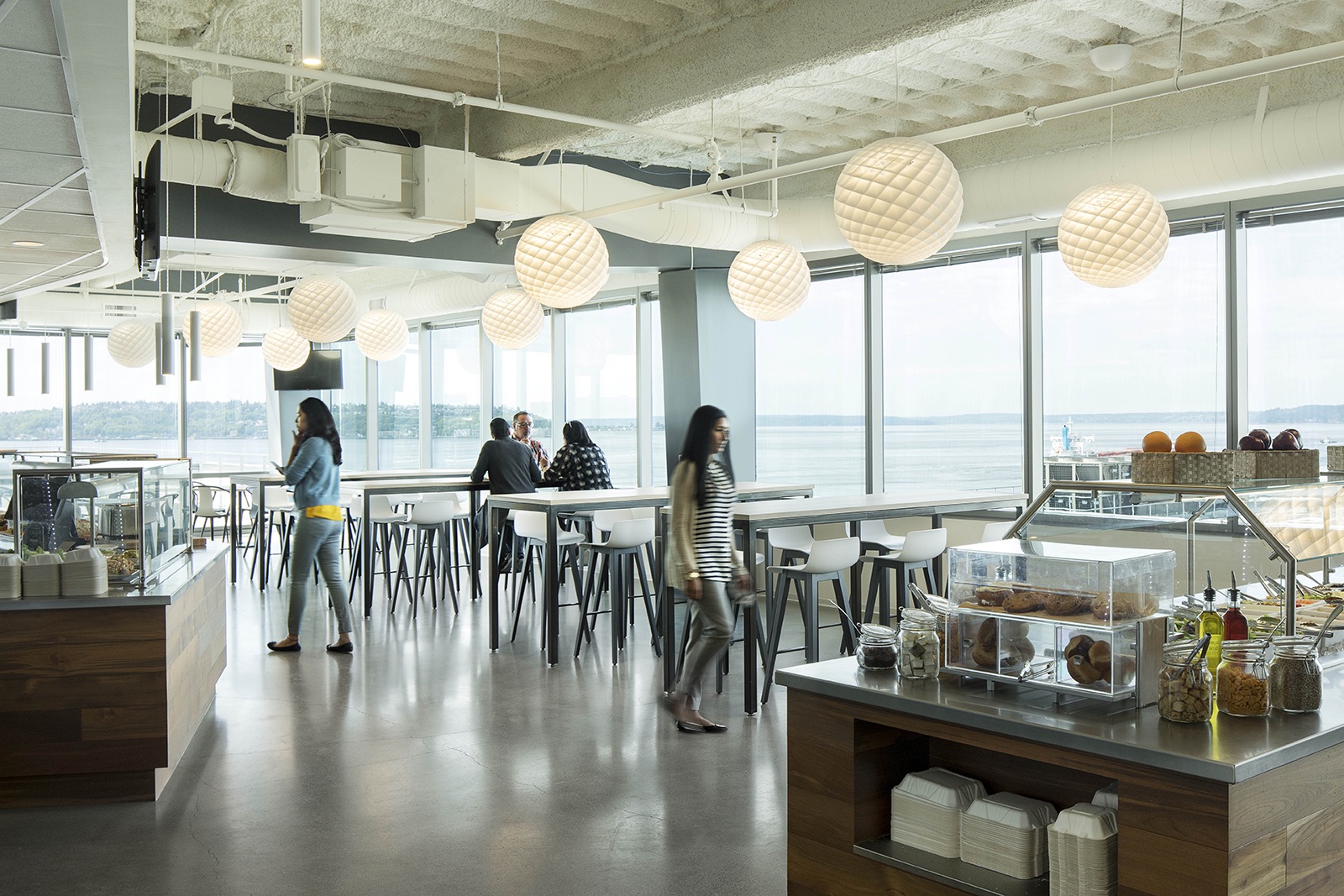
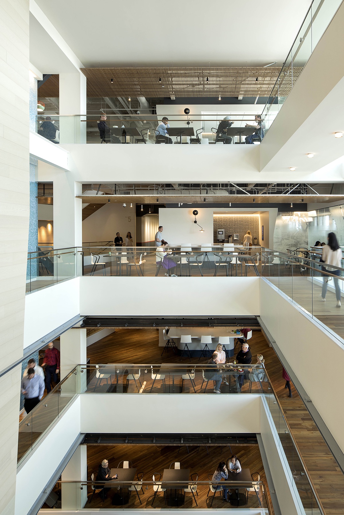
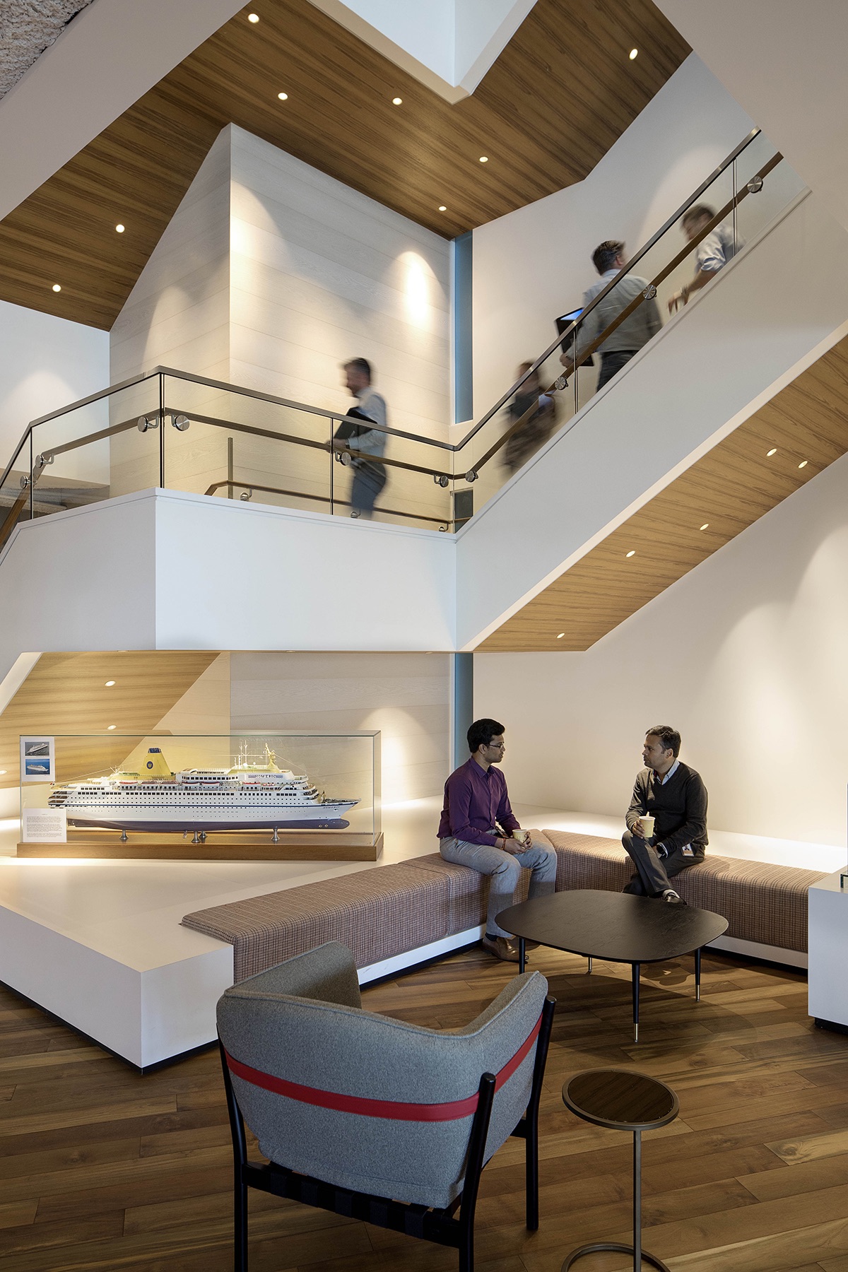
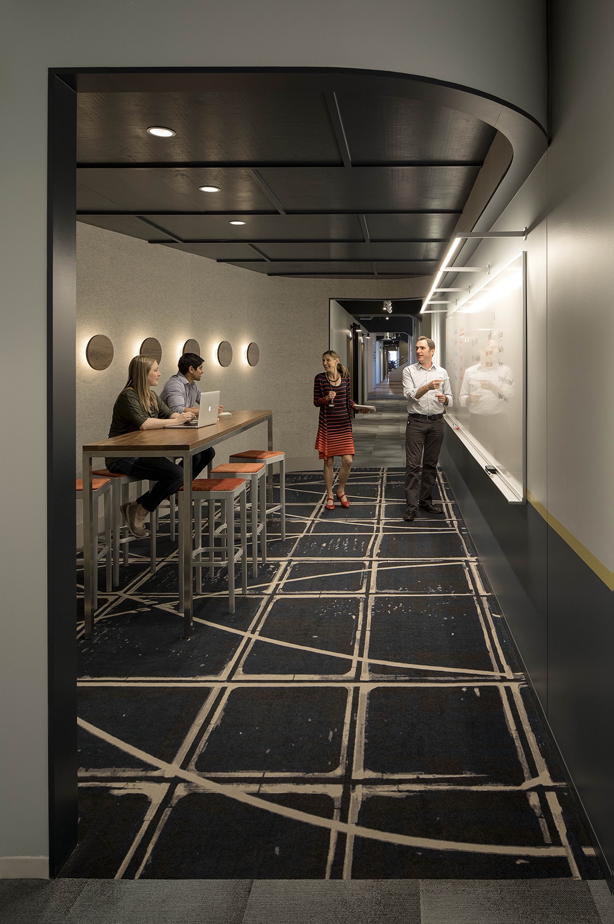
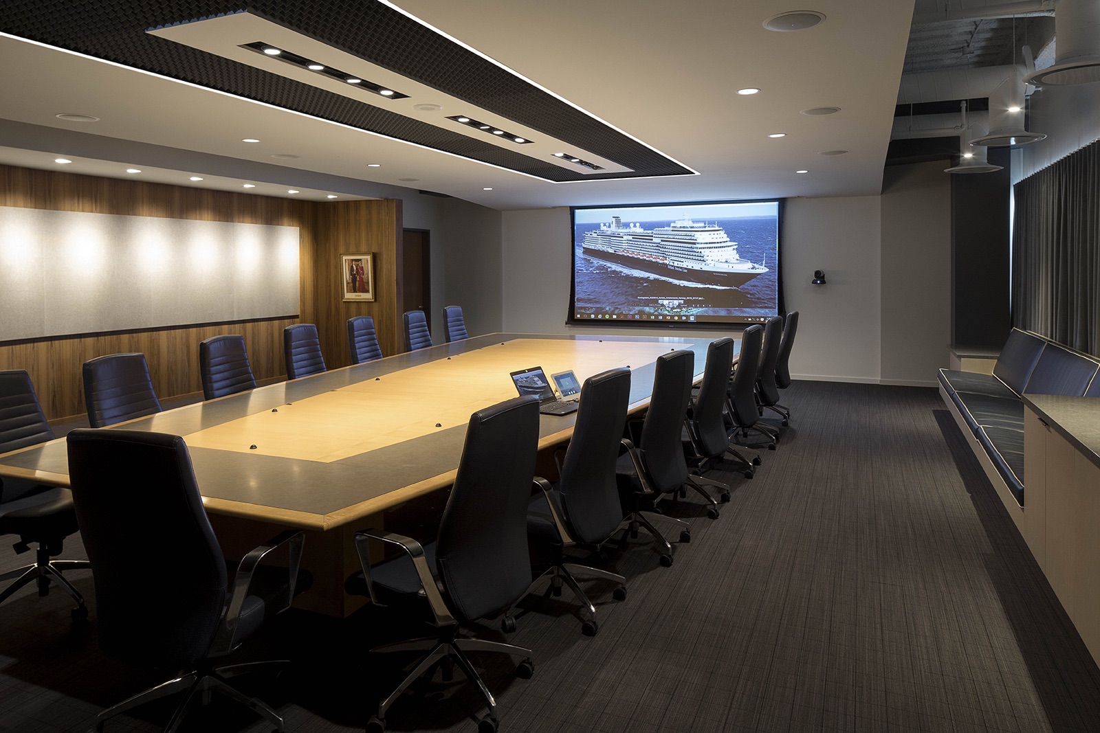
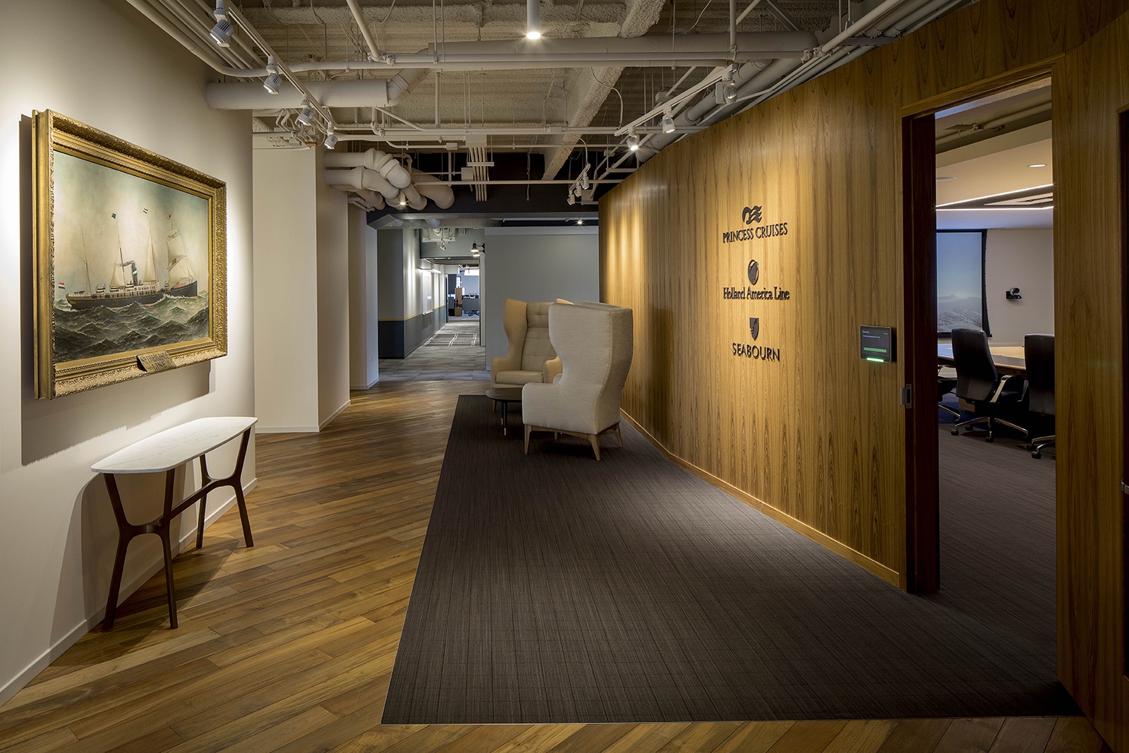
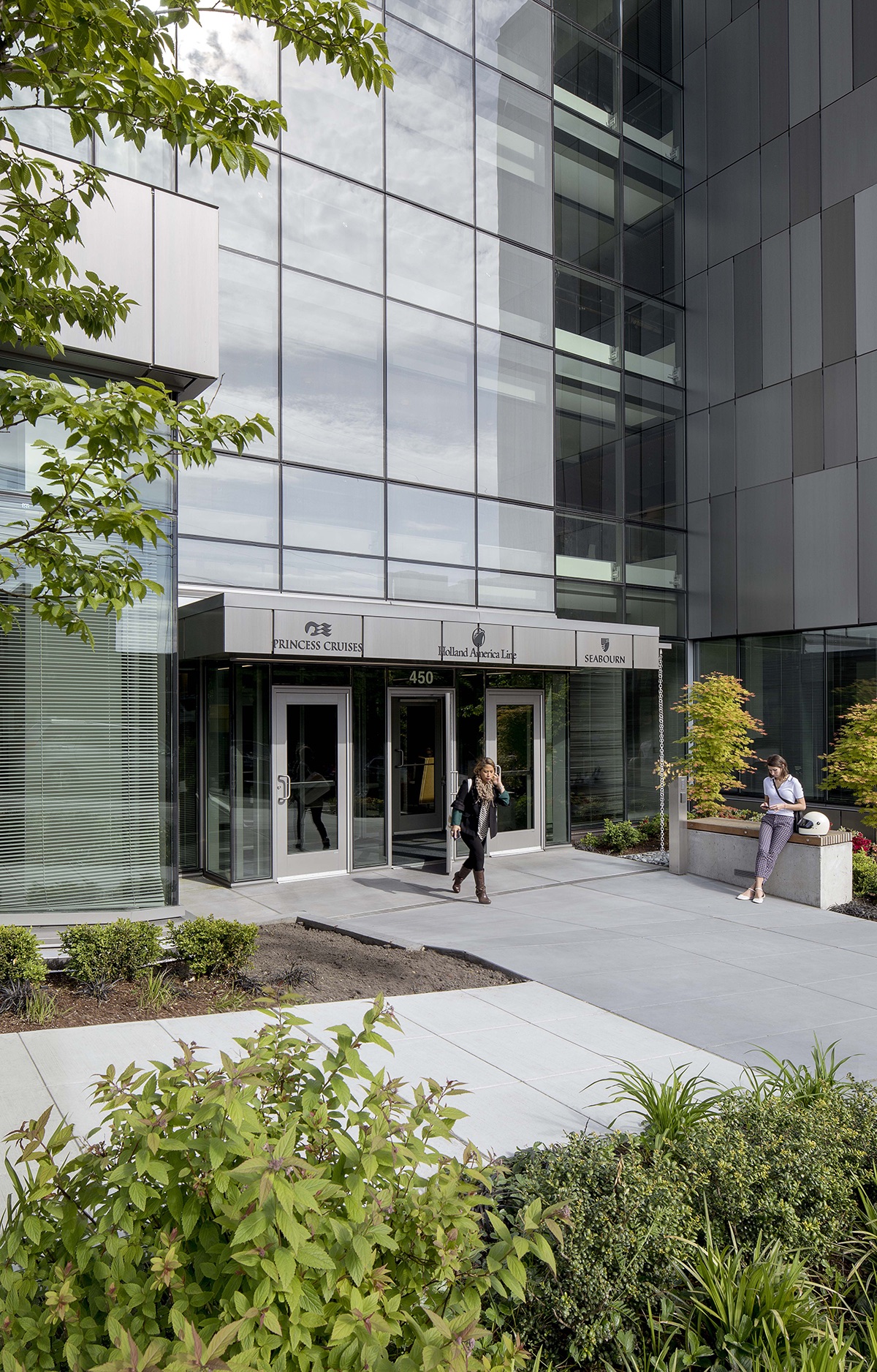
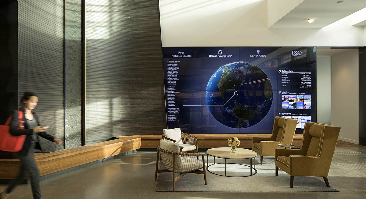
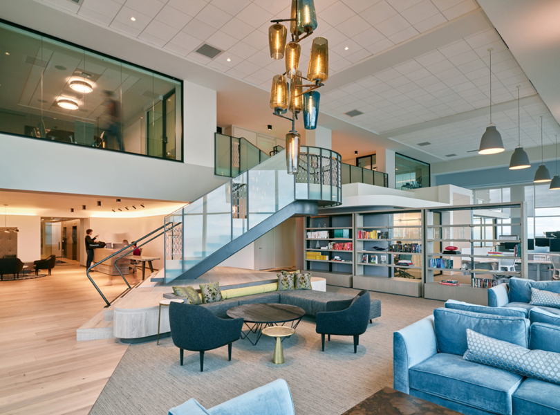
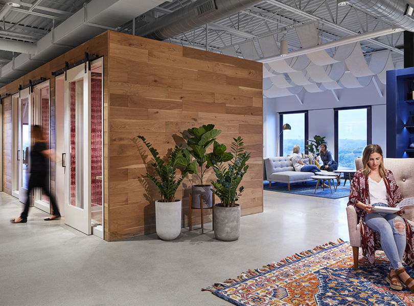
“To bring Holland America Group’s brands—Holland America, Princess, and Seabourn—into closer alignment and increase operational efficiencies, the company sought to consolidate operations within a single facility. Securing a five-story, 150,000-square-foot building near Seattle’s waterfront (a building that was still in design), provided the opportunity to realize their vision in built form. Holland America Group, originally founded in 1873 as a Dutch shipping line carrying both freight and passengers—and instrumental in transporting hundreds of thousands of immigrants to North America—is the embodiment of global travel. The spirit of adventure, an important part of the company’s DNA, is reflected in the design of its headquarters; a setting that embraces creativity and the cross-pollination of ideas. This sense of exploration and discovery begins in the reception area, which captures the spirit of a ticket office or a hotel’s concierge desk. Adjacent waiting areas provide comfortable seating decorated with subtle cues to travel, including a compass rose etched into the center of the atrium’s concrete floor. A digital, wall-sized global positioning display provides up-to-date locations of the company’s fleet, while brass nautical clocks in the sitting area reference the company’s ports of call. According to co-designer Shannon Gaffney, “We felt the space should feel like Holland America without having to see a graphic or logo. We come from the school of thinking that brand should be woven throughout the space versus a tack-on afterthought. Given that, we unearthed unique aspects of the Group’s brand that allowed for design elements such as lighting, material selection and furniture to achieve the right look and feel.” Previously siloed and scattered throughout the city, the new headquarters is conceived as an open-office environment, encouraging communication and collaboration between the company’s brands and their 950 employees. Critical to the workplace design strategy is the concept, “alone together,” an approach to space that acknowledges a person’s natural desire to work independently, yet be near others. A robust variety of meeting and social gathering spaces supports this idea, as well as a technology network that ensures full connectivity throughout the building. Changes to the building itself, which was originally designed for multiple tenants, included opening the atrium to each of the floors, and inserting a catwalk that floats through the atrium, to better connect employees to each other and to the city and Puget Sound. The open, five-story atrium brings daylight deep into the building interior and enables circulation between floors to become a visible and desirable form of movement for employees. Open to each floor, an interconnecting stair—composed of teak stair treads and handrails, wood paneling, and glass railings—dramatically connects the floors and symbolically links the brands within the company. A four-story-tall feature wall, featuring abstracted portholes aligning with each floor of the building, partially clads one side of the atrium. From the lobby, the rhythm of the portholes draws the eye upwards to take in the entire volume of the space, while the portholes themselves frame views of Elliott Bay and provide visual orientation throughout the office. Light fixtures, placed at one-fathom intervals, wash the feature wall with light and serve as a nuanced reminder to the maritime nature of the business. A water feature flows from a pool on the second floor down to the lobby, providing a subtle auditory reference to the brand. Blurring the line between hospitality and work, furnishings are both comfortable and informal. Hubs, located on each floor, provide a range of seating options to satisfy the desire for social engagement, while more isolated touchdown areas provide opportunities for quiet reflection. Hotel-esque settings suitable for impromptu meetings and alternative work places are the norm. The entire office is treated as a merger of work and hospitality, a literal and figurative testing ground where staff are encouraged to seek out the best possible work environments. “Collaboration is important, but ideas come from individuals. As such, we’ve found that space to focus, concentrate, and decompress within the workplace is important. We looked for opportunities to incorporate this into Holland America’s new headquarters, spaces where you can feel the energy of the group, but be protected and have enough privacy to do your own thing. The end result is that Holland America has an assortment of intimate spaces within public areas. Structures inside structures. Edges between the social and private space. The response has been fantastic and we’re very proud of that,” notes co-designer Shannon Gaffney. Circulation paths integrate cozy eddies where staff can meet in formal and informal settings. Fixed workstations feature customizable, personal storage elements. Daylight, from the atrium and expansive glazing, is in ample supply throughout the office, while building amenities such as locker rooms and showers, are generous. The cafe, located at the top of the building, affords a prime view of Elliott Bay—where company ships regularly put into port—a place where all staff are able to enjoy the best seat in the house.”
- Location: Seattle, Washington
- Date completed: 2017
- Size: 150,000 square feet
- Design: SkB Architects
- Photos: Jeremy Bittermann
