A Look Inside Confcooper’s Minimalist Headquarters in Rome
A team of architects and designers from Italian architectural studio It’s recently completed a new office design for Italian organization Confcooper in Rome, Italy.
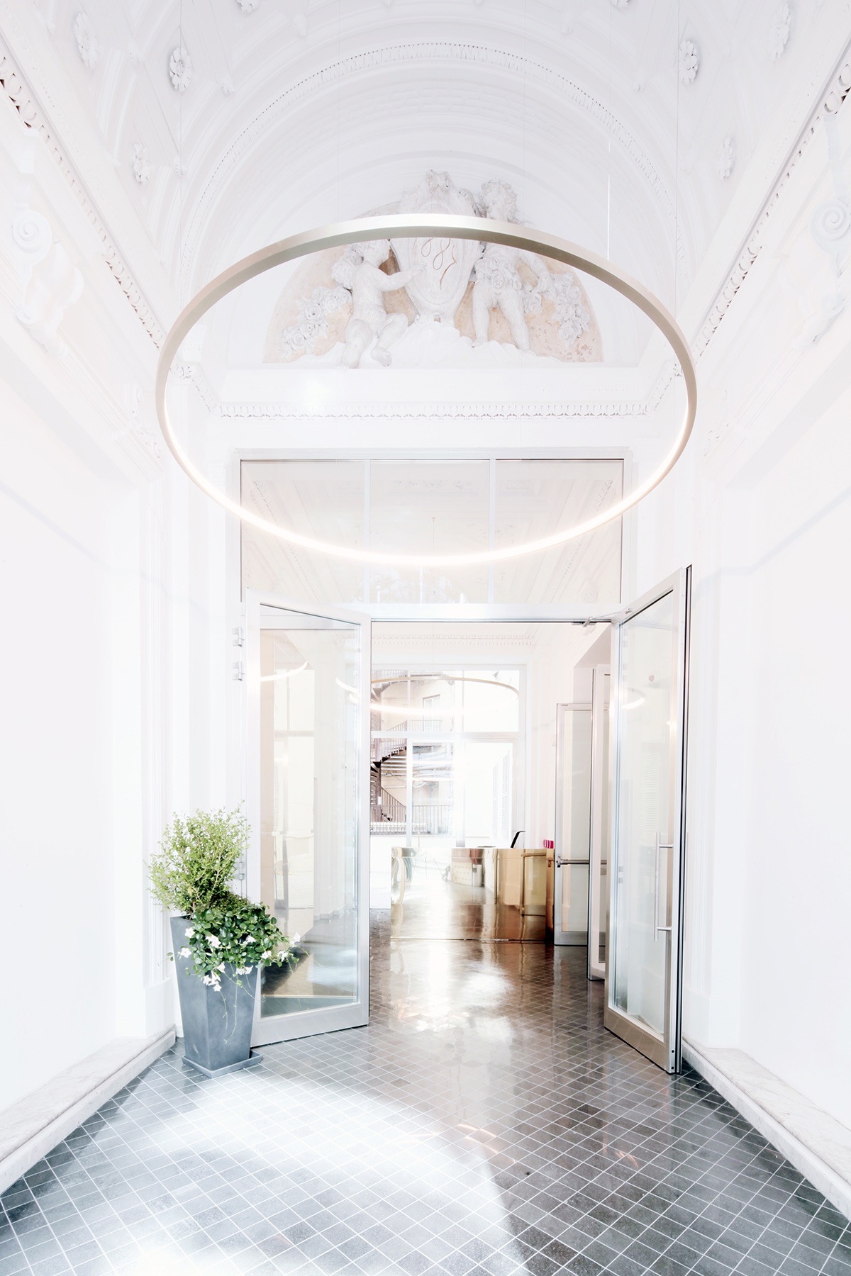
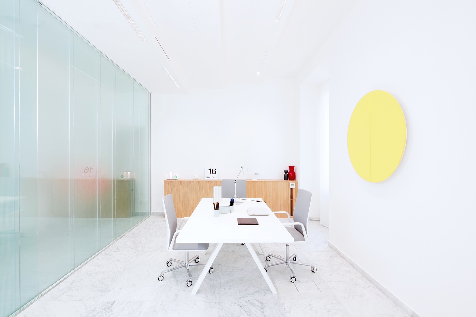
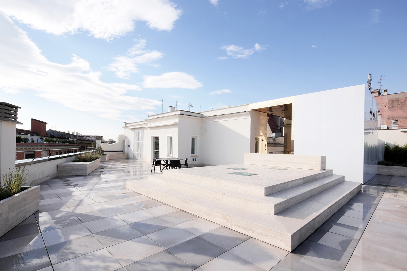
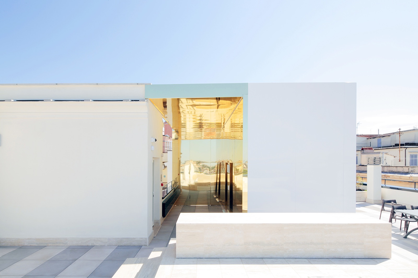
“The design by It’s defines a balance with respect to the different periods that co-exist in the building, creating a dialectic between the original nineteenth century elements and the more contemporary ones. The project constantly deals with two different eras: the historical aspect, retrieved by restoration of its original structure – freed of all the elements that had later compromised that identity – and the contemporary, introduced by means of the construction of new architecture. Areas of historic walling alternate with thin glass walls and classical materials such as
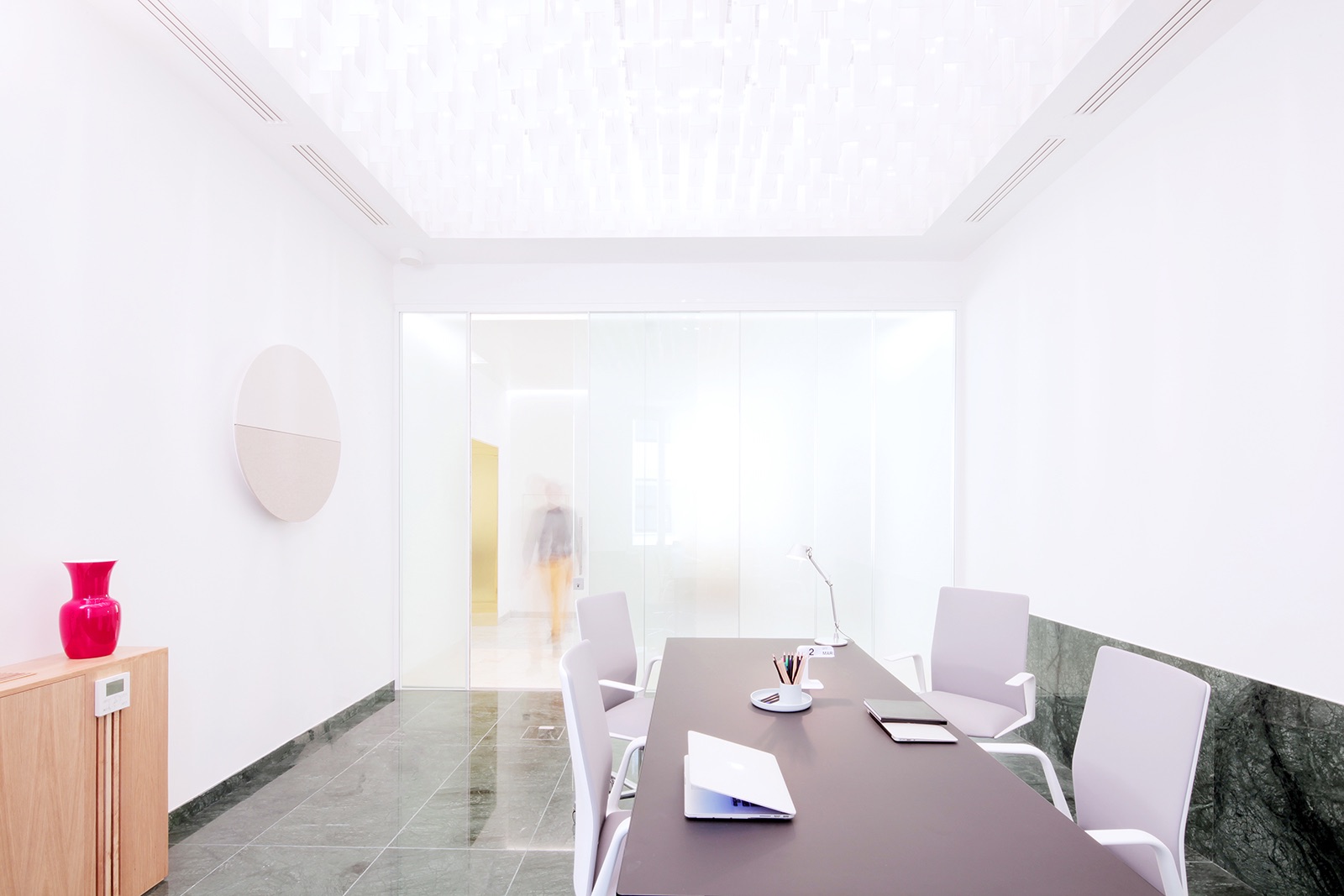
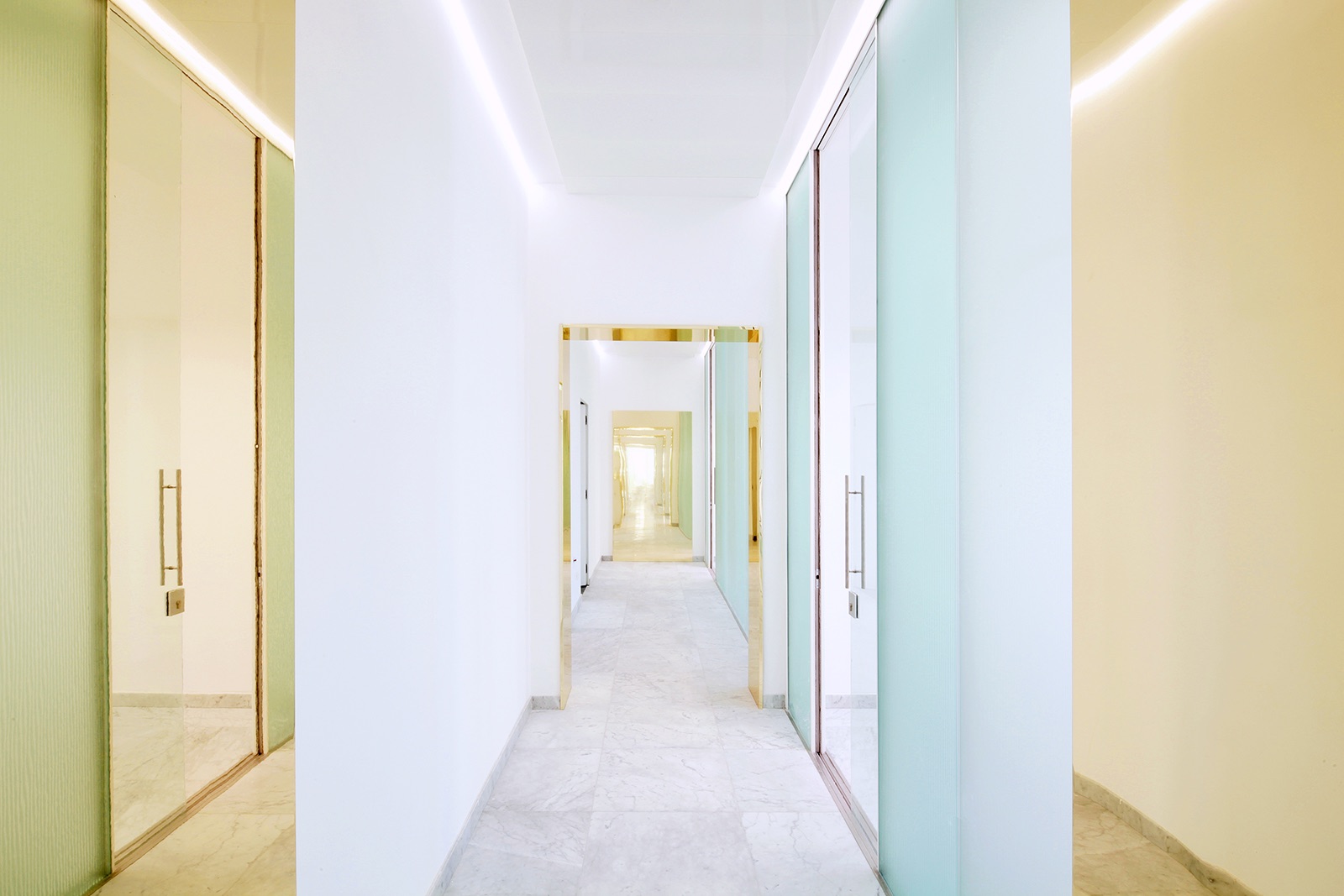
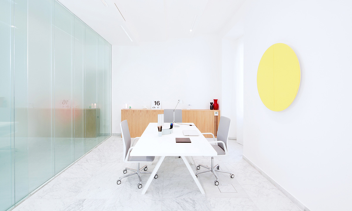
marble are placed alongside new light materials such as reflective aluminium; a vertical green wall highlights the geometry of the stone courtyard. The project has provided the opportunity for research and experimentation in the improvement and restoration of heritage using the BIM approach, which has been central to all phases: from design to management of site elements and on to the future management of the building. BIM was used to elaborate the design project and to plan and run the construction site: added to which, by means of the data-filled model it is possible to follow the life of the building during its activity and in particular document energy consumption and use of space. White Carrara marble is the prevalent material used for internal flooring, re-worked in a contemporary key in thin slabs of a milky colour, each measured, produced and numbered by means of the BIM model. The reducing process of materials also characterises the vertical dividing partitions
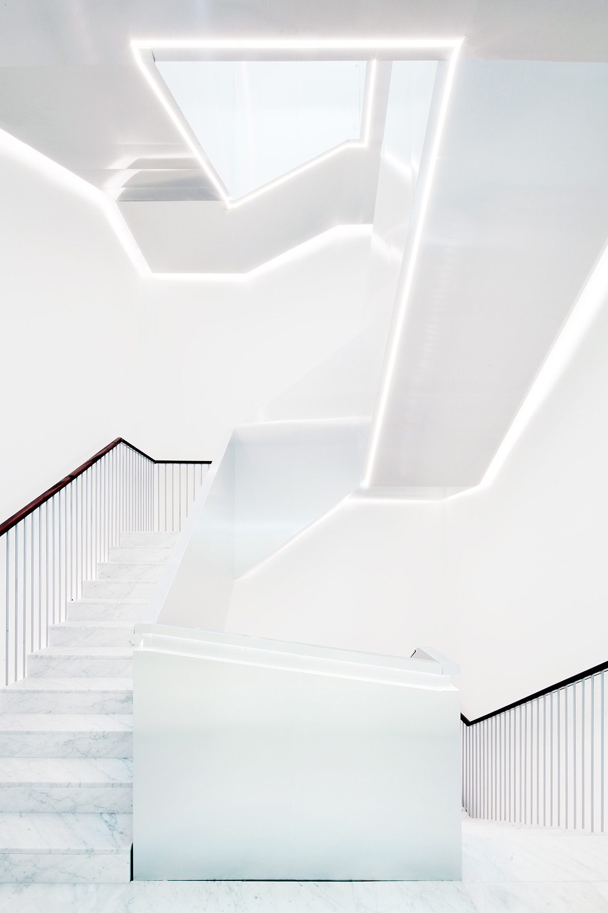
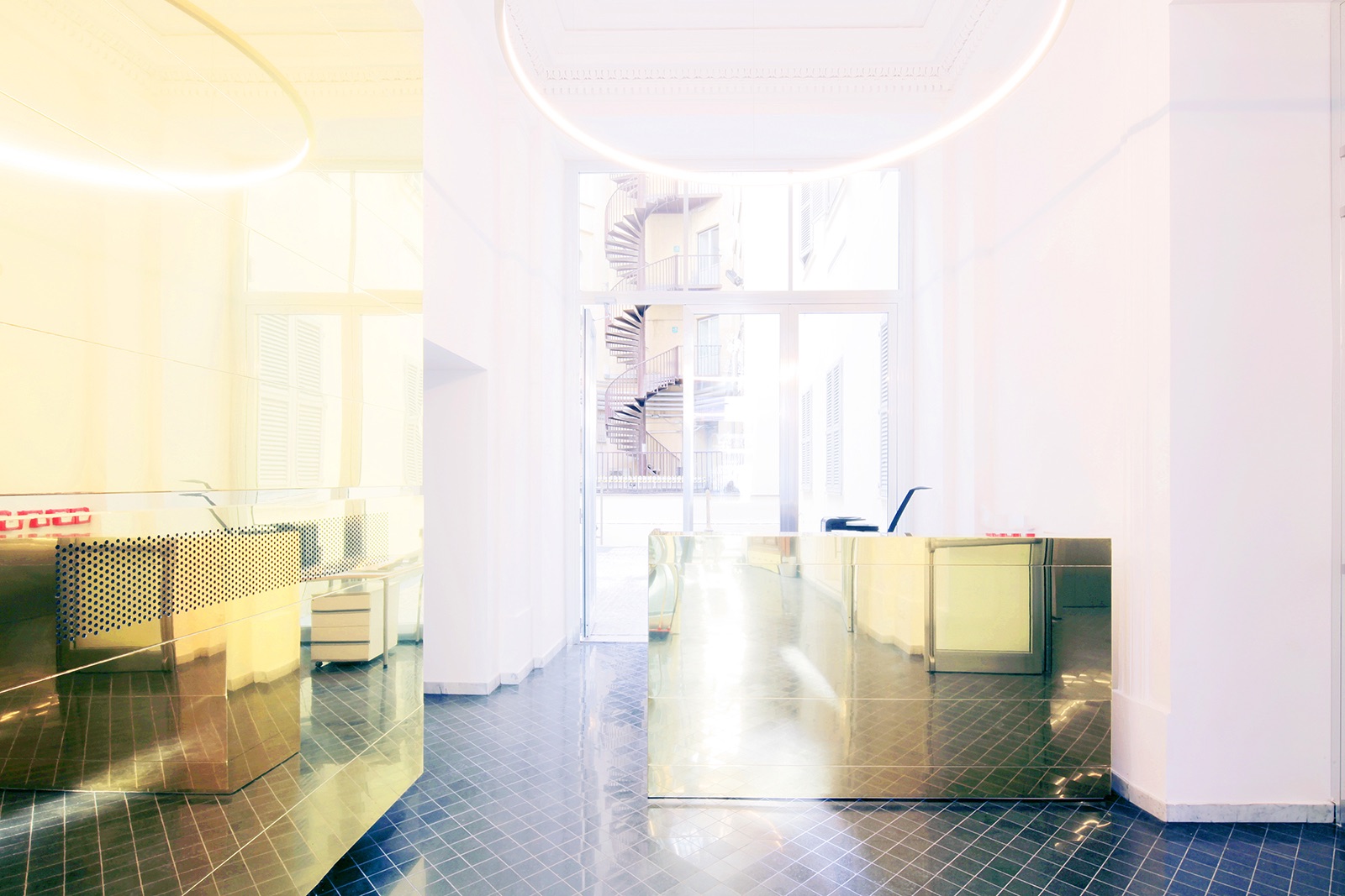
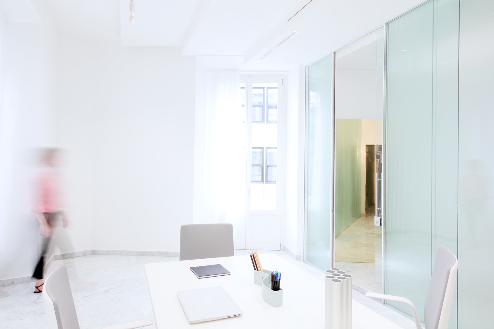
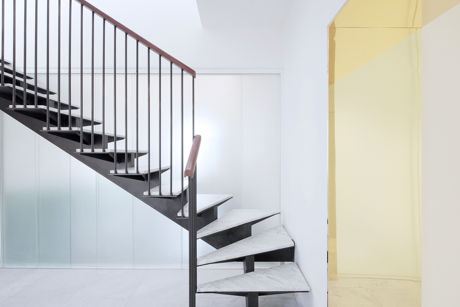
between workspaces, made of high-performance sheer glass panes that are patterned to heighten the reflection of external light into the internal areas of the building and to create a pattern that affords visual privacy to single offices. The internal light was planned and assessed through simulations as part of the BIM model, permitting analysis of the best relationship between natural and artificial light. From a vertical point of view the spatial re-design hinged on the position of the original staircase, substituting it with a strip of white marble and reflective steel to unite the various floors. These elements were assembled off site and each panel finished in steel was geometrically checked and laser cut using the digital model. BIM also guarantees constant dialogue with the building, likening it to a live and active organism, and rapidity of construction times: 15 months from the beginning of the project to completion. So the site takes on a new digital dimension integrating artisanal experience and skill with technological innovation. The density of nineteenth century construction brings with it the complex theme of how to capture light and make it reverberate. Adopting an approach that was in part inspired by the architecture of Luigi Moretti reworked in a contemporary key, the design aimed to send diffuse light through the interiors and spread it by every possible means: through the materials and chrome finishes as well as the design of the area. White marble from Carrara is the chosen material for internal flooring, re-elaborating it in a contemporary style by a reduction in the thickness of the slabs; Alpine green marble and Portugal pink marble mark out the common parts of the building, clearly identifying areas for collective use with a polychrome theme. The organisation of space was also redesigned in the vertical, using the position of the original staircase while substituting it with a strip of white marble and reflective steel, connecting the different floors that rise to the building’s terrace, designed as a hanging garden opening onto the horizons of the city,” says It’s
- Location: Rome, Italy
- Date completed: 2018
- Size: 44,132 square feet
- Design: It’s
- Photos: Francesco Mattuzzi
