A Look Inside Macquarie’s Modern Beijing Office
Architects and designers from architecture and interior design firm CUN Design have recently completed an office renovation for research and development firm Macquarie in Beijing, China.
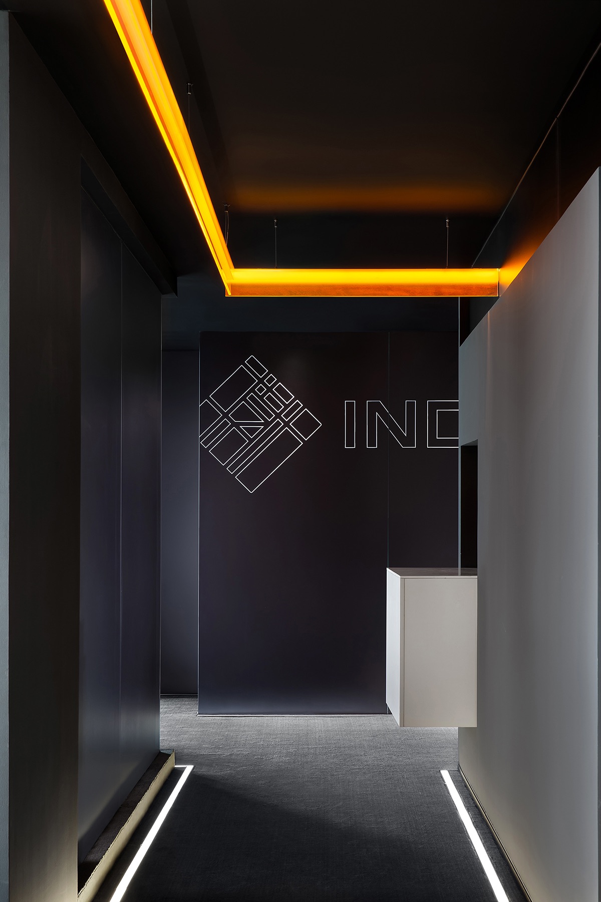
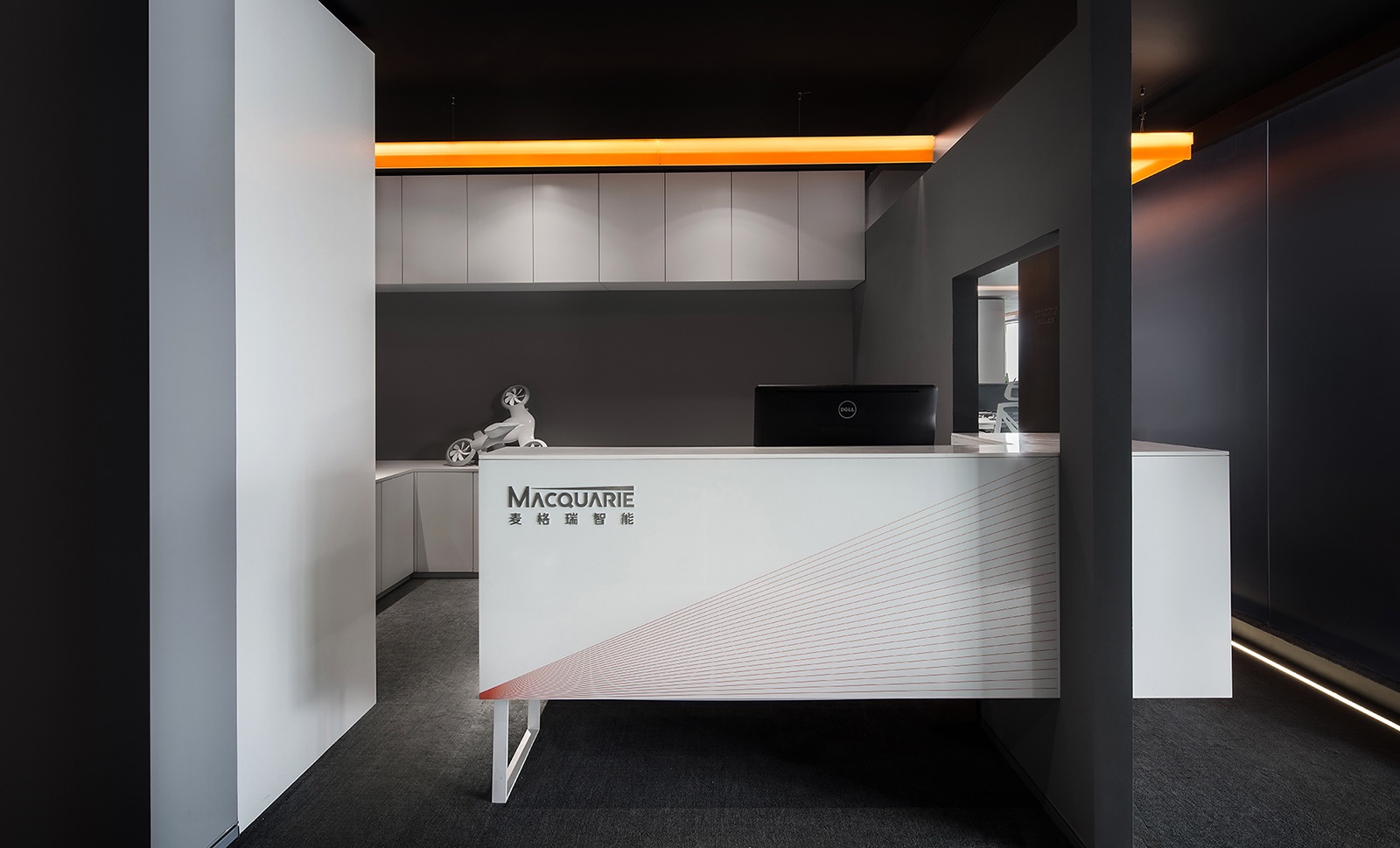
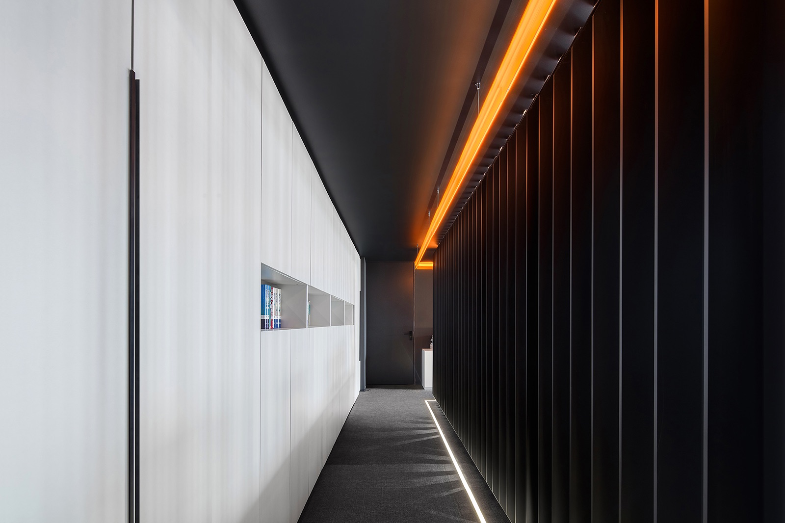
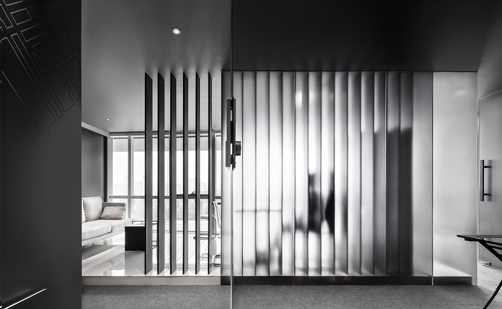
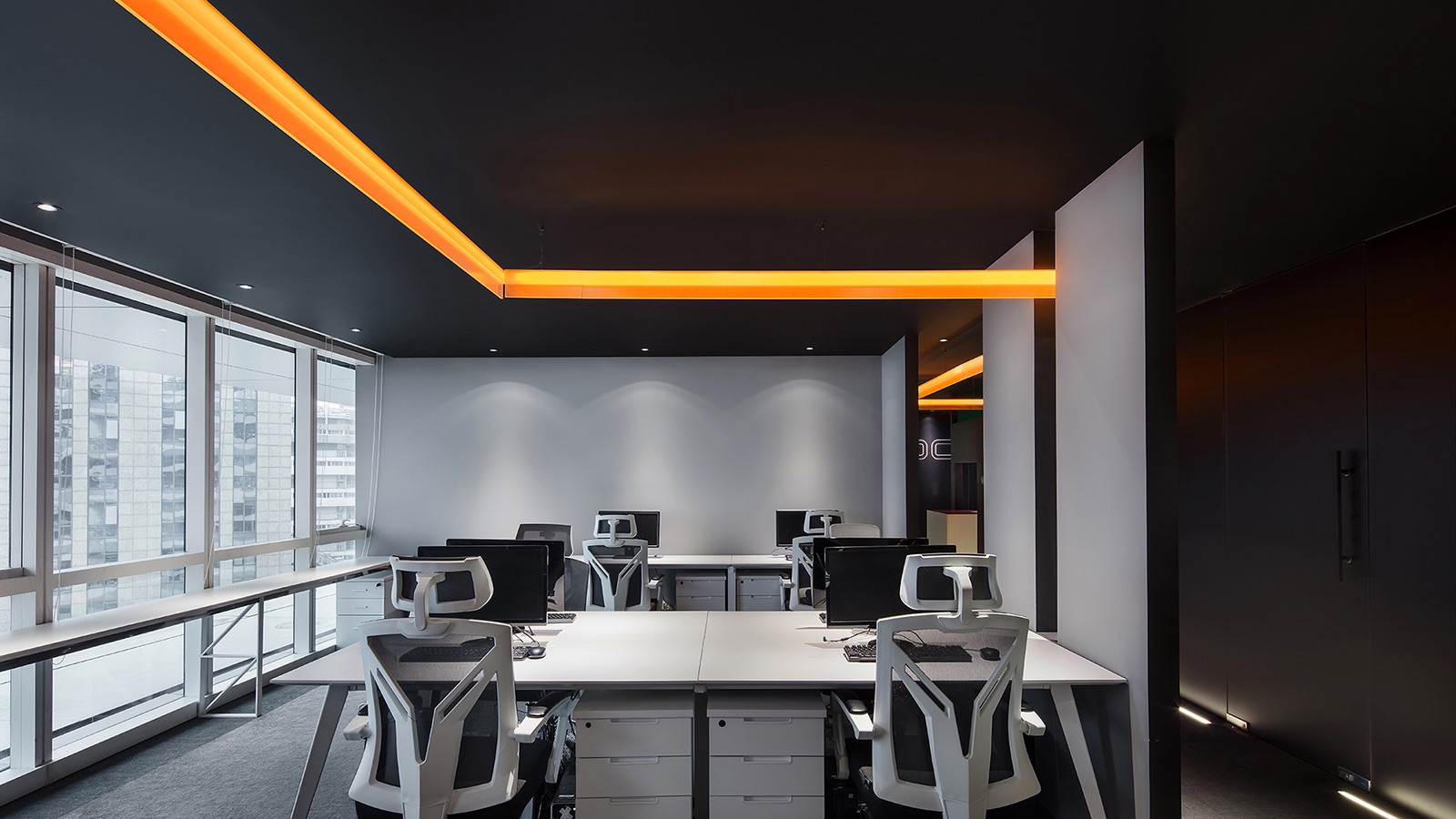
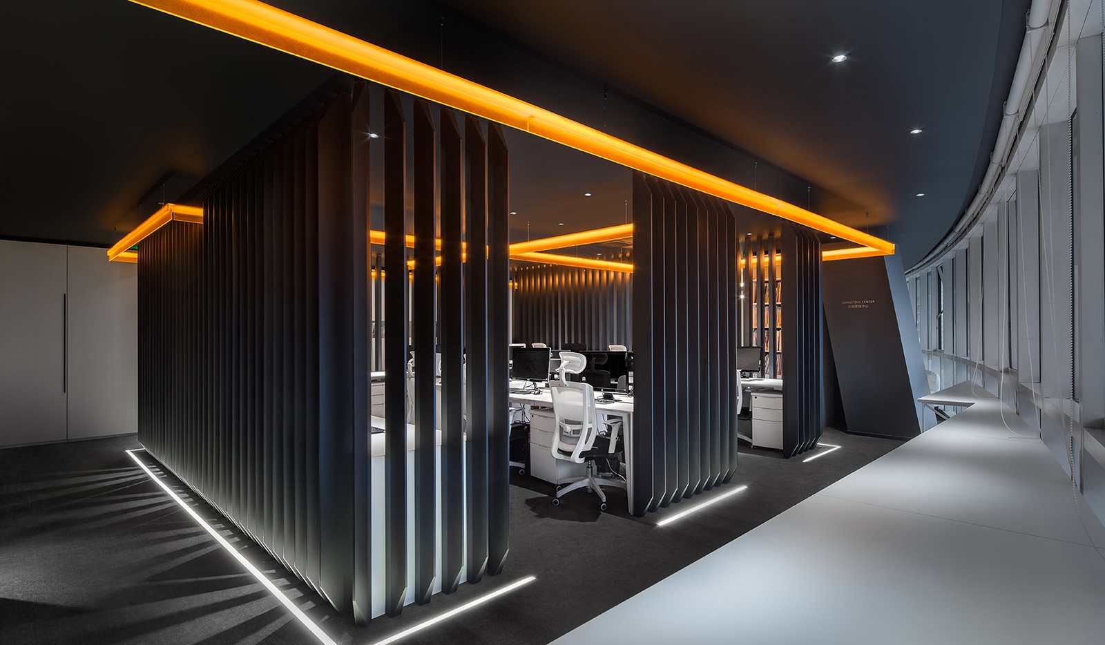
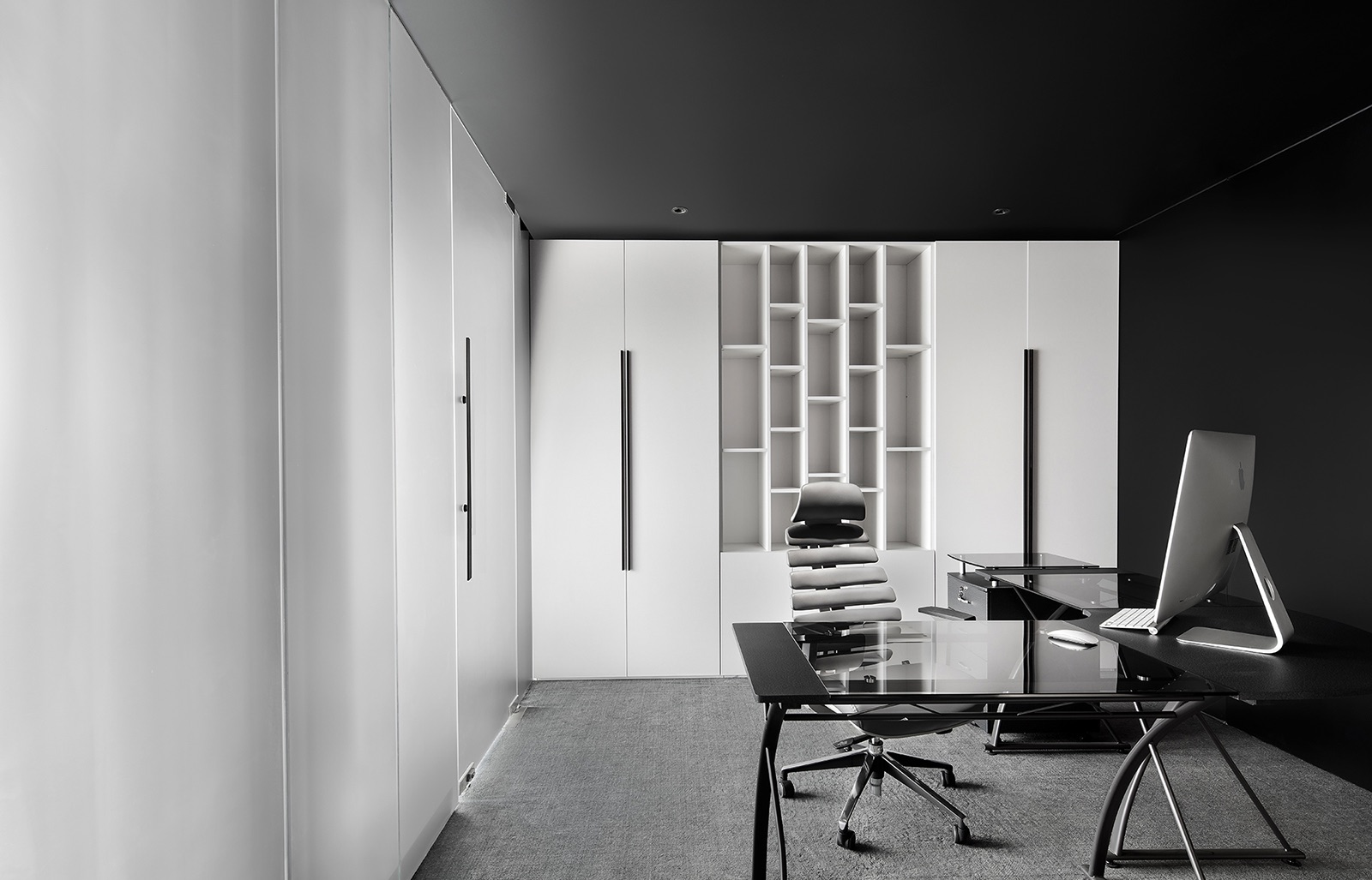
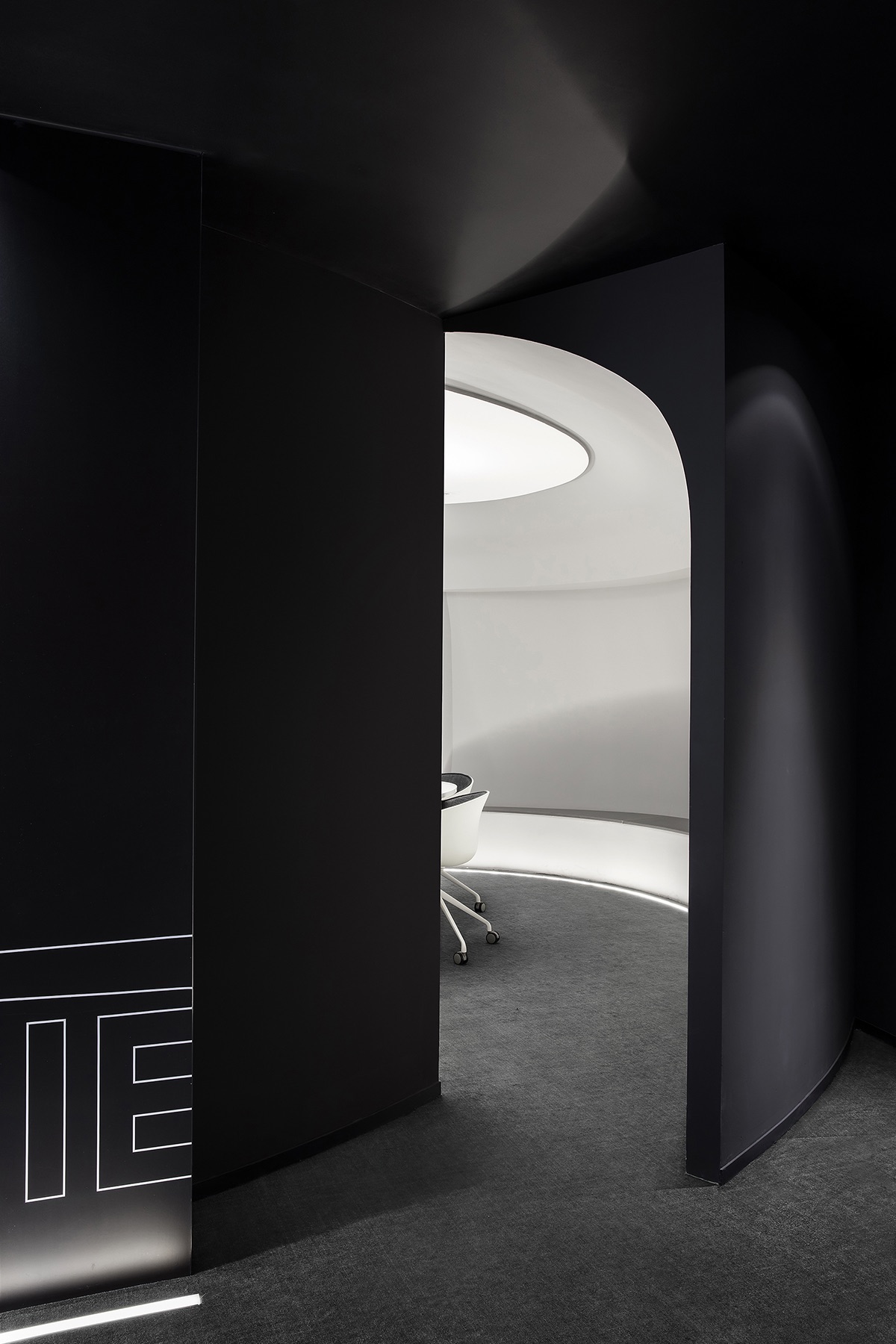
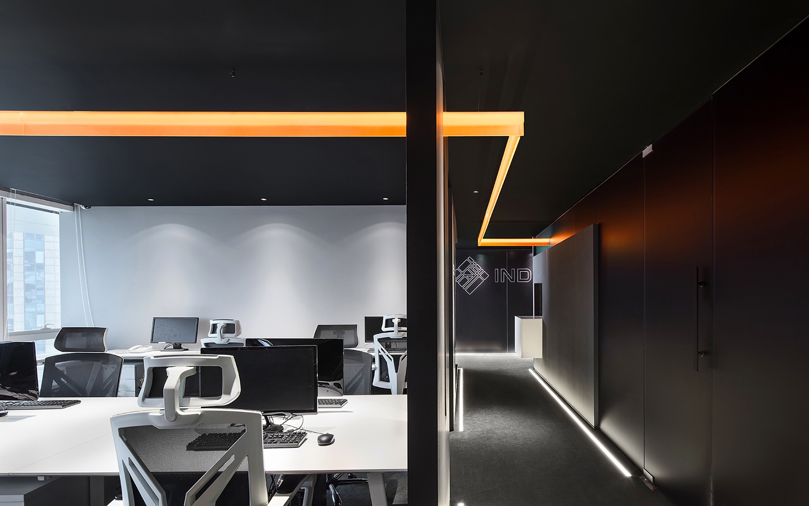
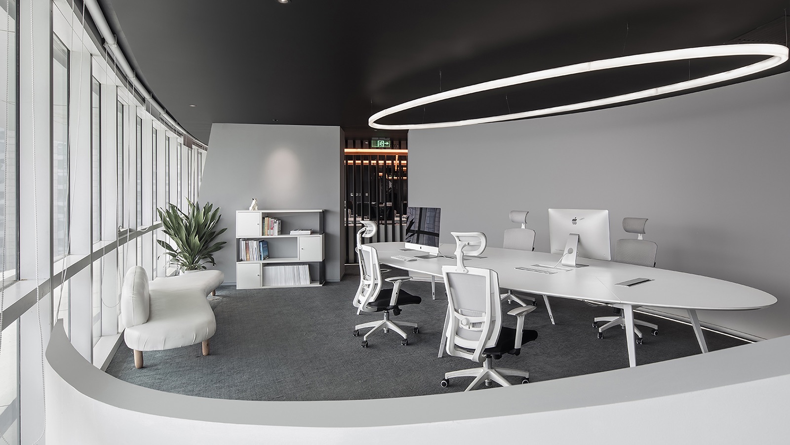
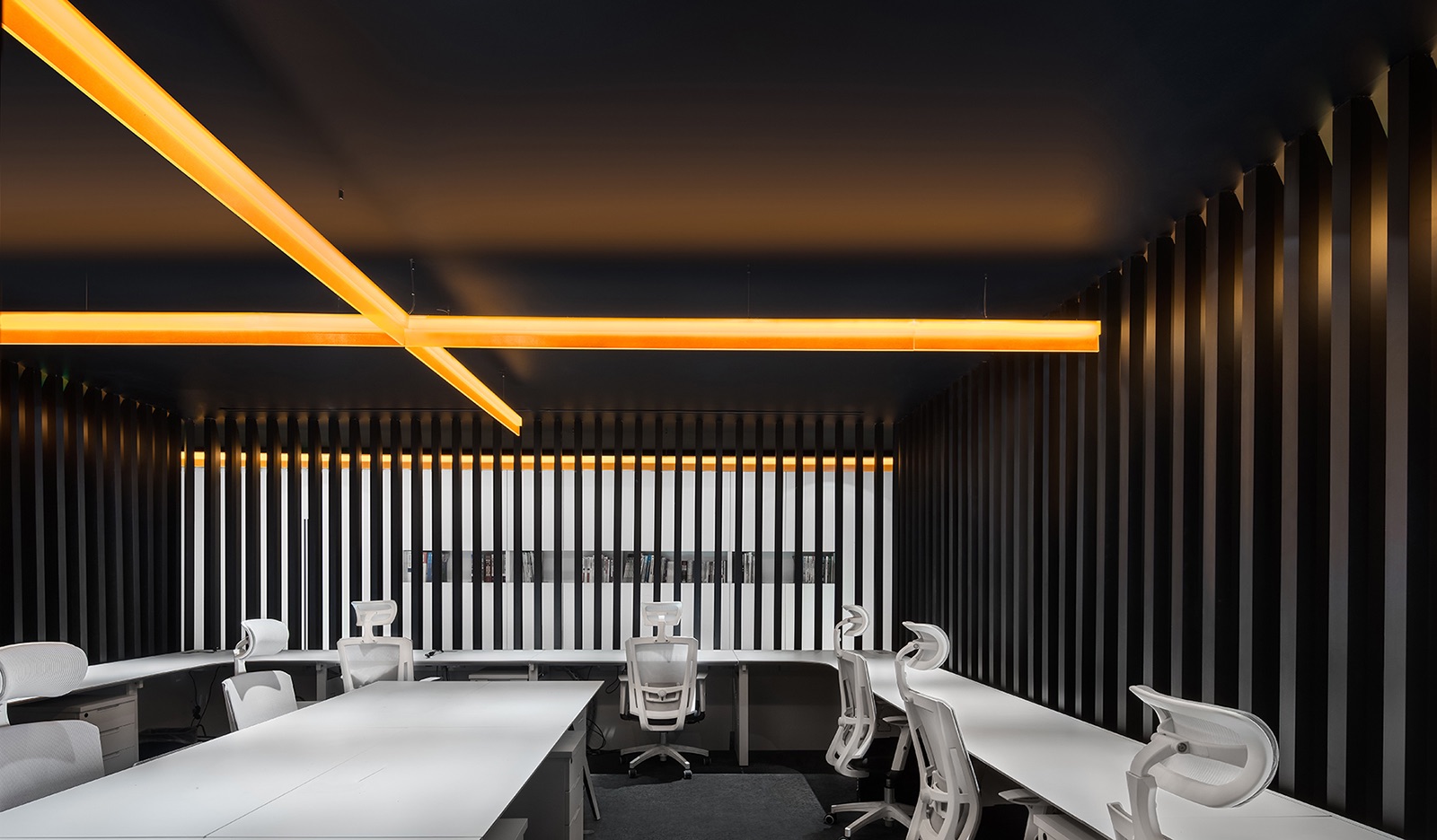
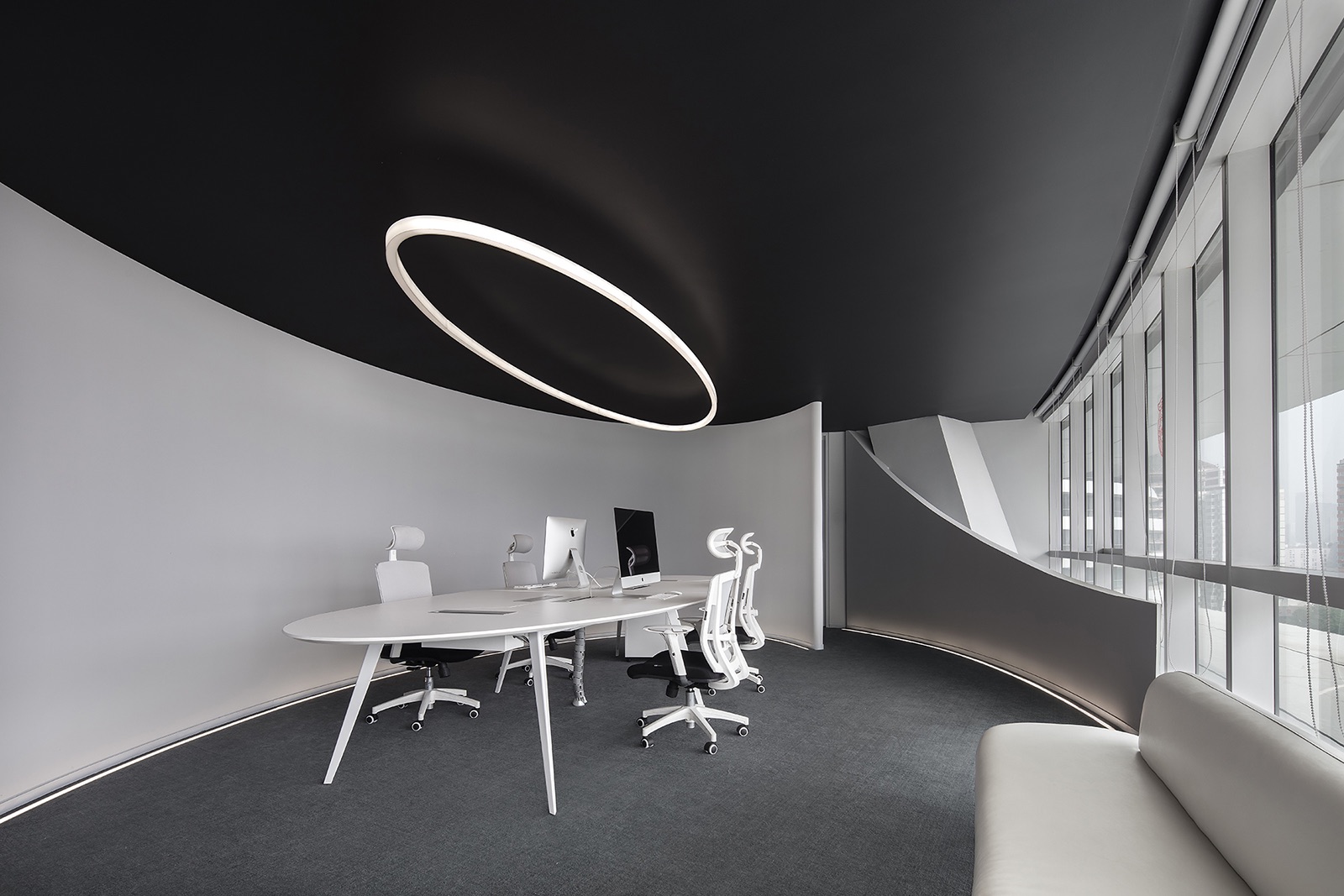
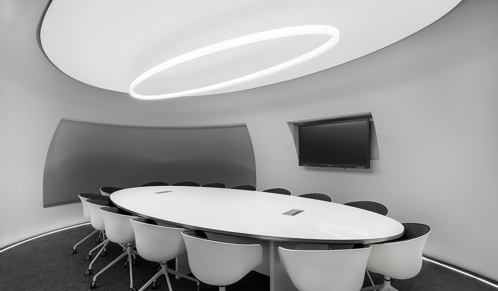
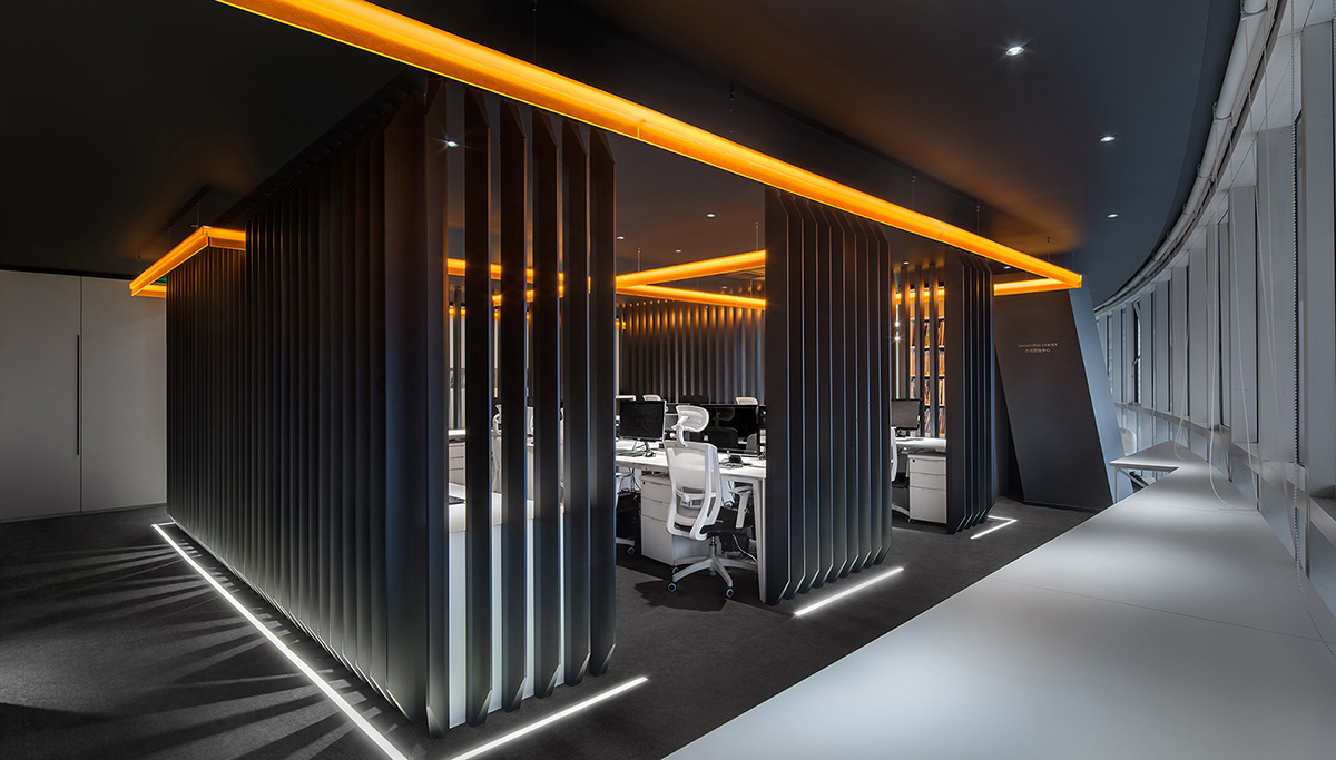
“At the beginning, we visited the original R&D Centre, a 400-square-meter workspace consistingof three independent spatial units. It is situated in GALAXY SOHO, a landmark designed by Zaha Hadid Architects. The overall architecture features special and striking shapes, which resulted in irregular open plan spaces, hence bringing difficulties to our work. First of all, the plan has a curved shape, so it was hard to find a straight wall or divide the overall space into several square ones. Besides, the fan-shaped plan also made it difficult to arrange straight circulations to partitionthe space. It was a great challenge which we had to solve. What’s more, the ceiling air conditioning andbeamscaused a relatively low ceiling height, only 2.1 meters in some parts of the space. So dealing with the clutter of the ceiling in the relatively small space was also an arduous task.After identifying these challenges, we worked to figure out solutions.However, things didn’t go very smoothly. Weoverturned nearly twenty design schemesand still couldn’t find an ideal one, because we thought they were a little bit complicated.InspirationI like riding, and pay great attention to motorcycles. As we were stuck with the design solutions, an electric motorcycle concept unveiled by BMW in 2016 enlightened me. The motorcycle has the following three characteristics:-Using no traditional machines, which changed the way of assembling and restructuring; Utilizing the most prevailing materials to redefine the product;-Combing technology with interconnection, which brought some changes to the functions.I really lovethe orange element of it, like a light, stretching through the whole body of the motorcycle, and breaking the conventional structure of motorbikes.A beam of light can pass through the space and solve all the problems. So I drew inspiration from it, hoping to create an impressive workspace. Learning from BMW’s design idea, we firstly rearranged the layout of the space. We made use of the unique features of the curved spaces and endowed them with the functions for conference and discussion. And at the areas with more regular shapes, we split out several offices. At the middle of the overall space, we designed an open square working area, with the office furniture arranged in a modular way, which ensured a comfortable working space for the staff. Around this square working area, we restructured four necessary circular passageways. Each was given other different functions. It wasfrom this coresquare area that the spatial layout of the office was completed.2. For the narrow spaces left, we turned them into the foyer and corridors. And most importantly, we redesigned the circulation of entering the office. The space is enclosed and narrow at the entrance. But as going further in, it becomes more open, filled with surprises. We spent lots of time thinking about the plan, with a view to letting the daylight completely fall on each staff’s working position. Besides, we also honored the source ofthe design inspiration -BMW’s electric motorcycle concept. The entire space features textures similar to that of mechanical design works, with translucent glass, gray metals, stainless steel and plastics, very modern. At last, I integrated the orange light that I love the most into the space. Its position was not identified through careful calculation. It starts from the entrance, leads to all areas and runs through the whole space freely, creating a free atmosphere in the office,” says Cui Shu from CUN Design
- Location: Beijing, China
- Date completed: Janury 2018
- Size: 4,520 square feet
- Design: CUN Design
- Photos: Wang Ting
