A Tour of Private Real Estate Company Offices in Nanjing
A private development company from Nanjing, China, recently hired architectural firm Wei Yi International Design Associates to design their new head office.
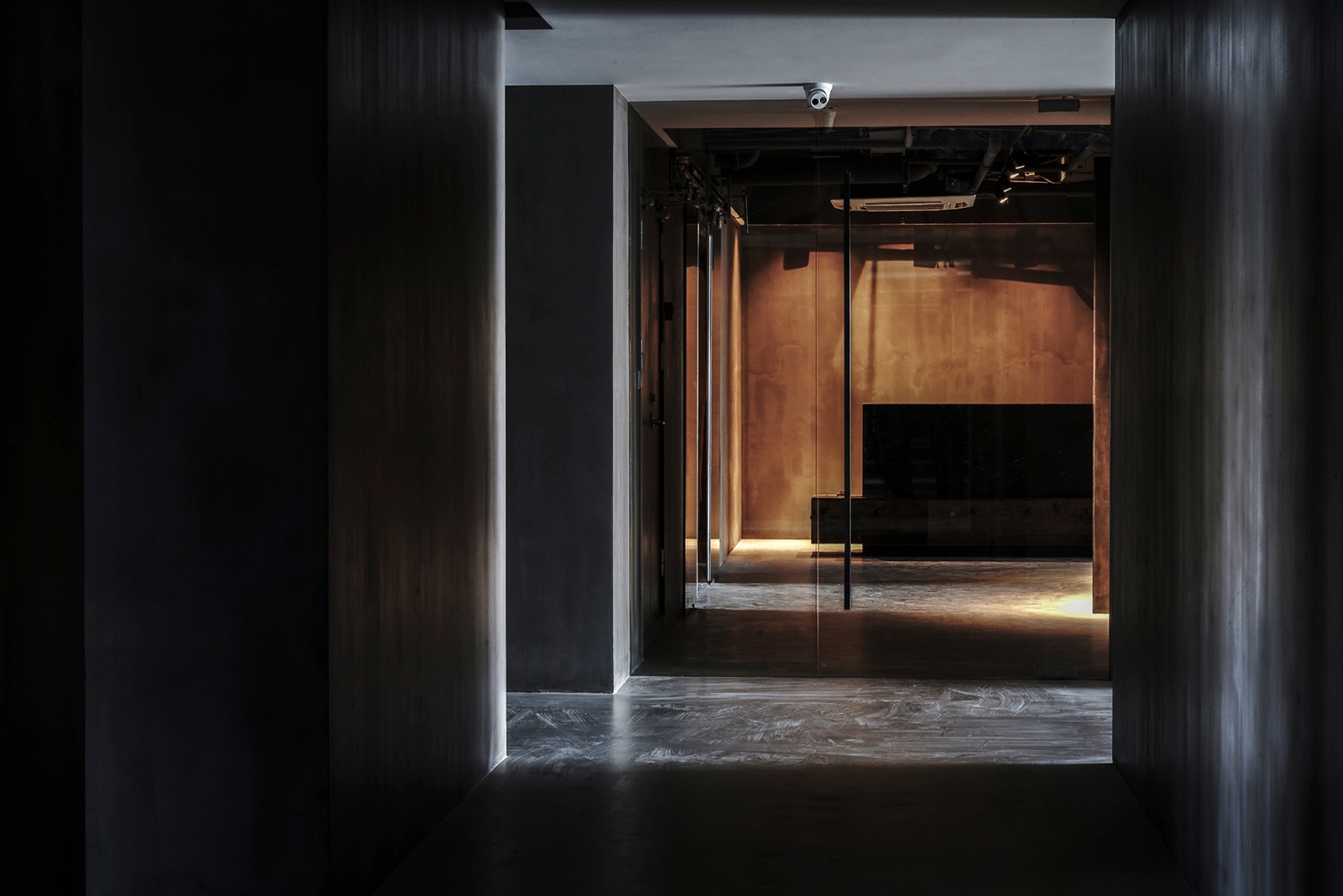
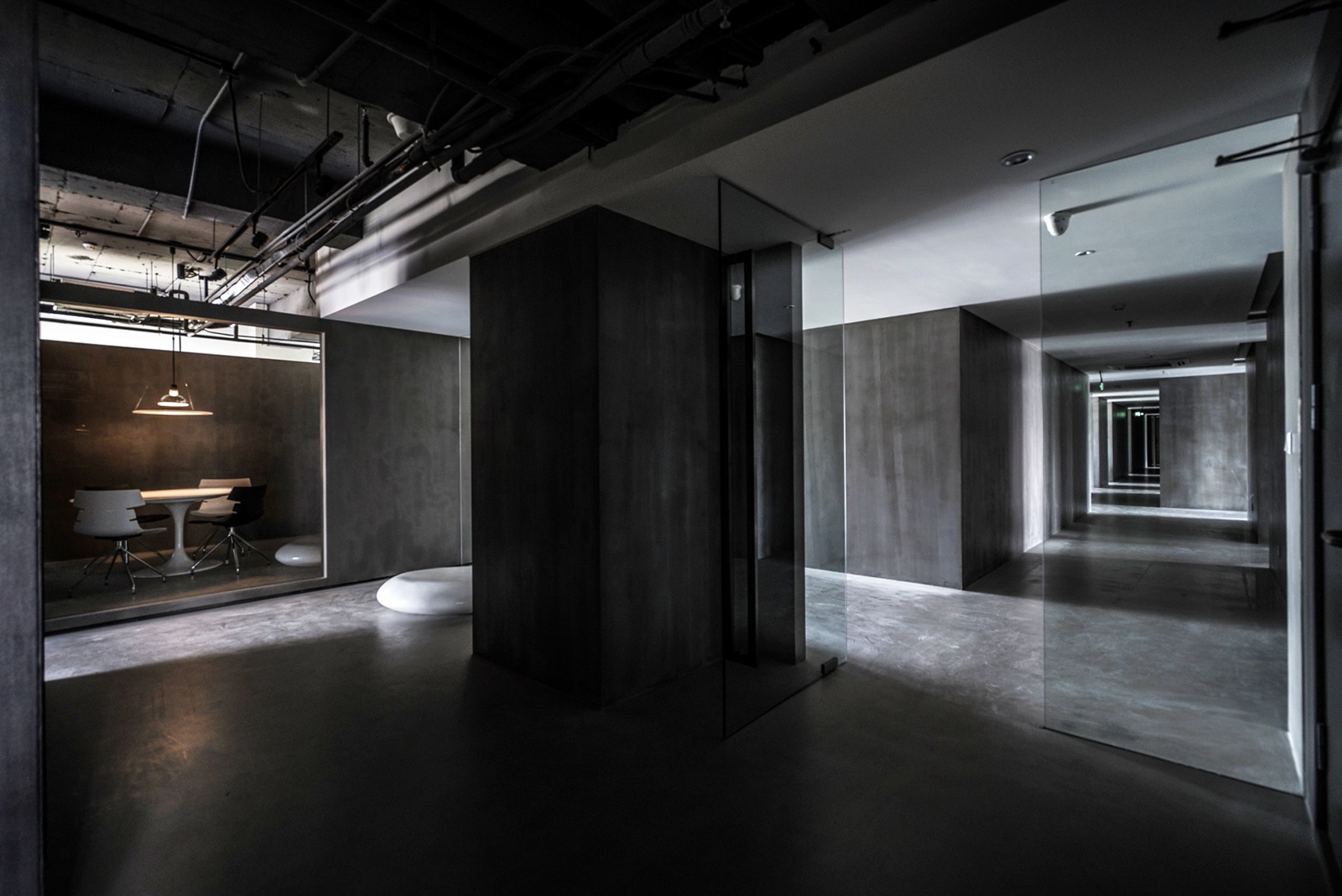
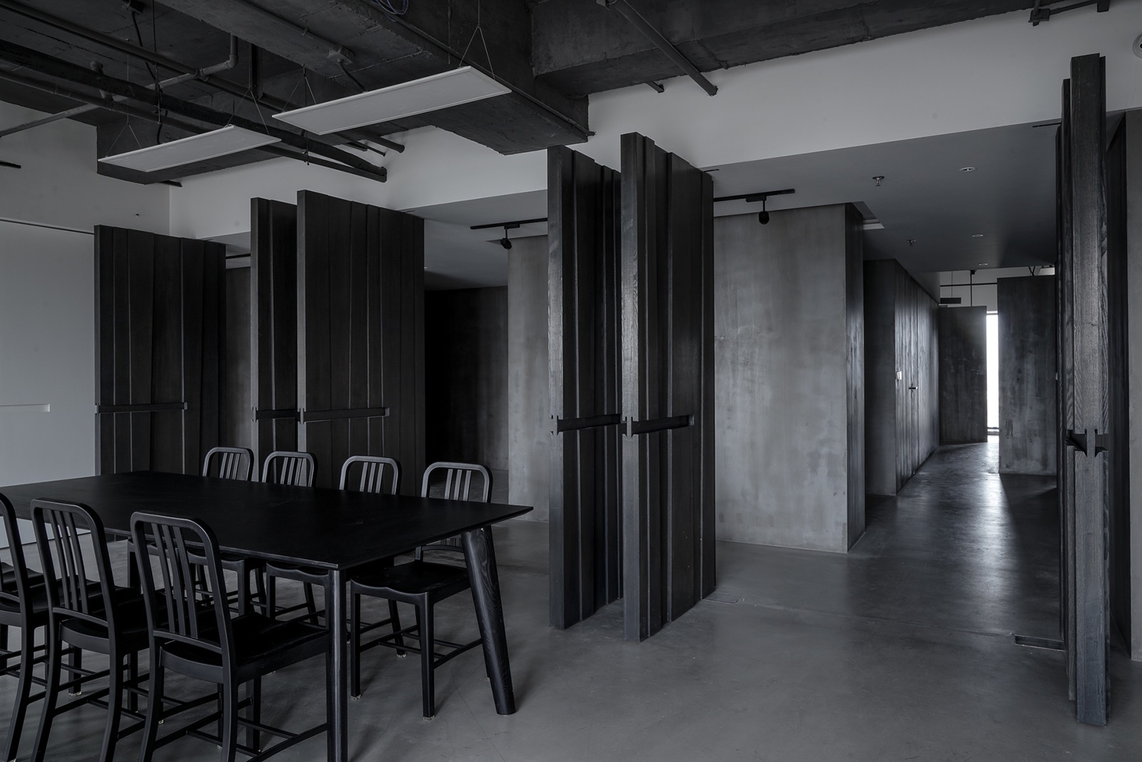
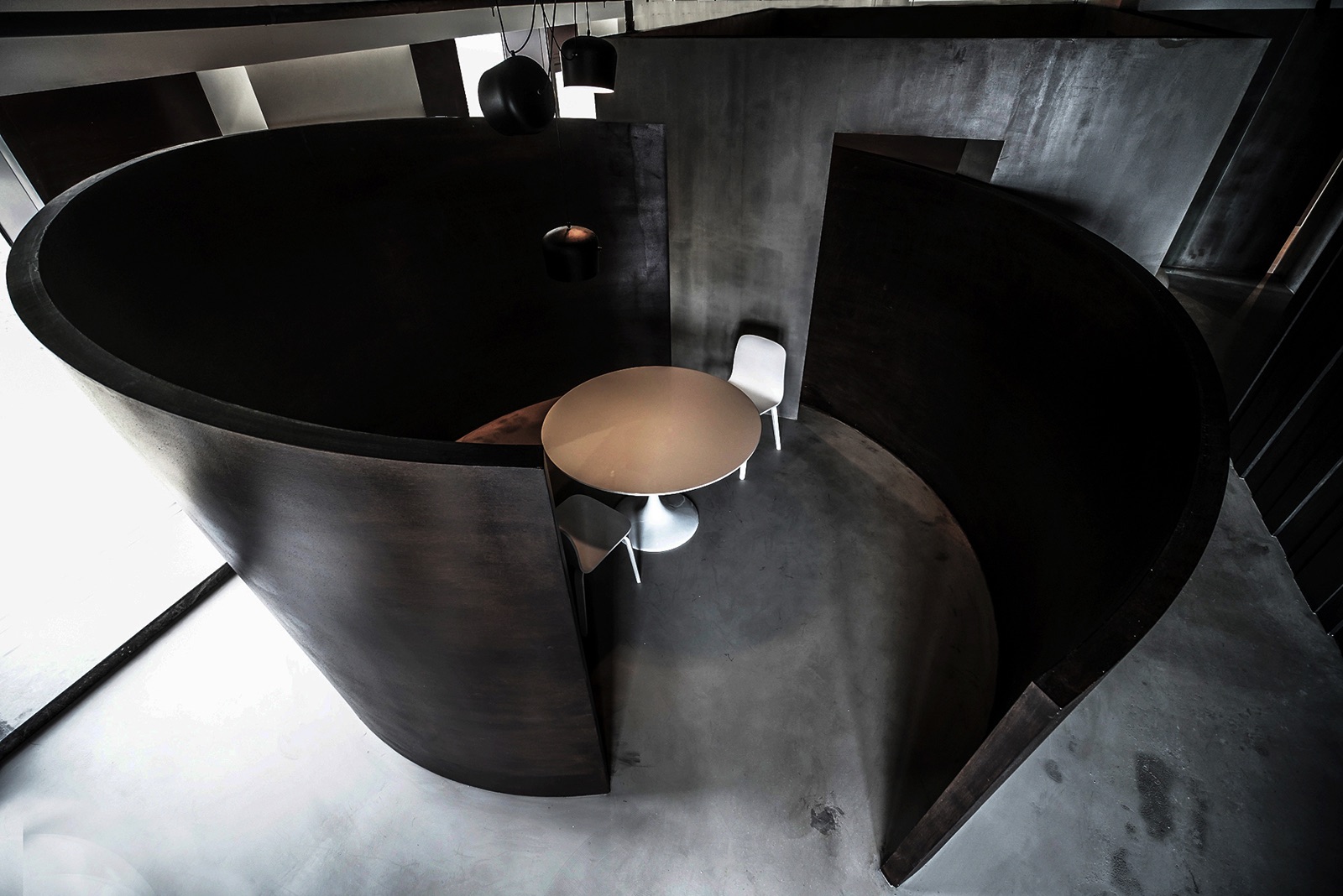
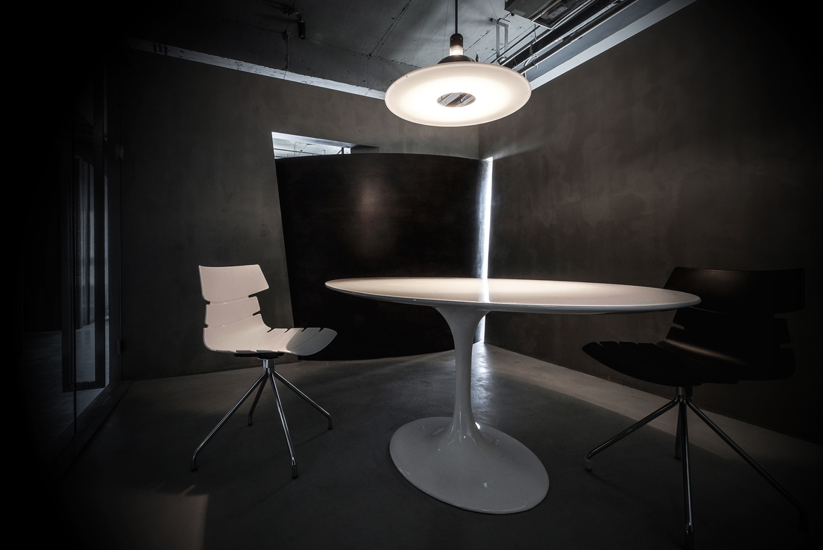
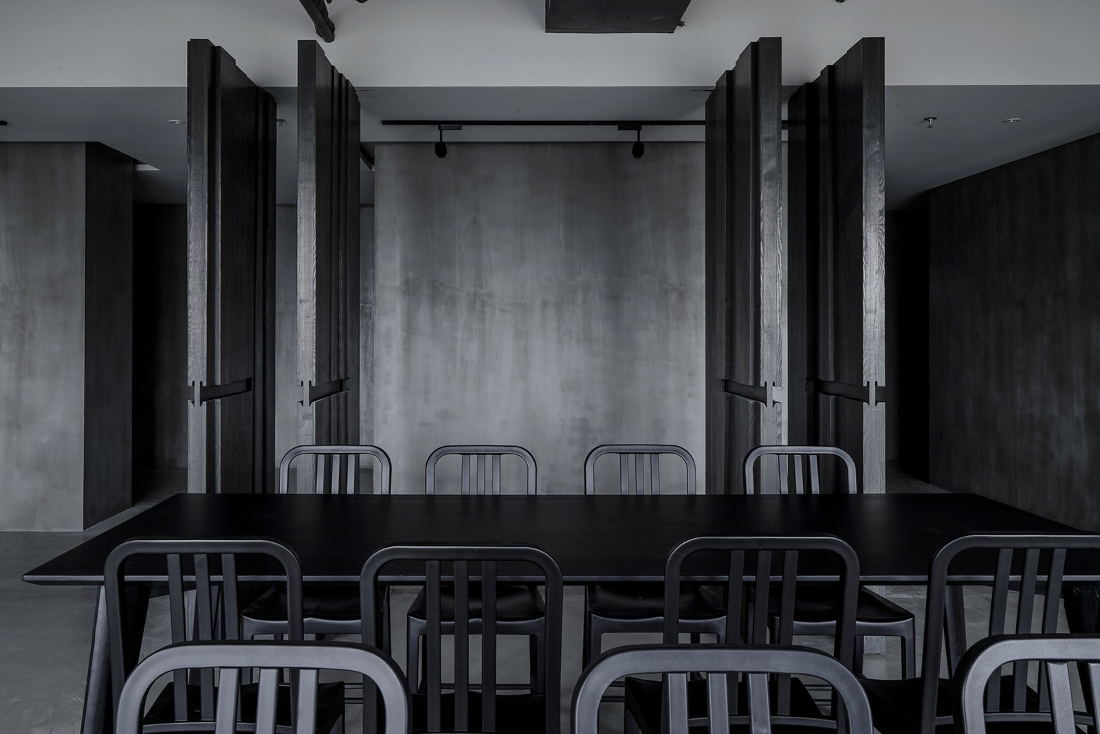
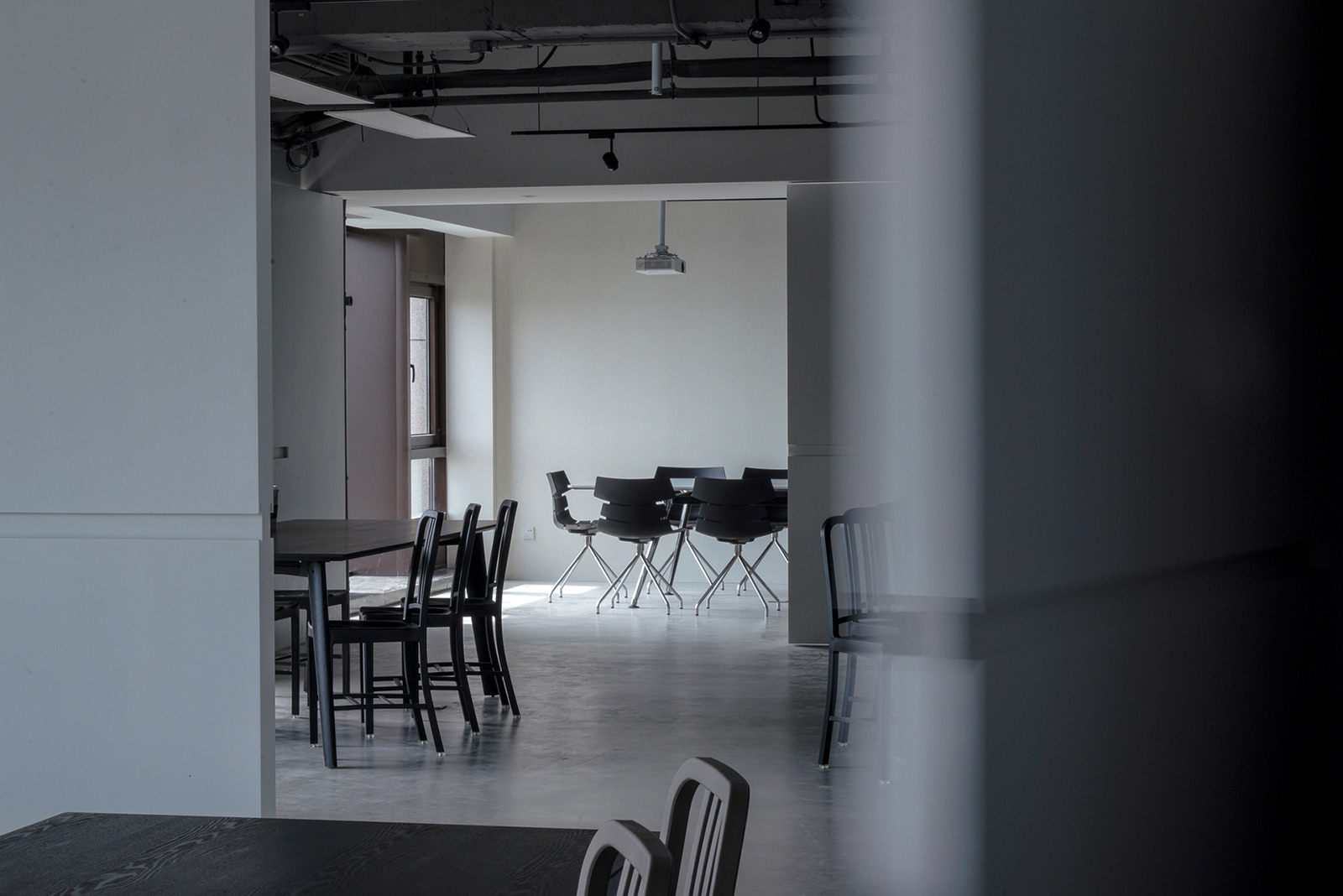
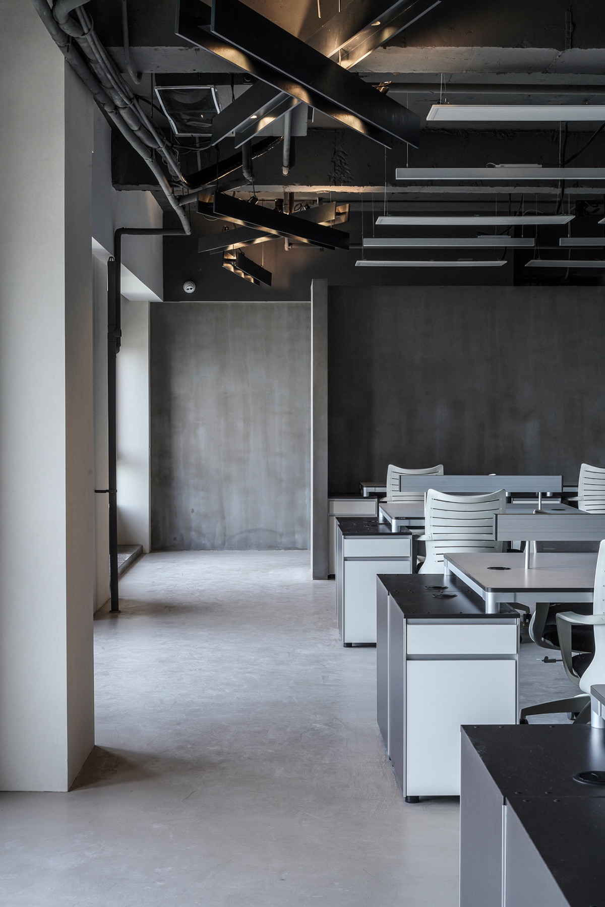
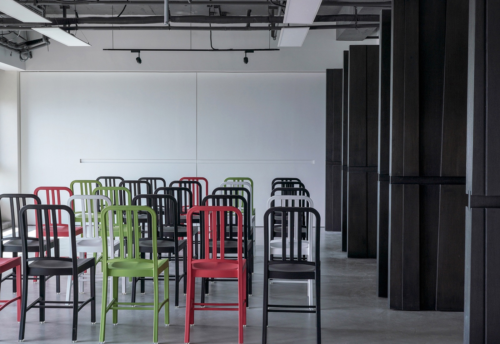
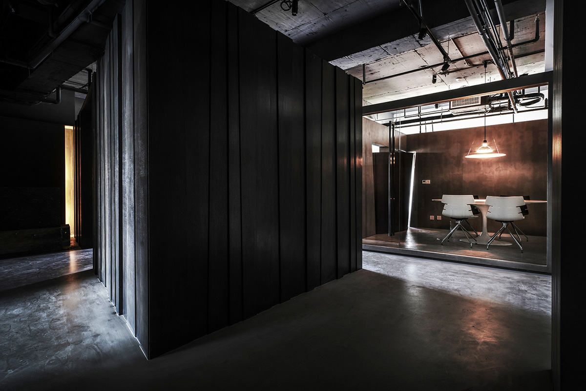
“Instead of the stereotype of office design, the designer attempted to create gallery into this office as the key feature. Moreover, the geometrical structures are the other main factor for special concept, such as circle, triangle, square and rectangular, to create areas for different function. Some divisions between different areas are movable thus the areas could be divided as well as connected depends on the occasion which brings the most flexibility. On the other hand, to enrich the variation in the office, the icon of art gallery is adopted into the space. All these ideas putting together giving interest to people walking around, making it like an easy walk in the tranquil lanes. By the main concept of geometric, every functional area was created in an box form into the space. The front counter which is rectangular, the square-shaped reception room, the circle reception area, all these parts come out the front area of the office. The roll-shaped wall for reception room goes cross through the square meeting room, describes the connection out of the isolation from each other. The cutout allows the air and light flow through these spaces. The vertical rectangular volume along the corridor gives the focus. In the main meeting room, the movable divisions gives flexibility. The pure material adopted inside to bring the original characteristic reveals the limpidity. With the reflection of light on grey factor of the ceiling, the wall and the floor, it reveals the gradation of the depth from different grey. Due to the simplity of the color and materials, the beauty of the variation of light by time are described perfectly in the space. As the lights throw on the layered structures, with the access of the pure materials, it plays the delight in the space, coming back to the origin to explain the simplity of materials. The white ceiling and the thin lighting panel come out the contrast in the dark grey space of the meeting room. Turning to the GM office, the cabinet presented as a blue square on the grey wall together with the black and red armchairs, the room is created the owner’s world out of an art museum. Breaking through the ordinary, coming from the purity of the material, the office is no longer a dull space. With the concept of an aesthetic and interesting floating gallery it comes out a unique and extraordinary result.” said Wei Yi International Design Associates
- Location: Nanjing, China
- Date completed: 2018
- Size: 9,709 square feet
- Design: Wei Yi International Design Associates
- Photos: Andrew Wu
