A Look Inside Private Financial Company Offices in San Francisco
A team of designers and architects from Jennifer Tulley Architects has recently completed a new office design for a private financial services firm in San Francisco.
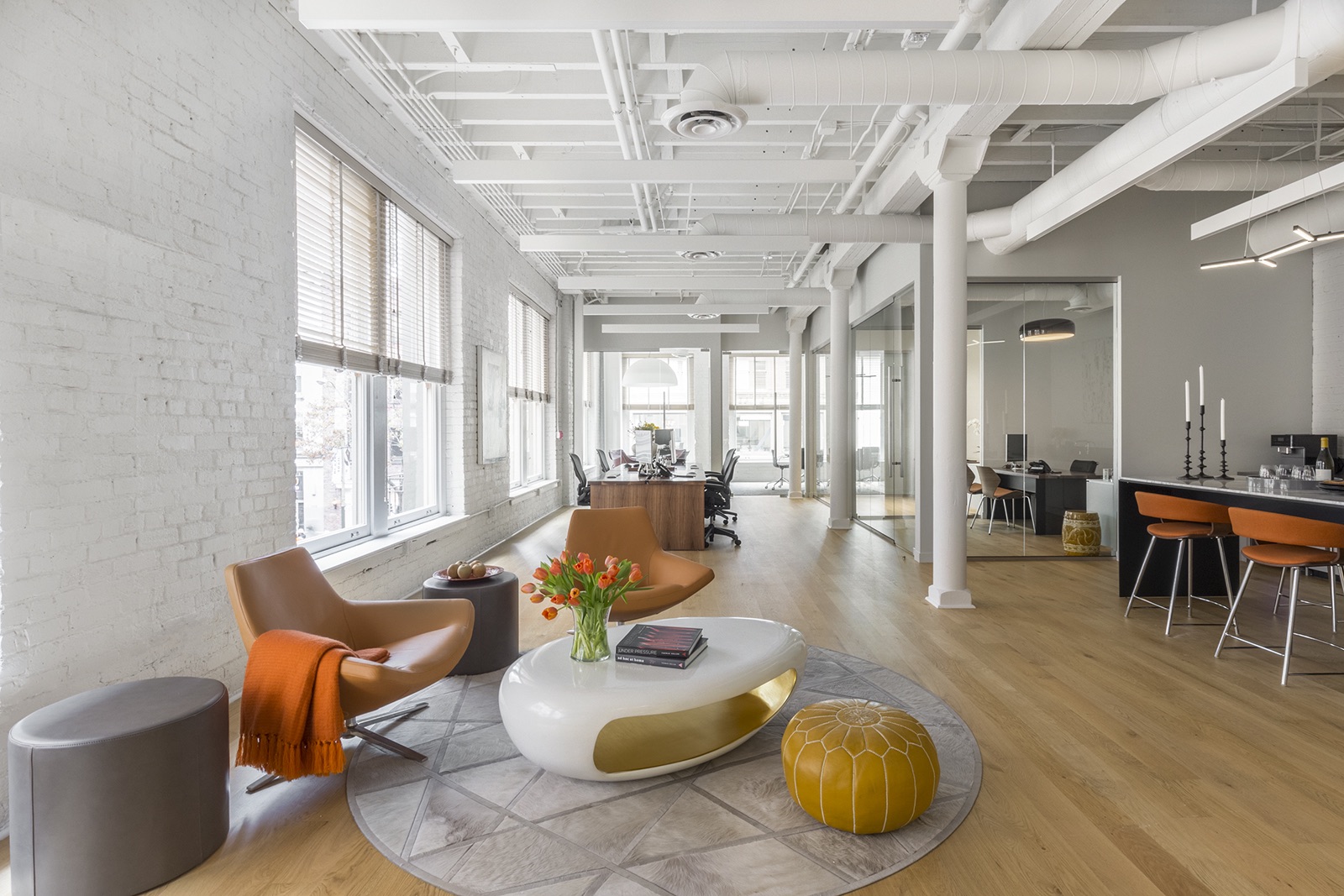
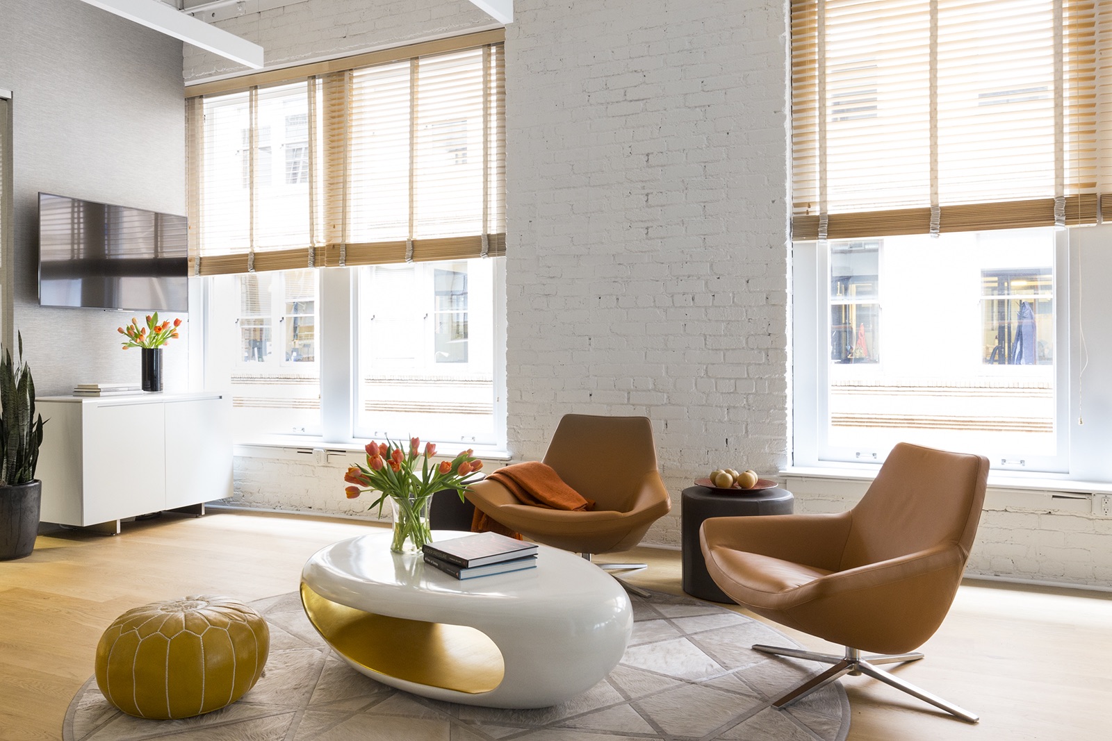
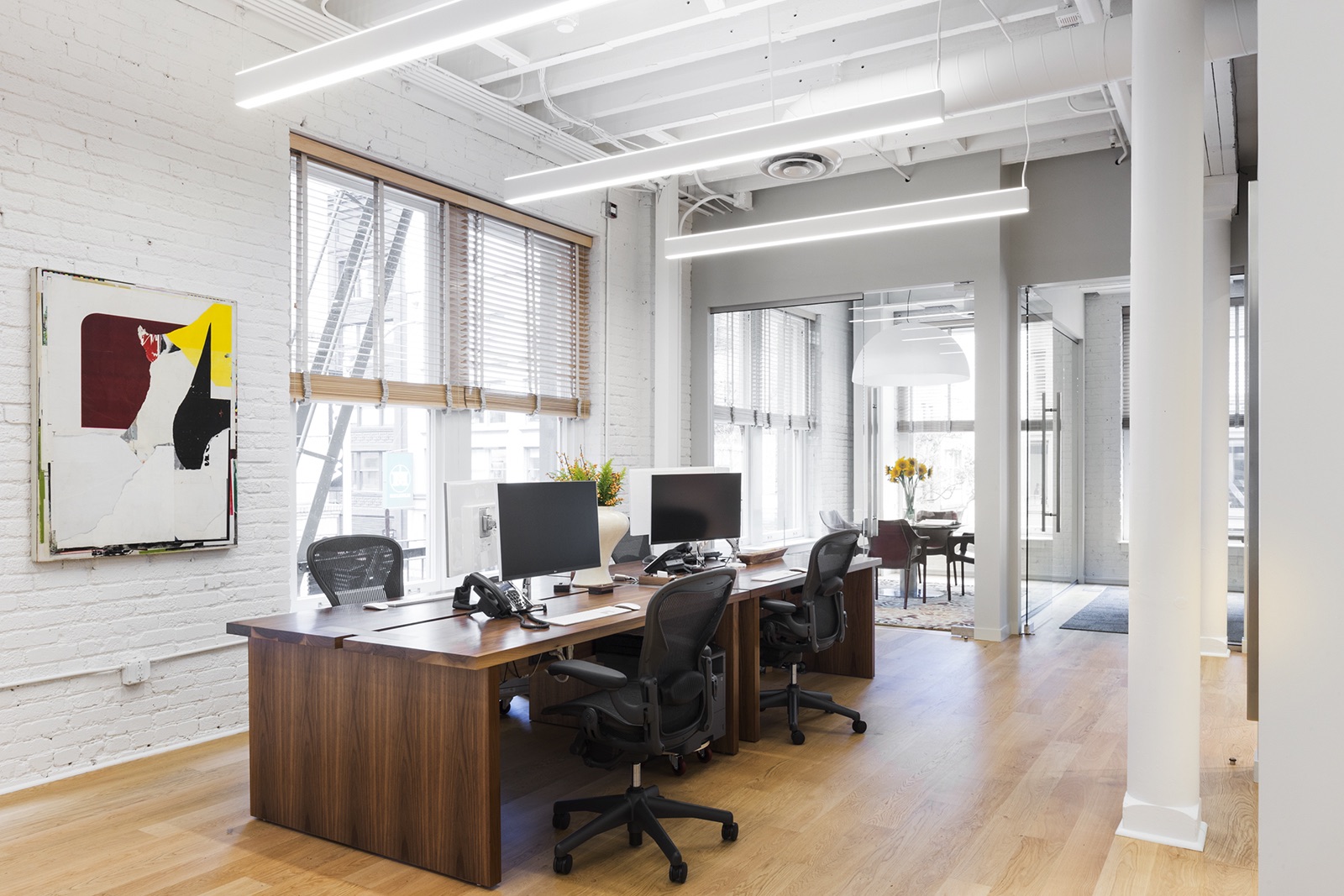
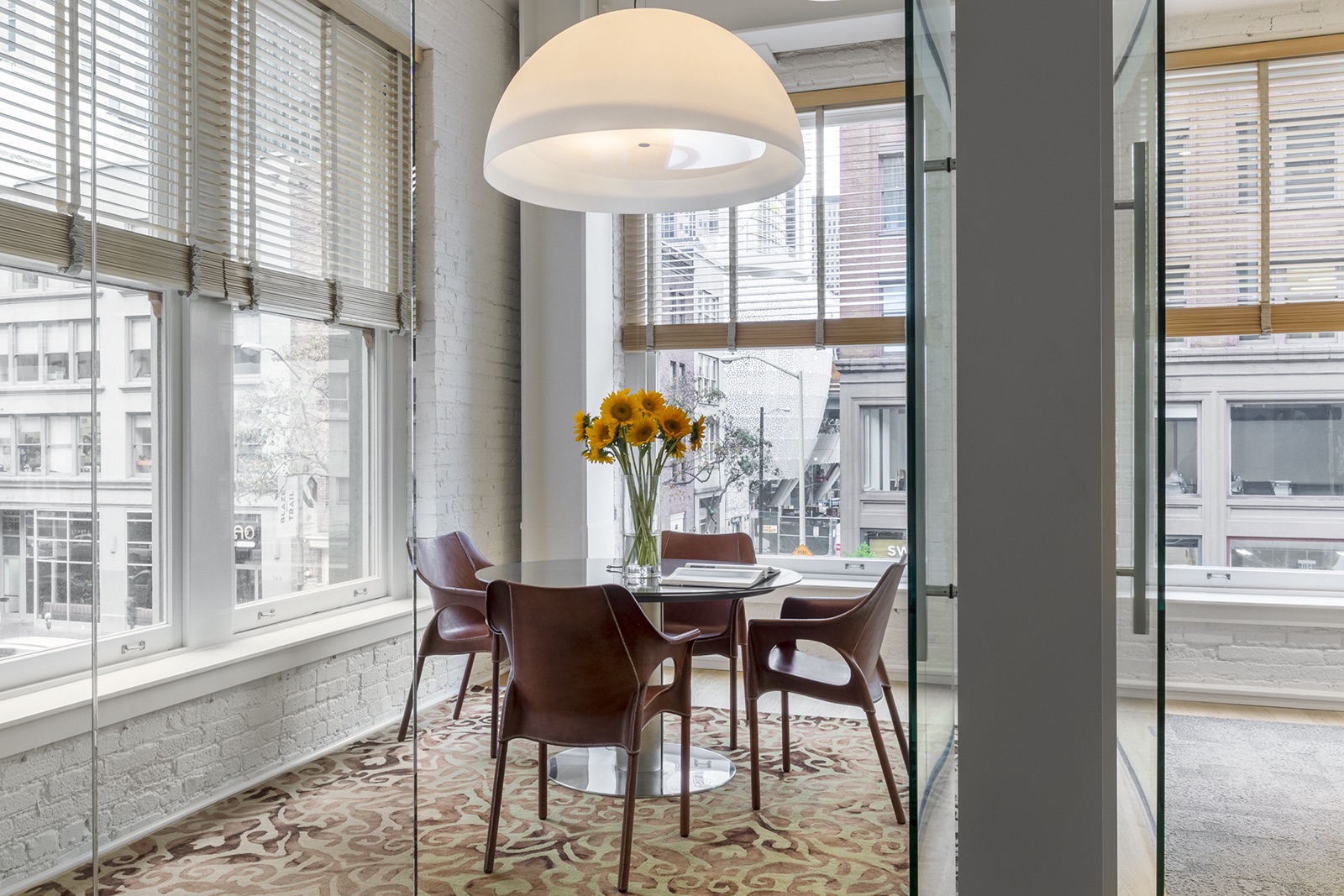
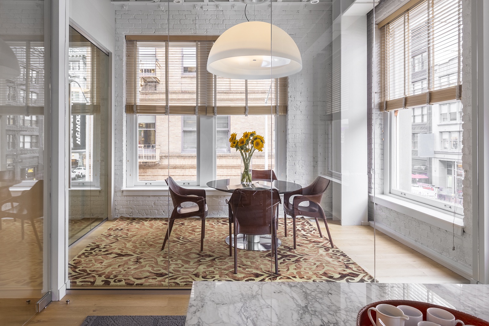
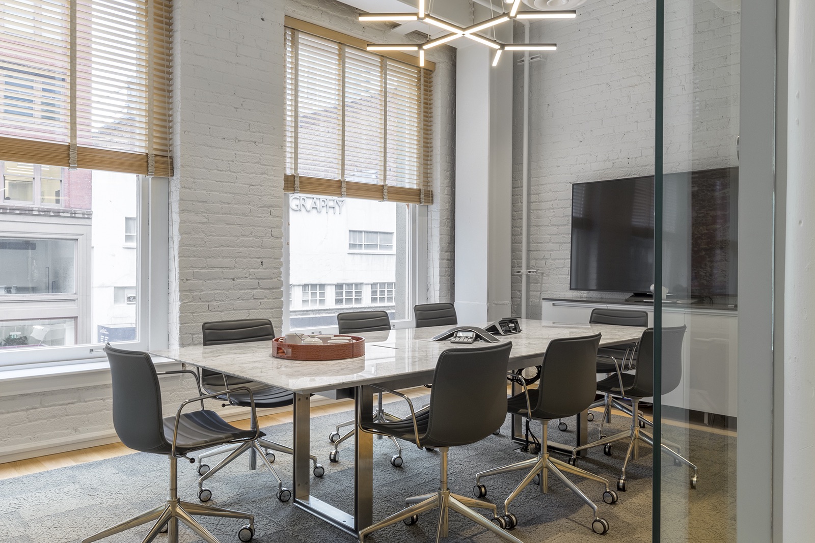
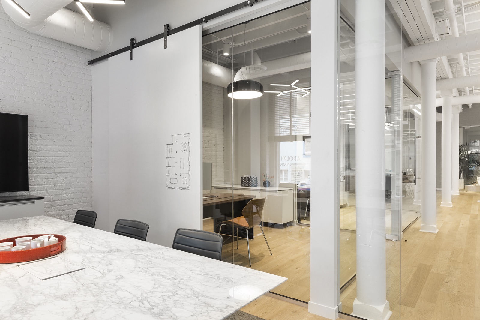
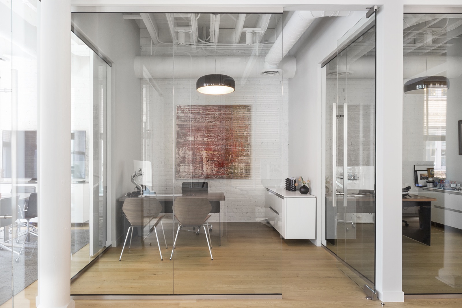
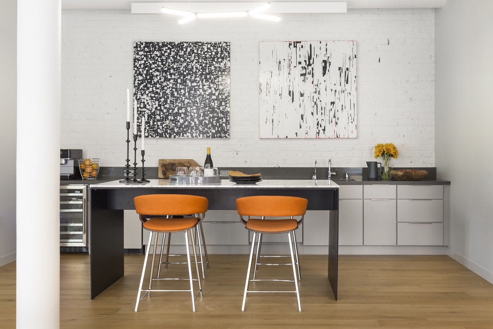
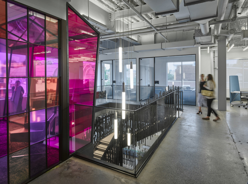
“The goal was to maximize open space, light and views, while providing privacy for meetings and phone calls. The client wanted an office that was welcoming, comfortable, clean, modern, and fun. JTA was hired to update the space into a functional modern office. The client wanted to remove all of the existing partition walls to start with an open floor plan in this tall ceiling downtown industrial space in the former Photography District. Then they wanted to add as few walls as possible, with as much glass as possible to maintain that open feel while providing workspaces to meet their needs. He also wanted a great cappuccino machine and a large hang out space around it! This is an office space so private offices for the principals and a private conference room, a bit of social space (found in the kitchen and the entry foyer); and they were very attracted to the rough industrial quality of the space, so maintaining this was important. Jennifer created a clean open design that accentuated the existing bones but also met the needs of a private office. The client wanted to maximize glass in the offices but that left only a small wall space for a whiteboard in the conference room. To increase that area, we created a sliding whiteboard wall that slides over the window between the private office and conference room, providing double the whiteboard space and privacy for meetings. We had to make the two existing restrooms handicap accessible which took space out of the lobby area. We took advantage of this by painting one of the bathroom walls with light gray whiteboard paint and using this to turn the kitchen into a brainstorming work area. It also created a more intimate feel to the entry since the space was more compressed than the larger open workspace. We were able to open up the space to reveal all of the large windows, the series of columns and the open ceiling, and to create a single, large, volume, but with more intimate, connected workspaces within the whole. JTA’s crisp modern style of architecture was able to shine. Inspired by the rhythm of the large windows, JTA designed a linear lighting plan that carried through the entire space. The plan was punctuated by fun decorative fixtures in key areas for effect. JTA designed custom furniture including the desks and tables, using walnut and marble for a sophisticated feel. The furniture design for the work tables and desks utilized a simple bent steel support to maintain a streamlined look. The result is a clean, open space with a comfortable, warm feel. Artwork was provided by Bettina of Upstart Modern. She consulted with Jennifer and the client to source pieces that would add vibrancy, color and dimension to the space. Artwork by Michael Cutlip and Harry Moody. Our style is contemporary and approachable, with a preference for clean and uncluttered design, whether is it a traditional or modern project. Our designs feature a blend of material and textures, crisp detailing and a clear floor plan favoring site views and openness to nature. Our work is informed by a rich modern aesthetic and by the belief that form and function can be perfectly married, that high design can be accomplished on an economically rational basis, and that buildings foster uplifting experiences for their users. Our collaborative process allows us to understand our clients design preferences, lifestyle and practical requirements, and to complement their own thinking with fresh and innovative ideas. We strive to ensure that the creative process continues through all phases of design and construction, creating modern, contemporary and stylish spaces,” said Jennifer Tulley Architects
- Location: SoMa – San Francisco, California
- Date completed: 2018
- Size: 2,500 square feet
- Design: Jennifer Tulley Architects
