A Look Inside JYC’s Minimalist Dongguan Office
Chinese clothing brand JYC recently hired architecture firm AD Architecture to design their new office in Dongguan, China.
“The space is an “illusory structure” deduced from physical light and shadows. Rather than following conventions, the project emphasizes creative and spiritual attributes of the space. At the beginning of design phase, the designers tried to think from the perspective of the space itself and apply metaphysics to the interior design. In this way, they created a geometric space which seems to be disorderly and features a deep and perspective view, aiming to inject creativity and spirit into it.
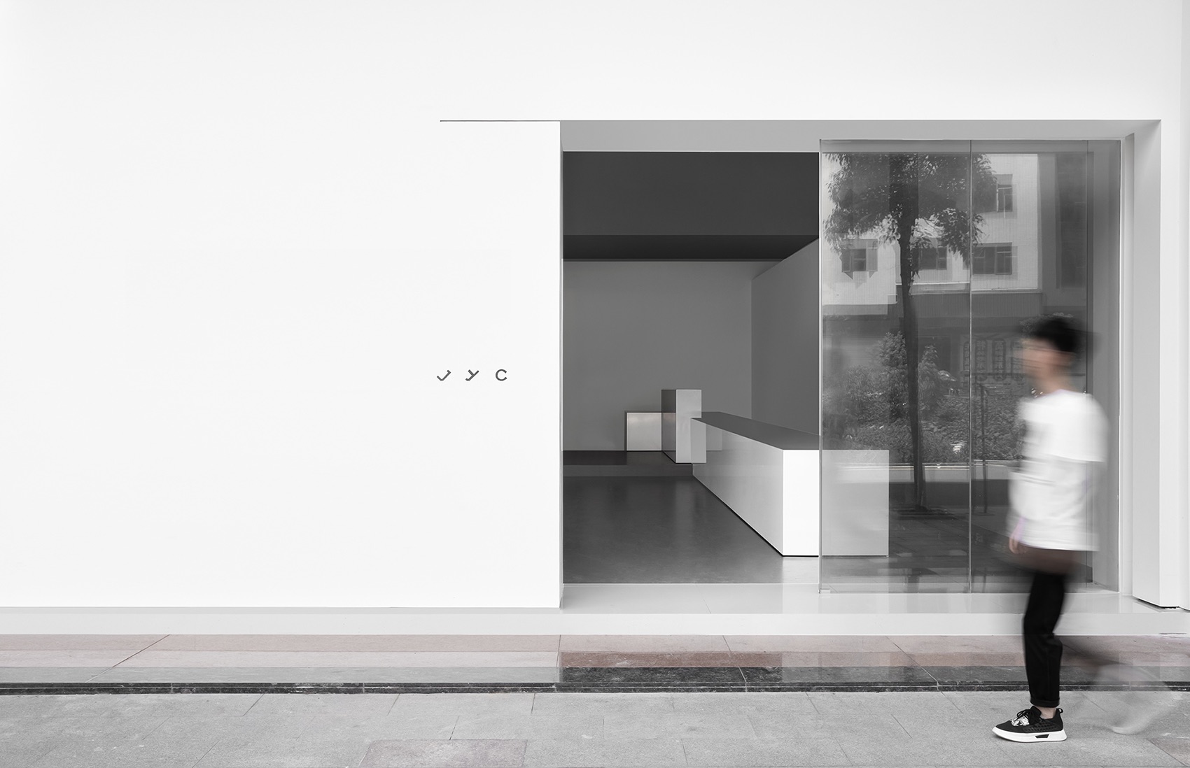
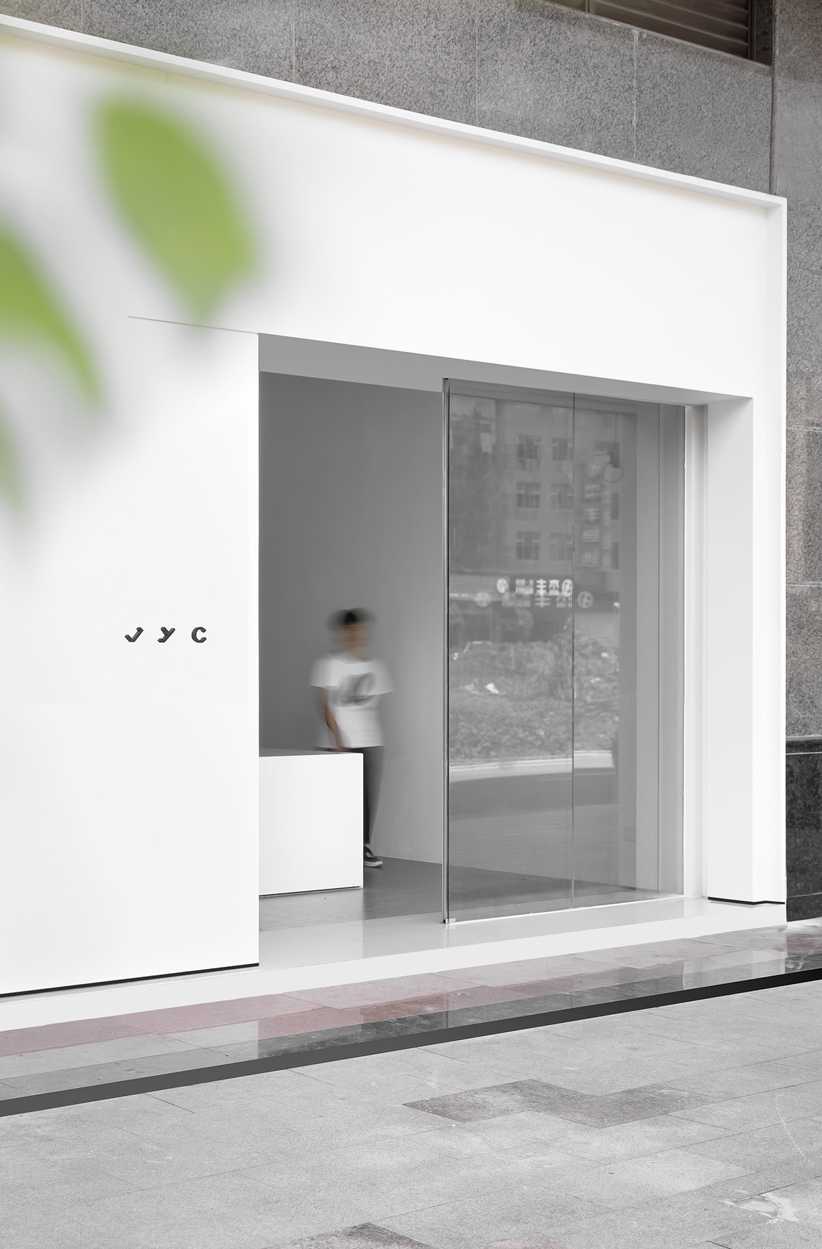
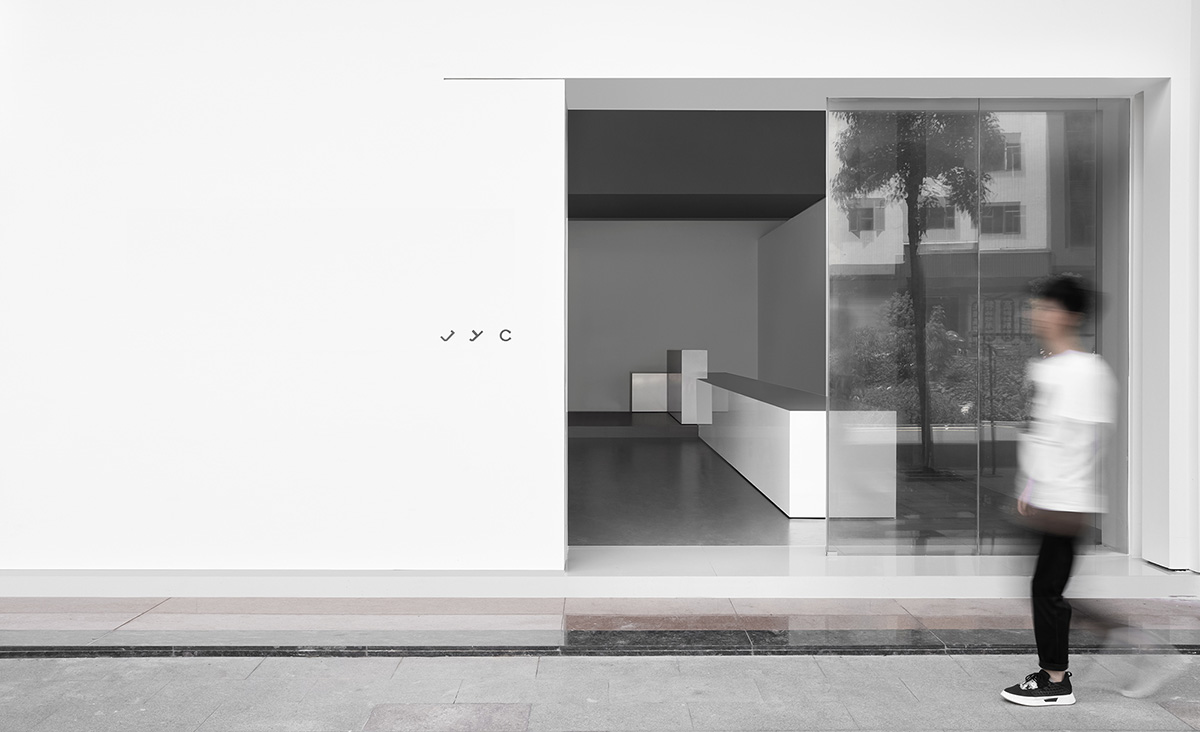
The project is situated at a woolen clothes wholesale center, surrounded by a noisy and chaotic commercial block. The space serves for garments design, working and sales activities. At the entrance, a white cube was inserted into the disorderly architectural space, through which AD ARCHITECTURE hoped to rebuild spatial order and bring a new image to the commercial block.
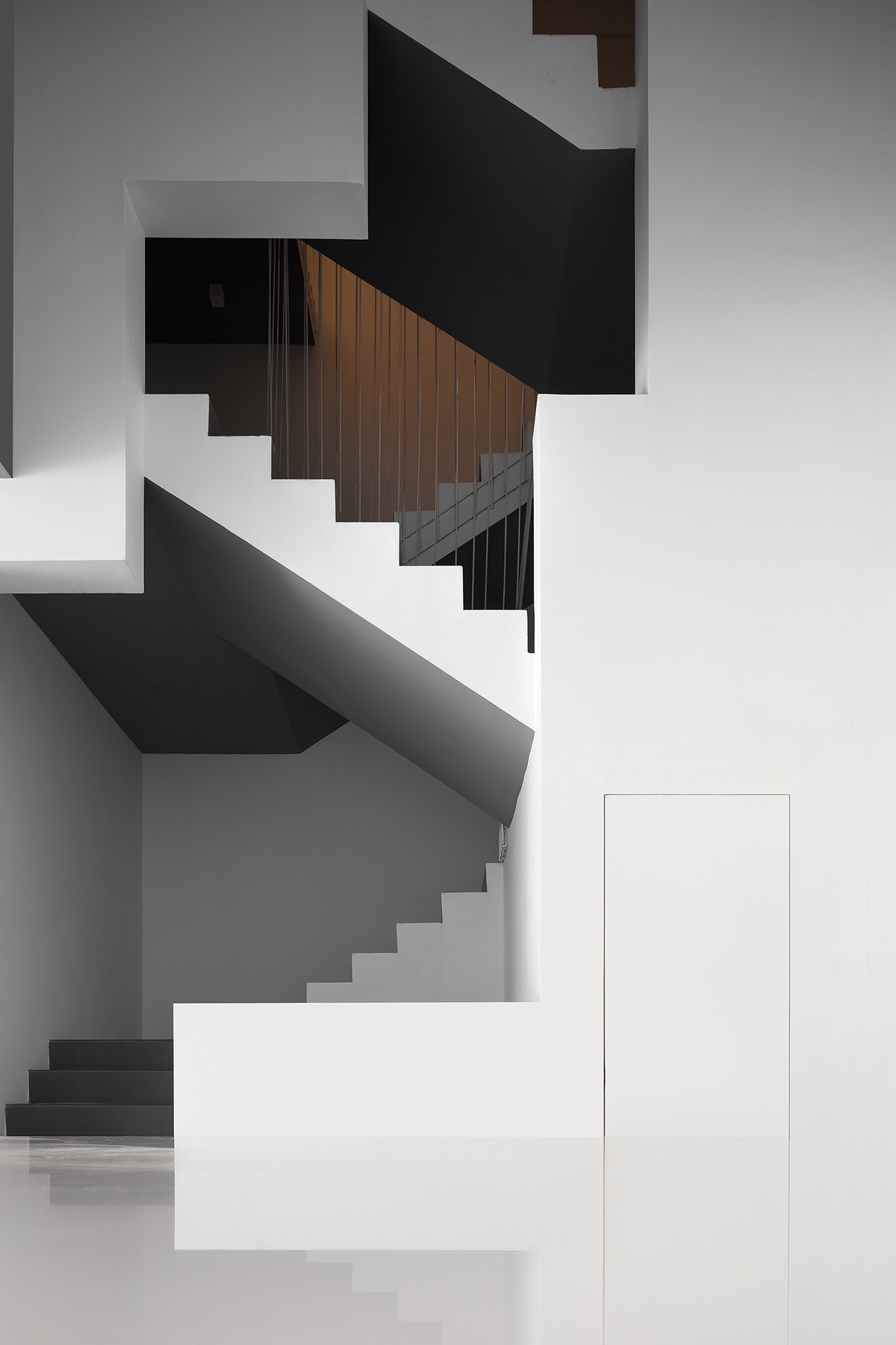
Functional spaces are combined in a geometric manner and connected by the staircase. 1F is used for reception, while 2F and 3F serve for working, meetings and new products release.
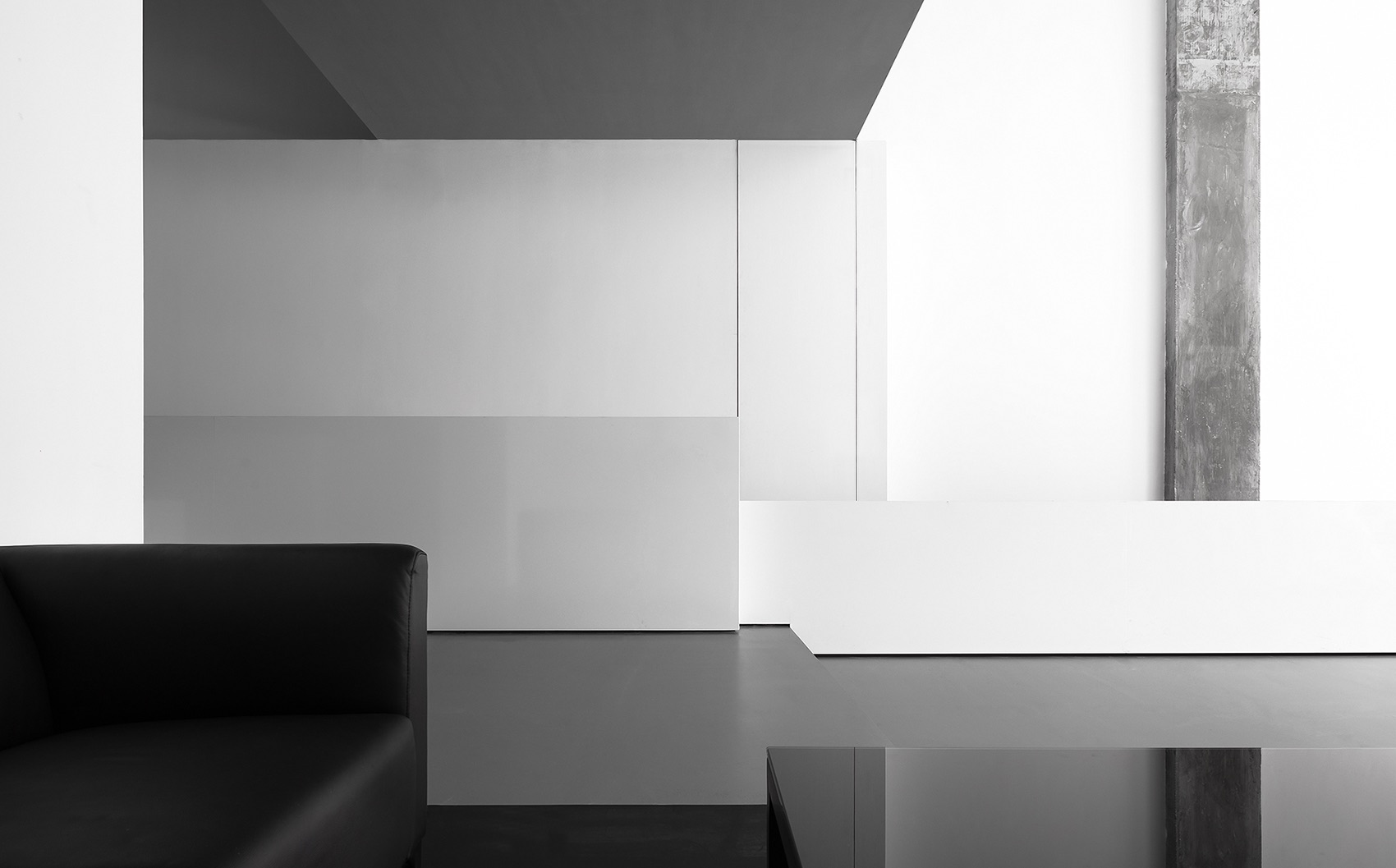
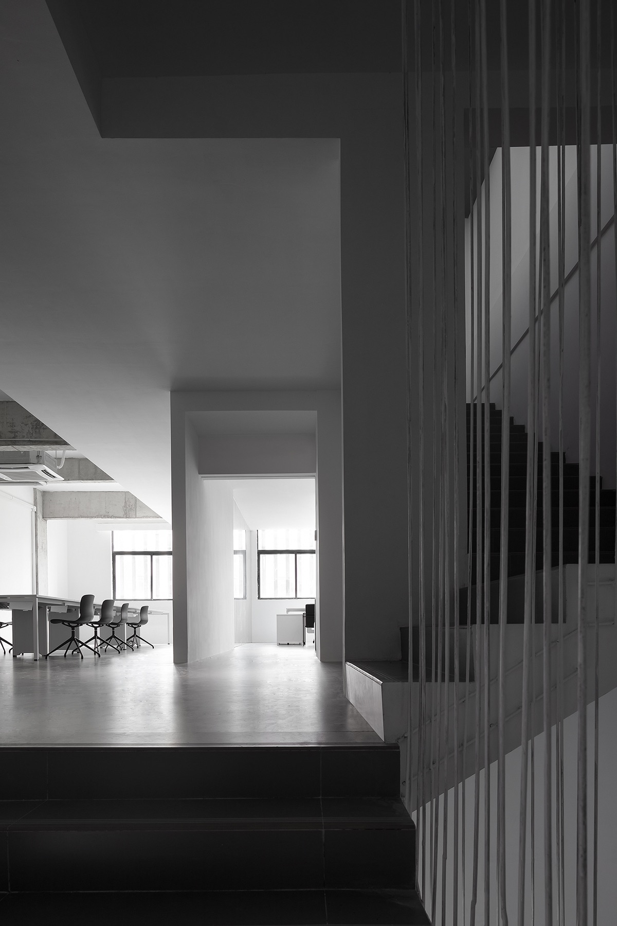
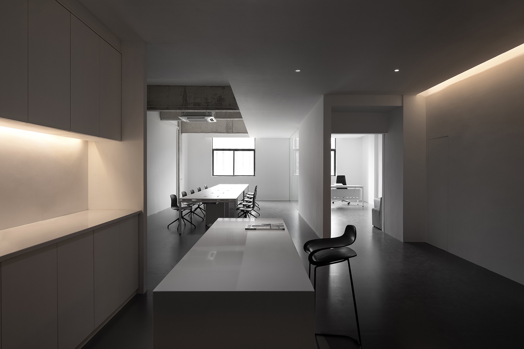
The original space has a long and narrow rectangular plan as well as a single-span framework. AD ARCHITECTURE embedded a large unadorned geometric volume into the full-height foyer, which adds a sense of tension to the interior. The gray block on the top provides additional storage space. The foyer and reception area are separated in a subtle way, and the gray concrete column that already existed is retained, which highlights the interior structure whilst enriching spatial textures. The white block functions as a reception desk and a bar counter, and leads the sight line to move from the foyer to the rear staircase area. The staircase area provides a twisting circulation route and becomes a visual highlight in the space, with its flexible structures and openings allowing playful interaction between people and the space. The overall spatial design emphasizes volume and scale. And the staircase alternates between black and white, which appears more lightweight, just like a piece of paper.
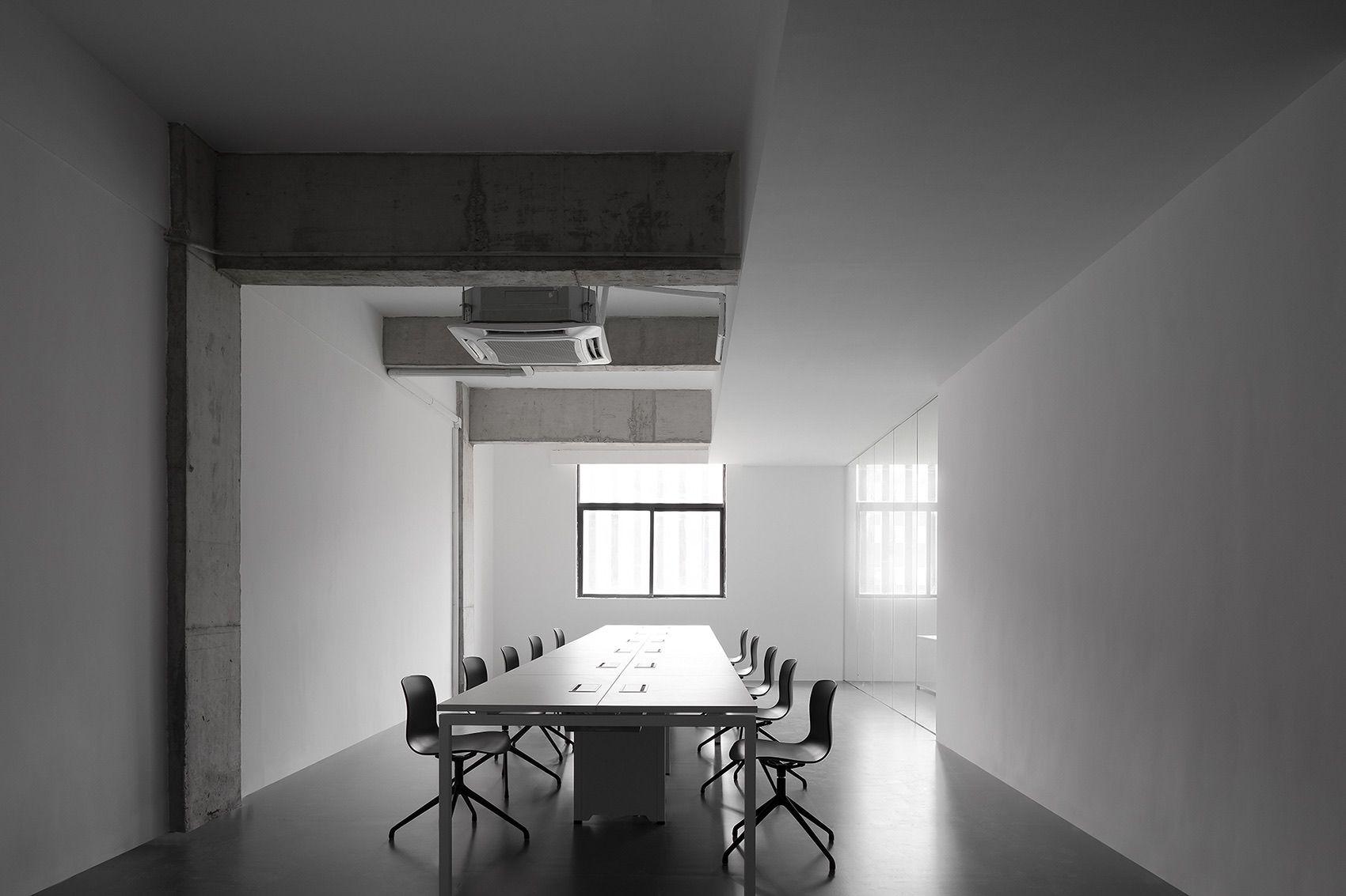
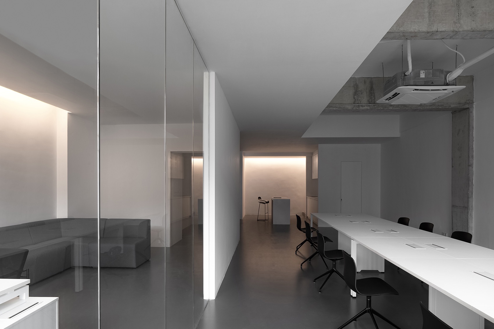
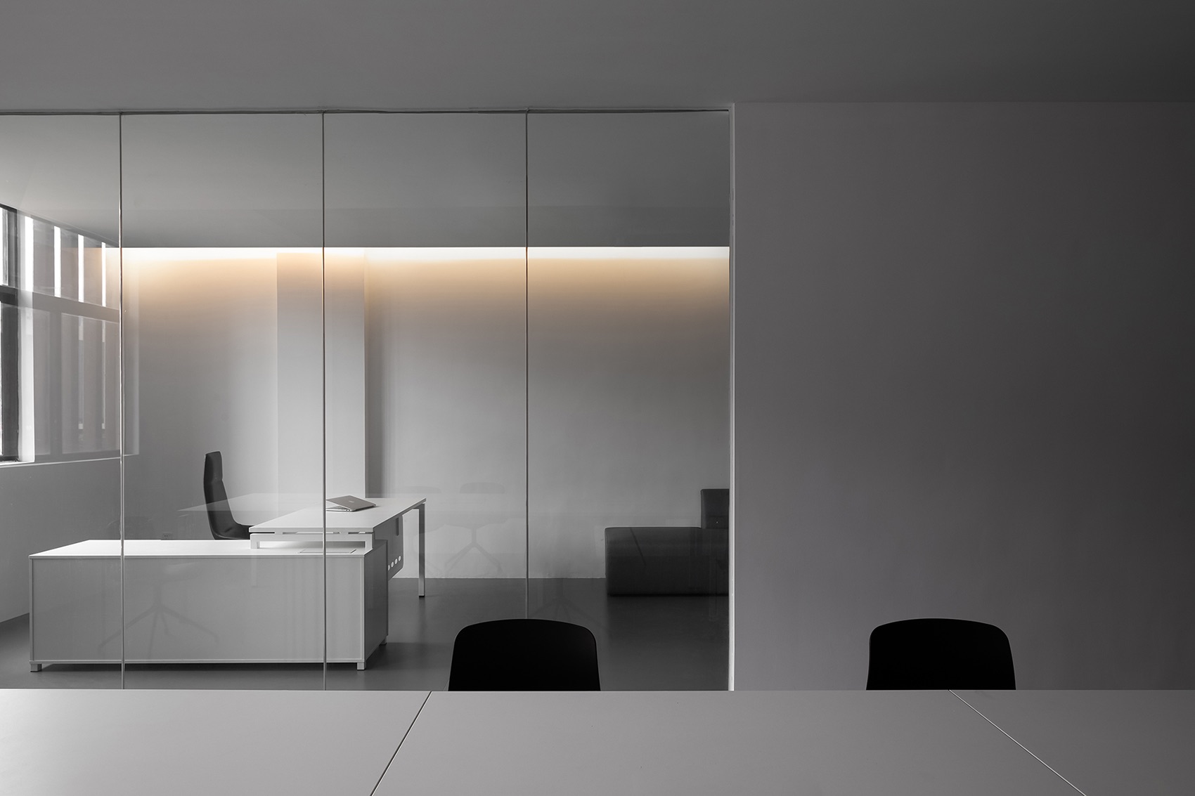
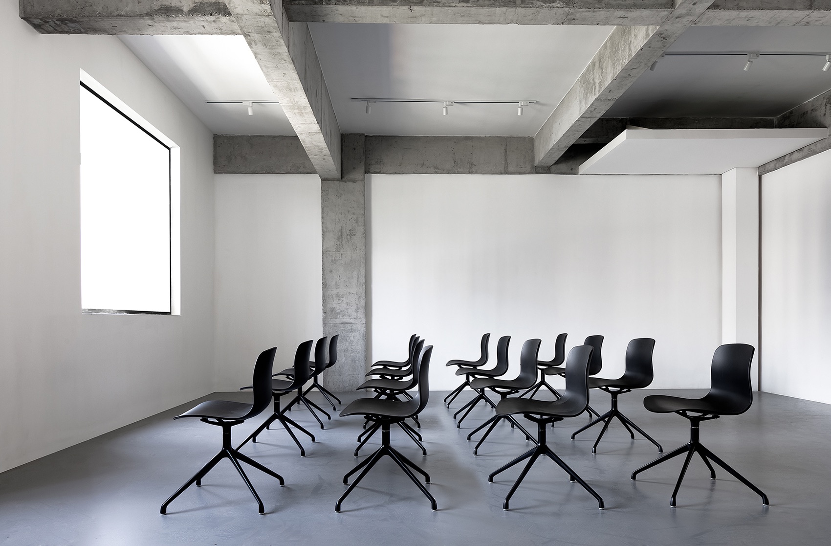
In the working area, the ceiling presents varying shapes, either void or solid, which demarcates the resting space where the staff can communicate and have a break. The original concrete interior structure was “liberated”, so that a clean and comfortable environment was created in the compact workplace. Apart from the manager’s office which is partitioned by transparent glass, there is no massive physical partitions within the space, which ensures an open and relaxing spatial atmosphere. The bar area plays an important role in connecting 1F and 2F and is capable of guiding physical behaviors. With a cozy ambience, it softens and balances with the cool tone of the overall space,” says AD Architecture.
- Location: Dongguan, China
- Date completed: August 2019
- Size: 4,305 square feet
- Design: AD Architecture
- Photos: Ouyang Yun
