A Tour of Santander’s Elegant Lublin Office
Santander, a multinational bank that offers banking and financial services, recently hired interior design firm The Design Group to design their new office in Lublin, Poland.
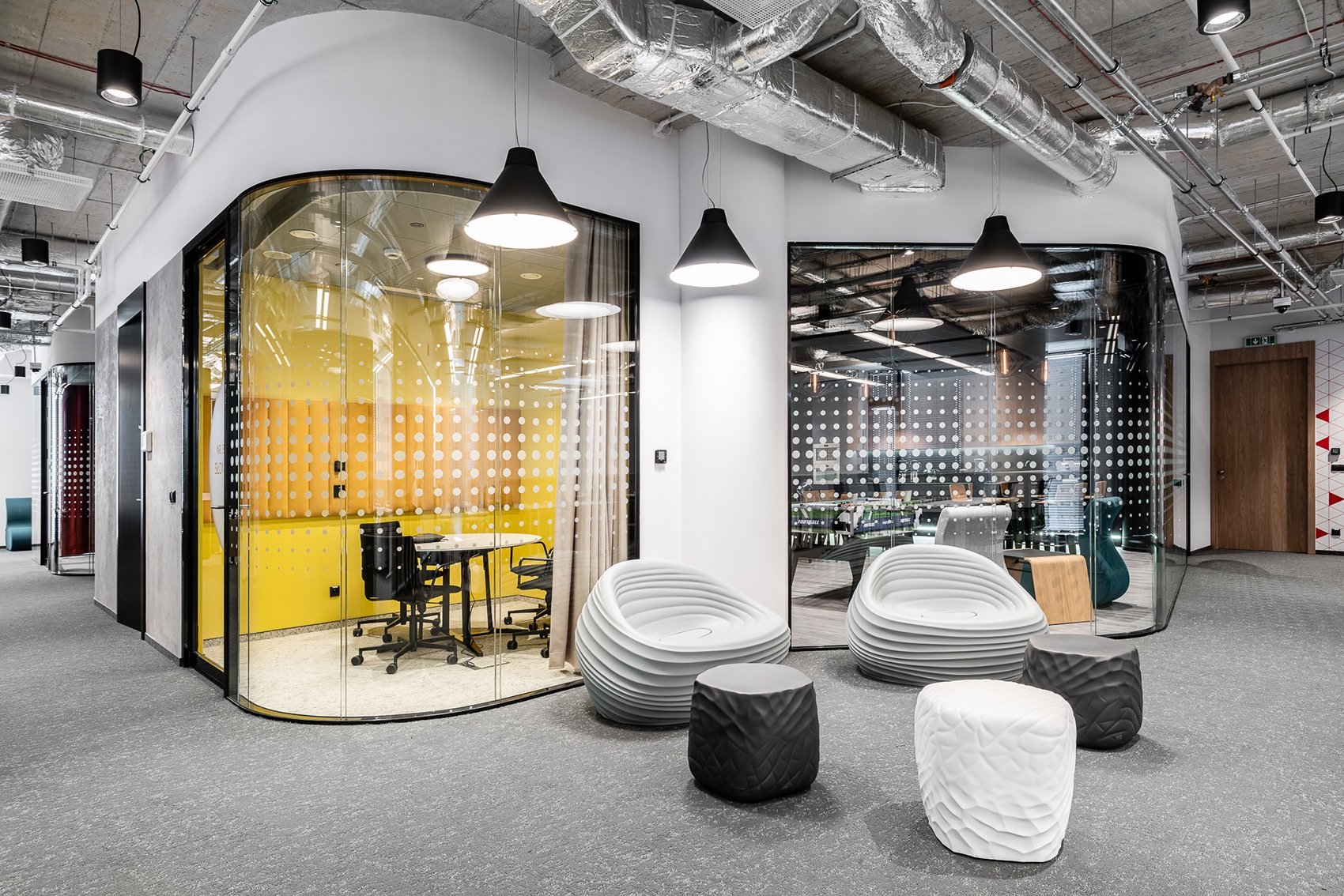
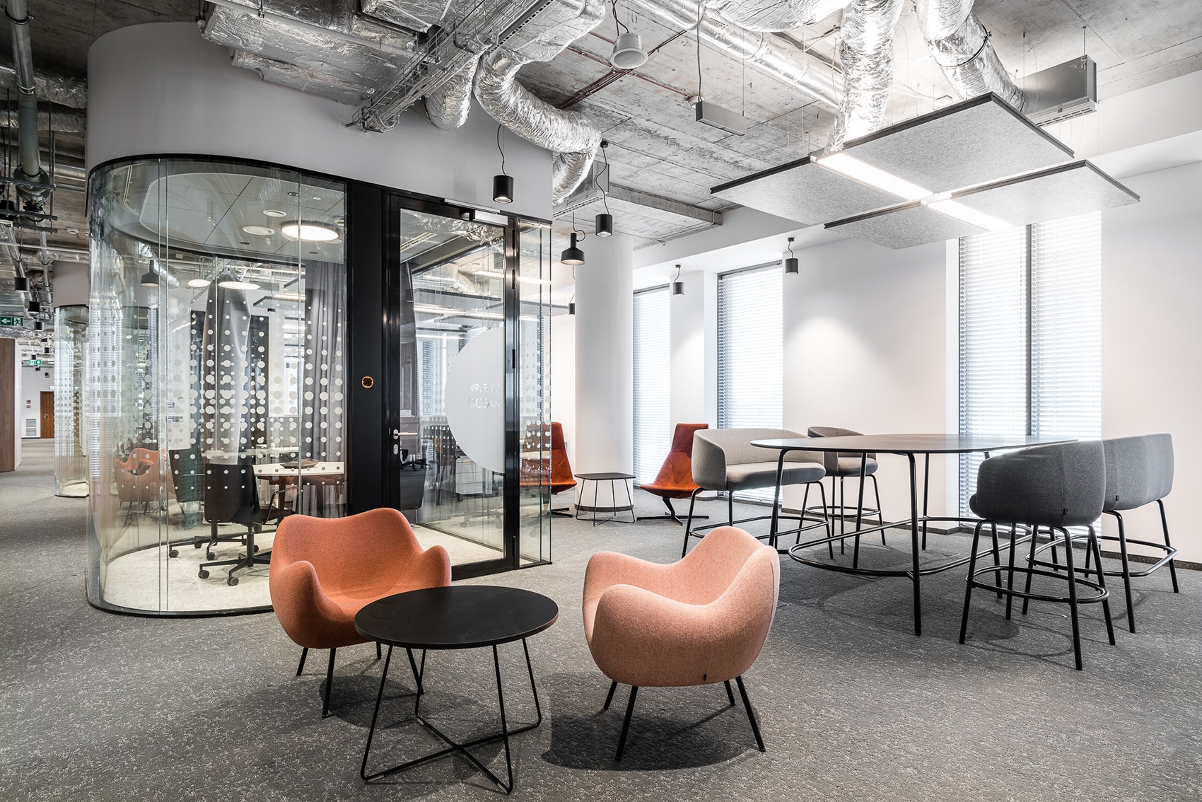
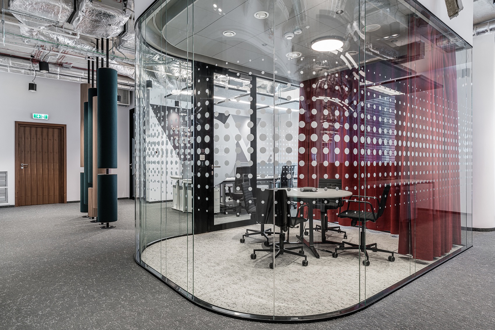
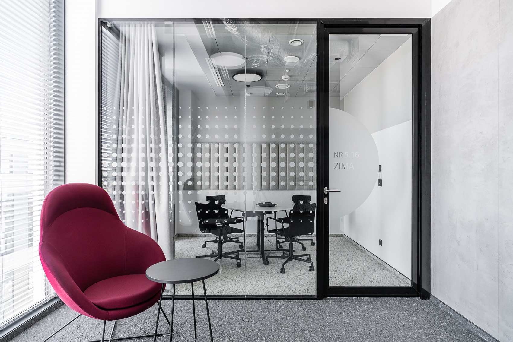
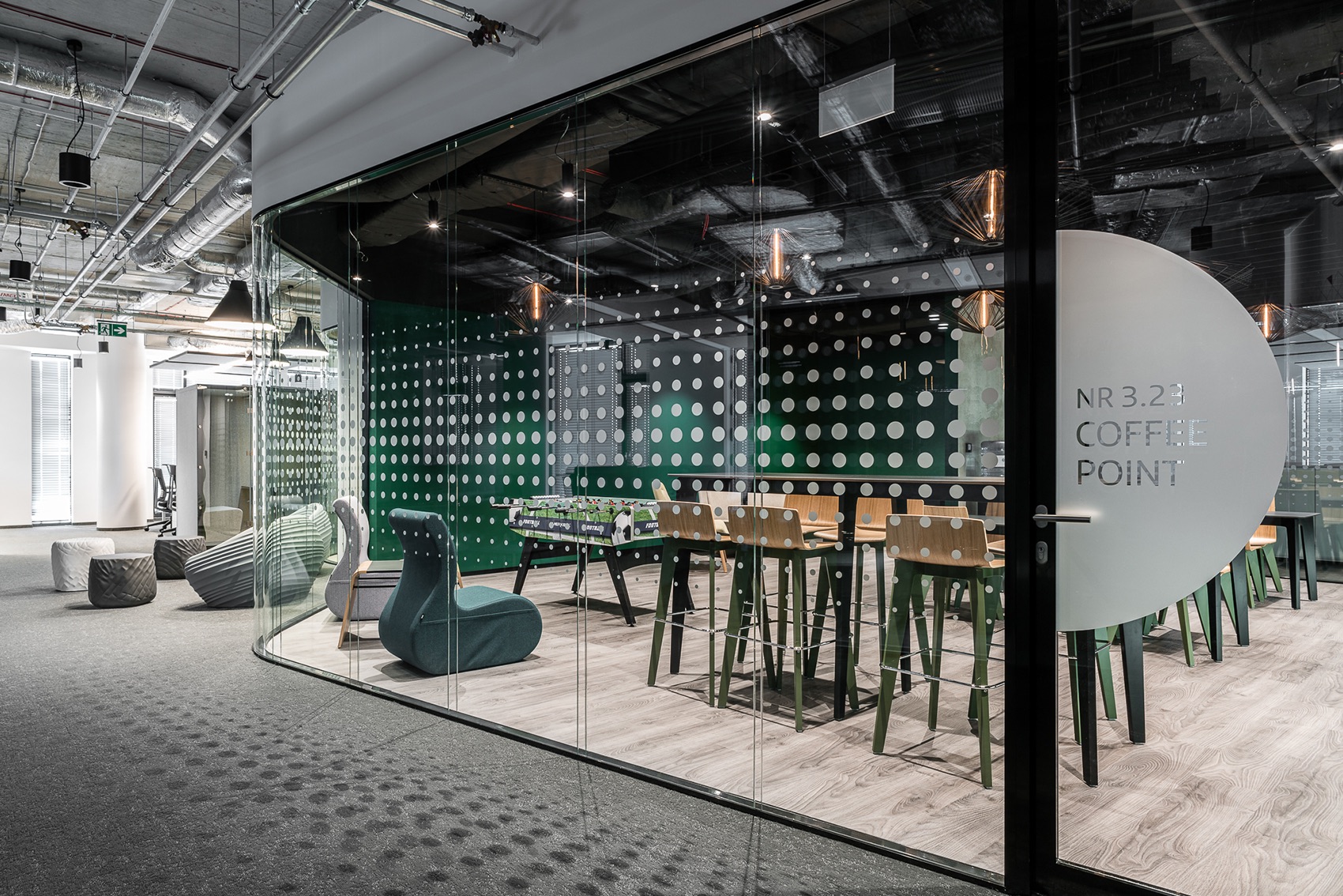
“One of the most expressive elements of the office are conference halls separated behind glass walls. Round and dynamic lines of the walls break the ordered and geometric space of open space. Still, the uniqueness of this part of the office consists in something else – in the unique use of bent glass made up of two layers. Between them, there is free space filled with air.
When necessary, glazed rooms can be visually separated from the rest of the open space using backdrops. They are made of textile in expressive colors, allowing vibrant colors to suddenly appear in the monochromatic office space. This simple solution makes it possible to instantly bring additional energy and variability into the workplace.
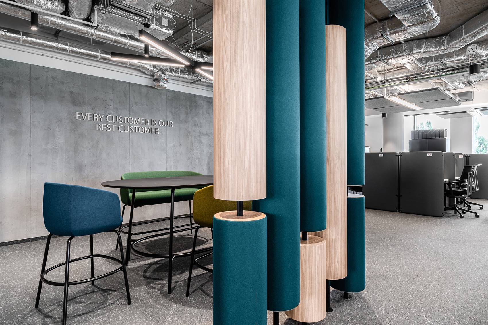
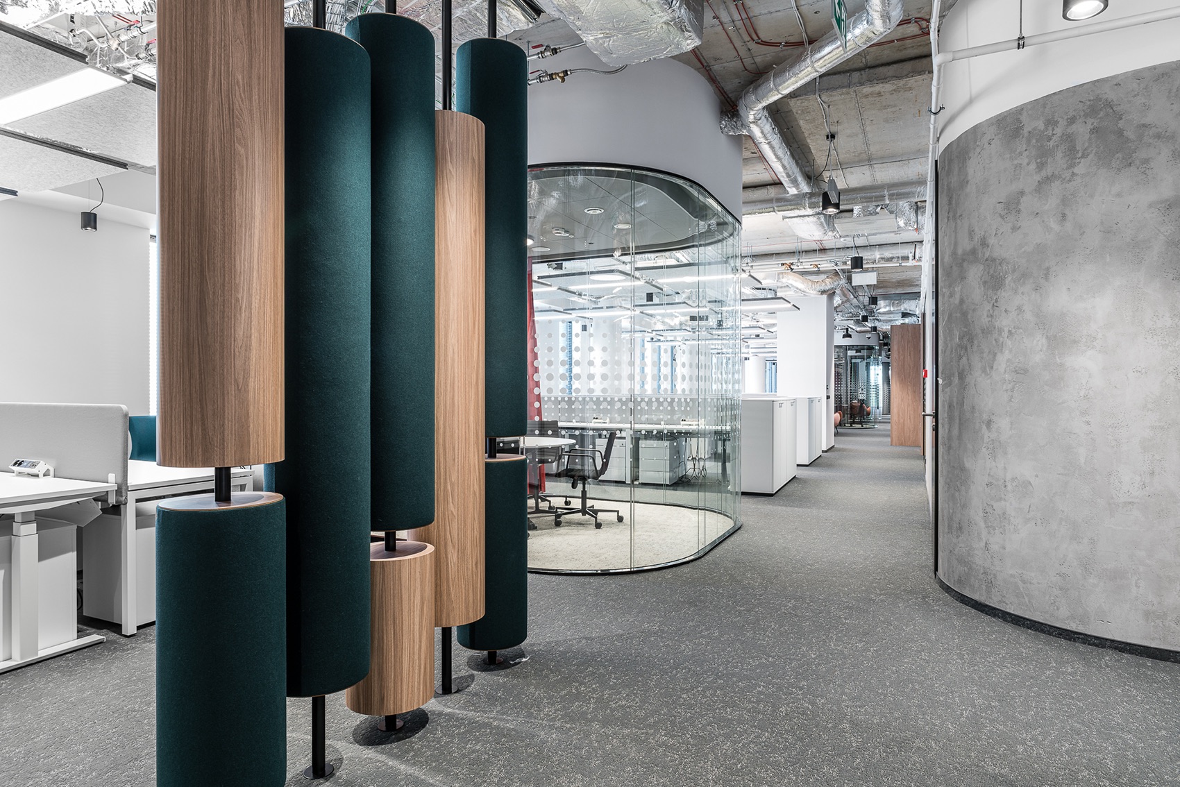
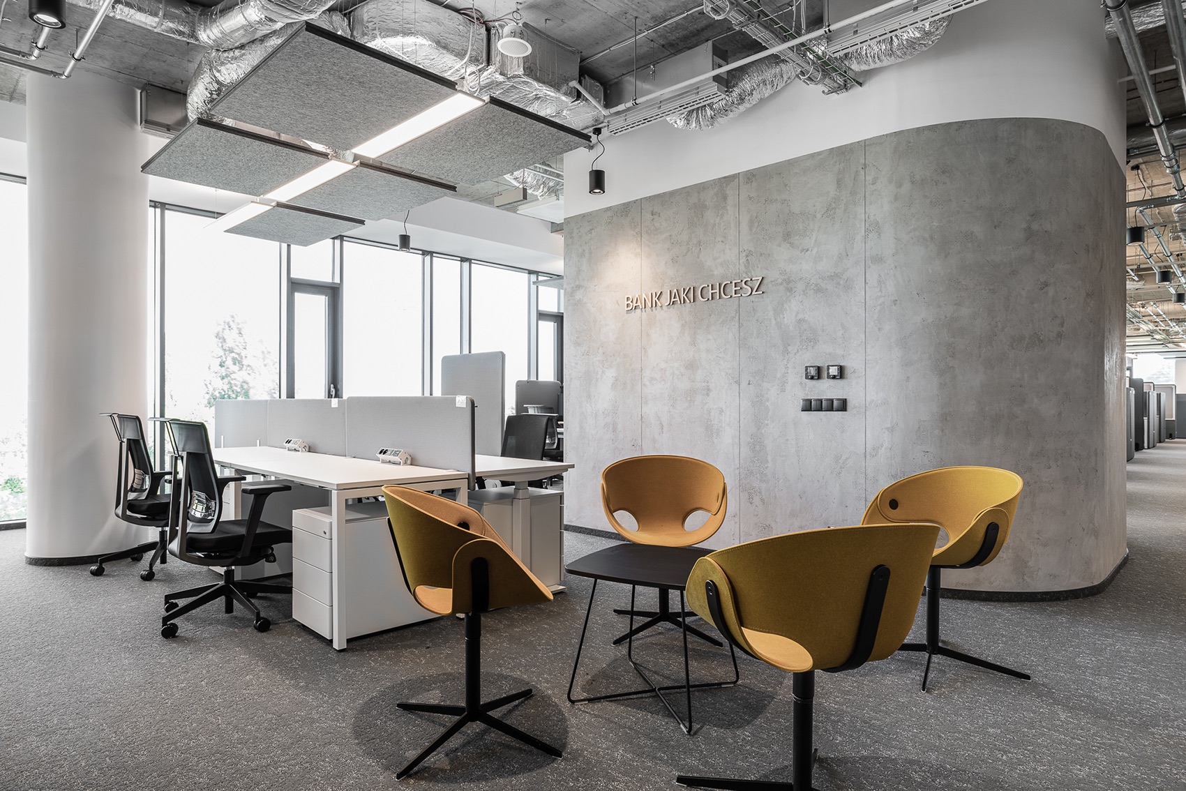
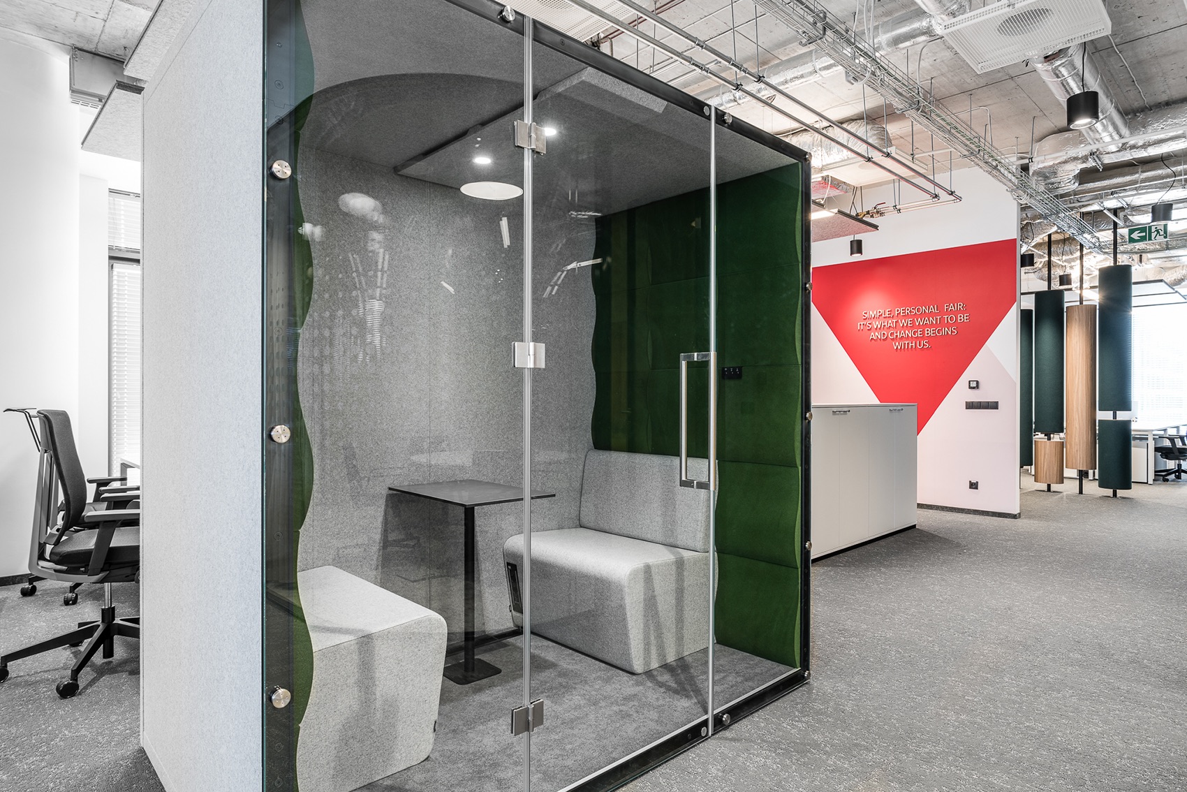
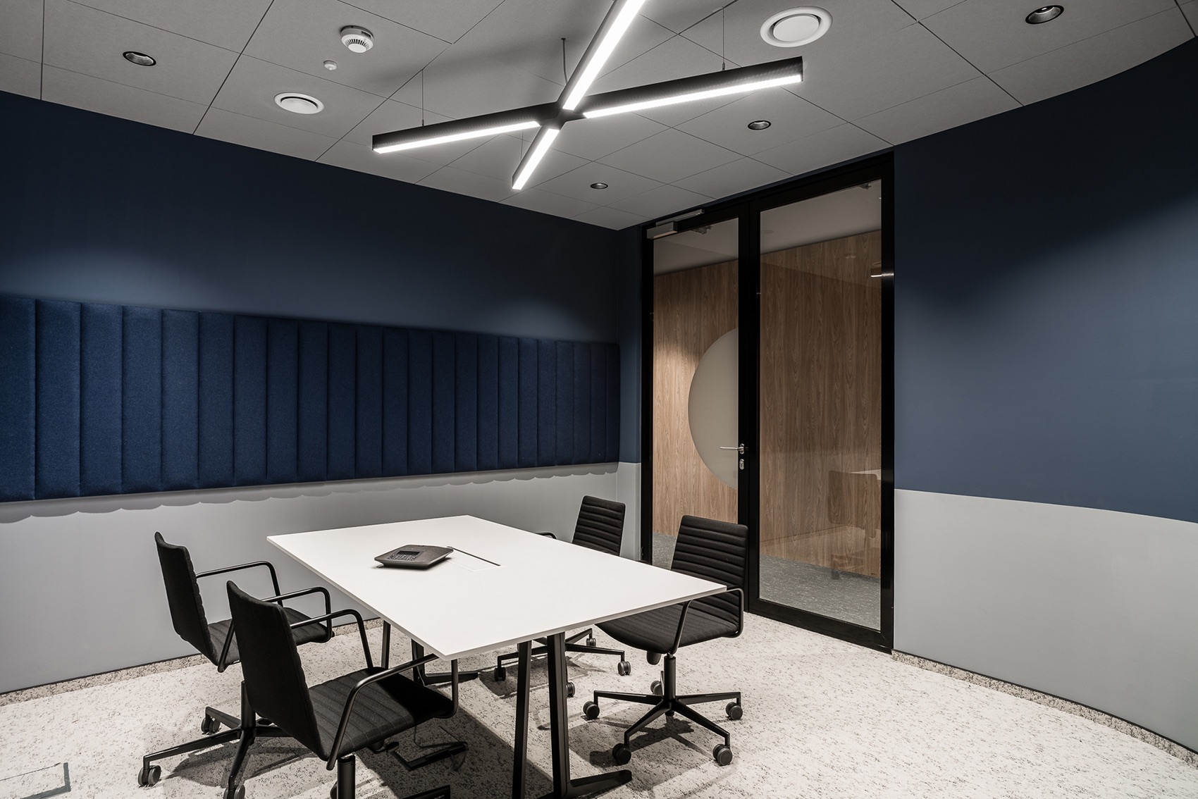
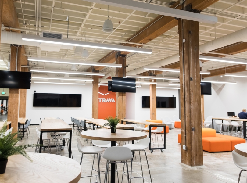
Room acoustics is always refined to the highest degree in The Design Group’s office designs. Panels on the walls or between desks or additional systems allow for controlling noise at the workplace. One of the interesting elements in SBPantander’s headquarters are wooden pillars separating the office part from the meeting point. Some pillars are covered with a special fabric that muffles noise. It is also a color accent consistent with the armchair upholstery.
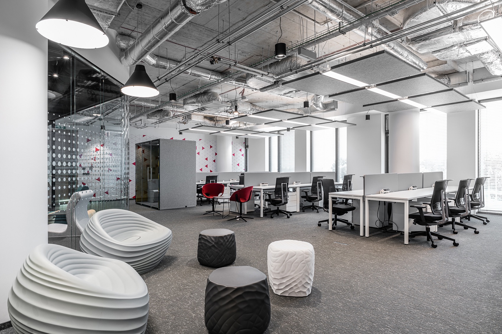
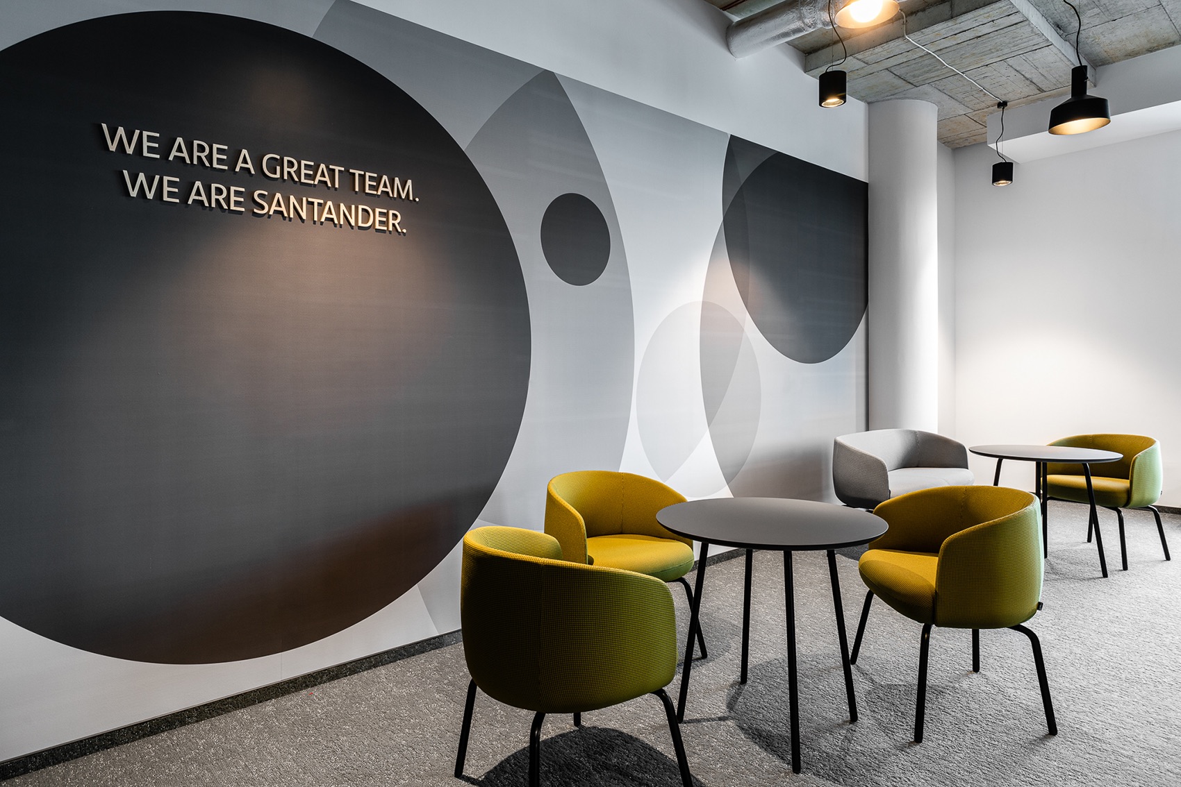
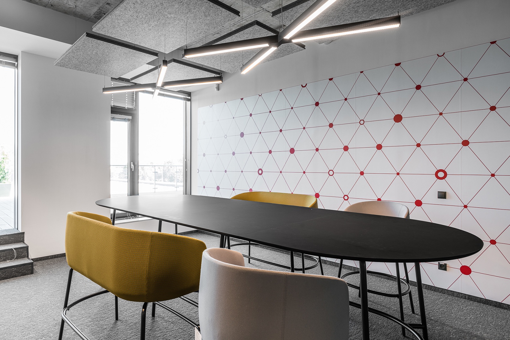
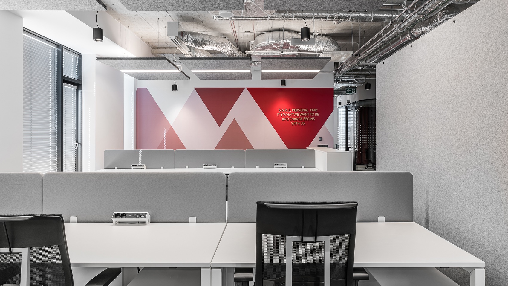
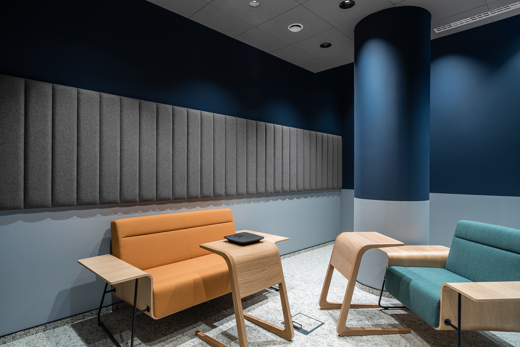
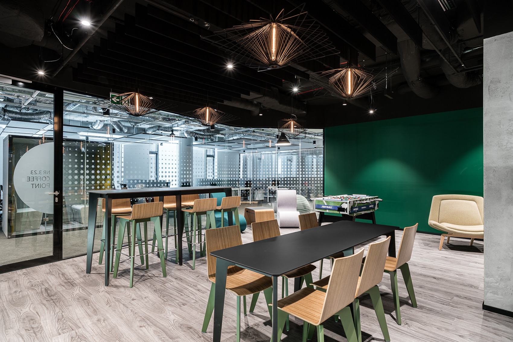
Although the office makes the impression of a cool and technical space, in fact it has a precisely refined and functional color palette. In addition, extremely deep and diverse – when you only look at it more precisely. In the open space, colors act as accents. In monochromatic aesthetics they act as variety elements, but do not destroy the order of the working space. Red insertions on the walls, several pieces of colorful furniture, pillar upholstery, furniture upholstery- this is fully sufficient to revive the interior. Dimmed and subdued colors of green and navy blue distinguish the chill&out zones and the kitchen. Such selection is to foster leisure and tranquility. The colors shine to the fullest only in conference rooms – there are 30 of them in total. We have Storm, Winter, Sunrise, Night, Autumn, Frost, Fog, Forest, Wind, Amber, Mint, Aurora and Drizzle rooms. The names hint which color palette has been used to design the interior of each of the rooms.
Given the so refined visual layer, the applied lighting solutions are also important. They affect not only the comfort of work but also e.g.: that visually the office preserves its characteristics and character. Open space and conference halls are equipped with precisely located and planned dedicated lighting that ensures proper conditions for the employees at desks or in the course of meetings. The technical lighting system is also supplemented by decorative lamps. In the office space these are simple, industrial forms, but in the kitchen one could afford more decorative, expressive shapes,” says The Design Group.
- Location: Lublin, Poland
- Date completed: 2019
- Size: 50,590 square feet
- Design: The Design Group
- Photos: Fotomohito
