A Tour of Logity’s New Industrial-Style Office in Kharkiv
Global logistics software provider Logity recently hired Studio Bondarenko Design to design their new office in Kharkiv, Ukraine.
“Logity company turned to our studio for a new interior after rebranding. It changed its name to the more imposing one and the style became more modern and expressive. We had the following input data: 1. black and red palette; 2. and understanding that office employees should feel themselves like workmates of the field staff. Or rather those who are everywhere, as Logity drivers travel across entire America.
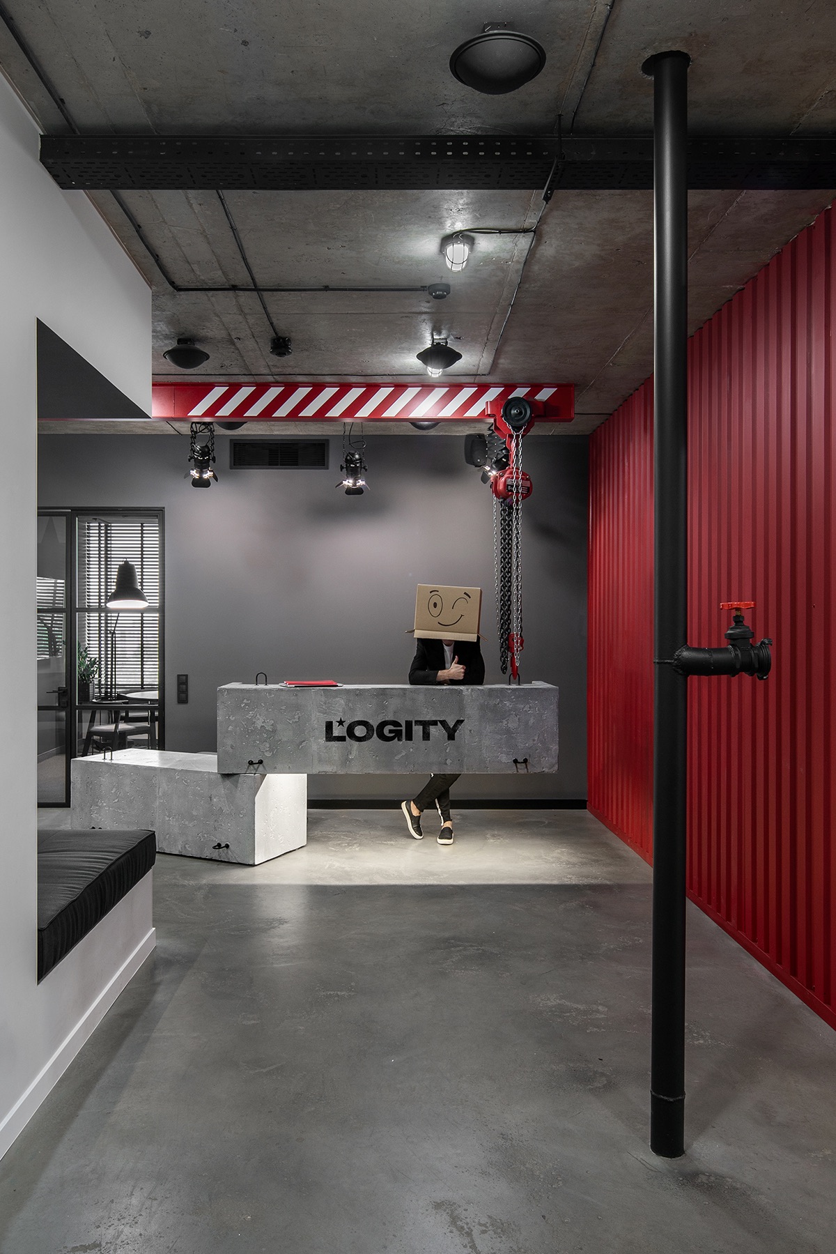
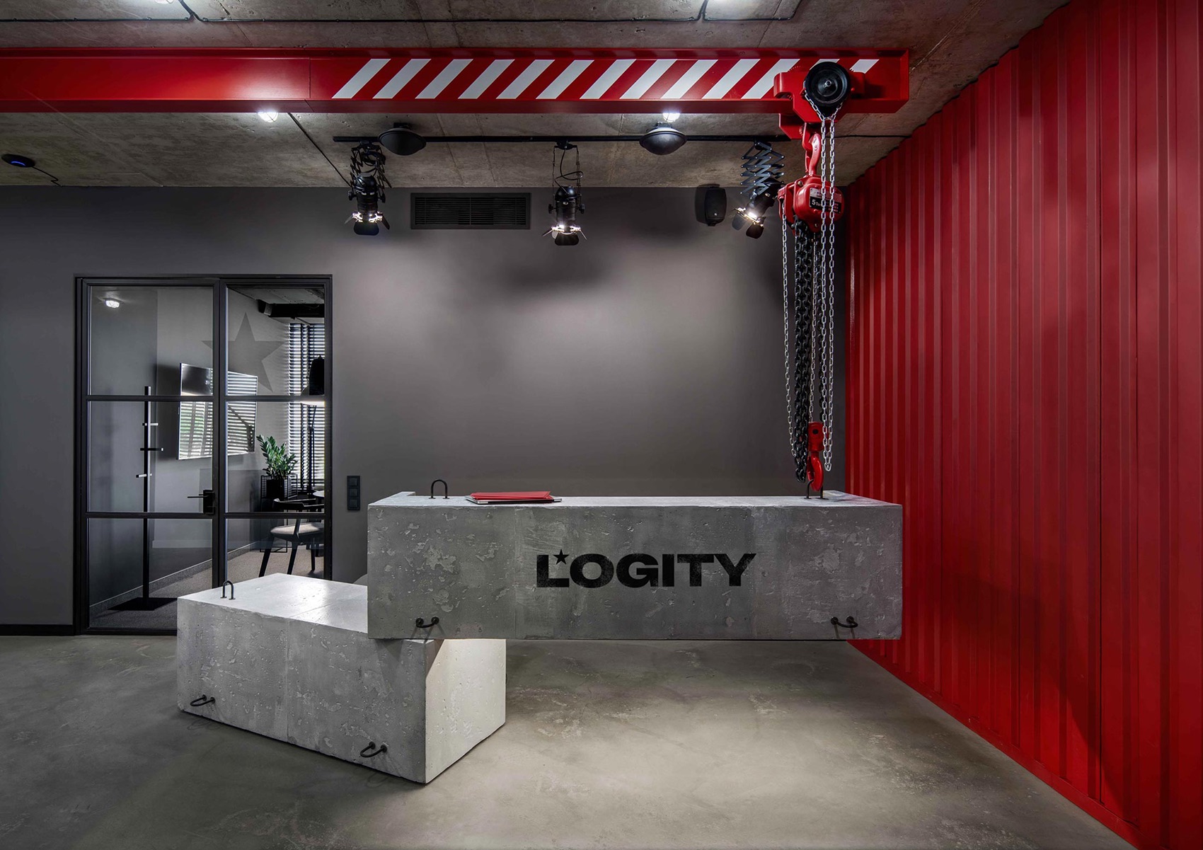
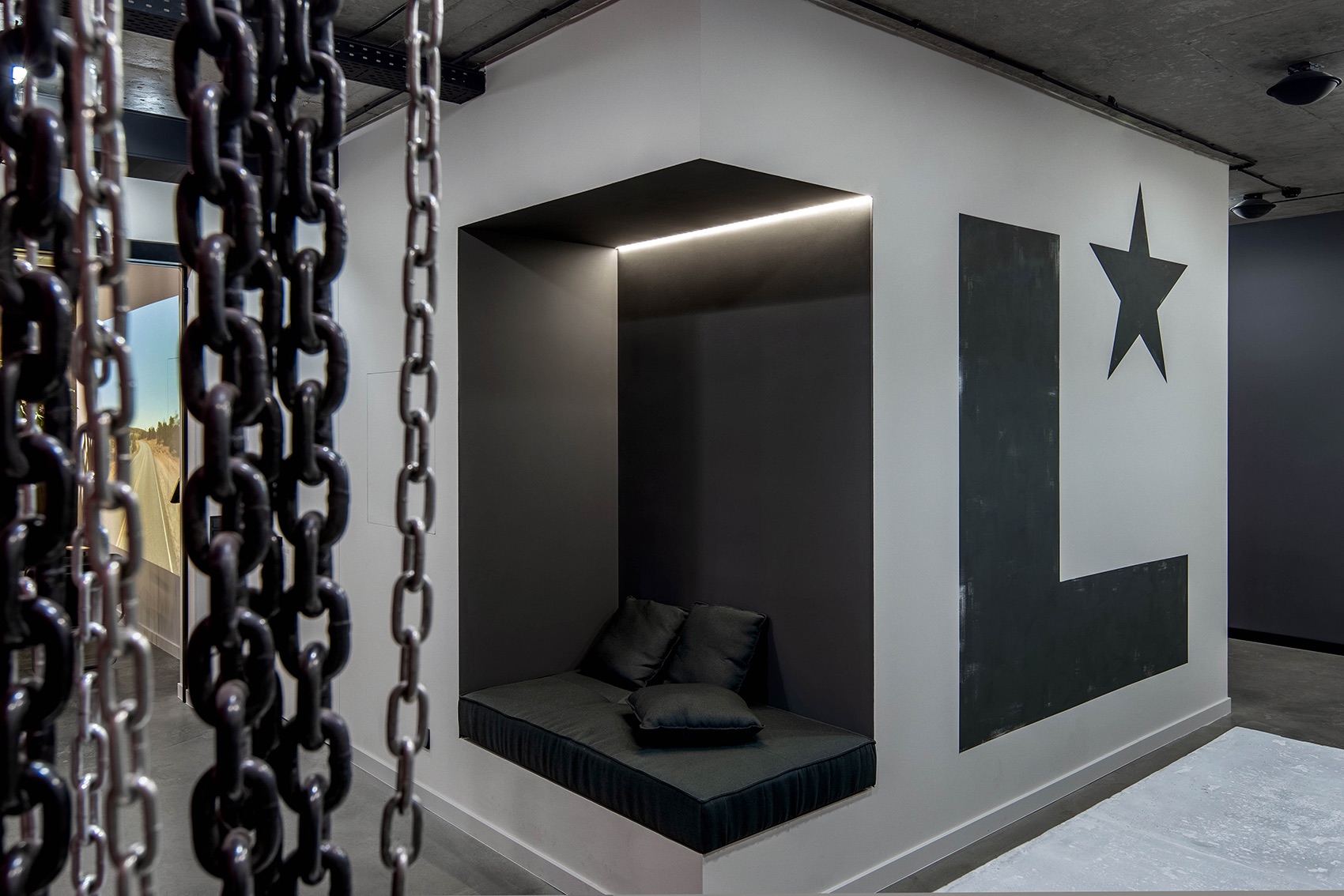
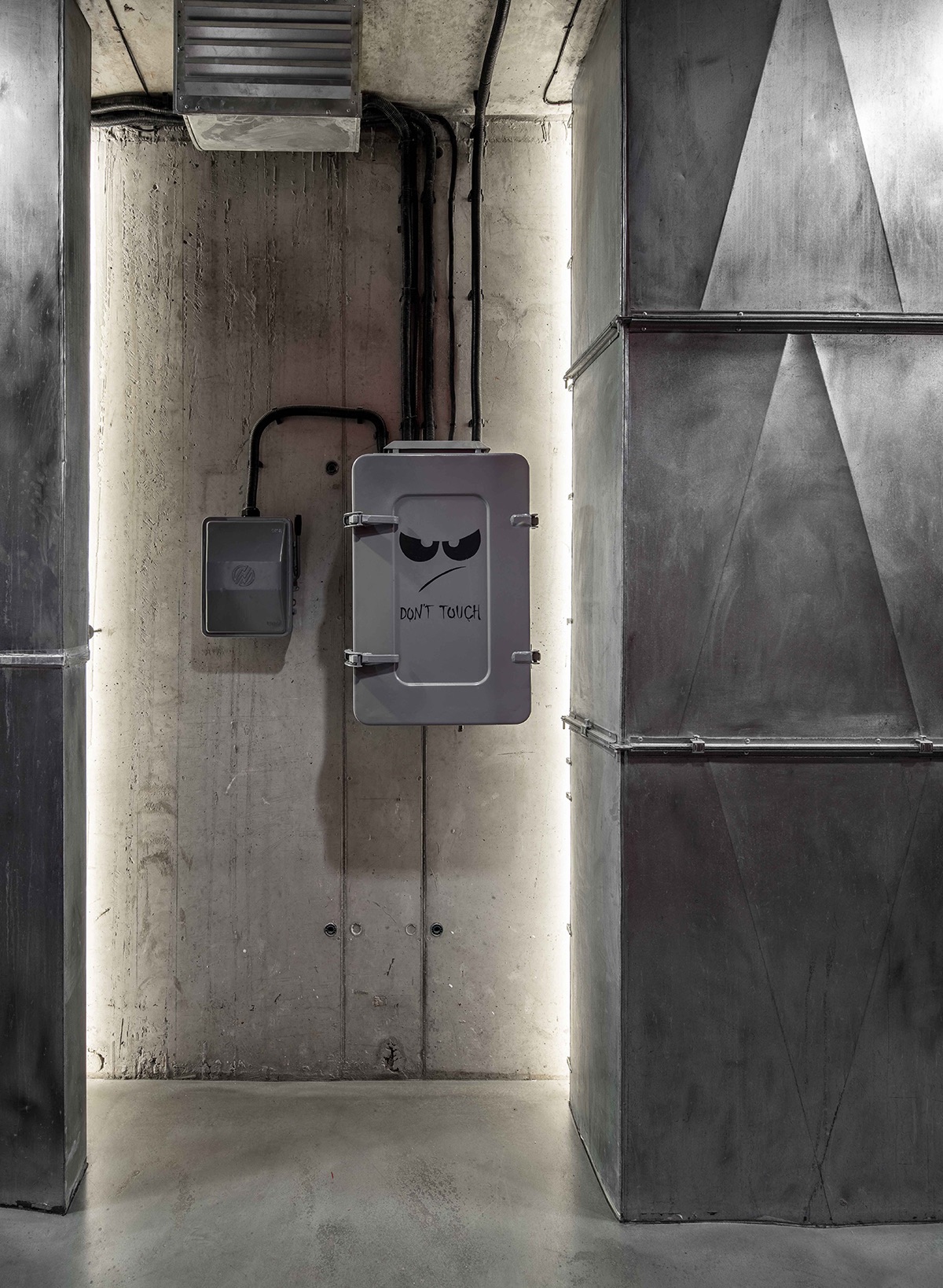
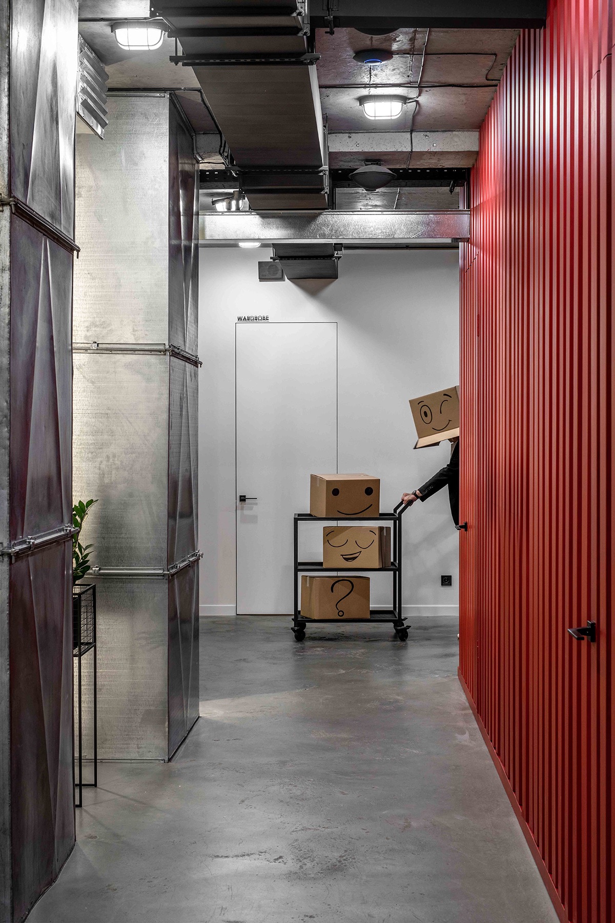
This interior became the place of accumulation of textures relating to surroundings in the field of logistics. Keeping to the industrial style, we combined representations of a truck (main hero of the company) and a workshop (main place of destination). So, concrete, metal, wood and plants appeared in the interior. Leaving an elevator, an office employee will first see a dynamic projection of a road on a wall. It is like he moves into a truck and becomes a driver himself. Further an employee gets to a reception desk through a glass sliding system and here the full immersion into the field begins. A red L-shaped wall looks like a cargo container and а reception desk is hung by a lift crane. Comparing with offices on other floors, the Logity entry zone is much wider. We demounted the walls that covered ventilation channels and fire plugs, and they became art objects: if they were absent in the area, they should be added.
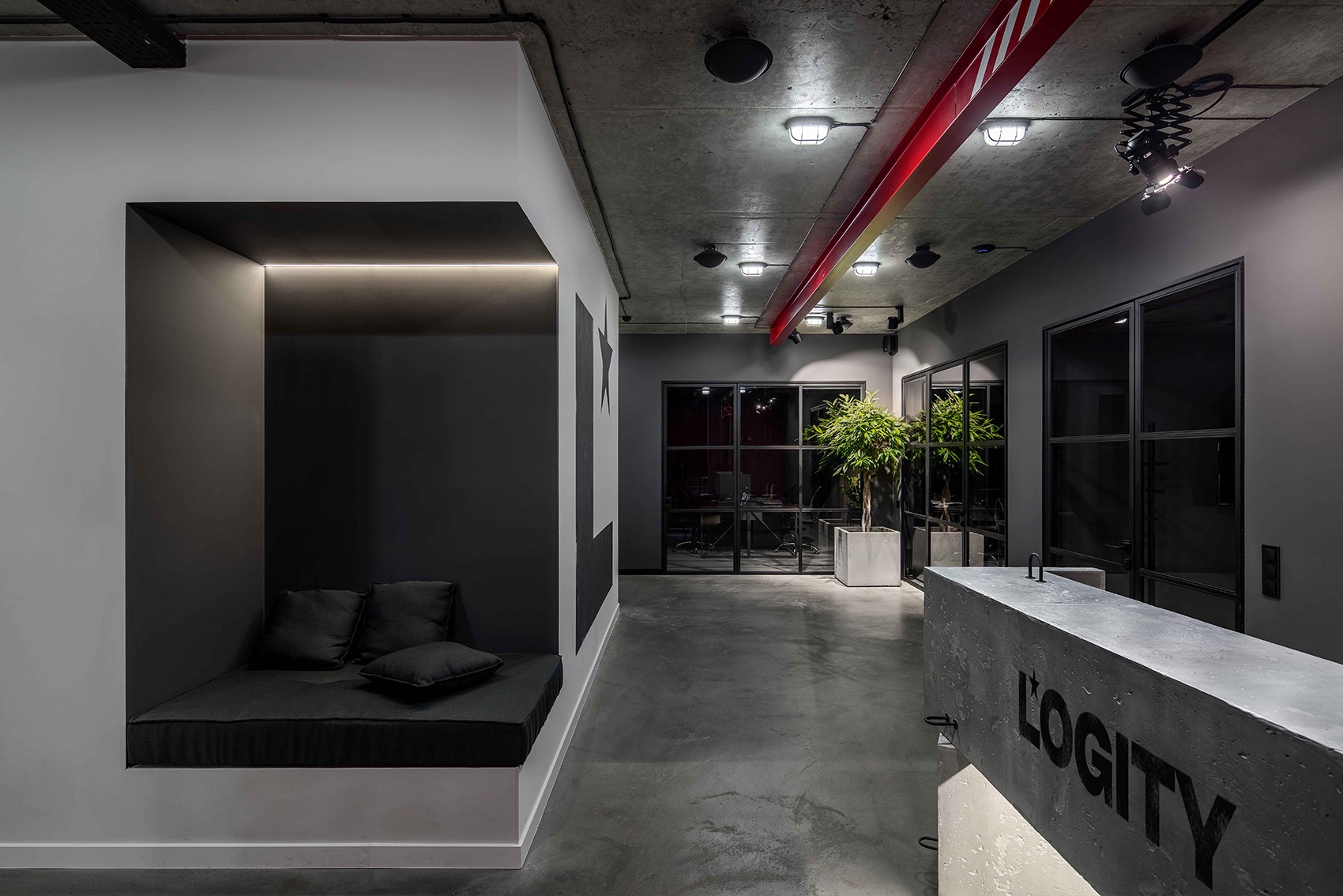
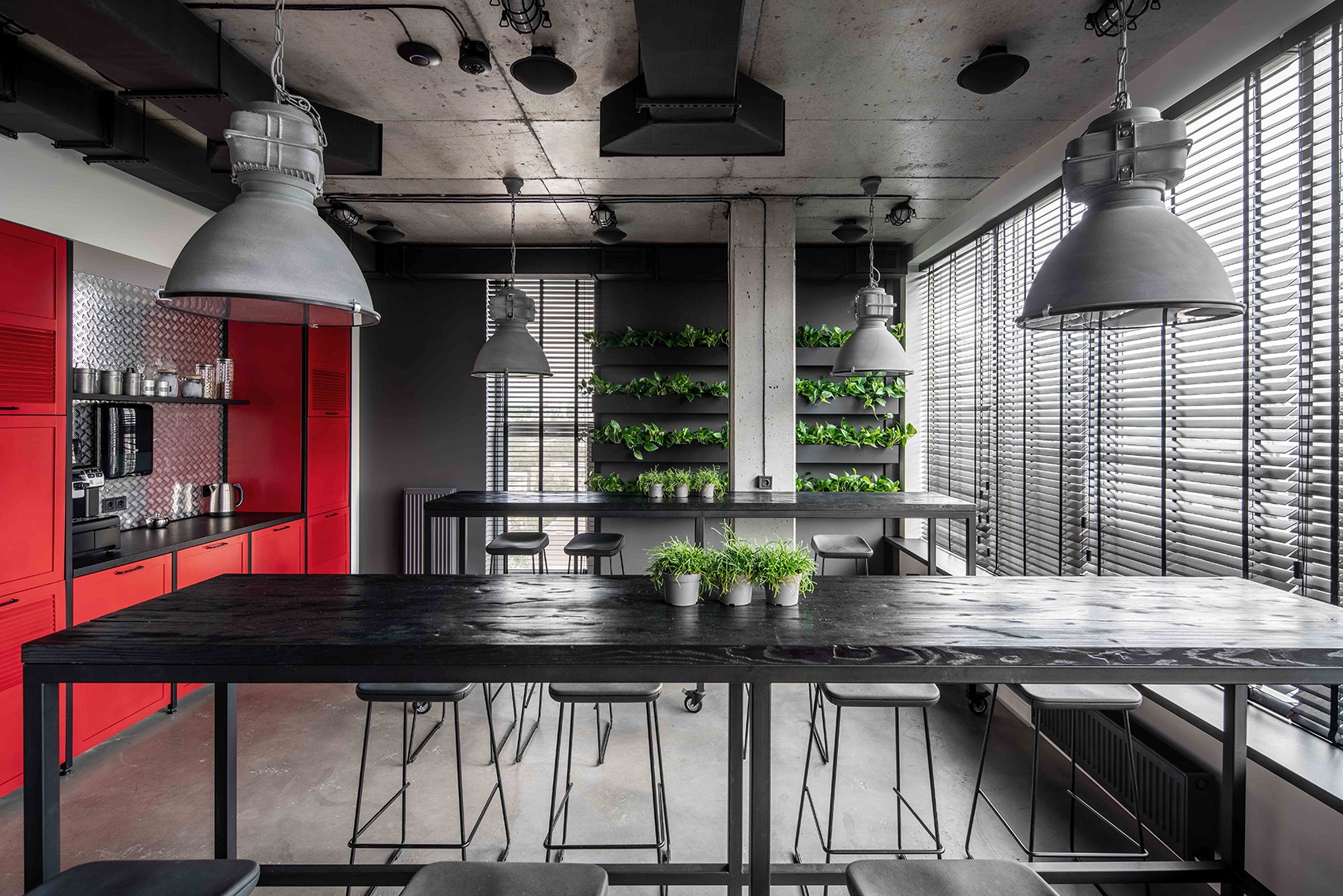
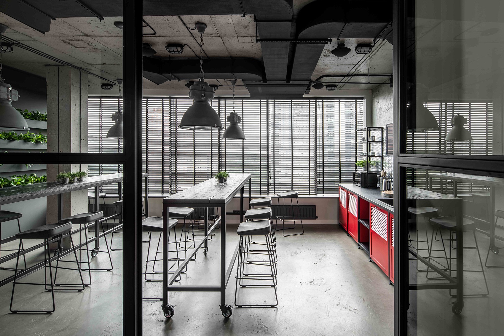
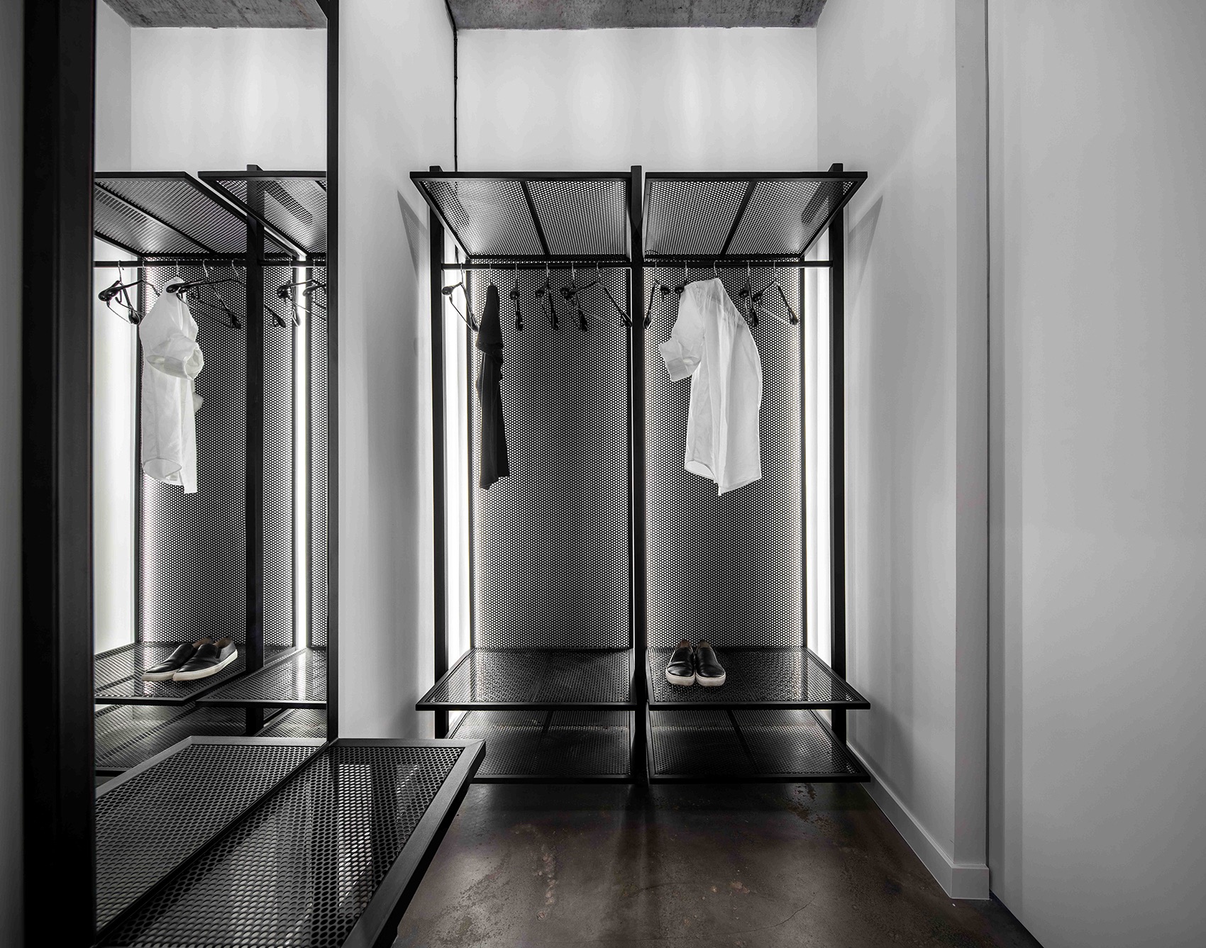
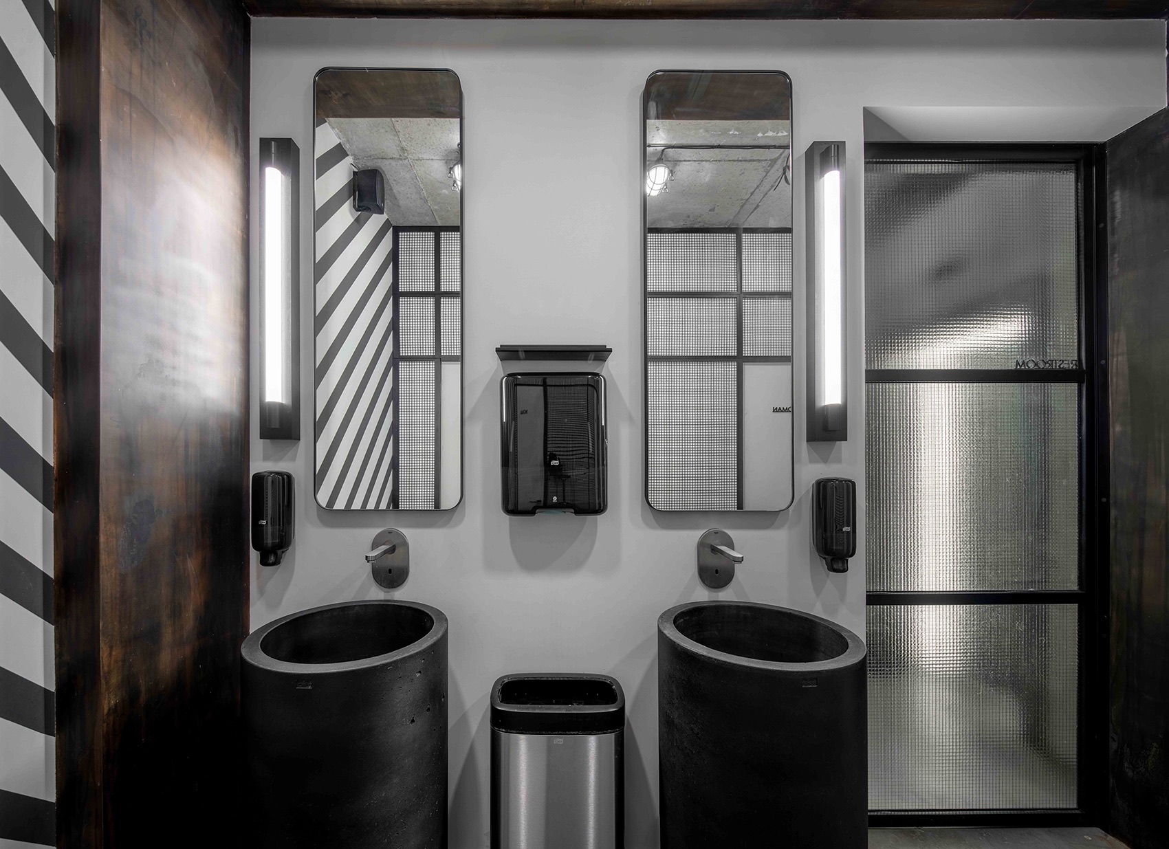
At the reception, a person can take a seat in a corner waiting area or come into a dressing room to leave belongings. We made the furniture from mesh and used it to cover some walls in a corridor and lavatories. A partition between lavatories and a foyer is made of reinforced glass. All elements are taken from surroundings of truck drivers. We brought materials that are usual for them into an office and ensured the creation of a uniform visual context for all employees of an international company. A kitchen was an important stage of the design and here we haven’t missed a single element. Bar tables also hint at the industry and, moreover, they are a functional element: they can be easily moved for simulating different boarding scenarios. We
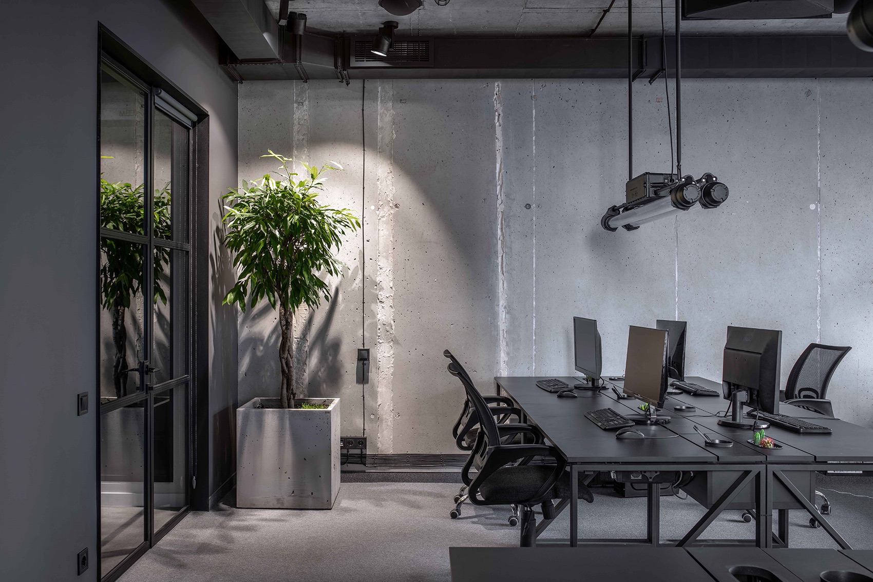
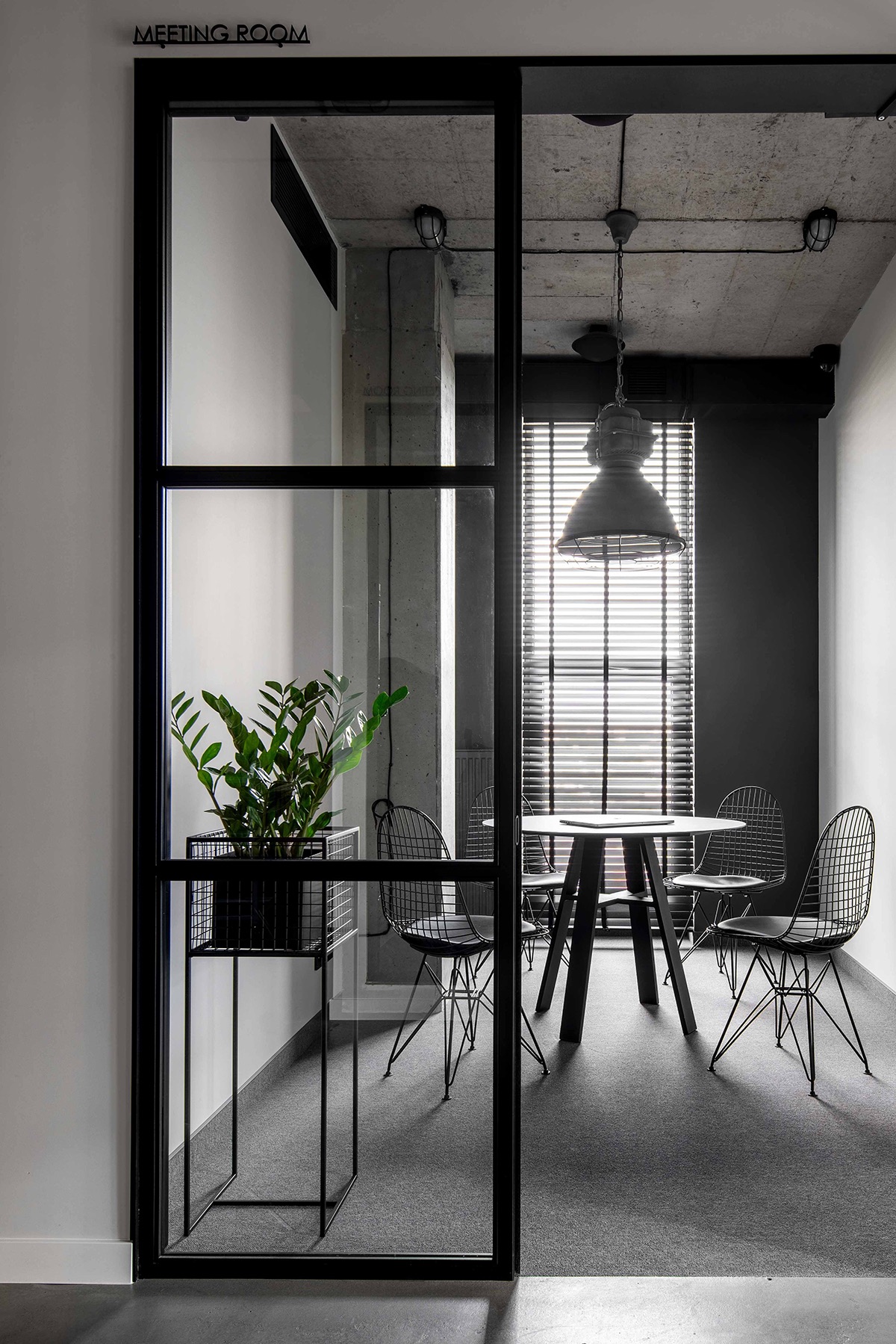
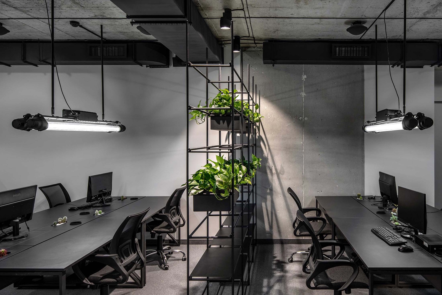
discerned a radiator grille in a large industrial freezer and enhanced that likeness with kitchen furniture facades. The material of the facades — metal — was also taken from the industrial field.We even made a splash back from aluminium sheets, similar to those of truck steps. Table boards were machined with an angle grinder, making a rough notched pattern. In the result there are only two romantic elements in the kitchen: a beautiful city view from high bar chairs and one can pick fresh leaves of basil and mint, growing nearby, and add them in dishes. Everything else is hardcore. The main material in working areas is concrete. We cleaned it, covered with lacquer and then surrounded with authentic items. Ventilation channels are open and make an image on a ceiling. Names of departments are stencilled on the concrete. Lamps were designed for industrial premises, but we restored and cleaned them. We made some flower pots ourselves from already beloved mesh,” says Studio Bondarenko Design.
- Location: Kharkiv, Ukraine
- Date completed: 2019
- Design: Studio Bondarenko Design
