A Tour of Azure Publishing’s New Toronto Headquarters
Media company Azure Publishing hired architecture firm Dubbeldam Architecture + Design to design their new headquarters in Toronto, Canada.
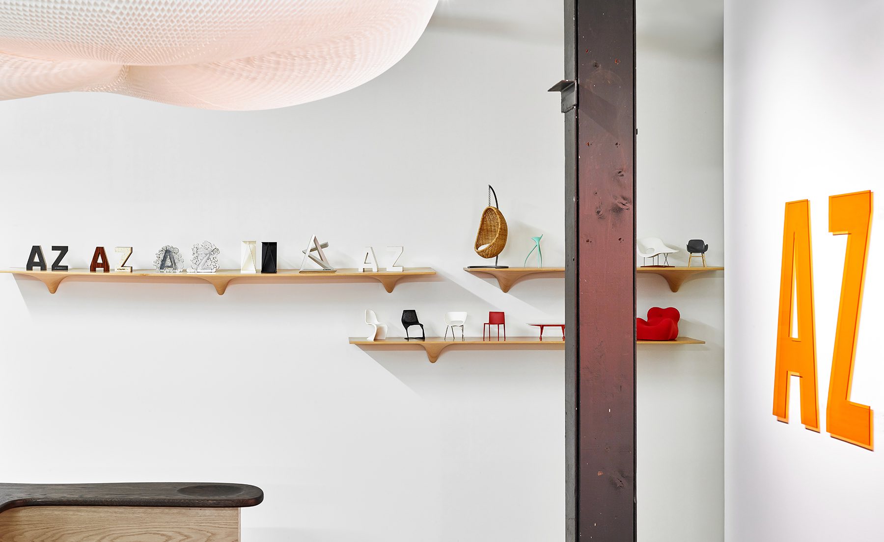
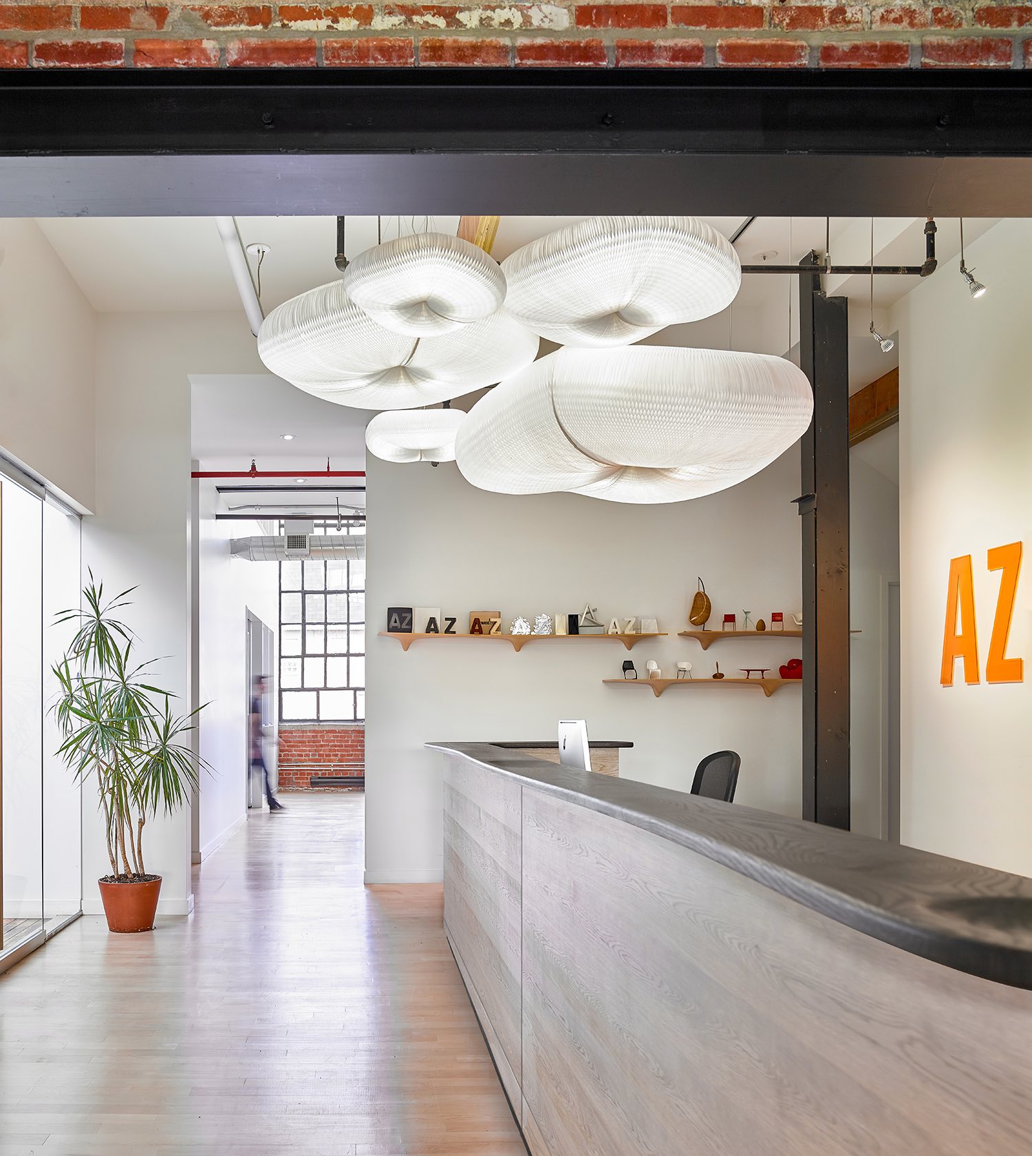
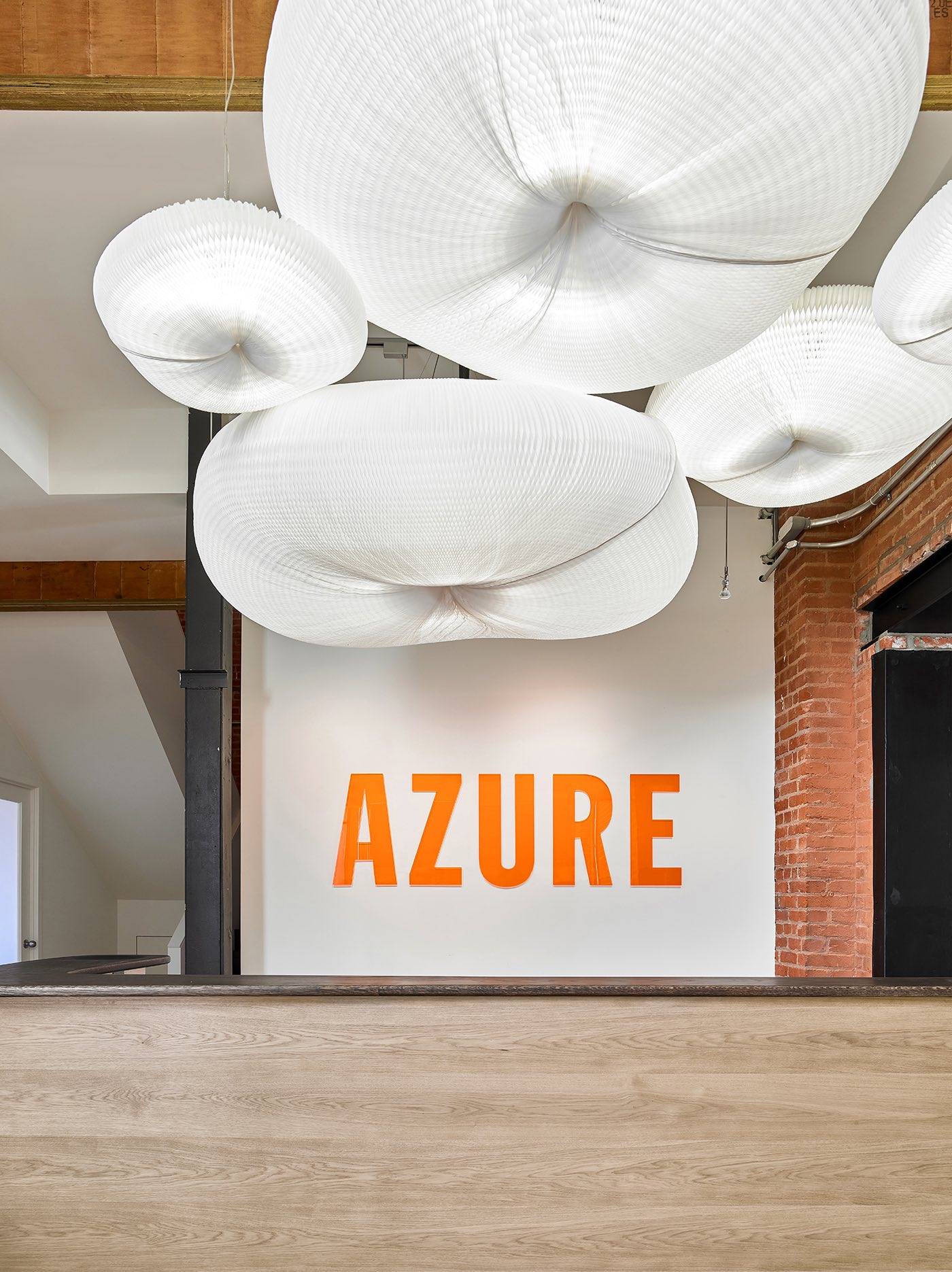
“The entry is demarcated by its distinctive logo, rendered in a bold orange super-graphic, visible through the reception glass on axis at the end of a long corridor leading to the office. In keeping with the Canadian designers who are routinely featured in the magazine, the whimsical pendant overhead is by Molo, a Vancouver-based studio that makes furniture and lighting fixtures out of expandable paper geometries. An assemblage of five pendants are clustered like cumulus clouds and float above the reception desk whose sinuously organic wood top is crafted by the Brothers Dressler, bespoke furniture makers who are also neighbours on Sterling Road.
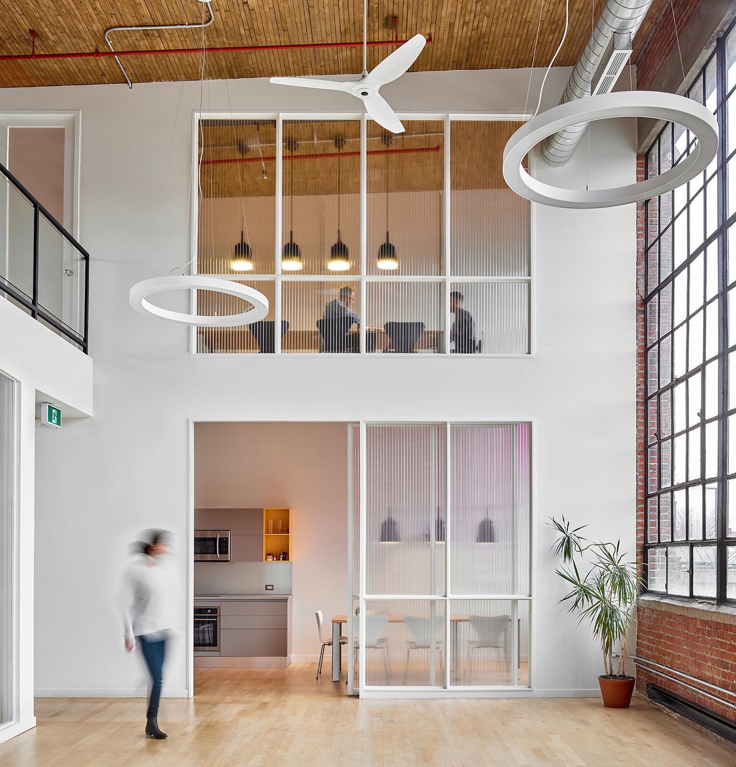
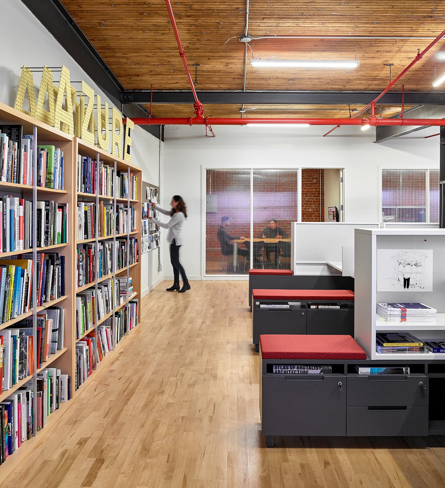
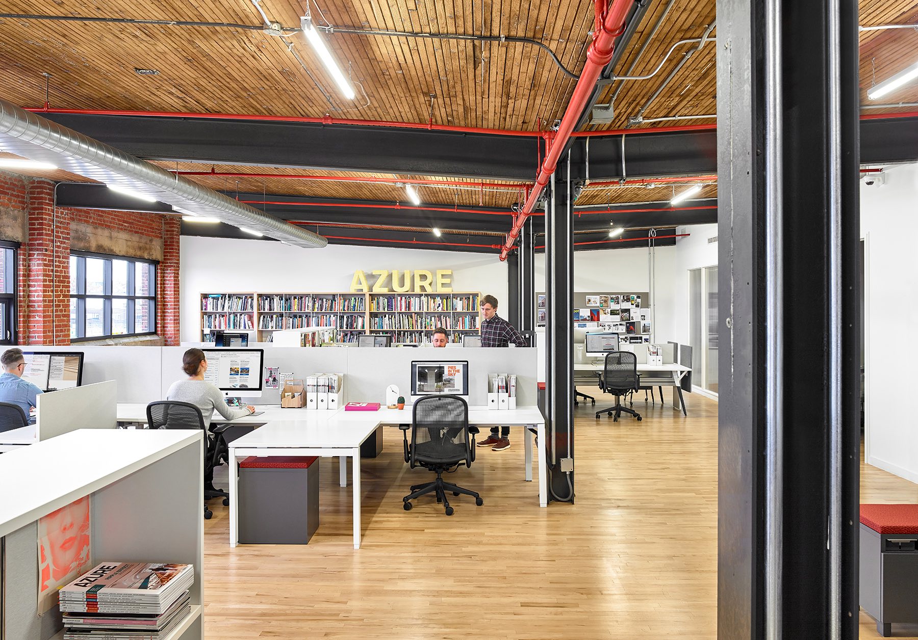
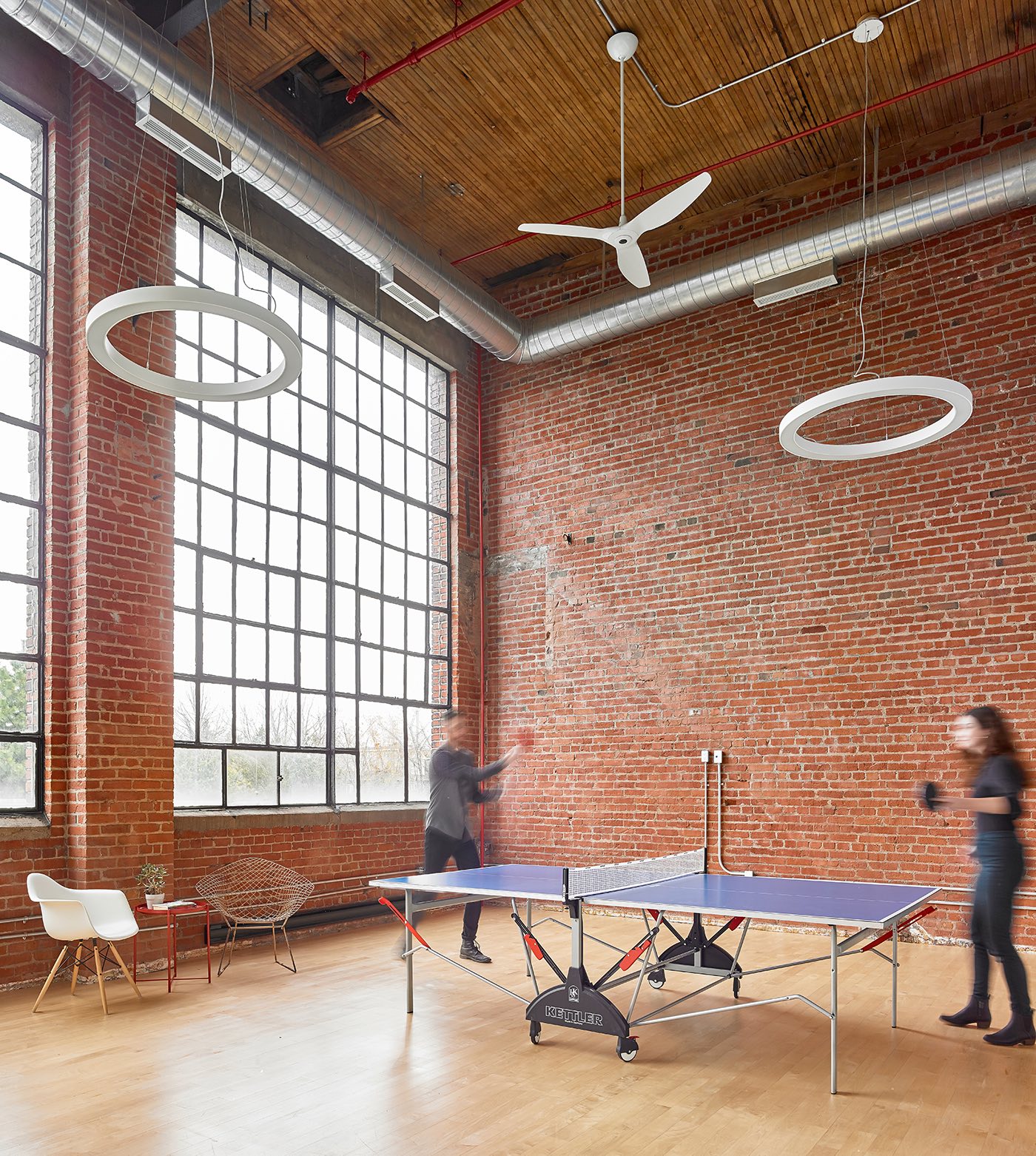
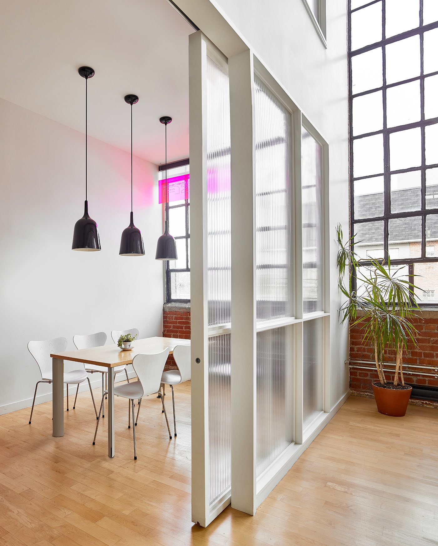
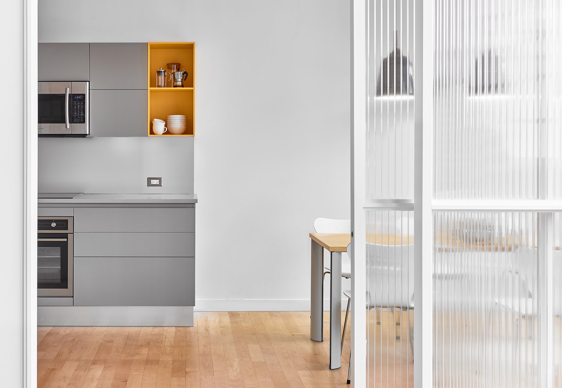
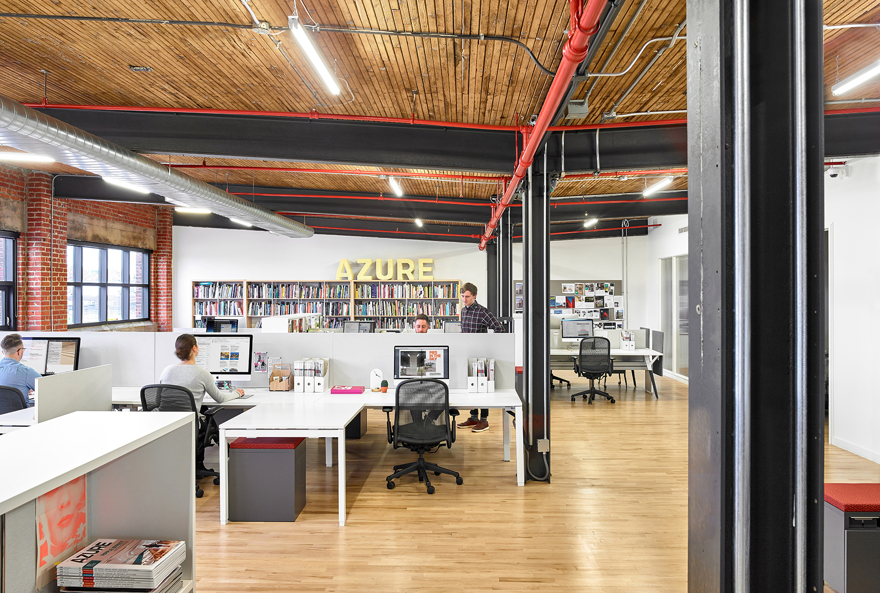
The reception area is flanked by a large, open-concept space that accommodates 26 workstations, a pair of private offices and a meeting room, which serve as the working environment for teams of editors, publishers, writers and advertising sales. Equipped with ergonomic desks and task chairs by Teknion, this quiet zone is conducive to professional focus, while also accommodating client meetings and collaborative sessions. To optimize structure and order, reference material and personal belongings can be stowed in integrated bookshelves and storage cubbies. The space is bathed in natural daylight from both south- and east-facing windows, increasing productivity and a sense of wellbeing for staff. On the opposite side of reception, a double-height space captivates with its volumetric expansion, with 16-foot-tall original factory windows framed in black metal providing even north light. Flexible in nature, the space is ideal for social events and recreational activities. The adjoining lunchroom and staff kitchen – fitted with Scavolini cabinets – can be closed off by a sliding translucent acrylic screen, a device used throughout the office to maintain a modicum of privacy without sacrificing light transmission.
The office’s material palette is a strategic interplay of new and old: white and pops of colour are introduced through graphics, seating and signage, in contrast to the neutral palette of the historic textured red brick walls, aged wood plank ceilings, newly installed honey-blonde maple floors, and darkened rough steel columns and beams,” says Dubbeldam Architecture + Design.
- Location: Toronto, Canada
- Date completed: 2019
- Size: 5,600 square feet
- Design: Dubbeldam Architecture + Design
- Photos: Scott Norsworthy
