A Tour of Private Financial Company Office in Brisbane
A team of designers from architectural firmn Gray Puksand recently designed a new office for private financial company in Melbourne, Australia.
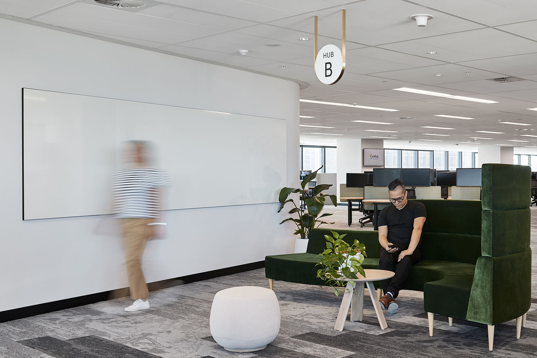
“The intent was to deliver an interior exuding a sense of calm and balance that essentially functions as a yin to the yang of the often high-intensity business. In order to do so, the project team employed the principles of biophilic design throughout, incorporating natural materials, neutral colours and patterns reminiscent of nature.
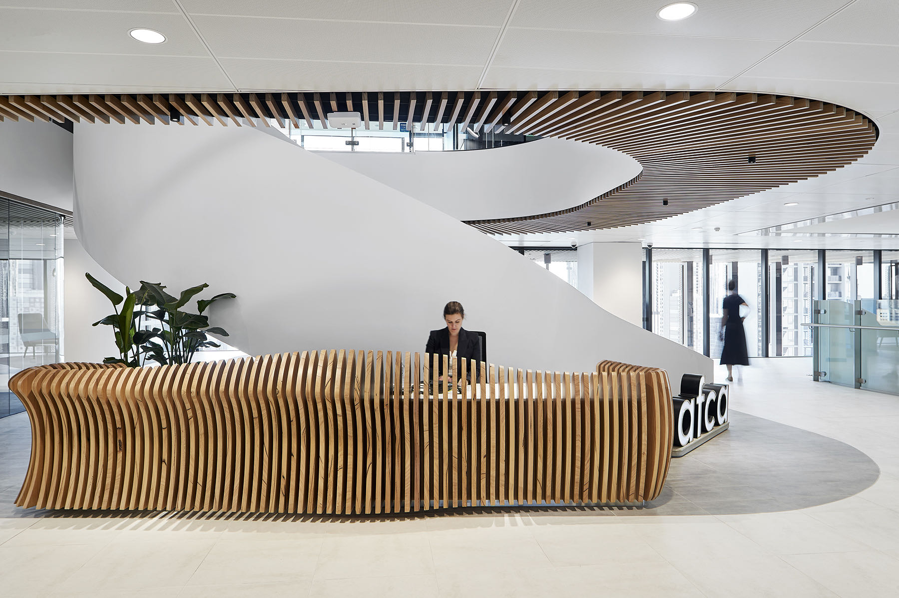
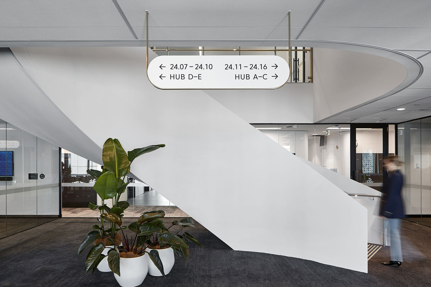
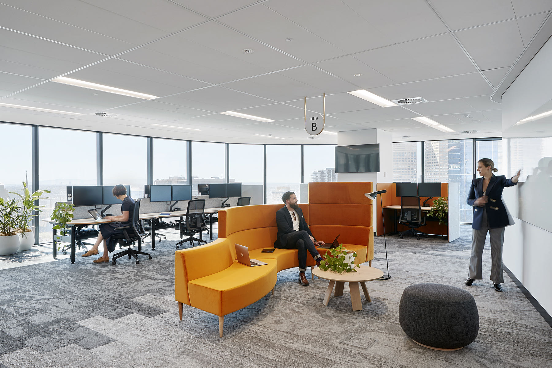
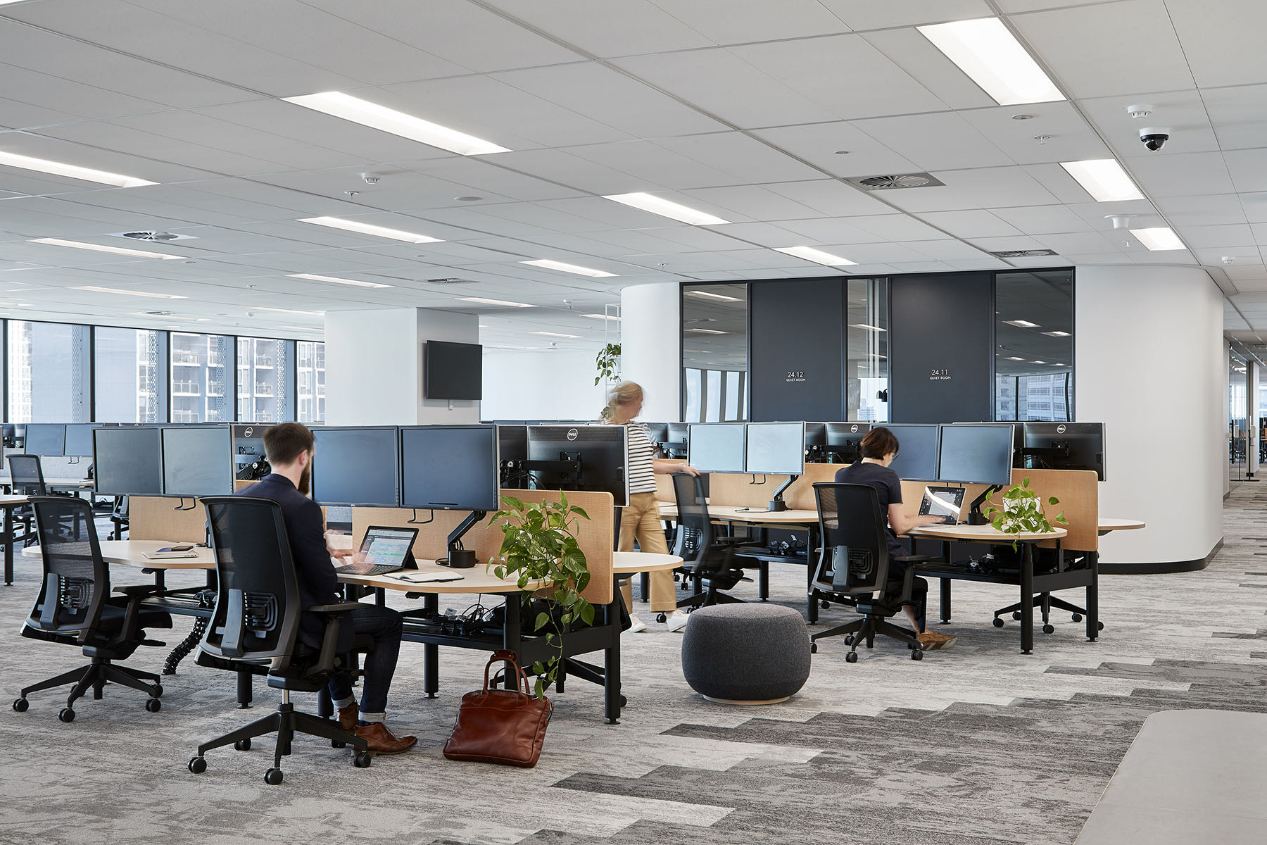
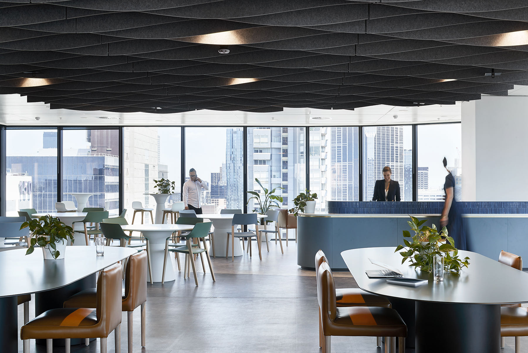
The design’s driving concept is underpinned by themes of fluidity, growth and solid foundations. These interconnected ideas are expressed as strong spatial and architectural elements, beginning at the entry, with a generous reception area that welcomes visitors. Beyond its organically shaped desk is the sculptural stair, which connects all four levels. This dramatic structure visually anchors the fit-out, while around it, different settings allow employees to choose how they want to work by offering zones for collaboration alongside intimate areas for quiet retreat.
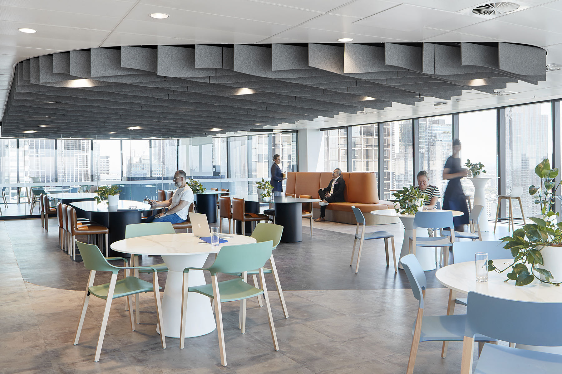
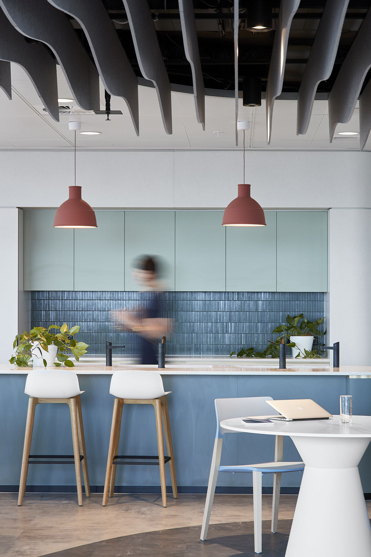
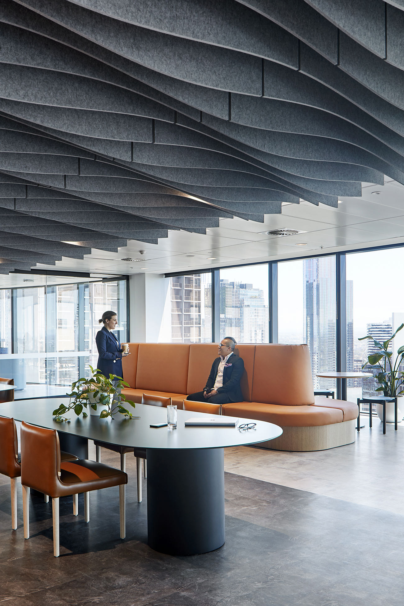
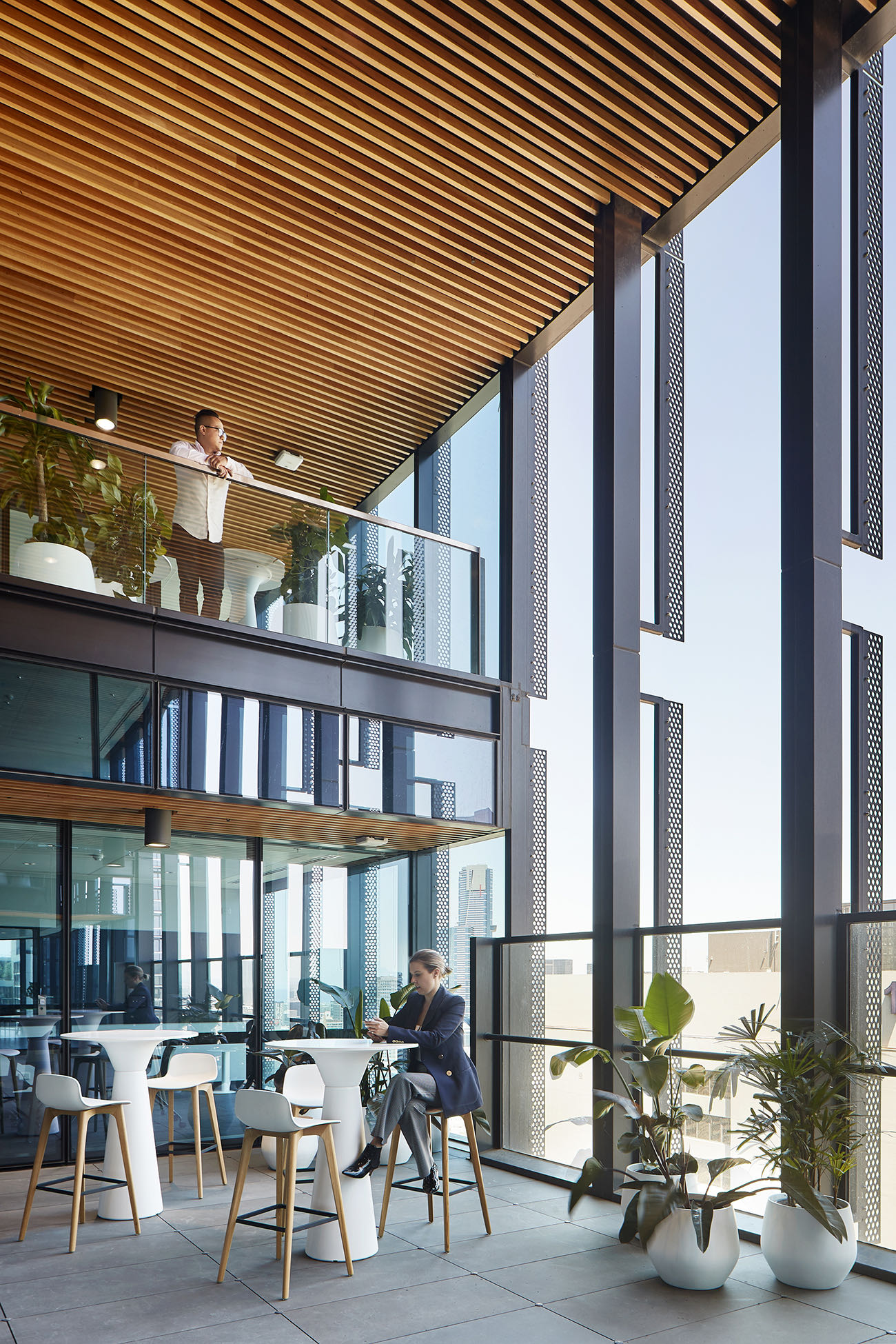
Key to the overall design is the Green House, an informal meeting space that allows employees to gather in small to medium groups. While a variety of modern furniture in pastel blue, pistachio green and warm ochre characterises this area, it’s defined by a striking ceiling feature that recalls rippling water. This is adjacent to the Wintergarden, which boasts a double-height space and abundant plantings. Panoramic views of the north of the city further extend the connection to nature, as does the natural stone flooring, timber detailing and subtle textures of the fabric upholstery.
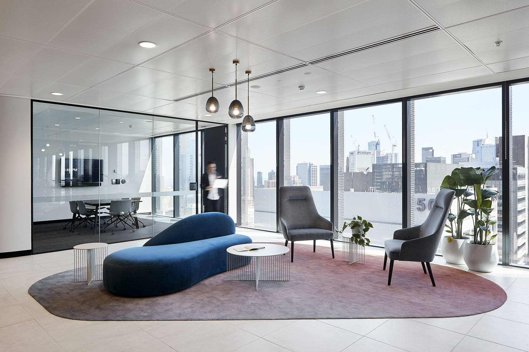
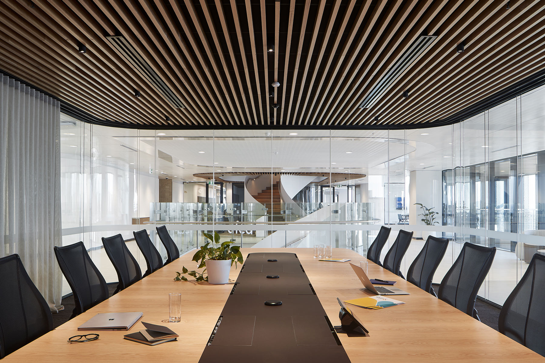
Soft edges and curves dominate the design, from the wide non-linear circulation paths that carve out each floor’s plan to the pendant lighting and amorphously shaped rugs. Even the glass-enclosed boardroom, centrally placed to symbolise an opportunity to ‘meet in the middle’ when resolving disputes, doesn’t have any sharp corners. The fit-out’s forms and shapes come together to represent nature’s ebbs and flows, which have ultimately settled in place to provide a relaxed, comfortable workplace,” says Gray Puksand.
- Location: Melbourne, Australia
- Date completed: 2020
- Size: 86,111 square feet
- Design: Gray Puksand
- Photos: Shannon McGrath
