A Look Inside Trayport’s New London Office
Energy trading provider Trayport recently hired workplace design firm Oktra to design their new office in London, England.
“Former client Trayport needed an in-situ refurbishment to support a workplace strategy that championed flexibility. The sudden rise of remote working accelerated their need to reshape their workspace, and we delivered the Cat B fit out over lockdown while employees worked from home. Having previously undergone an external workplace consultancy, Trayport had a clear understanding of their work flows and the types of spaces needed to support every department’s function. Our team built on their existing understanding of the client’s business, and set out to create a fundamentally more agile and collaborative work environment that would support a hybrid working model.
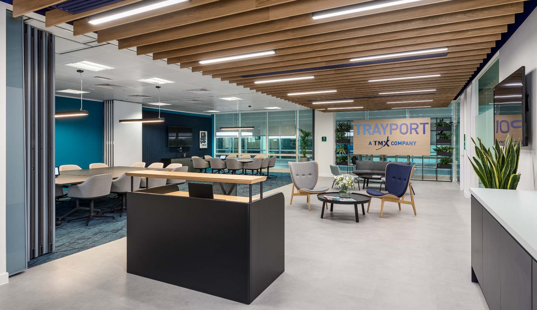
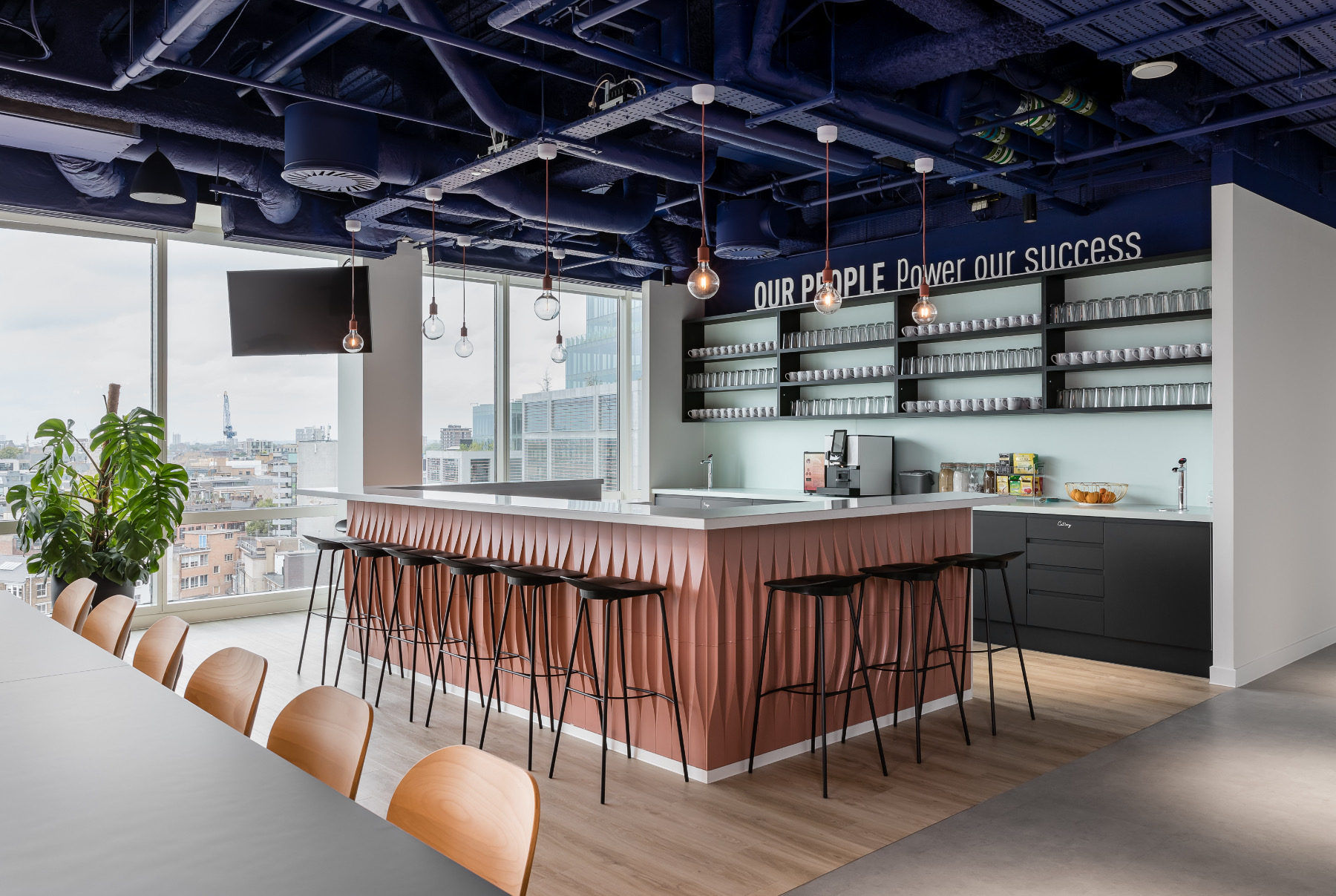
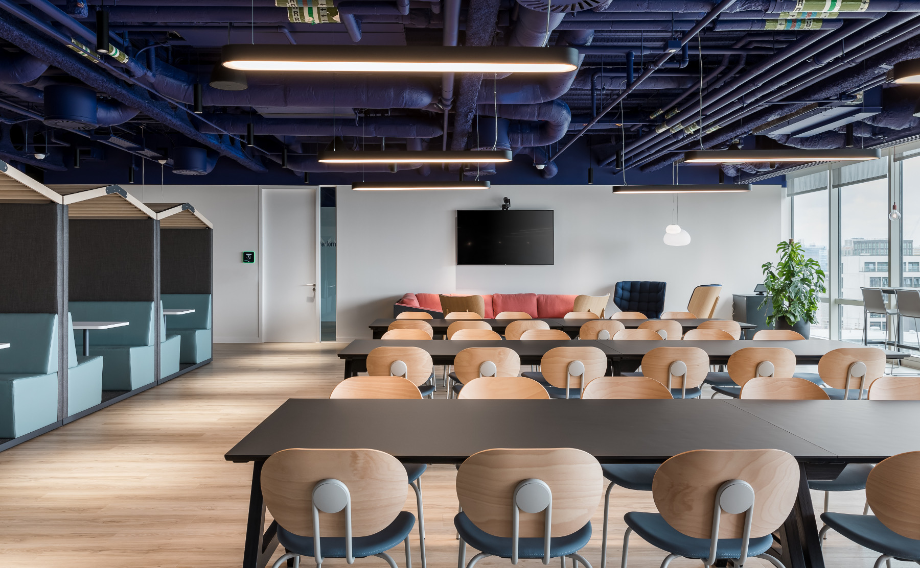
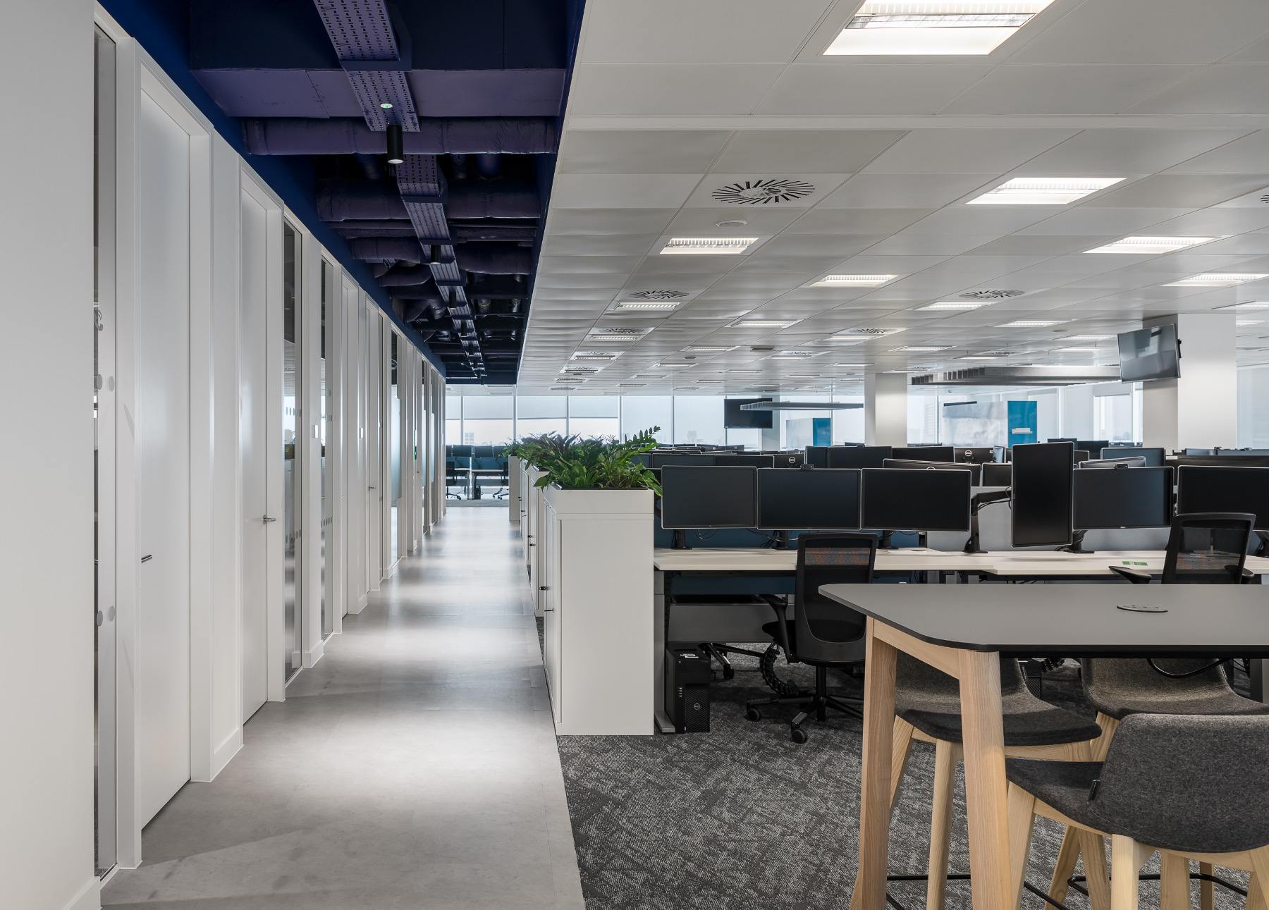
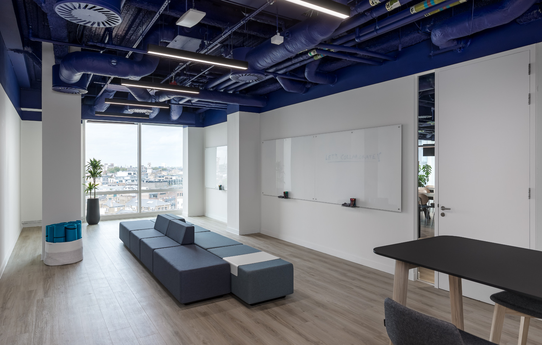
The revised layout of the office features a varied selection of work settings and 25% of the floorplate is allocated to collaboration zones. The breakout space is a focal point in the centre of the office and naturally draws in employees to encourage social interaction, as well as having the capacity to accommodate up to 200 employees for town hall meetings. Additionally, the enlarged teapoint is supplemented by a central bar where staff can gather away from the main workspace and socialise.
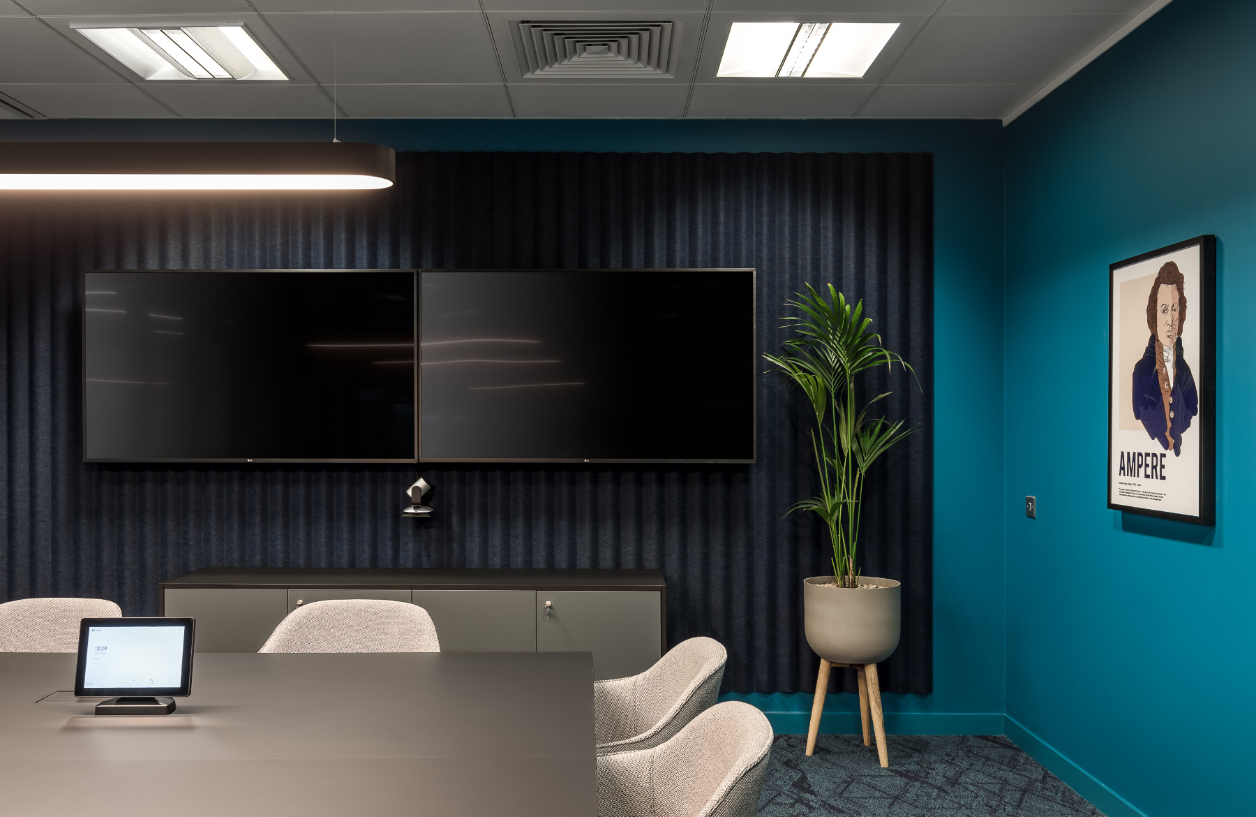
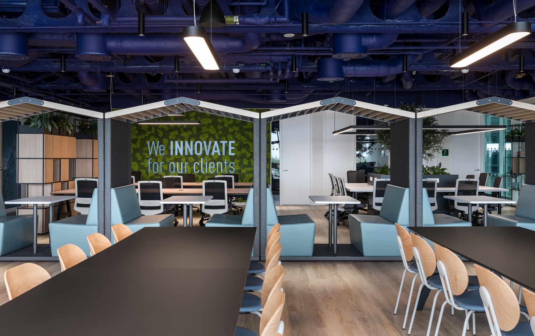
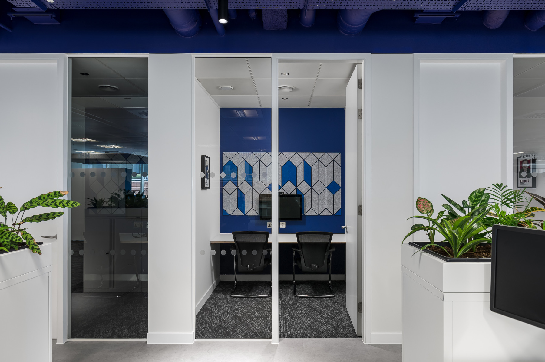
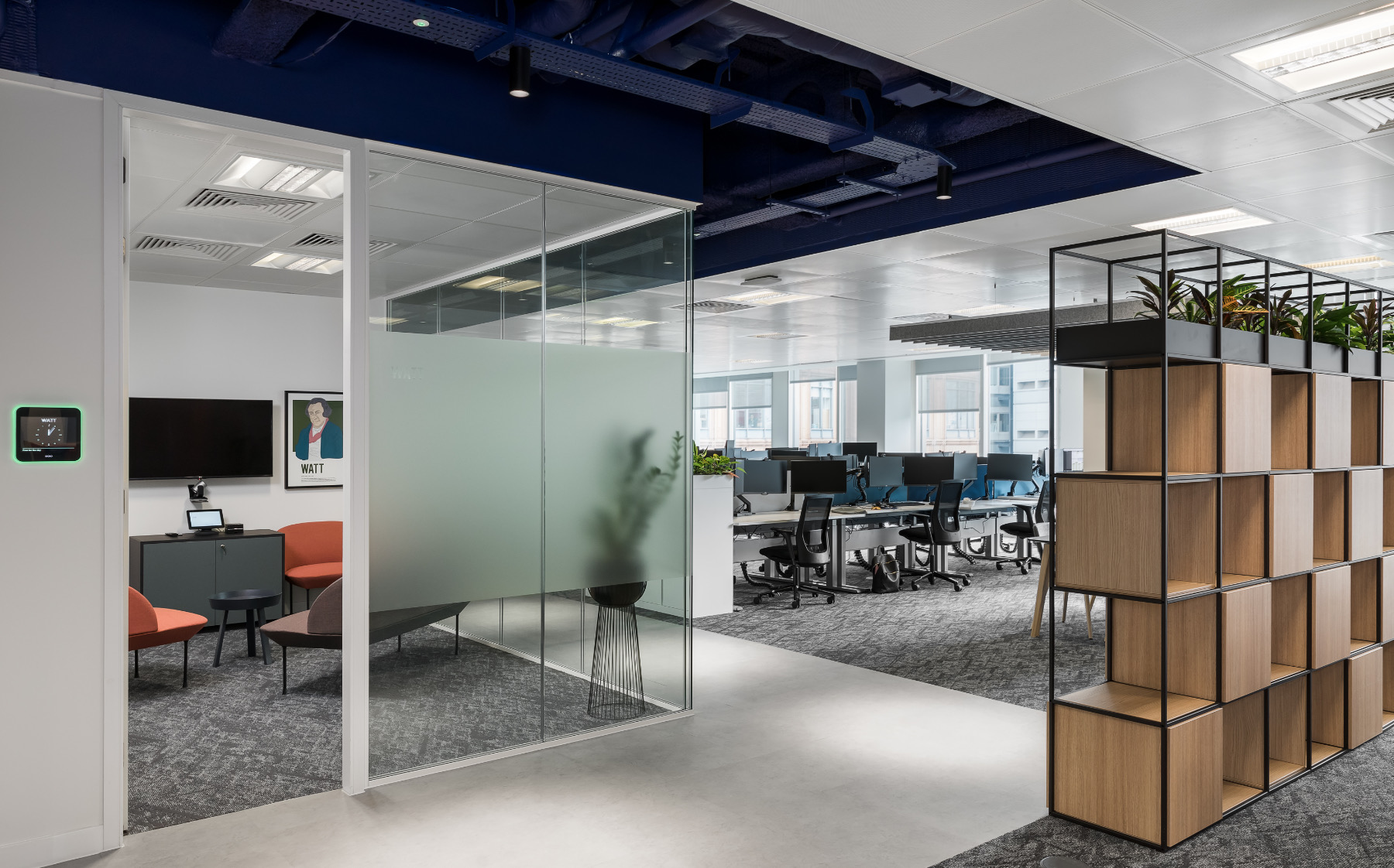
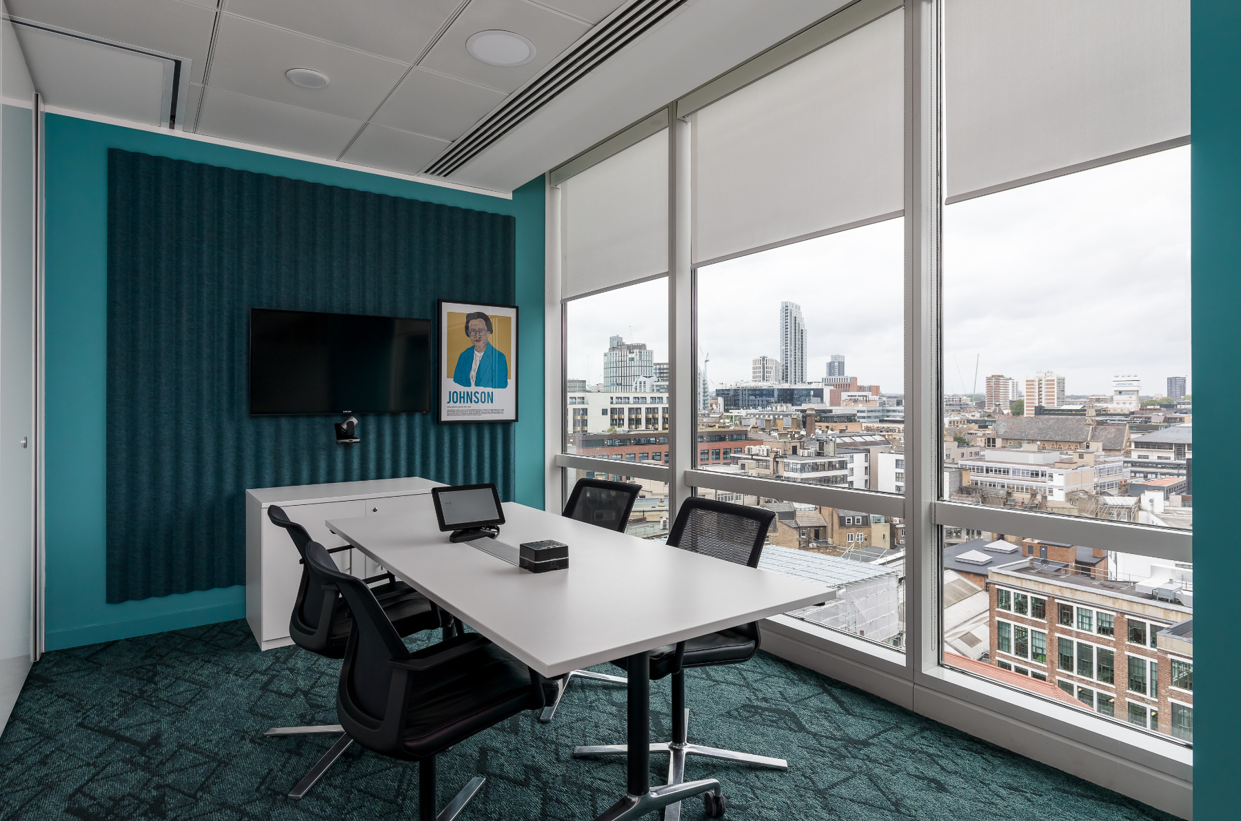
Following over a year of remote working for many, virtual collaboration has become the norm. AV conferencing solutions were initially planned for six meeting rooms, however, following the increased demand for flexible work practices, this number rose to include 33 phone booths and two-person ‘Zoom rooms’. With meeting rooms for two to 14 people, six meeting suites, touchdown workspaces, and a dedicated collaboration hub, Trayport’s employees are able to tailor their workplace experience to suit their daily tasks.
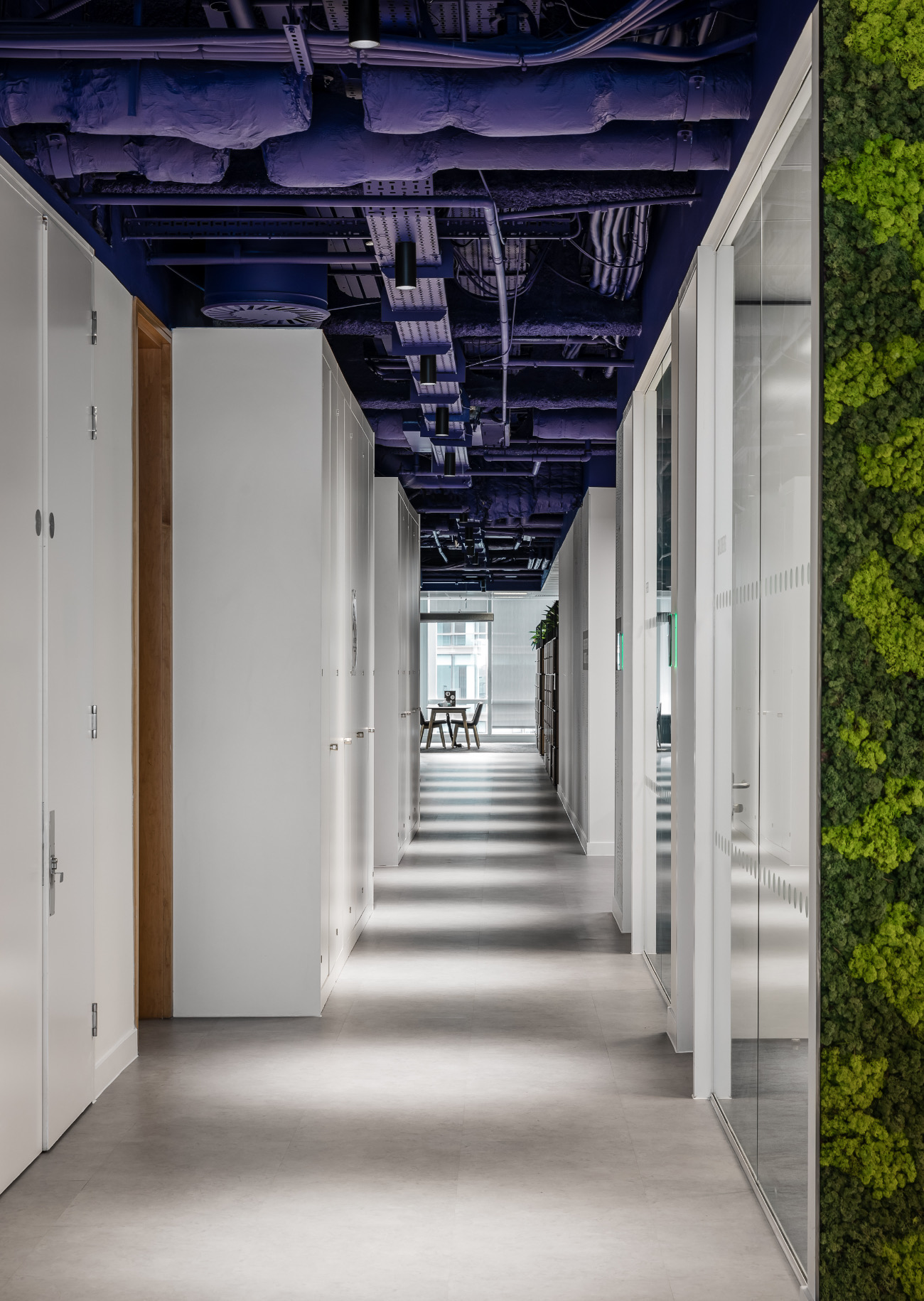
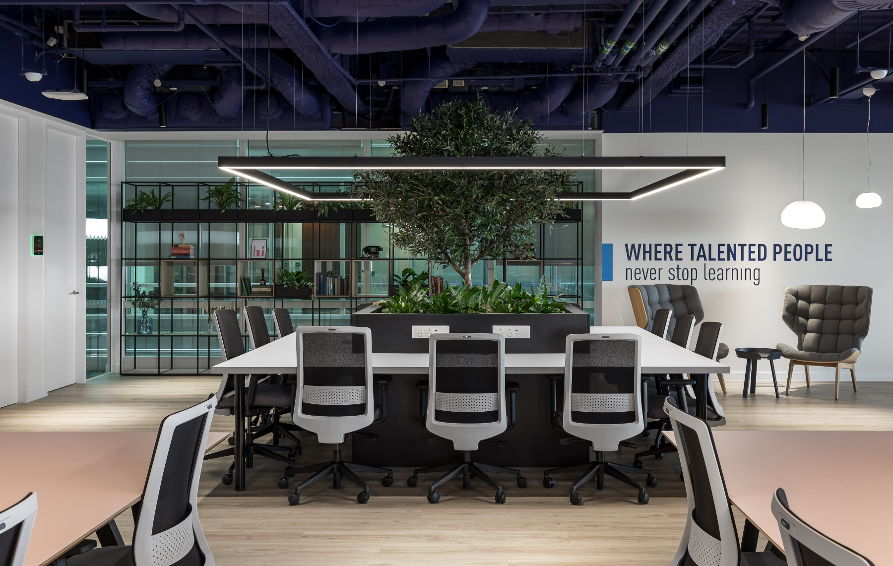
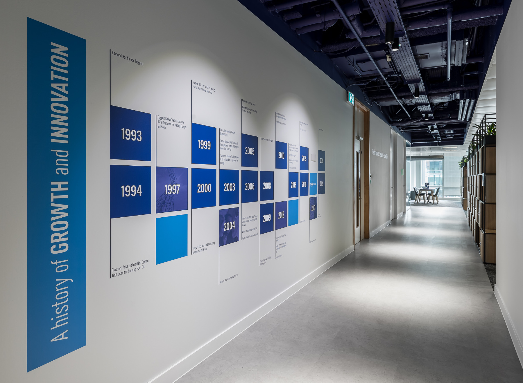
Employees are ensconced in their company’s brand as soon as they enter the office, with bold graphics, inspiring mission statements, and turquoise and blue fabrics for the furniture and acoustic panels. Trayport’s signature dark blue is visible throughout their workspace in the exposed ceiling that not only reflects their brand, but increases the envelope of the space and gives the illusion of a larger office. Borrowing a shade from Trayport’s secondary colour palette, the teapoint stands out with pink fluted tiles that provide a welcome pop of colour and set apart this more informal area.
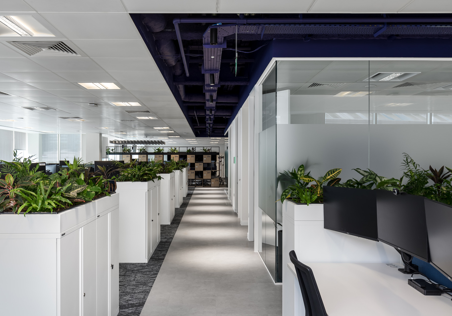
By relocating all meeting rooms to the core of the building, the desk areas where the programmers spend the majority of their time now have access to more natural light, creating a healthier work environment. With 80% more planting, biophilic elements now feature in almost every area of the office and include an air-purifying moss wall that breathes life into the space.
Human connection and an agile mindset is at the core of Trayport’s office design. As they look to a flexible future, their new workspace will encourage employees to come into the office to collaborate, while supporting those working remotely.”
- Location: London, England
- Date completed: 2020
- Size: 20,000 square feet
- Design: Oktra
- Photos: Oliver Pohlmann
