A Look Inside Studio Sisu’s Melbourne Office
A team of designers from interior design firm Maike Design recently designed a new office for business studio Studio Sisu.
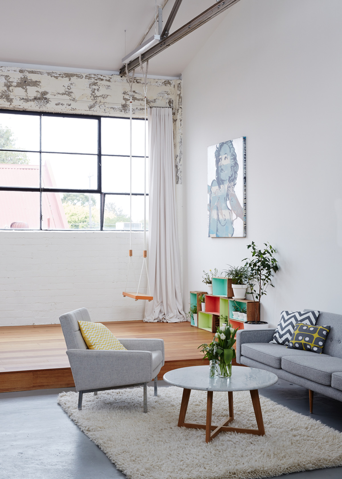
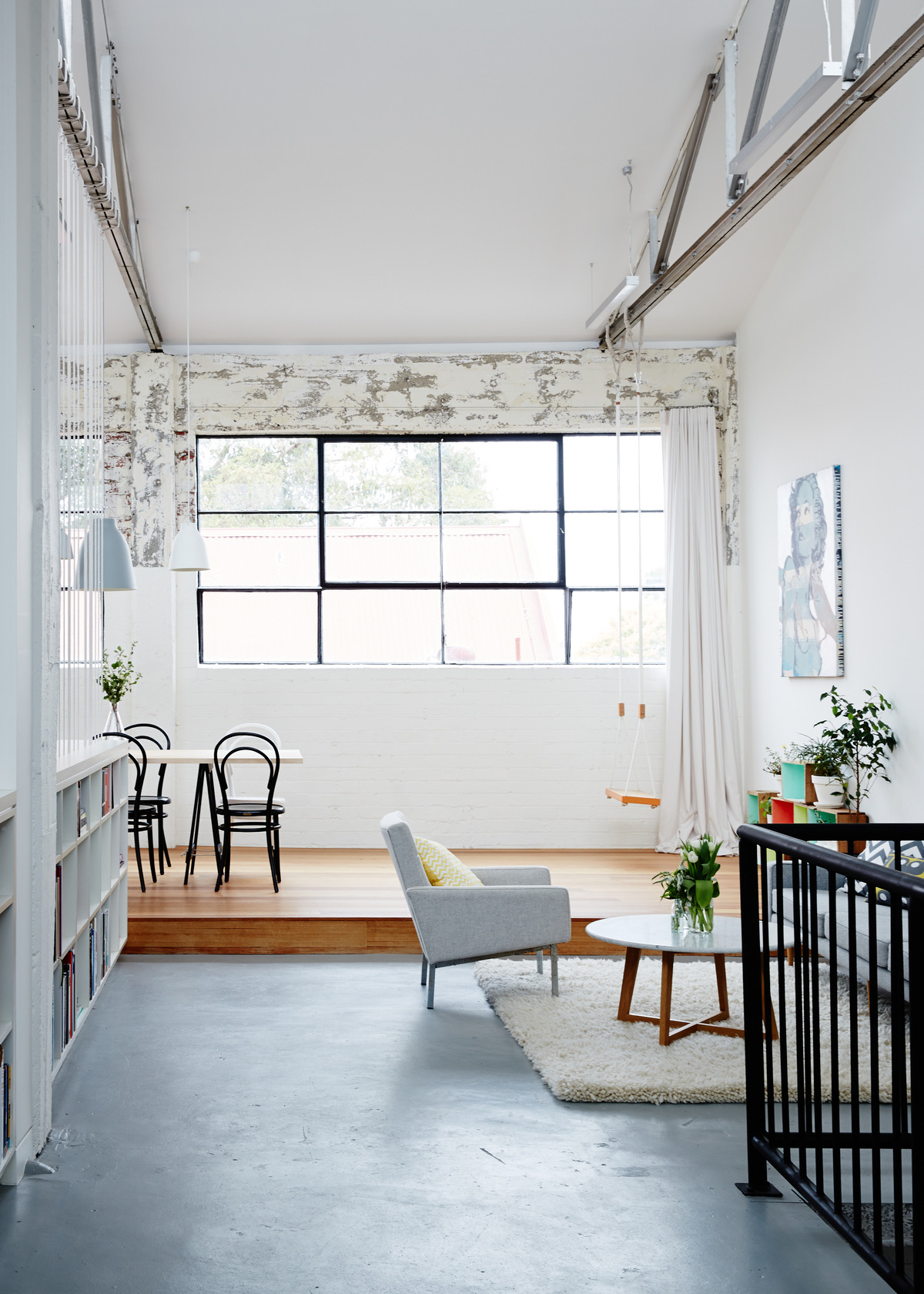
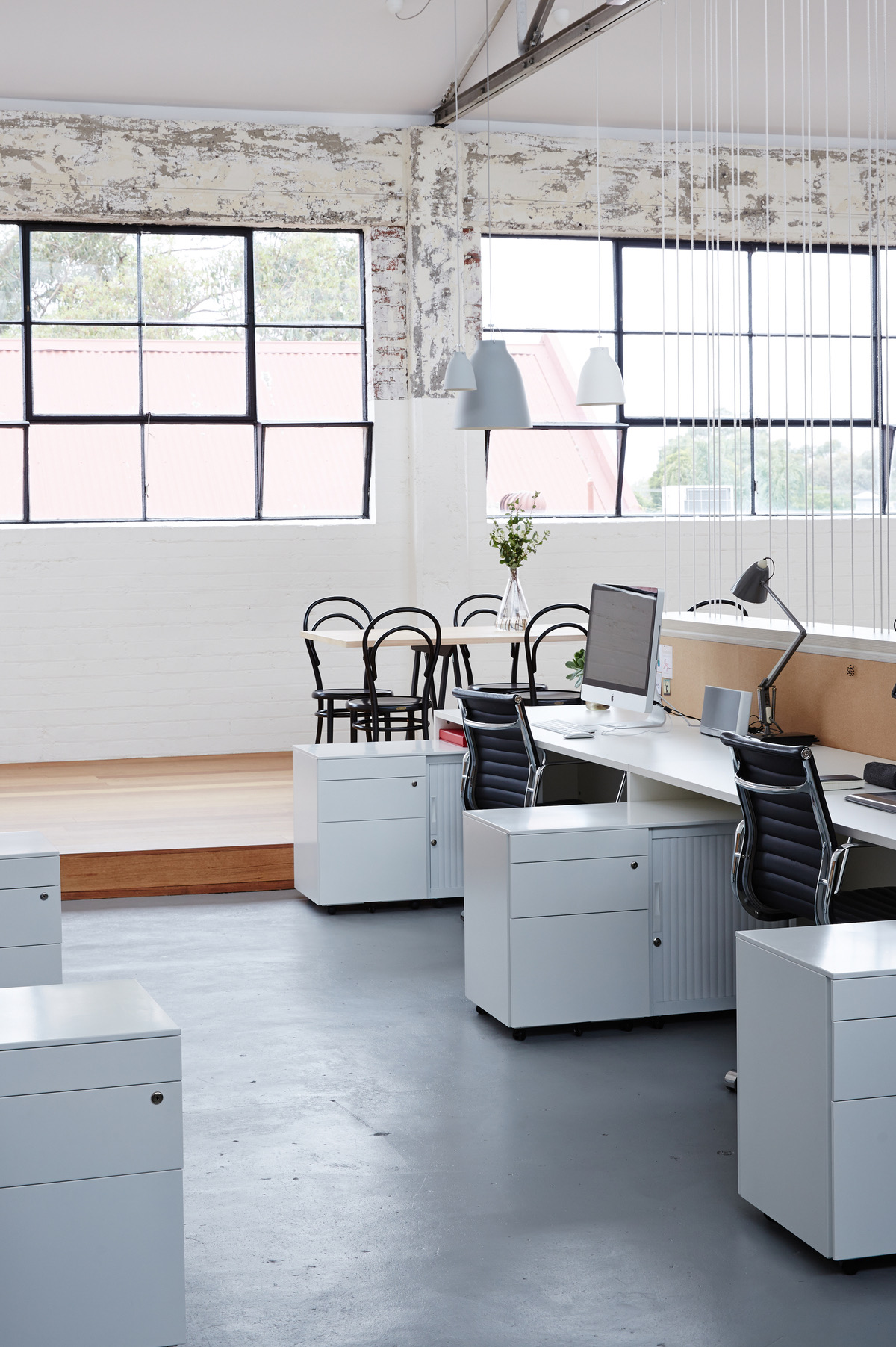
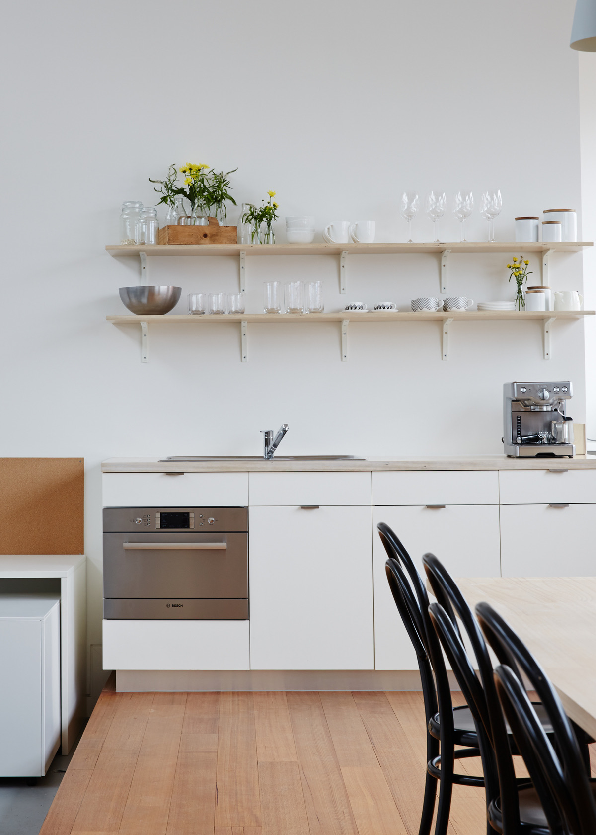
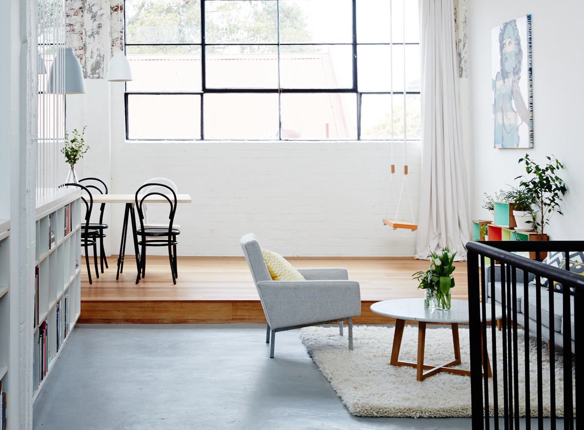
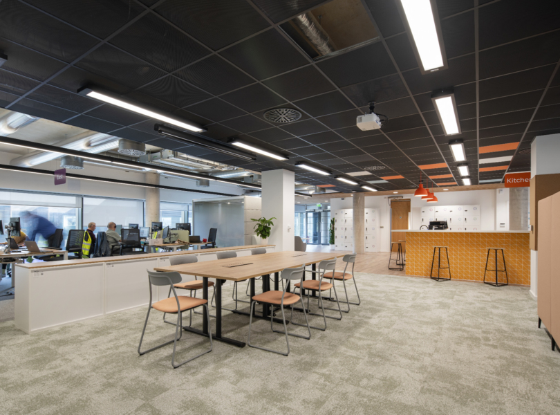
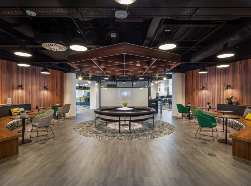
“The 1930’s warehouse shell has been transformed into a bright and inspiring creative work space. Providing different zones of use throughout offers the flexibility required for both collaborative work and individual creative exploration whilst retaining the original building’s sense of scale.
Studio Sisu is designed to address the physical limitations and isolation of an industry fractured by small studio business models. It brings together complimentary businesses to create opportunities for discussion and interaction amongst peers. Encouraging creative collaboration of ideas and skills creates an environment otherwise inaccessible to small businesses or individual practitioners.
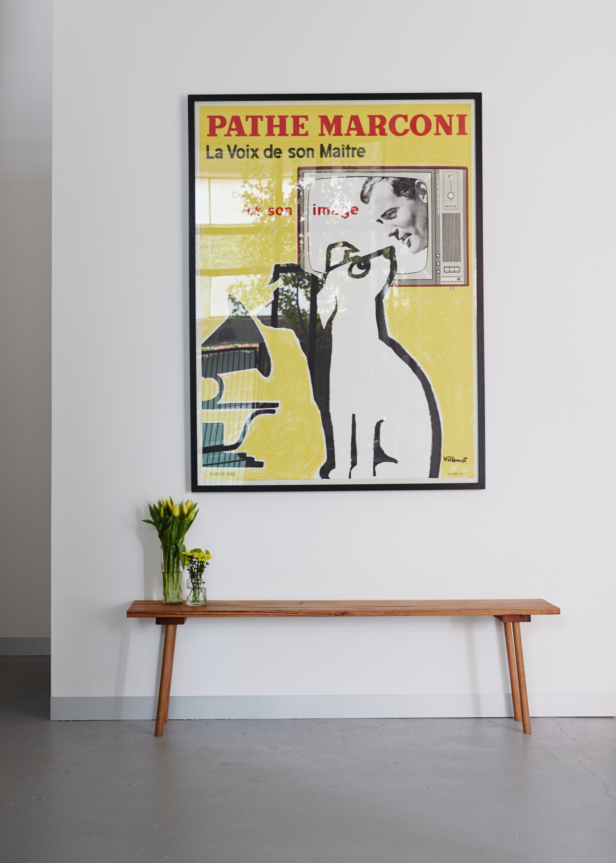
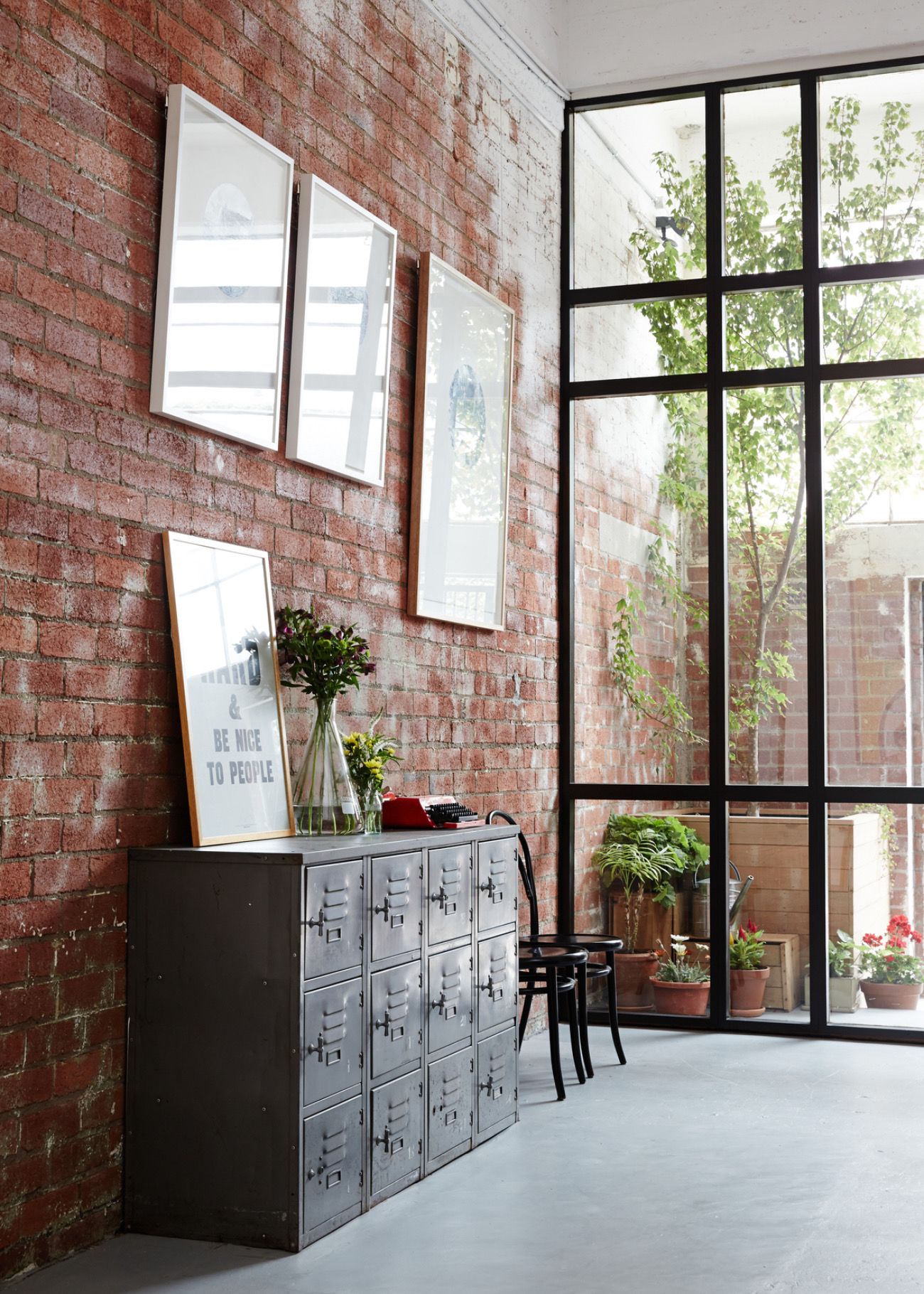
Using a mixture of high and low cost materials, furniture and fittings has allowed the design to create a highly crafted and unique environment within the specified budget. The inclusion of refurbished antique furniture and fittings allows the new building work to sit comfortably alongside the existing factory structure.
The design of the new interventions and custom designed furniture, uses a simple materials palette accentuating the highly tactile surfaces of the original building.
The new entry pulls back from the street and softens the solidity of the building, providing the studio with a distinctive presence within its laneway context. The entry doors emphasise the height of the space and their offset placement directs visitors to the office without the need for a formal reception.
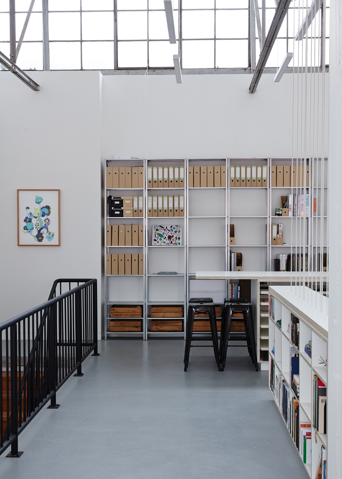
The ground level is a flexible, shared space allowing for large-scale projects or workshops not usually catered for in an office environment. Amenities on this level leave the entire upper level free from any solid visual interruptions.
The upper level office uses a simple palette to accentuate the highly tactile surfaces of the original building. Strategic use of screening and joinery creates distinct zones whilst retaining the sense of volume which made the original shell such a unique and appealing space,” says
- Location: Melbourne, Australia
- Date completed: 2021
- Size: 2,833 square feet
- Design: Maike Design
- Photos: Sean Fennessy
