A Tour of Vitality’s New London Office
Insurance company Vitality recently hired workplace design firm Peldon Rose to design their new office in London, England.
“Vitality has established itself as a household name, championing people’s wellbeing by incentivising and rewarding healthy behaviours, and this applies to its employees as well. Peldon Rose’s brief was to create a working environment that promotes connection, collaboration, innovation, and learning, as well as employee wellbeing.
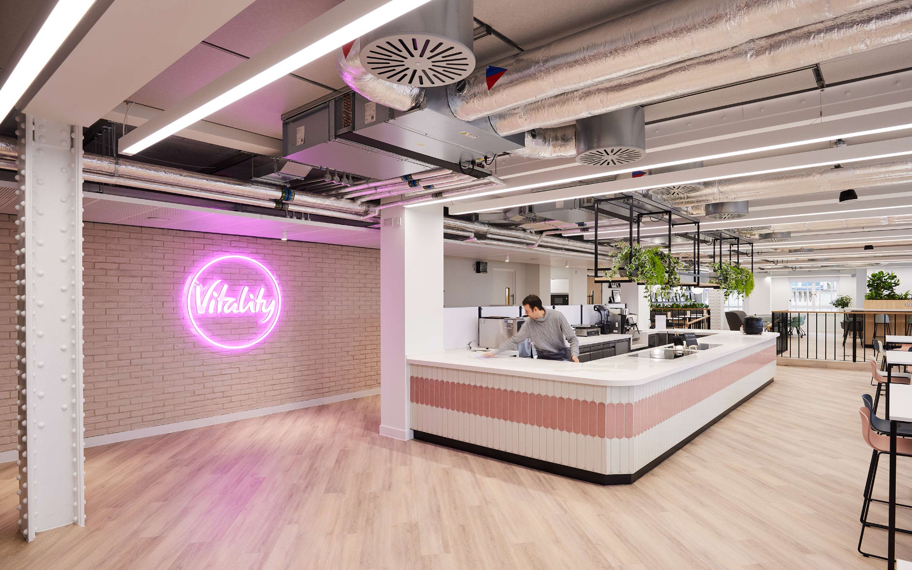
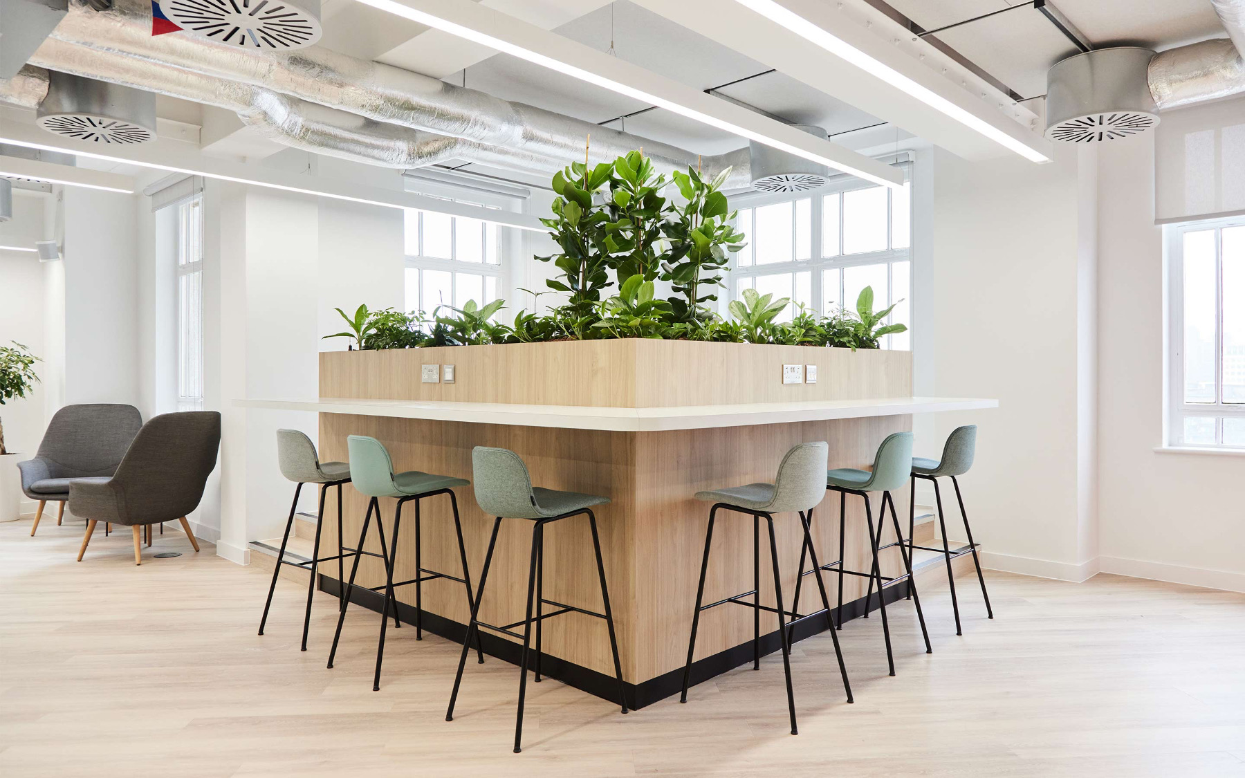
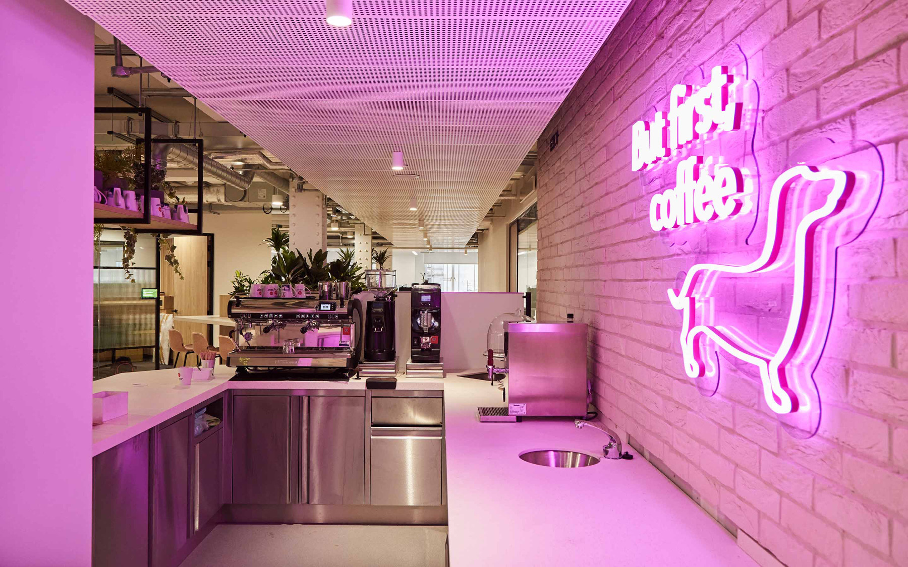
To discourage people from eating at their desks, the team introduced a vibrant servery and canteen which serves free nutritious breakfasts and lunches, as well as a welcoming coffee space with a barista. These social areas offer a variety of seating styles, creating opportunities to relax and unwind, and offering functional flexibility.
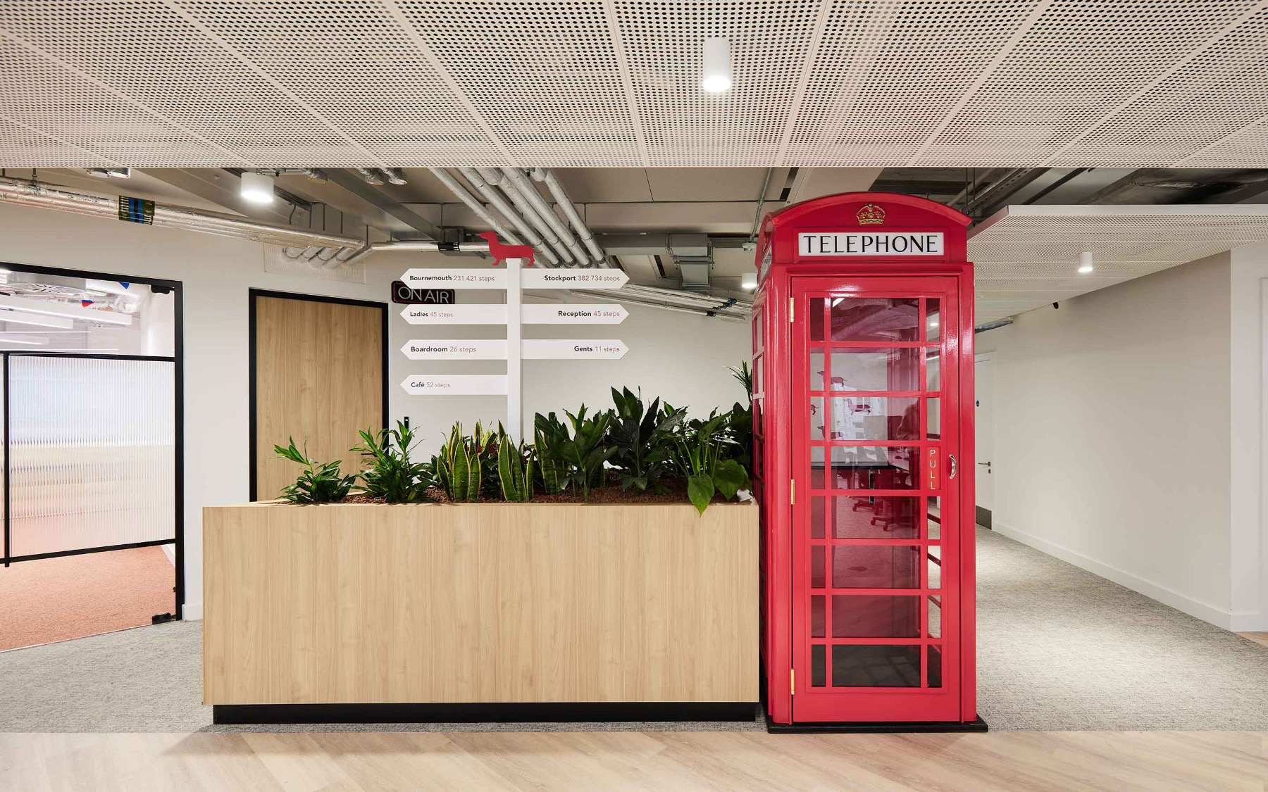
The interior design team worked some light-hearted behavioural nudges into everyday aspects of the workplace. In the middle of ‘Stanley Avenue’, the main corridor, wayfinding signs point users in the right direction and show the number of steps needed to get there. These design touches get people talking, comparing their step counts, and recognising the value of an active workday.
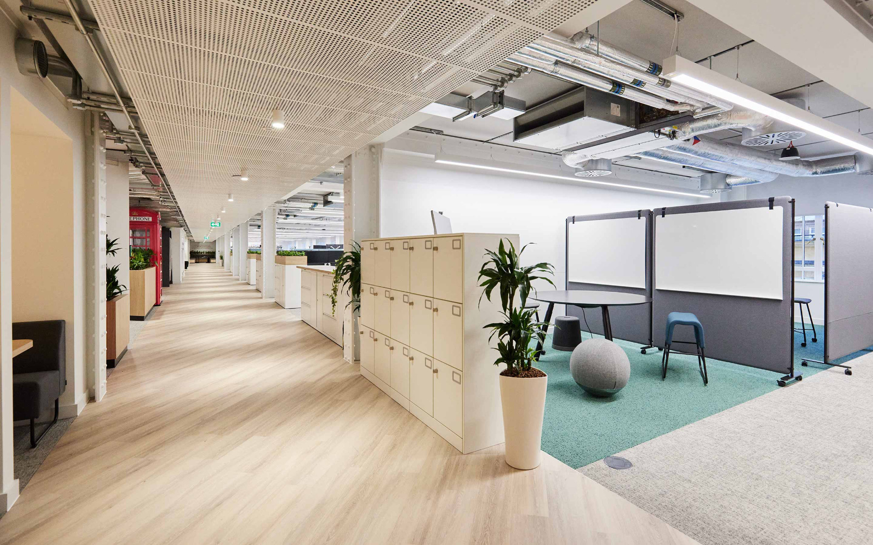
Vitality recognised that its workstations needed to be productive and versatile, and to match the comforts of home working. Peldon Rose worked with Vitality’s furniture supplier, Kinnarps, to specify sit–stand desks in the open plan area and softer furniture in meeting rooms and social spaces. There was a strong focus on sustainability, given that one of Vitality’s values is to be a force for good. Meeting room tables were repurposed or sourced locally, and recycled plastic was used on the reception desk, for example.
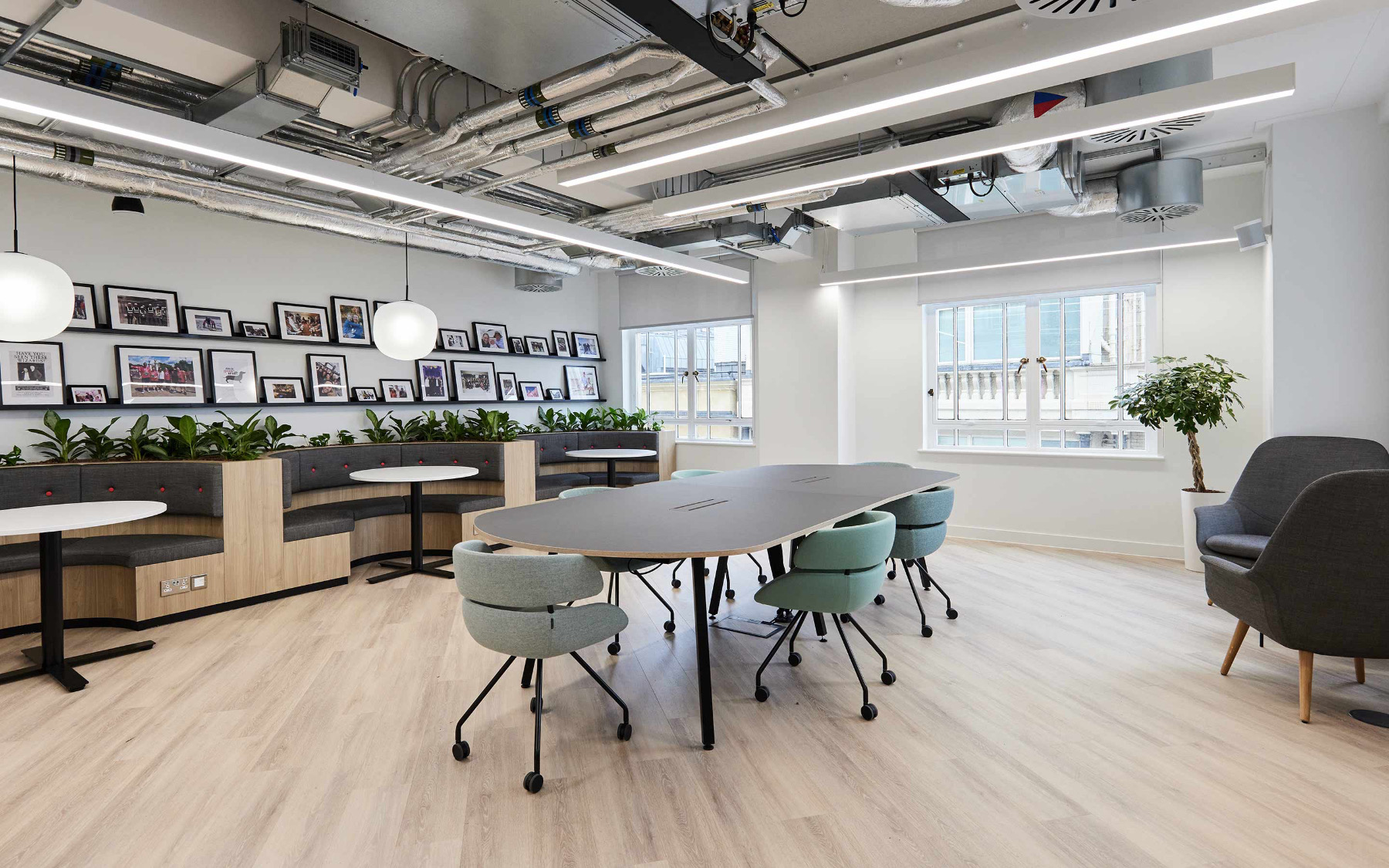
Vitality’s new home features a diversity of spaces aimed at promoting connection, collaboration, innovation and learning, including meeting rooms that seat between two and 30 people, collaboration zones, focus areas, a project room, and a media recording studio. An important feature of the new office design was the decision to devote spaces with views of the Thames and iconic London landmarks, as well as an abundance of natural light, to communal use. Vitality also chose to abandon assigned offices for executives.
Vitality’s branding is full of life, and embodied by Stanley the dachshund, who features prominently throughout their new office in the form of neon signs and sausage dog-adorned cushions. Stencilled Stanley acoustic panels in focus zones combine functionality with fun. A jam-packed awards cabinet showcases the company’s successes to date, and a gallery wall features personal pictures provided by Vitality employees.
Vitality’s unmistakable bright pink branding is in evidence, without being overwhelming. It features in picture frames, accents, and carefully selected quote walls. Complementary pinks align with the brand’s primary and secondary colour palettes, with teals and turquoises helping to create a softer aesthetic.”
- Location: London, England
- Date completed: 2023
- Size: 22,000 square feet
- Design: Peldon Rose
