A Peek Inside Private Office Space in Austin
Architecture and interior design firm Mark Odom Studio recently designed a new private office space in Austin, Texas.
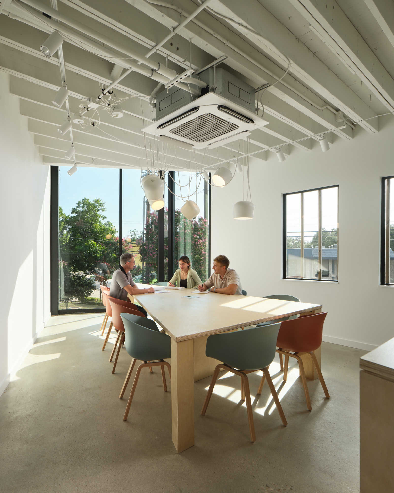
“Removing the exterior limestone and turrets that were at each point of the triangle allowed us to see the floor plan and design in its truest form. This also made possible for a large 12-foot window wall accommodating conference rooms on both floors,” says Erin Nies, Principal, Mark Odom Studio.
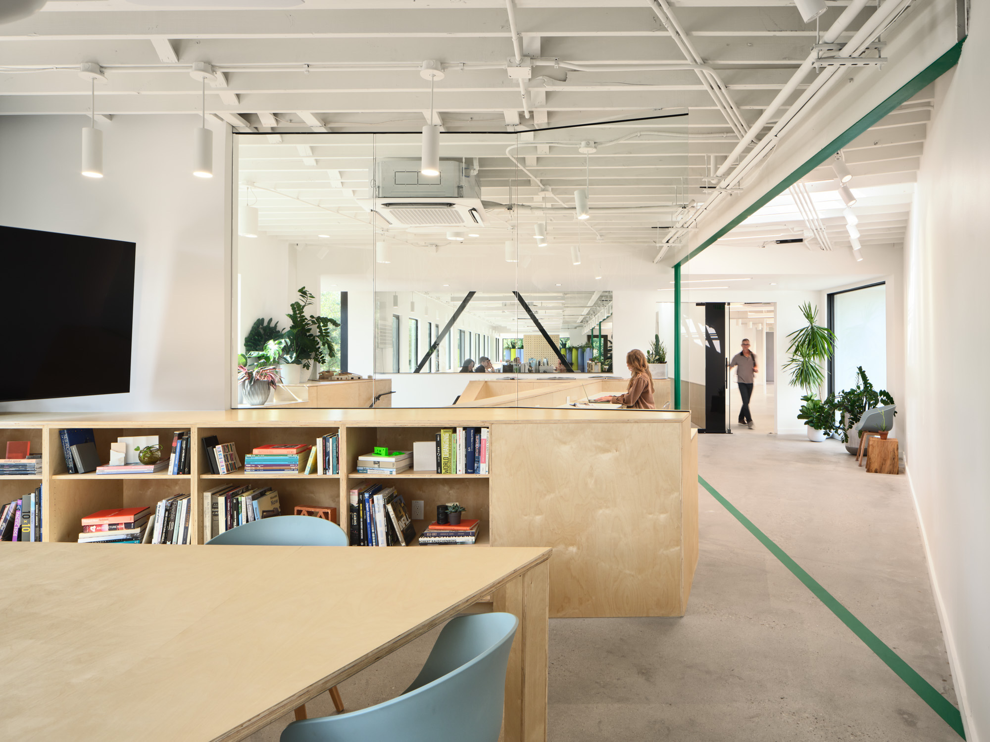
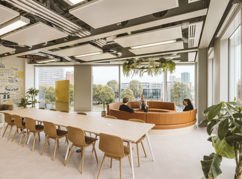
Mark Odom Studio reconfigured the building specifically to accommodate a creative industry user, programming spaces for multi-task and function. Windows and skylights were added, and the restrooms were placed on the south side of the building allowing natural light to hit all three sides of the building while also offering see-through views.
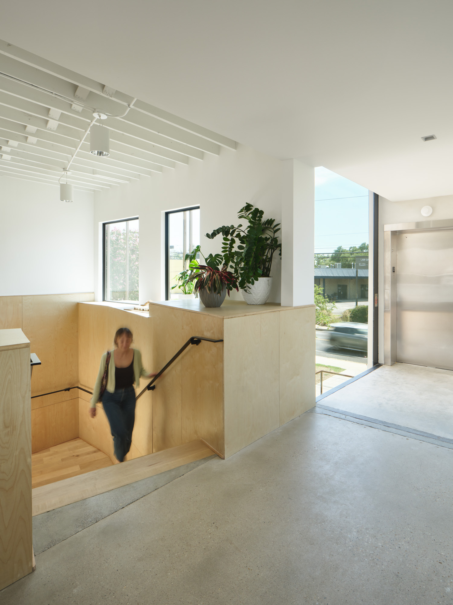
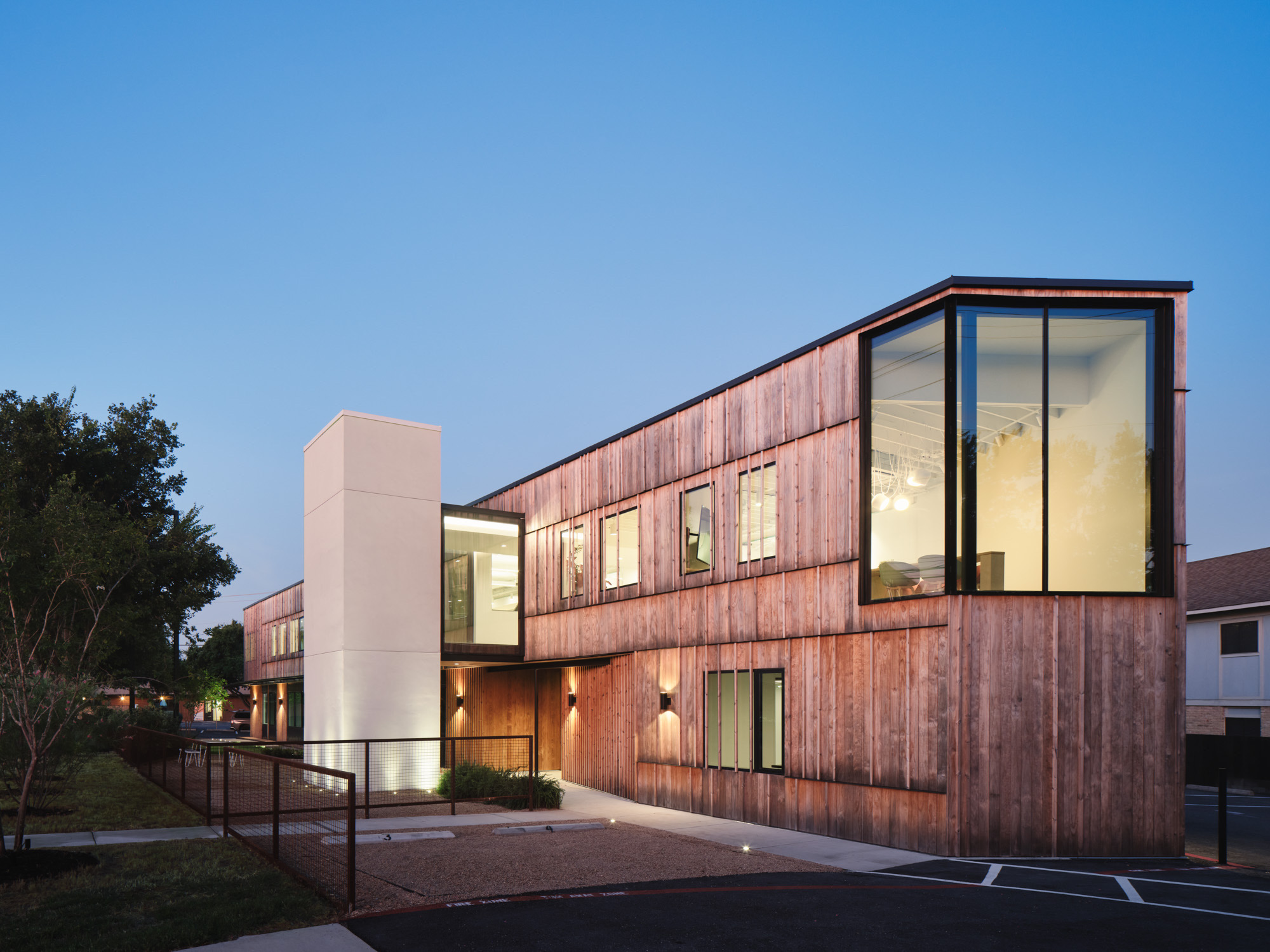
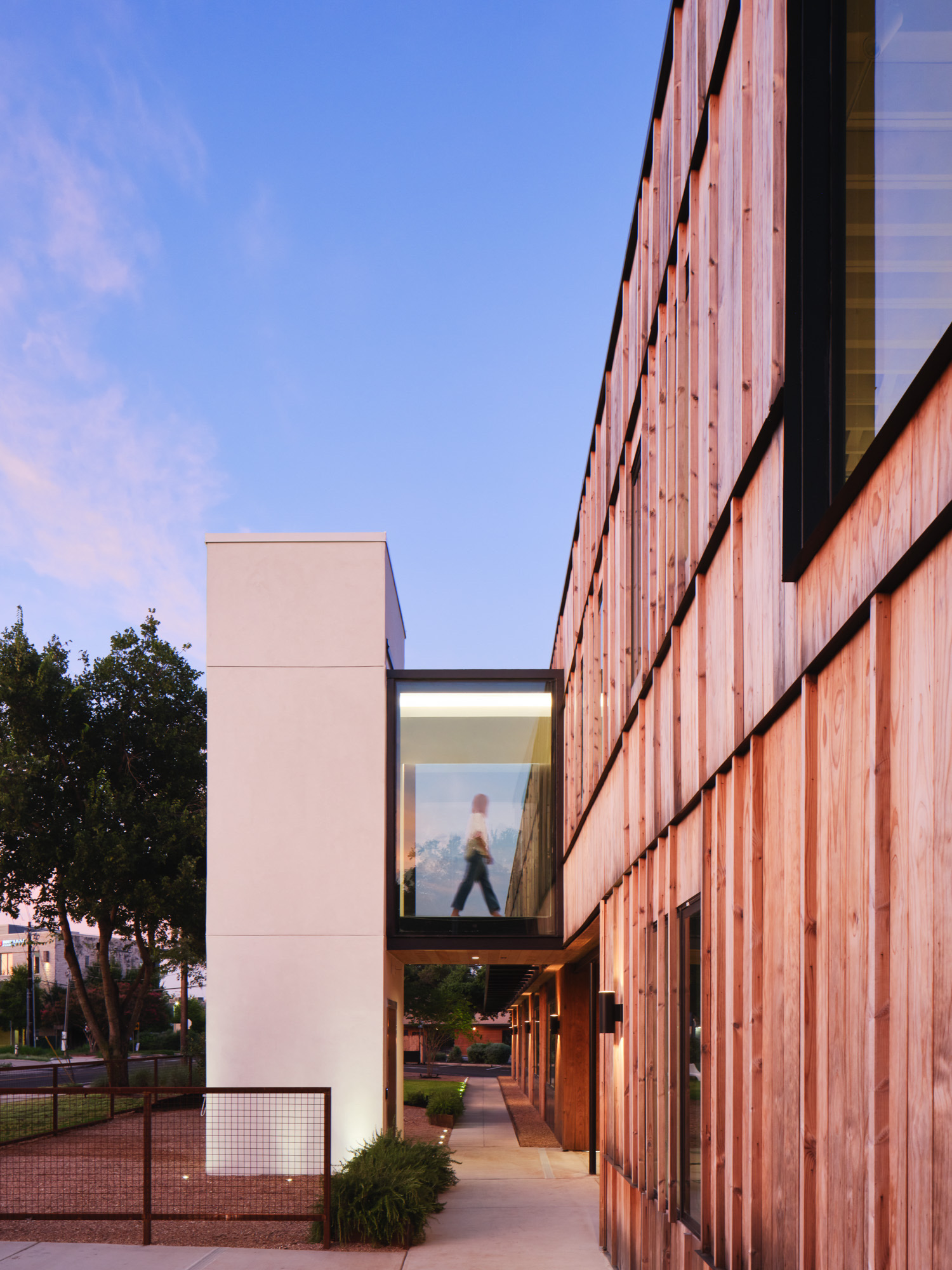
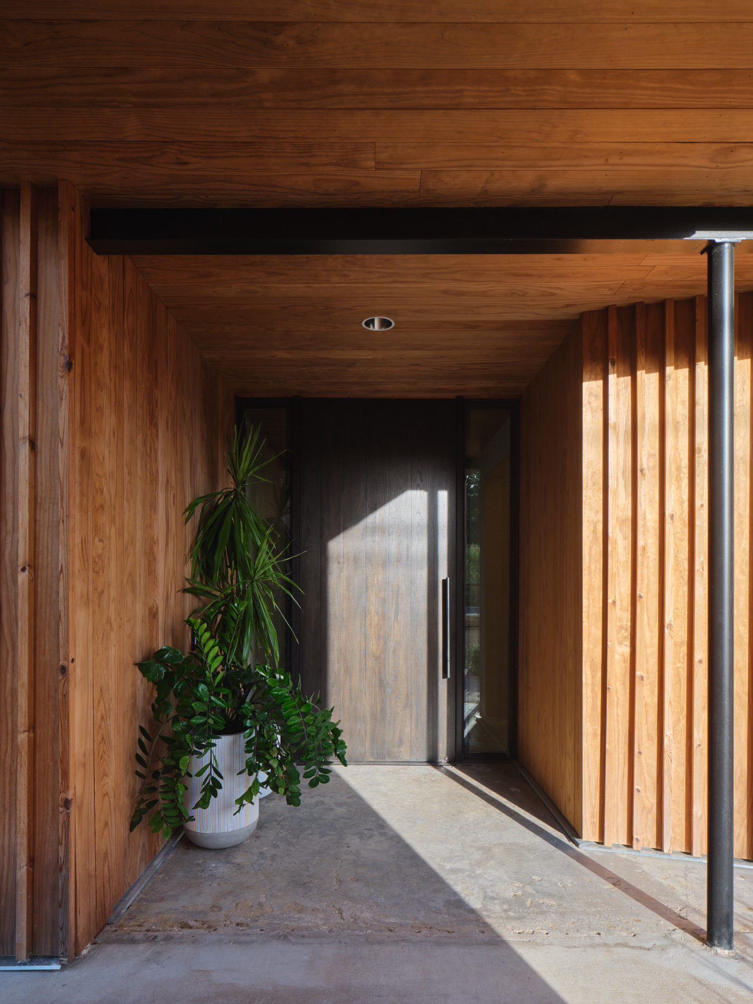
The addition of an exterior elevator is connected by a skybridge providing second floor access while not interrupting the triangular floor plan. The design team reused and salvaged the primary components of the building—slab, wall, and roof frame, while being conscious of improving the building envelope and natural light, modifying the dated building with quality, aesthetics, and function. The exterior was updated with a thermo-spruce facade.
The lot was originally a sea of parking, flanking all sides of the building, Mark Odom Studio removed the front parking lot to create a usable green buffer “front yard” located between the busy street and building. The removal of parking in the front of the building allowed for a substantial green space that now benefits all.
“The plan and design prioritizes wellness and sets a precedent for greenscapes in urban areas,” says Mark Odom, Founding Principal, Mark Odom Studio. “By making the much needed adjustments and the addition of an elevator with glass walkway and front yard, the re-imagined building is all about user experience and sets a precedent on the street.”
By taking a Class C office building and turning it into a Class A, while also maintaining the original footprint, the architecture firm has ensured the building gets a second life.
Mark Odom Studio has made the innovative creative office building its new HQ and occupies the top floor. Beaux Med Spa occupies the first floor, encompassing 5000 square feet.The original structure has been completely reimagined into a modern creative office building featuring loads of green space, ample parking, Class A finishes, an outdoor amenity garden, and more. Built in 1970, the two-story building, situated on a half-acre lot, had a distinct, unusual triangle shape. The architects used the odd configuration to a design advantage keeping the original footprint and some framing.
“Removing the exterior limestone and turrets that were at each point of the triangle allowed us to see the floor plan and design in its truest form. This also made possible for a large 12-foot window wall accommodating conference rooms on both floors,” says Erin Nies, Principal, Mark Odom Studio.
Mark Odom Studio reconfigured the building specifically to accommodate a creative industry user, programming spaces for multi-task and function. Windows and skylights were added, and the restrooms were placed on the south side of the building allowing natural light to hit all three sides of the building while also offering see-through views.
The addition of an exterior elevator is connected by a skybridge providing second floor access while not interrupting the triangular floor plan. The design team reused and salvaged the primary components of the building—slab, wall, and roof frame, while being conscious of improving the building envelope and natural light, modifying the dated building with quality, aesthetics, and function. The exterior was updated with a thermo-spruce facade.
The lot was originally a sea of parking, flanking all sides of the building, Mark Odom Studio removed the front parking lot to create a usable green buffer “front yard” located between the busy street and building. The removal of parking in the front of the building allowed for a substantial green space that now benefits all.
“The plan and design prioritizes wellness and sets a precedent for greenscapes in urban areas,” says Mark Odom, Founding Principal, Mark Odom Studio. “By making the much needed adjustments and the addition of an elevator with glass walkway and front yard, the re-imagined building is all about user experience and sets a precedent on the street.”
By taking a Class C office building and turning it into a Class A, while also maintaining the original footprint, the architecture firm has ensured the building gets a second life.
Mark Odom Studio has made the innovative creative office building its new HQ and occupies the top floor. Beaux Med Spa occupies the first floor, encompassing 5000 square feet.”
- Location: Austin, Texas
- Date completed: 2024
- Size: 28,000 square feet
- Design: Mark Odom Studio
- Photos: Andrea Calo
