Inside Tilt Creative + Production’ New Richmond Office
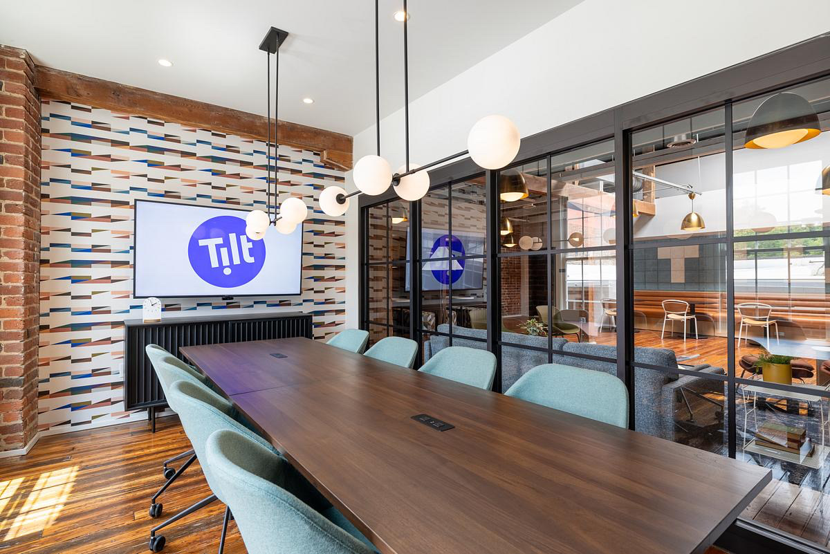
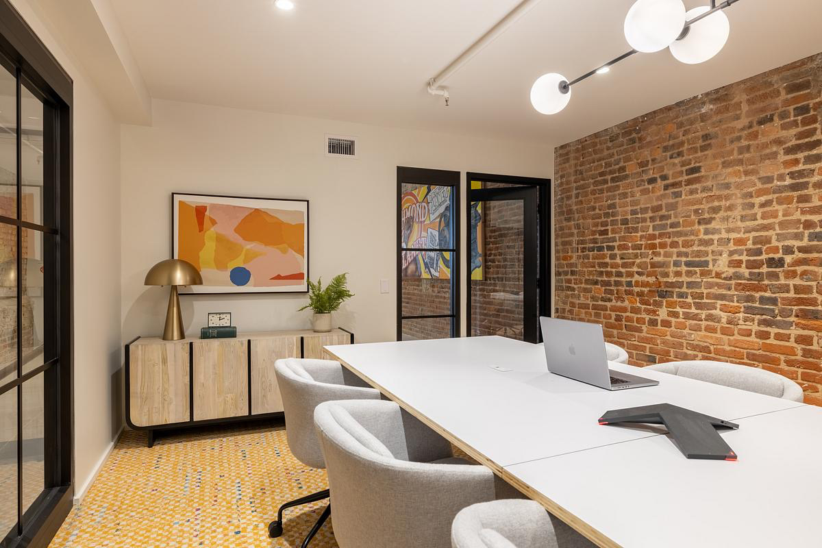
Creative studio Tilt Creative + Production hired workplace design firm Campfire & Co. to design their new office in Richmond, Virginia.
“The renovation of their building is not just a preservation project—it is a living testament to the resilience and progress that emerged after the Civil War. As Tilt restored this historic space, they revived the stories of those who fought to rebuild lives and communities in the face of relentless opposition. This spirit is at the heart of Tilt’s documentary on the Richmond Planet. This African-American-run newspaper shook the foundations of the Old South by fearlessly battling lynching and segregation during the Jim Crow era. Through Birth of a Planet, Tilt sought to honor the voices that fought for justice, equality, and progress. The renovation of their historic building and the telling of this powerful story reflect our commitment to blending the past and present in Richmond’s ongoing journey toward revitalization. Today, as Tilt breathes new life into a Reconstruction-era building, the renovation is more than just a preservation effort, they are honoring a legacy of resistance and resilience, one that continues to inspire change in the modern world.
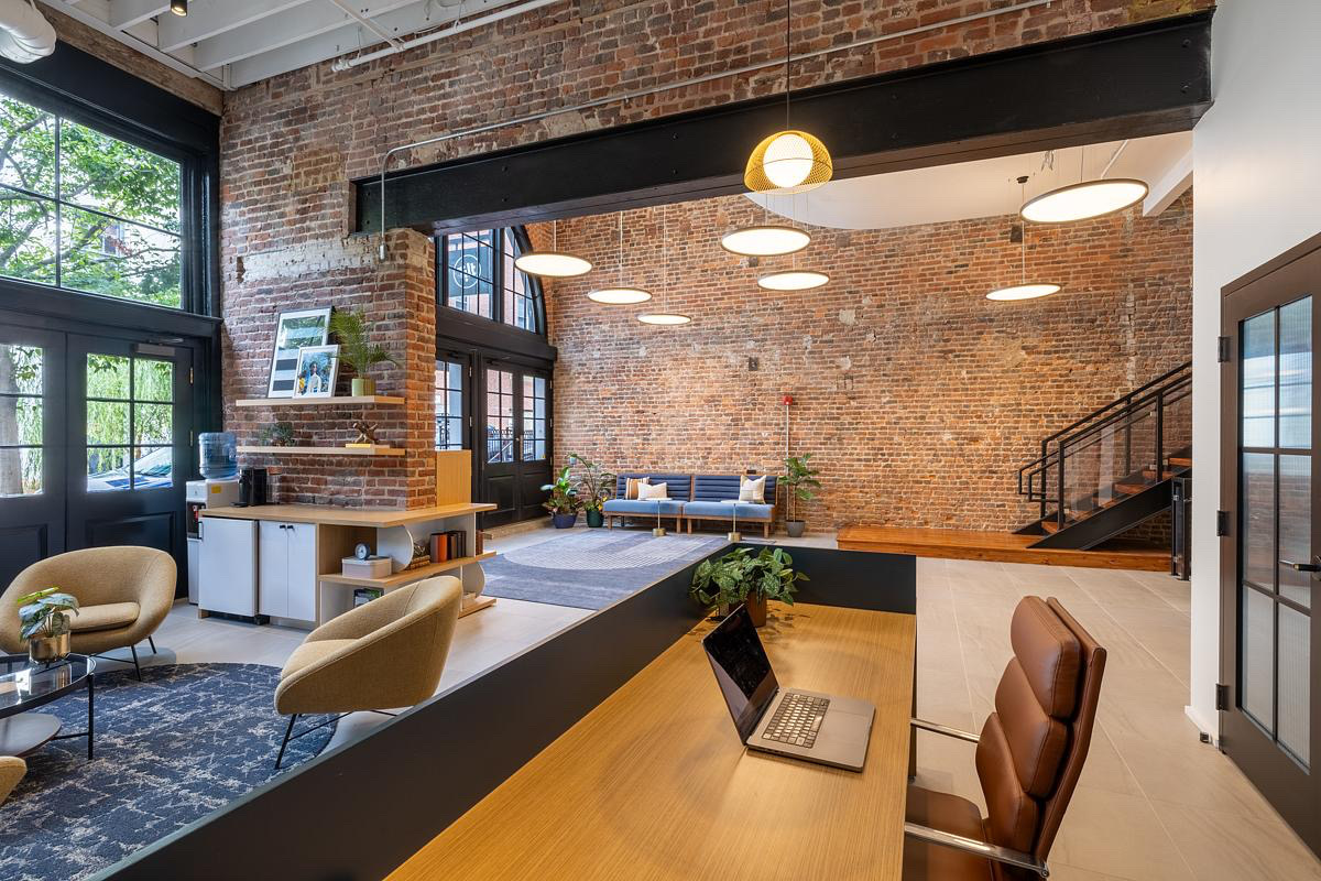
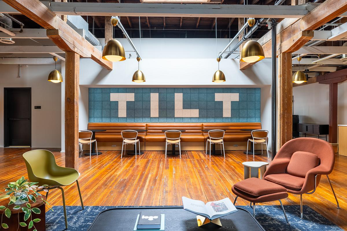
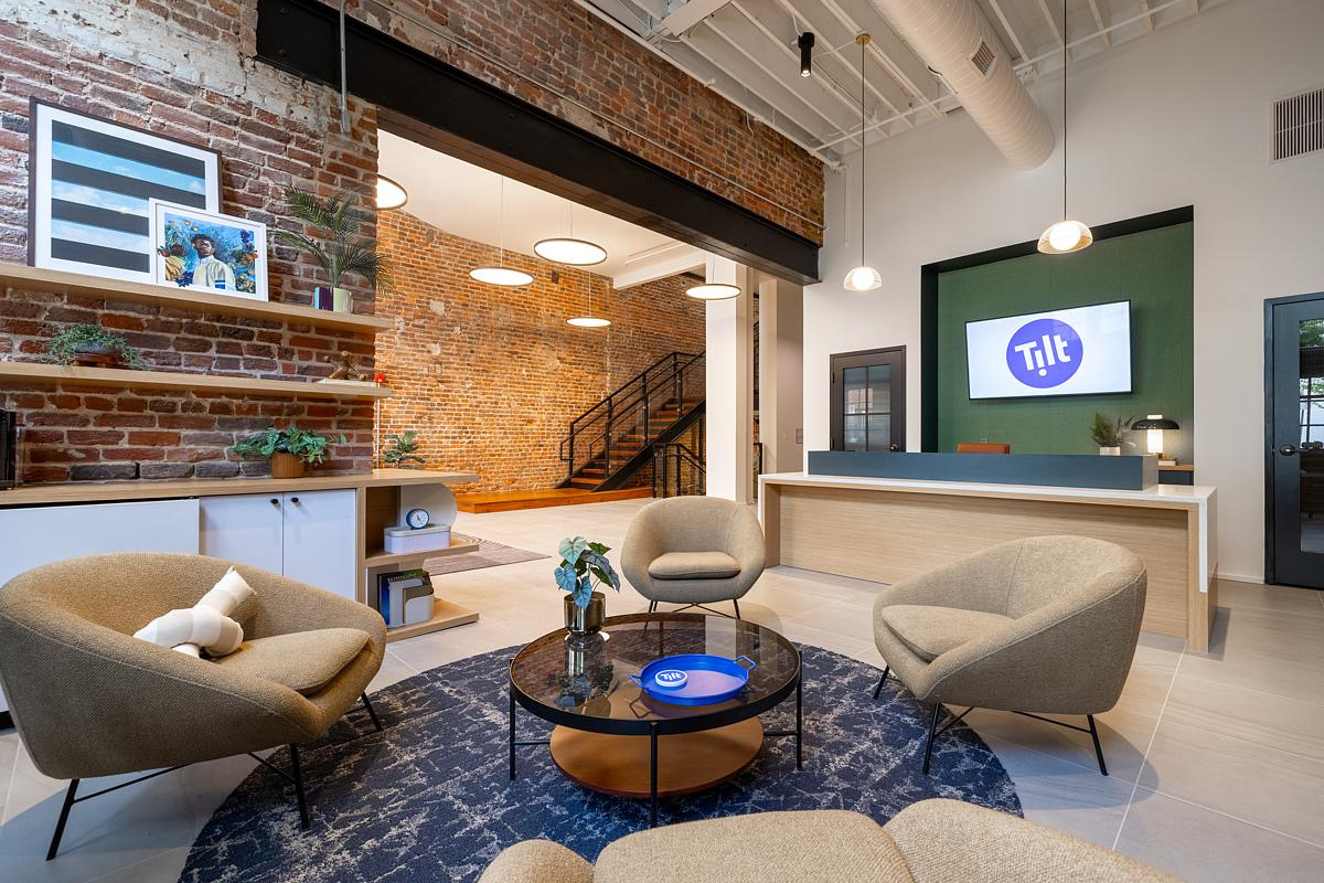
The transformation of the entry and lobby area was centered around reclaiming the volume and creating a welcoming, cohesive experience. Originally, a grand arched window greeted visitors, celebrated from the street. However, over time, the space was compromised by a freestanding structure that obscured the lobby’s volume and full potential. Visitors were often confused by the dark corridors and varying levels, unsure of where to go. By removing the collection of structures and eliminating tenant suites near the entrance, the design team reestablished the space’s original grandeur. The brick walls, steel structure, and timber ceiling—all previously hidden—were revealed and celebrated. We introduced a floating stair that extends daylight deep into the space, allowing visitors to choose between a beautifully illuminated stairway or a stunning elevator ride, creating an inviting arrival experience for all abilities. The reception area, now front and center, provides a clear sense of direction and a welcoming point for tenants and guests alike. The design was mindful of the lobby casework throughout, creating a light and fresh aesthetic that distinctly contrasts with the historic elements such as the timber beams and wood floors. This deliberate choice highlights the distinction between the modern furnishings and the original structure, allowing both elements to shine in their own right. On the streetside, awnings and other leftover structures were removed from the historic windows to reveal the beautiful arch shapes and allow additional daylight to enter the lobby.
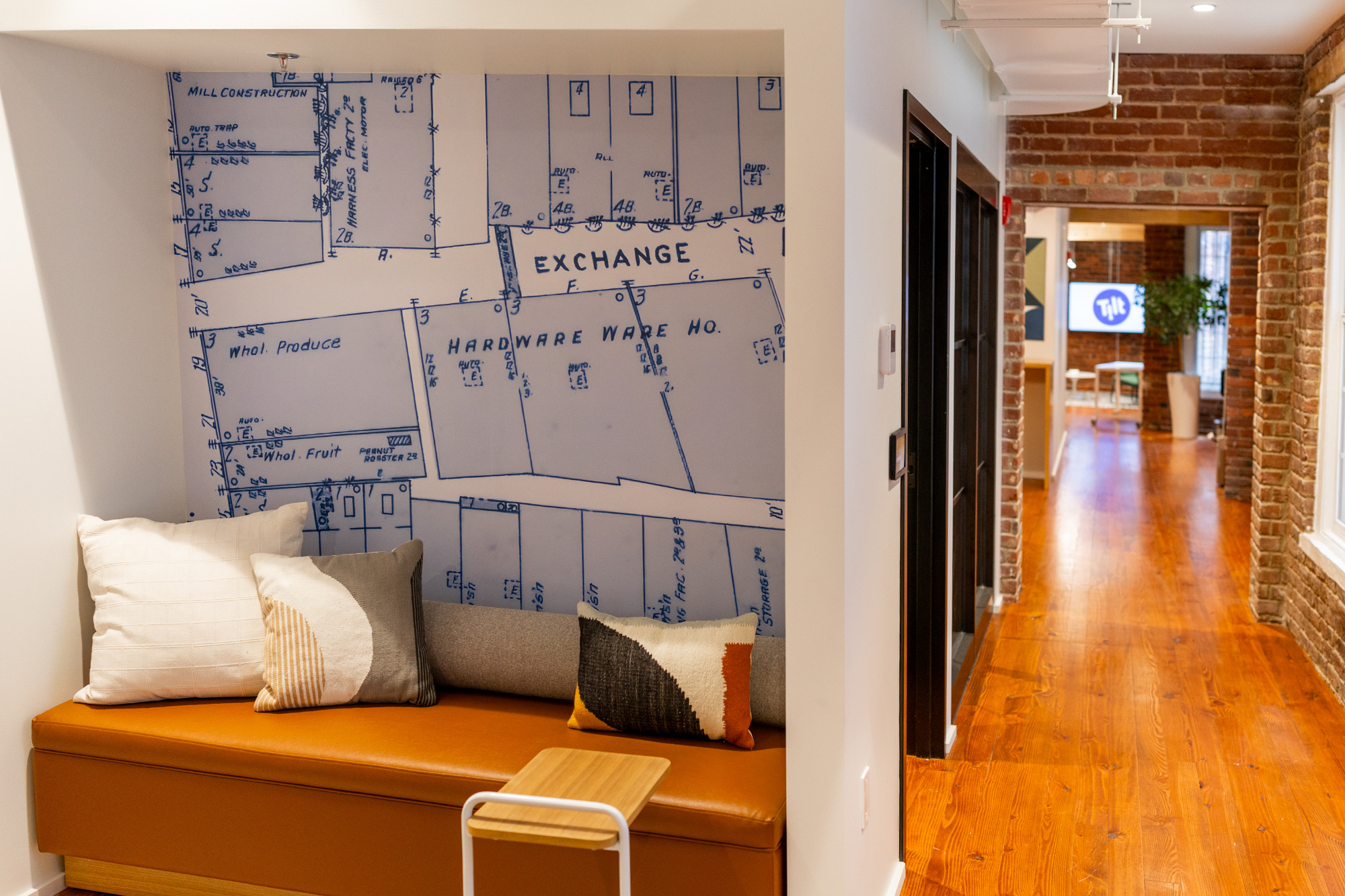
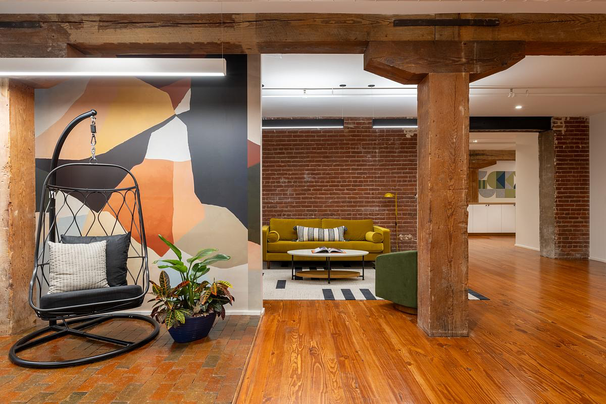
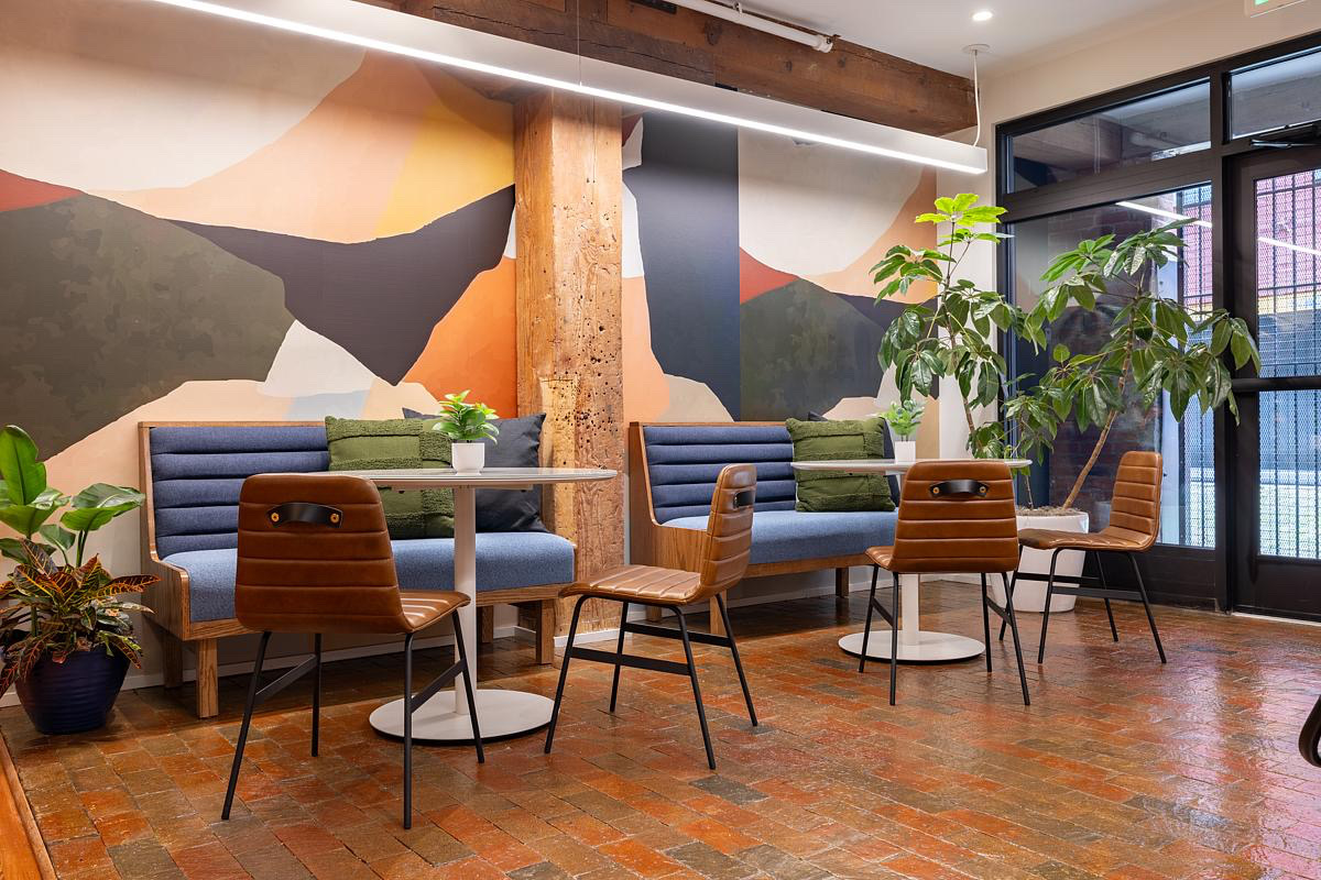
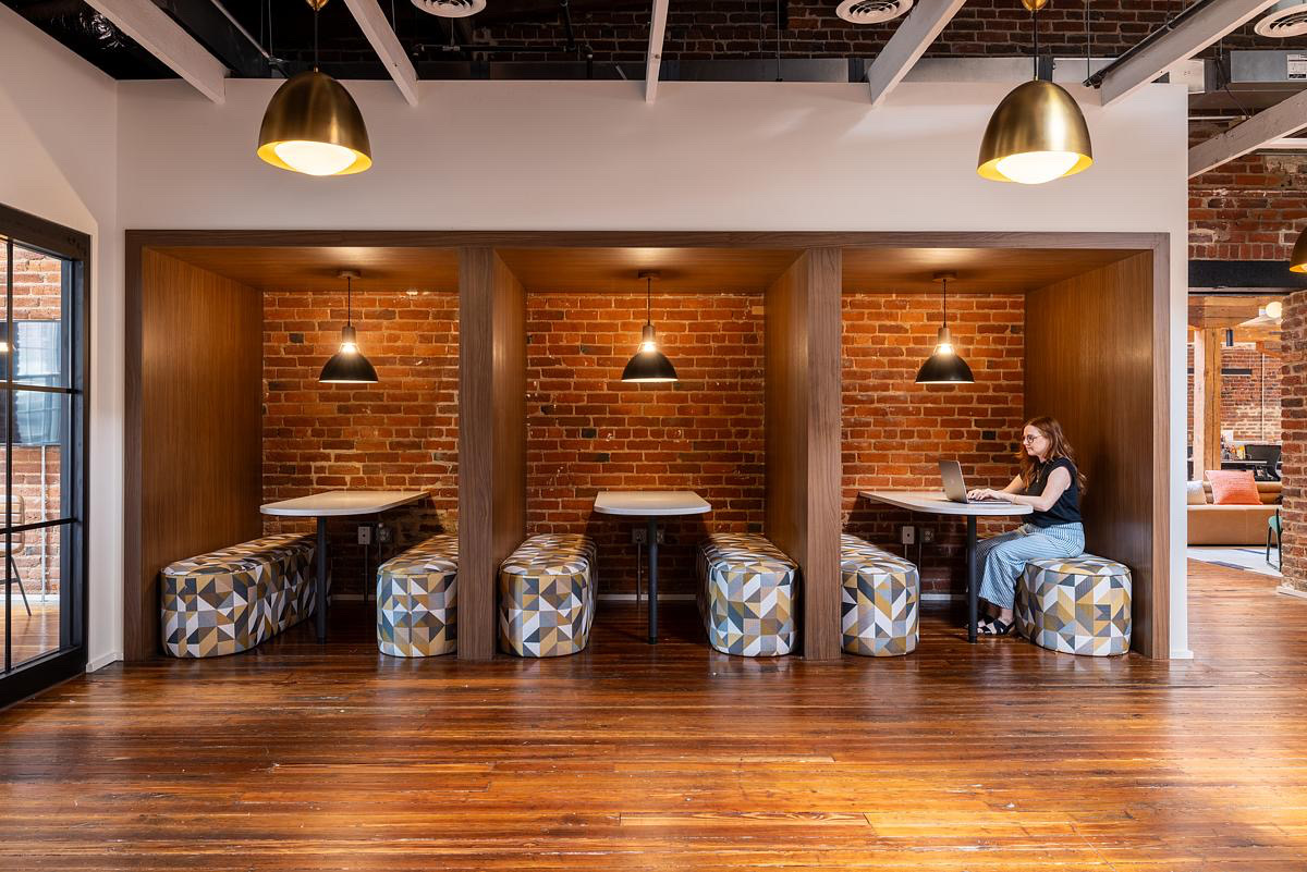
On the first floor, the focus was on creating efficient, functional spaces for Tilt’s production and editing teams. The original layout featured dropped ceilings, carpeted floors, and multiple underutilized areas. Timber columns were visible in some spots, but the timber beams were completely hidden. By relocating editing suites, which require dark rooms with detailed lighting controls, from the well-lit third floor to this darker area of the building, we maximized the space’s potential while providing more daylight and circulation to the common areas. We opened up sightlines, making the floor more navigable and creating pockets of daylight and lounge spaces to break up the once confusing layout. Subtle nods to history are infused into the design—such as the custom map wall graphic in the informal meeting nook, offering a simple yet meaningful recall of the building’s past. The introduction of a repurposed “indoor patio” space also brought a refreshing feel to a previously uninspired loading dock area, offering a moment of respite and connection to the building’s original use. Finally, a replica painting of a mural honoring the Richmond Planet newspaper further reflects Tilt’s mission to tell impactful stories, especially those that resonate with the African American community.
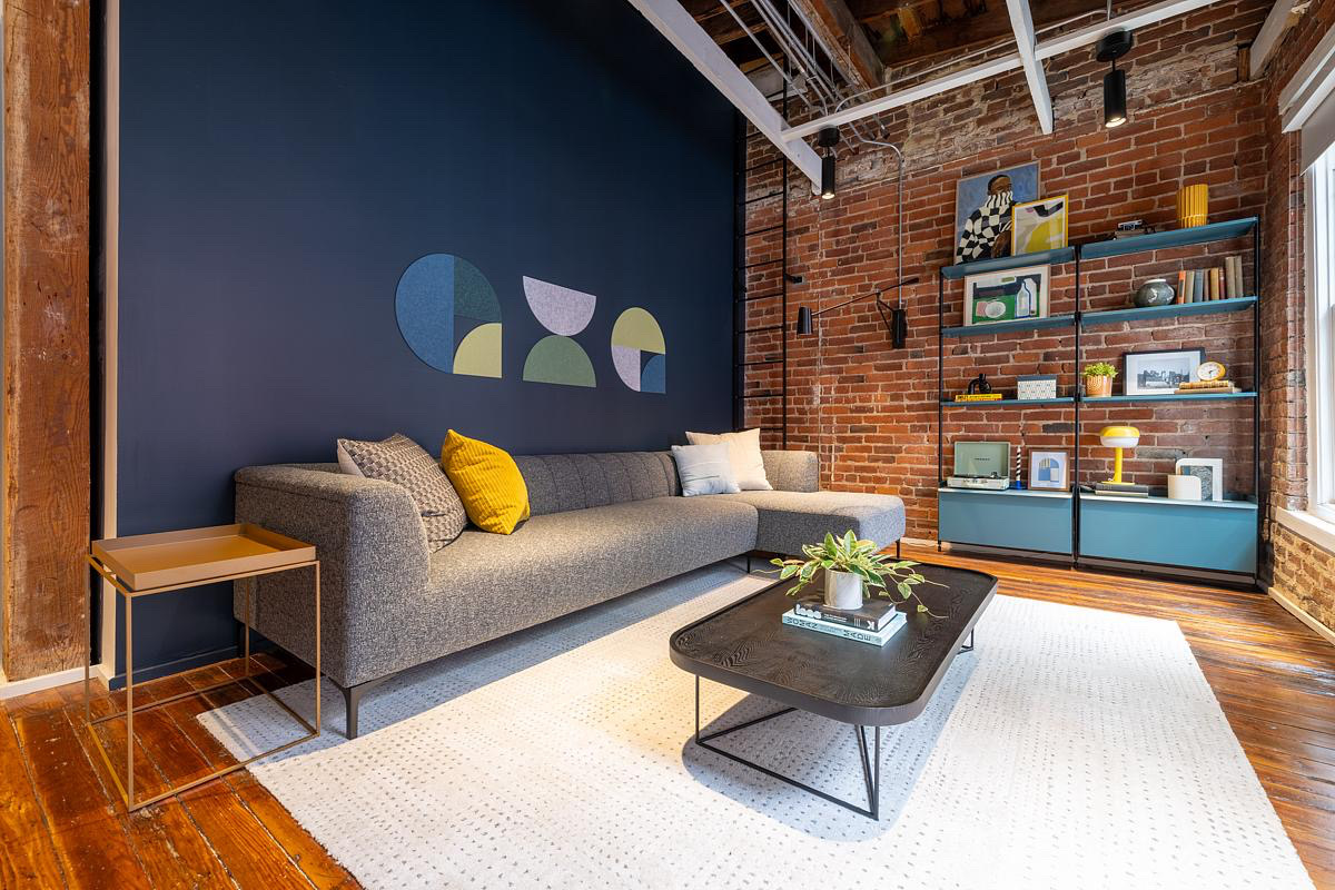
The third floor was redesigned to provide a cleaner, more organized experience for leadership and open-office work areas. The front of the building was reconfigured to connect more fully to the atrium and a central stair replaced the previous split-level, cobbled-together design. This redesign opened up space for a new lounge area alongside an internal stairway, offering a seamless connection between offices and reducing trip hazards. A bonus of the reduction in split-levels of this area was simplifying the ceiling below, which is in view from the entrance. This new streamlined ceiling was then curved to add to the impactful experience of arrival.
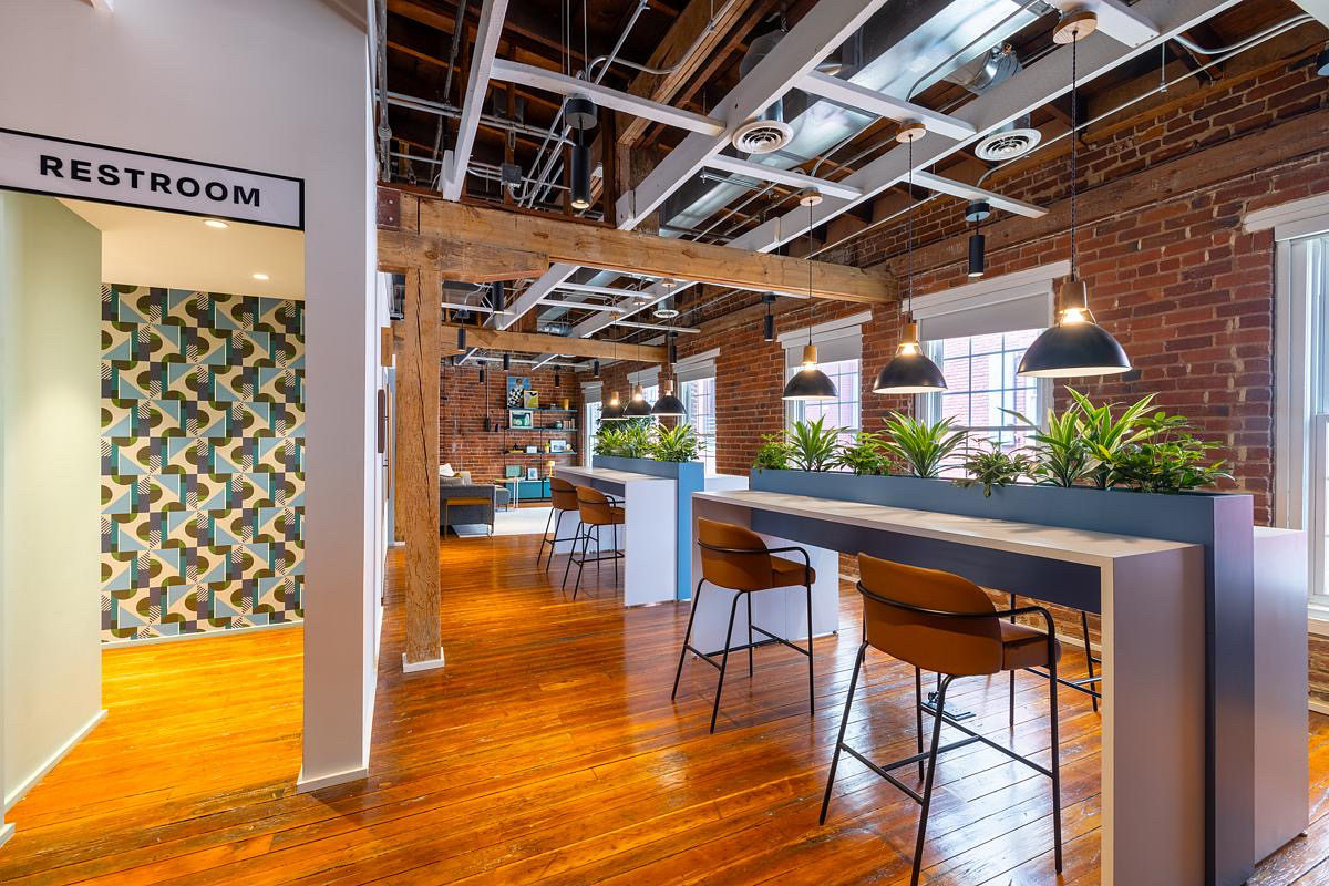
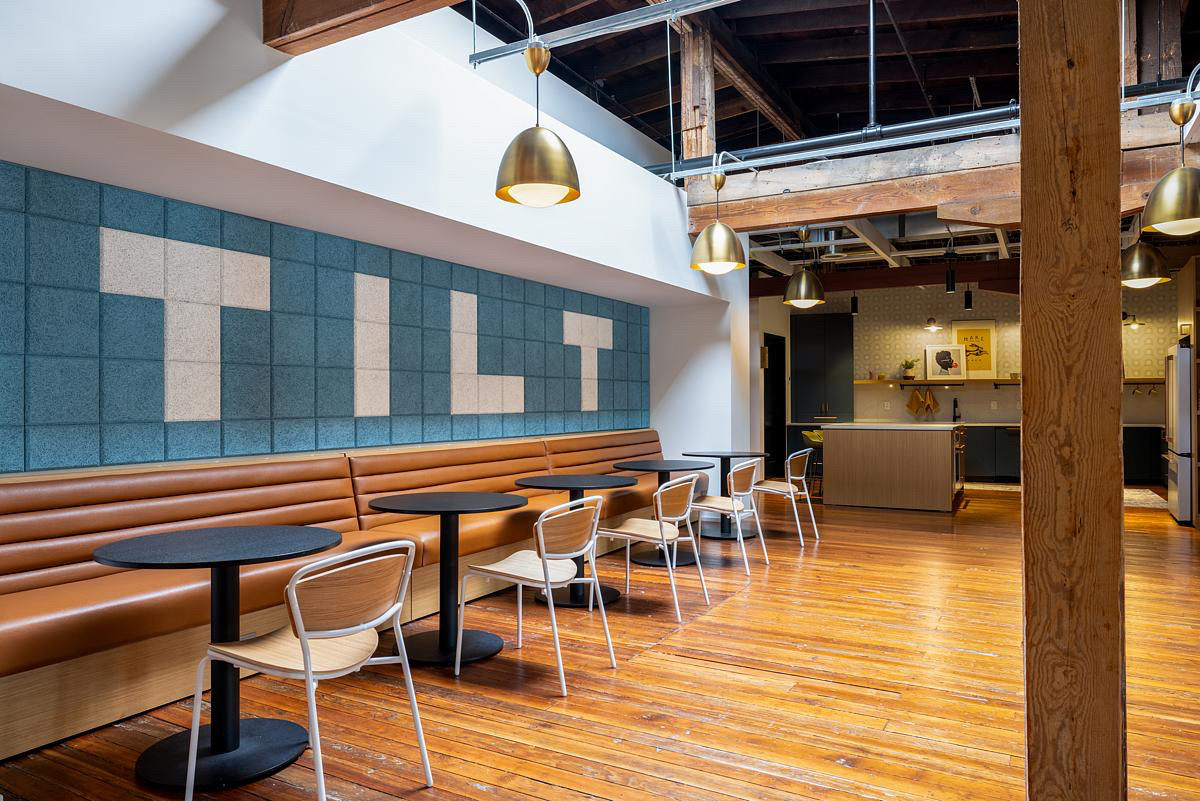
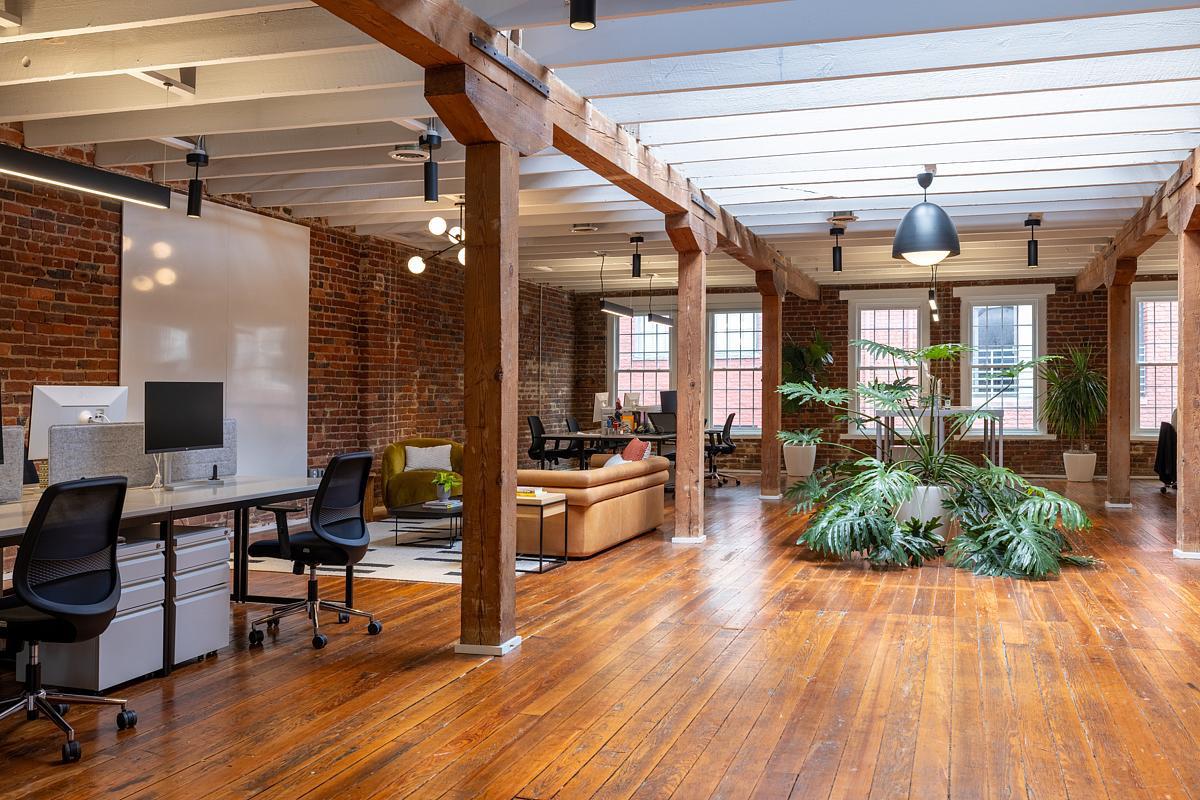
Moving toward the rear of the third floor, the design embraces the building’s historic warehouse feel, positioning a large open desking area with collaboration lounges around skylights and exterior windows. These hubs for brainstorming, dining, and meeting became key organizing factors, providing a balance between communal gathering and focused work. A standout feature is the community-oriented kitchen and dining area, designed to support everything from a casual office meal to a fully catered event. The previously awkward trapezoidal shape of the kitchen area was reimagined with a large island for gathering, while still respecting the building’s original structure. Finally, a once dead-end space near the restrooms was turned into a cozy record lounge, a surprising retreat that adds warmth and utility to what was once an unused corner of the building.”
- Location: Richmond, Virginia
- Date completed: 2024
- Size: 28,000 square feet
- Design: Campfire & Co.
- Photos: On Three
